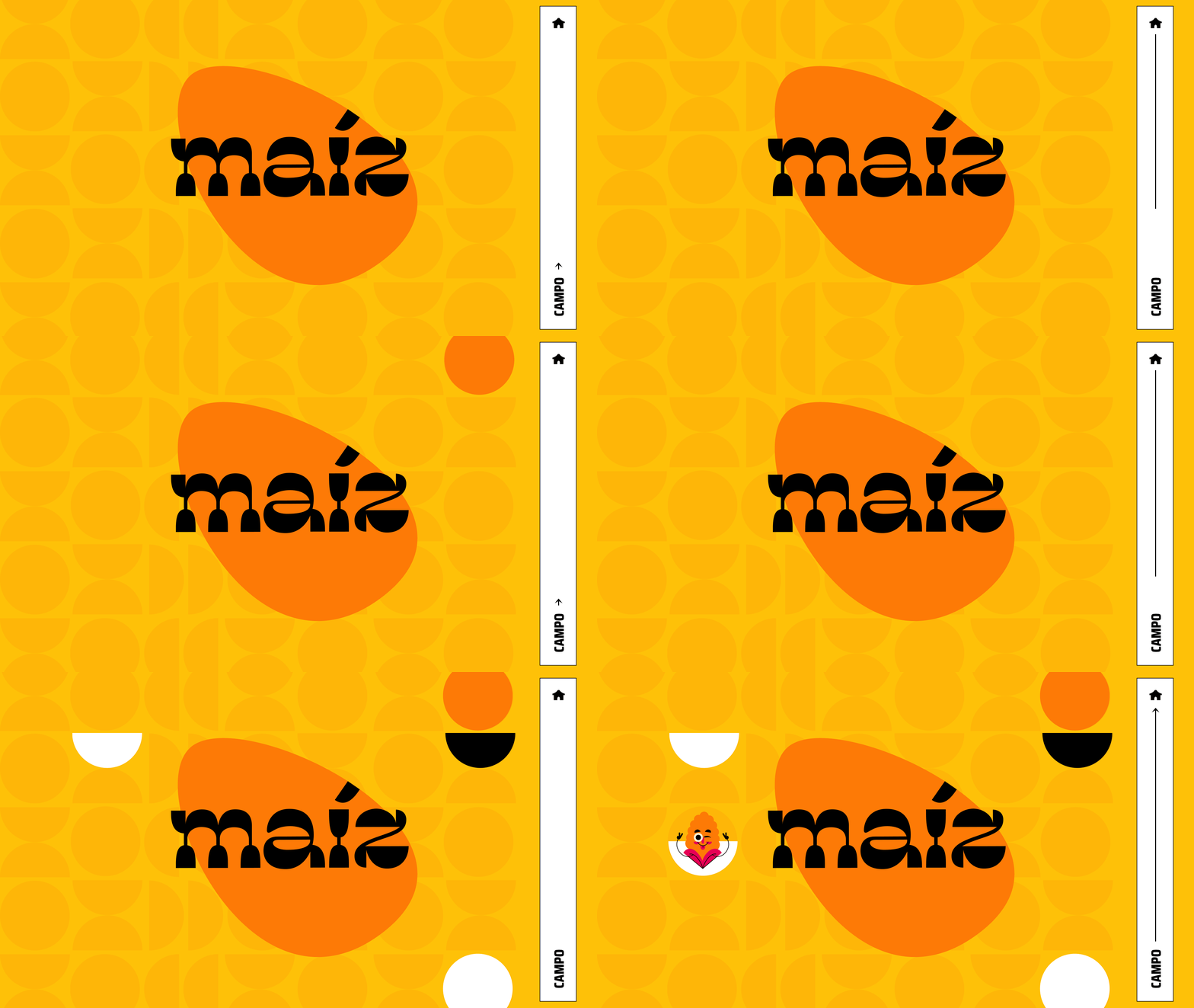
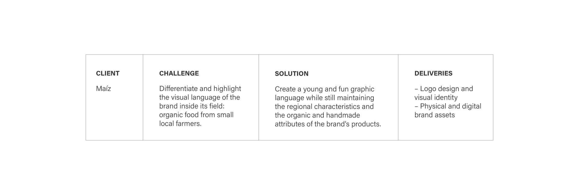
Maíz is a brand that sells organic food from family farming and small producers. The slogan “Food made by people” highlights the human and handcrafted character of its products.
Our goals with the project:
– Distinguish the brand from its competitors, avoiding the clichés that already exist in the sector, such as a regionalized aesthetic and the predominant use of earth tones;
– Associate the brand with the young, urban and relaxed concept, without neglecting its organic and artisanal character.
Logo
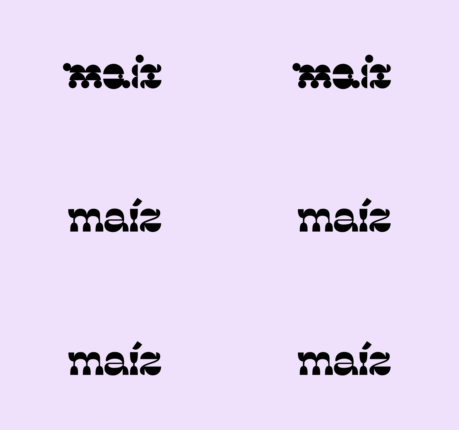
The graphic directions adopted for Maíz’s communication come from the meaning of its own name. The word “maíz” means corn in Spanish, a food considered sacred by the native people, whose cultivation involves family farming and the food health of a large part of the population at the time.
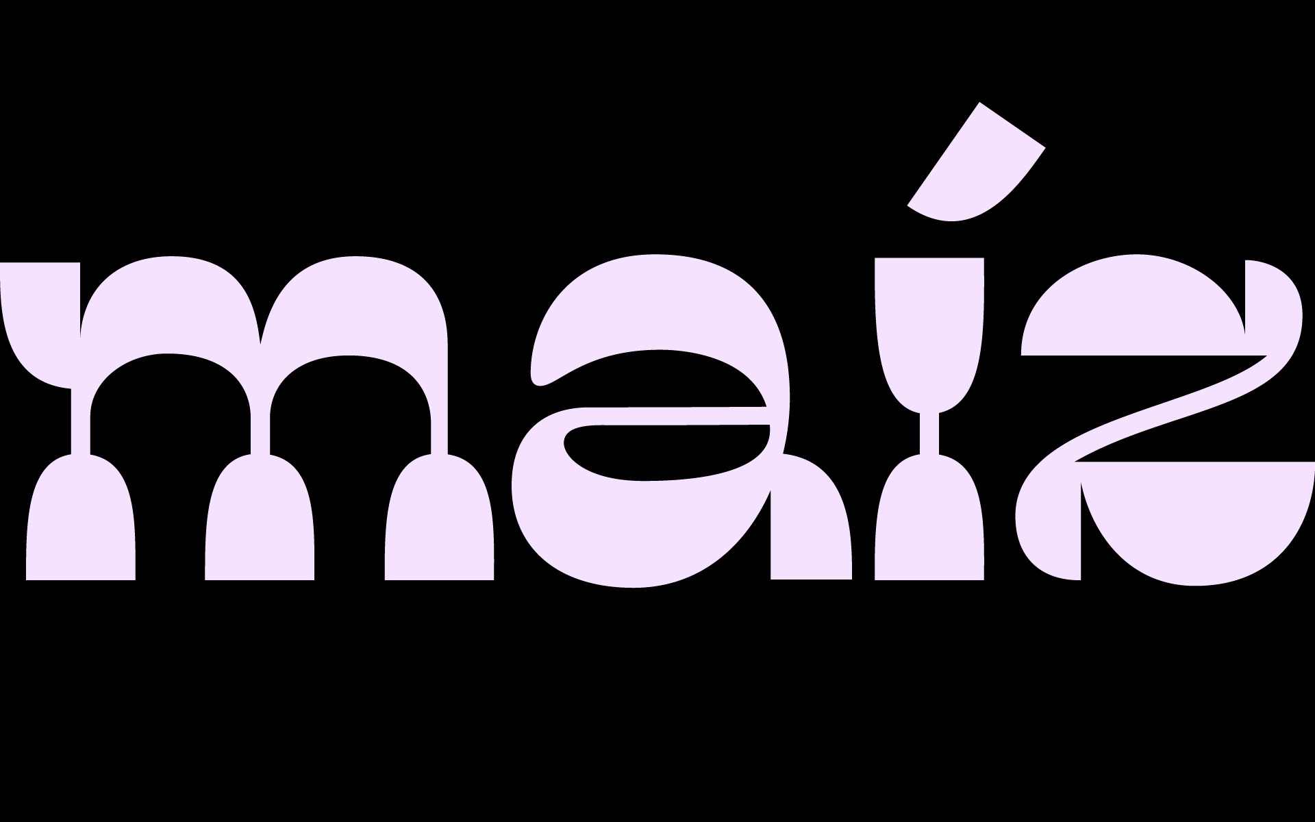
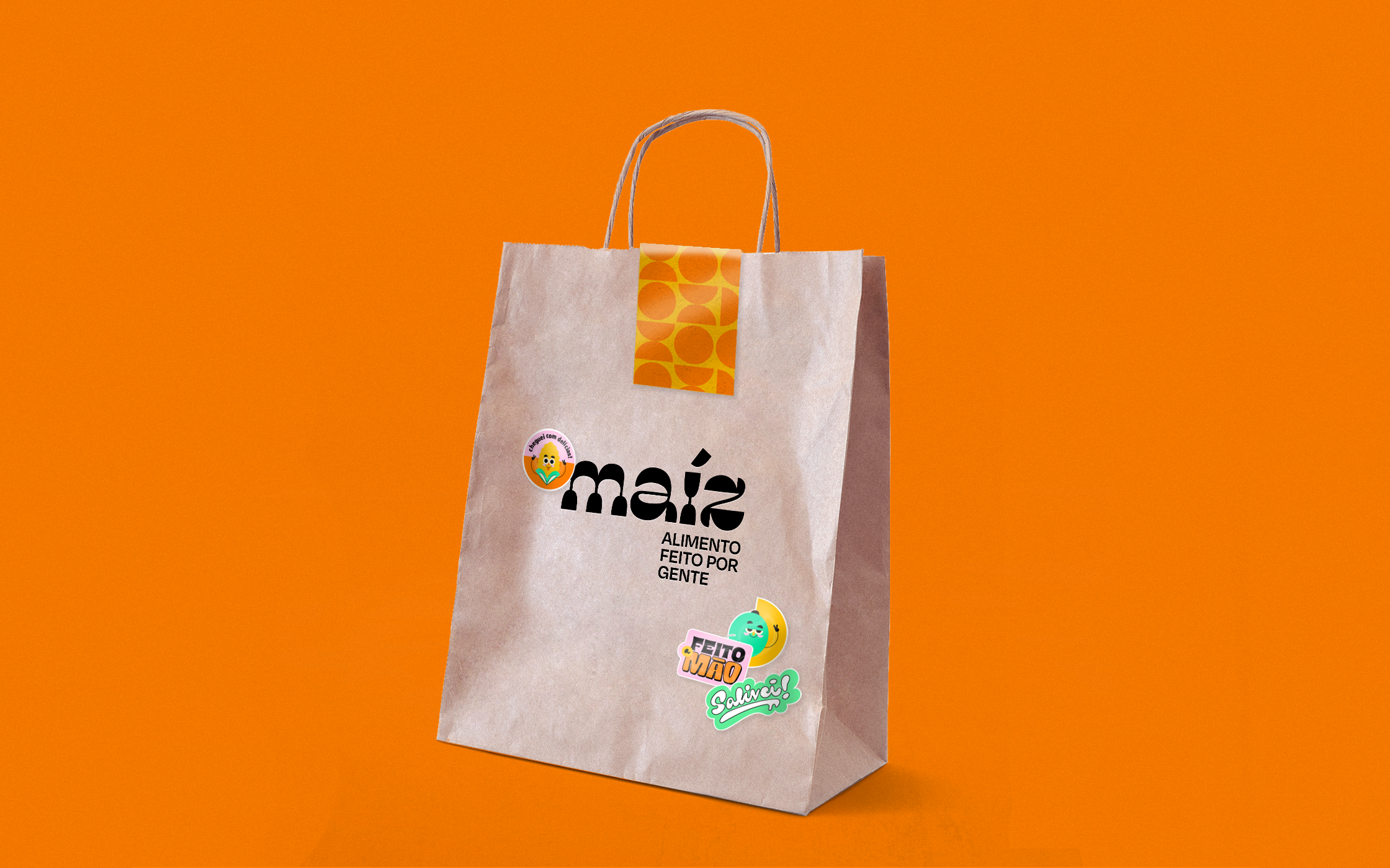
In its design, the logo has a direct relationship with the format of this food, which was used as a module and inspiration for the shapes of the letters. The final design represents the store’s concept in its purest form: it’s youthful, fun and energetic.
Visual Identity
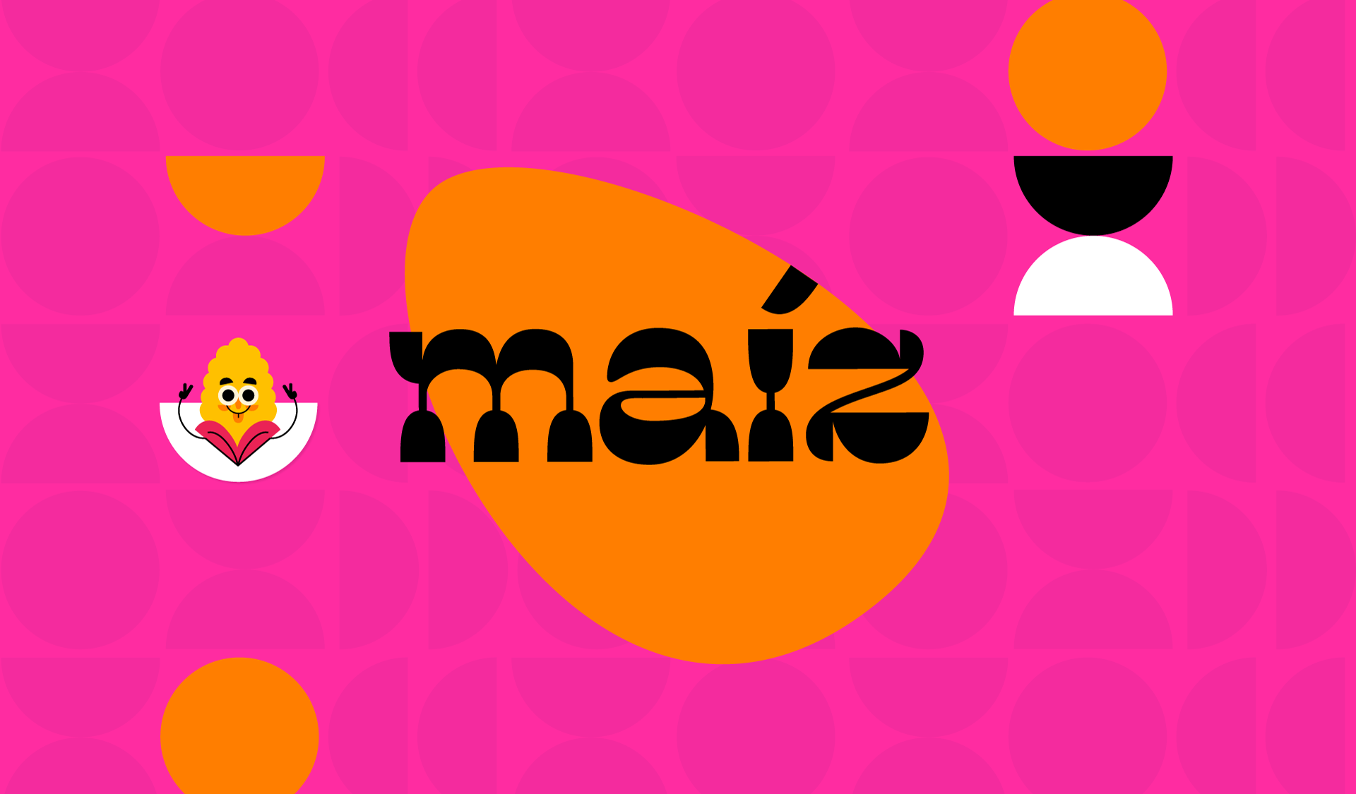
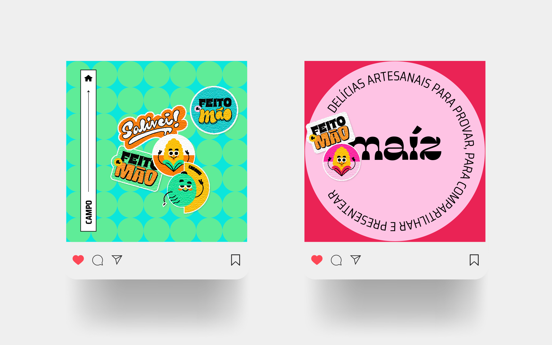
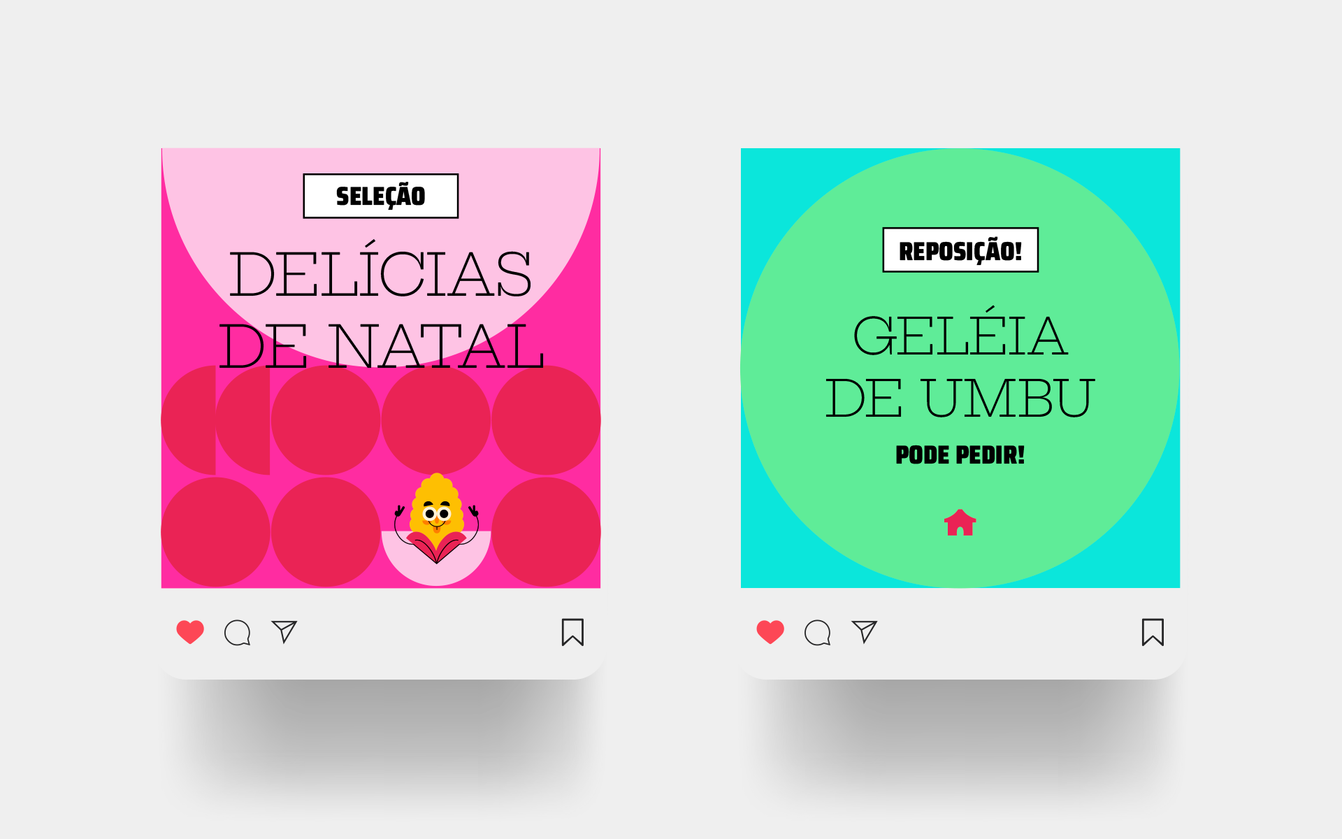
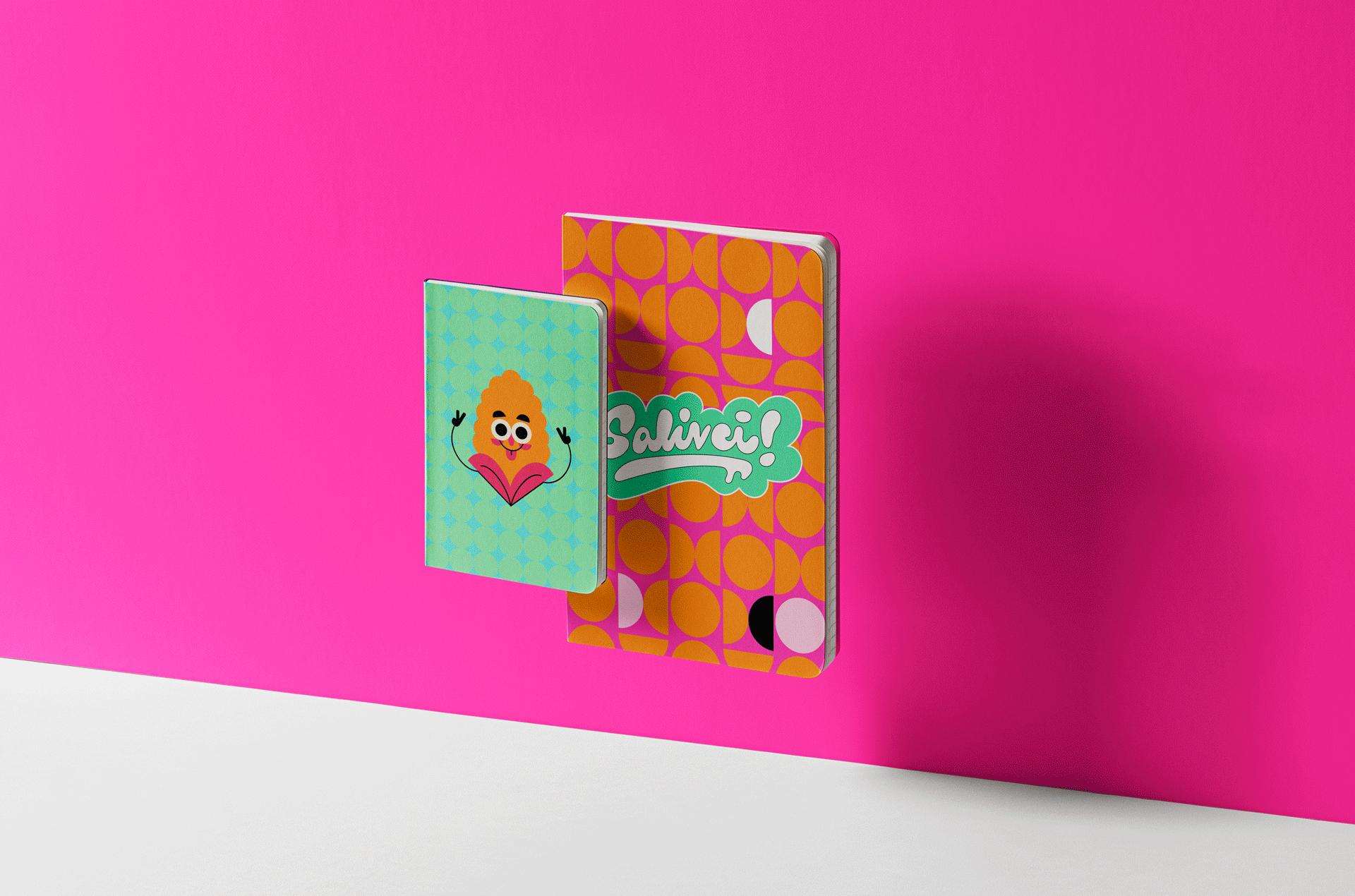
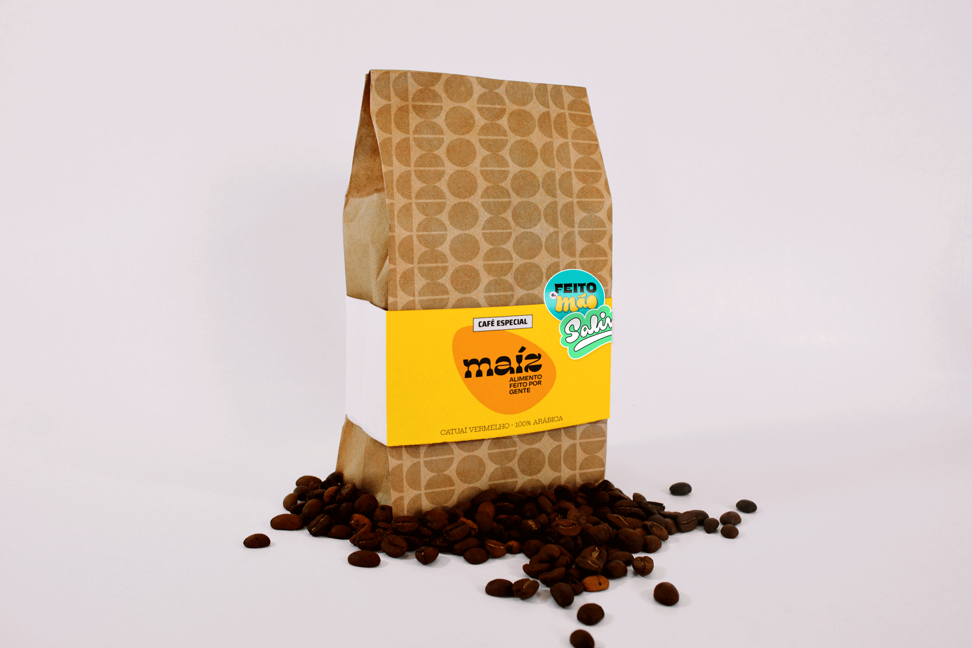
The use of circles and half circles in Maíz’s identity, as well as the logo, refers to the shape of corn, while the colorful and saturated color palette refers to the varied colors of the food around the world when it is free of pesticides.
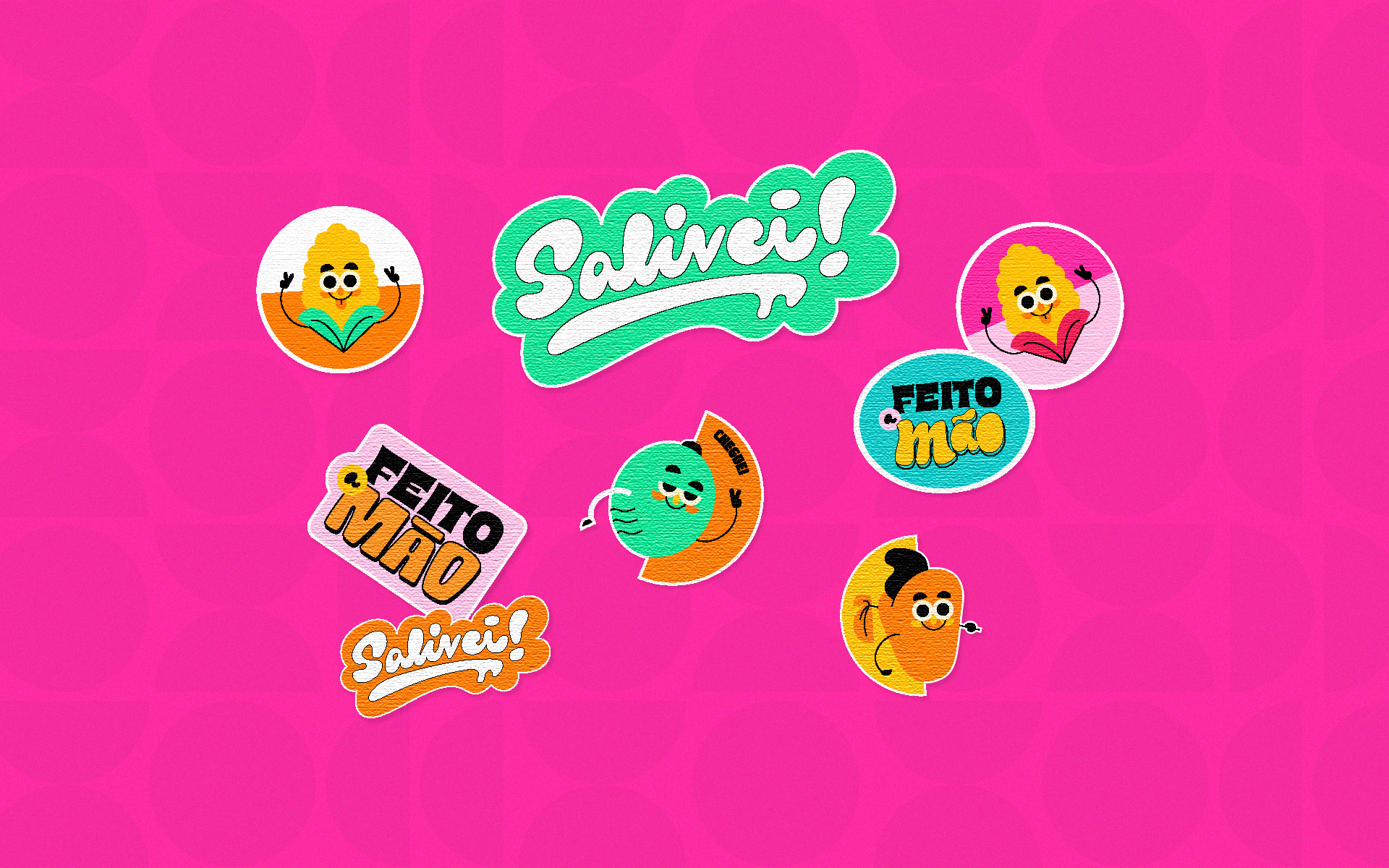
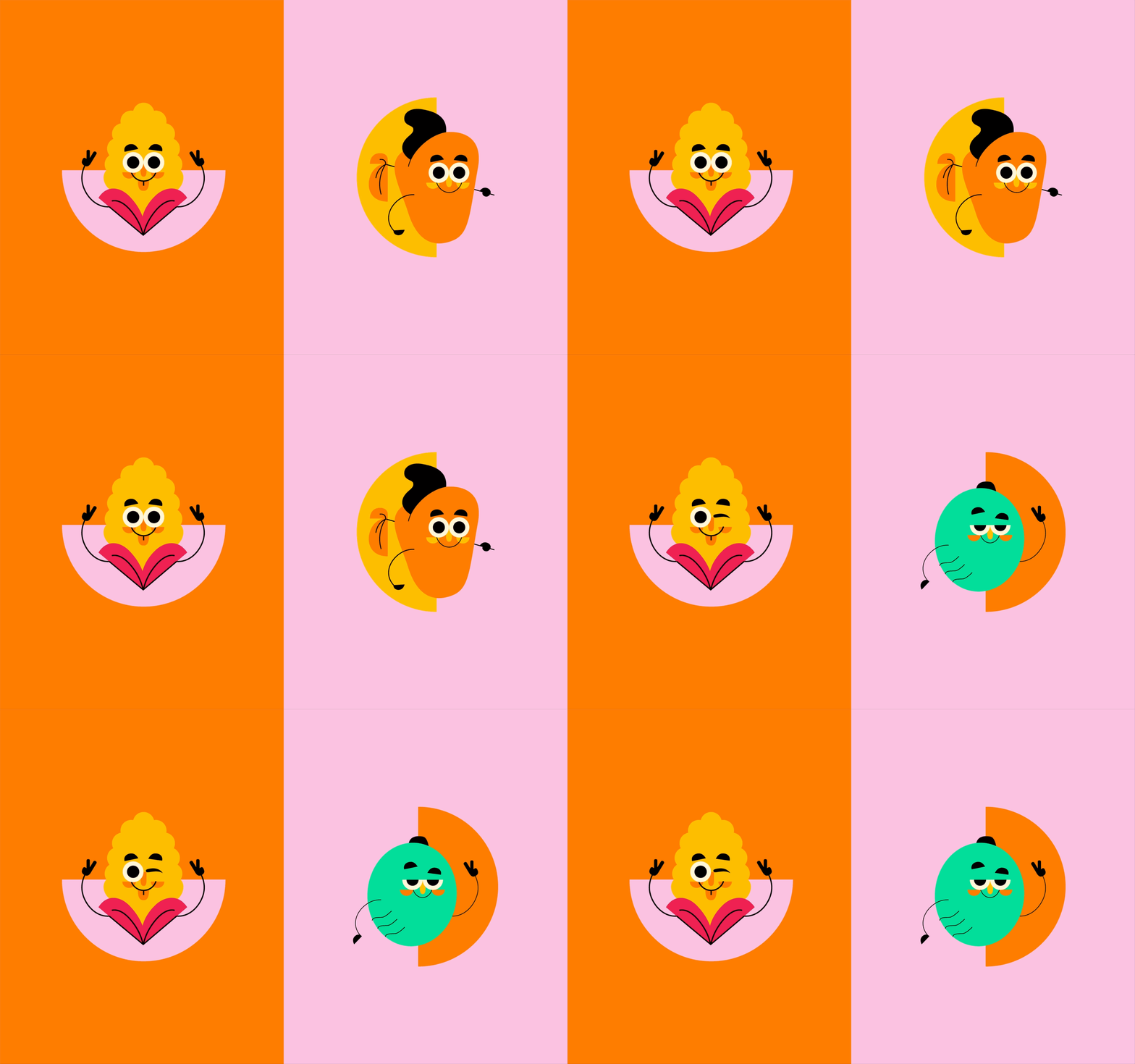
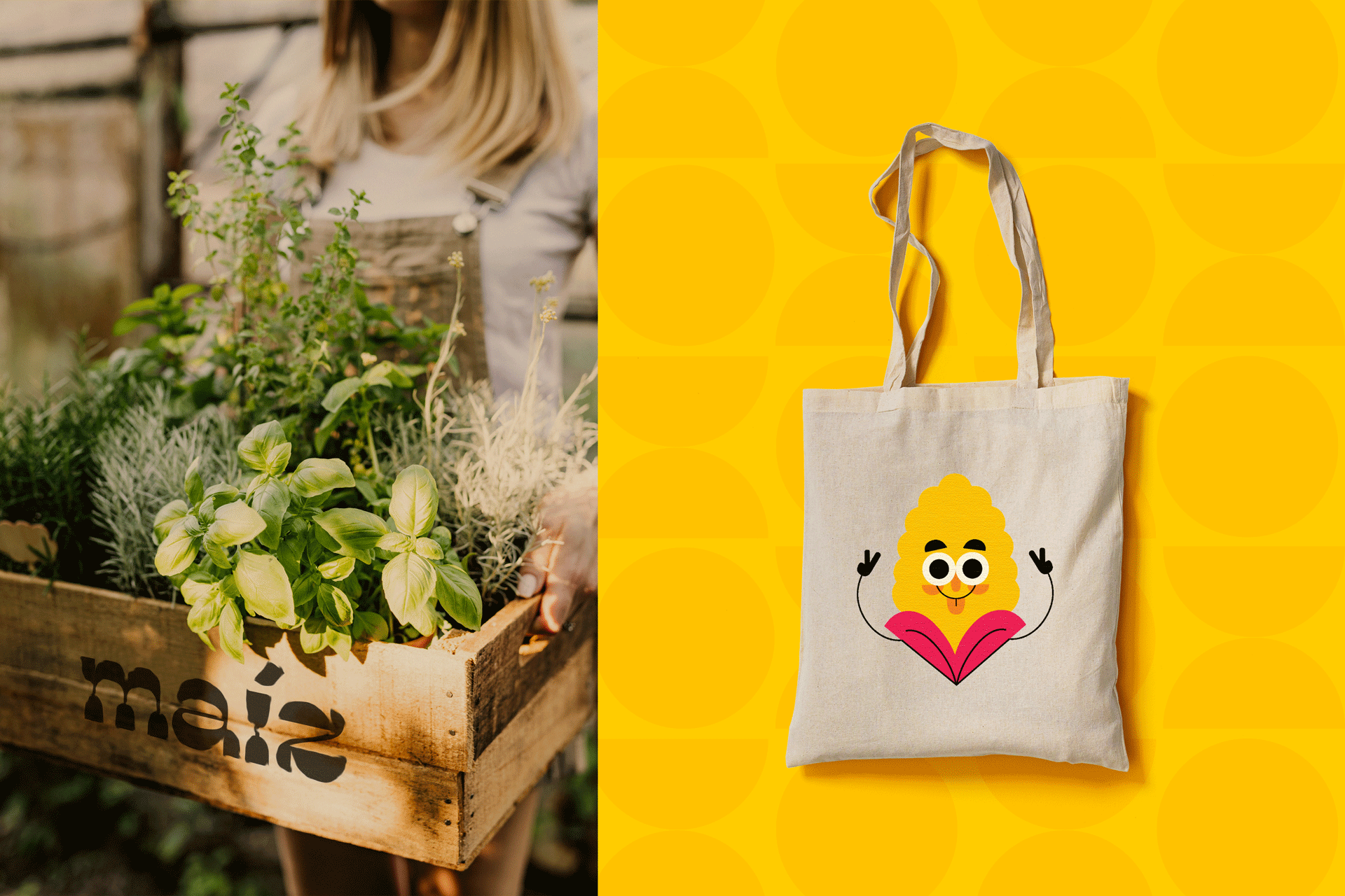
A fun and colorful visual language was developed for the brand in order to highlight it in its segment. The personified food stickers accentuate the identity’s fun and relaxed character and can be applied to physical or digital media with ease.
Visual Identity: Motora
Art Direction: Luize Araújo, Júlia Lago.
Type Refinement: Júlia Lago.
Illustrations: Juliana Argollo.
Designers: Juliana Argollo, Júlia Lago, Luize Araújo and Julia Sales.