Braztoa is the starting point for those who make a difference in Brazilian tourism. Founded over three decades ago, the Brazilian Tour Operators Association has established itself as the leading reference for representing and supporting leisure tour operators in Brazil. Throughout its history, the organization has stood out by leading discussions and initiatives that drive innovation, sustainability, and socioeconomic development through tourism.
The association works to promote its member operators as key players in creating safe, sustainable, and memorable travel experiences, both within Brazil and abroad. Its mission is to foster a collaborative and competitive environment, where ongoing support, market intelligence, and advocacy for the sector’s interests are top priorities.



Our Goal with the Project
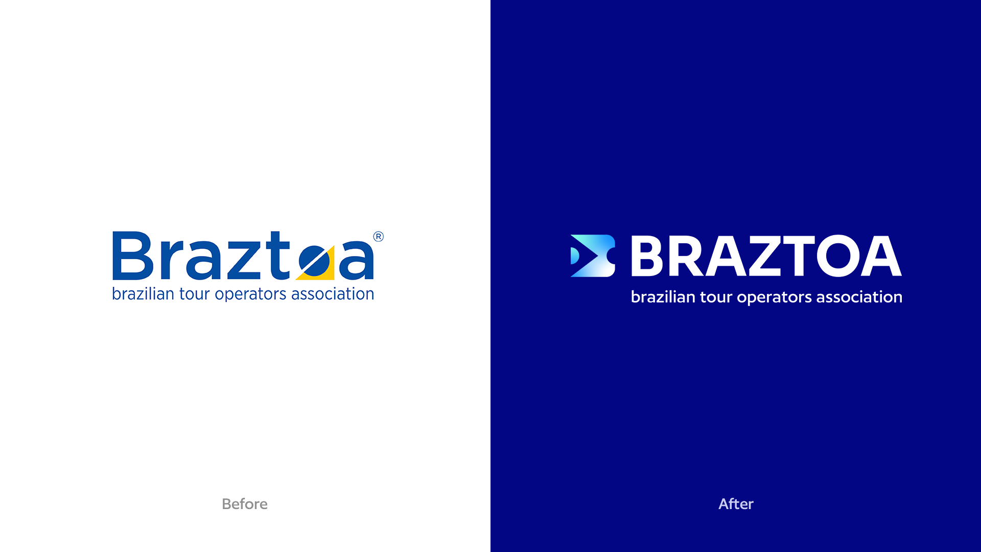
Braztoa is a well-established name in Brazilian leisure tourism, bringing together leading travel companies and shaping the industry since 1989. Over time, however, its brand began to be perceived as overly traditional and bureaucratic – an image that no longer matched its innovative actions or the forward-thinking positioning it aimed to embody.
Challenge Summary: How to craft a mature and trustworthy brand language that honors Braztoa’s legacy while embracing its innovative, future-oriented mindset? One that is open to experimenting with new formats and provoking meaningful conversations in tune with the expectations of new generations?

Insight and Strategy
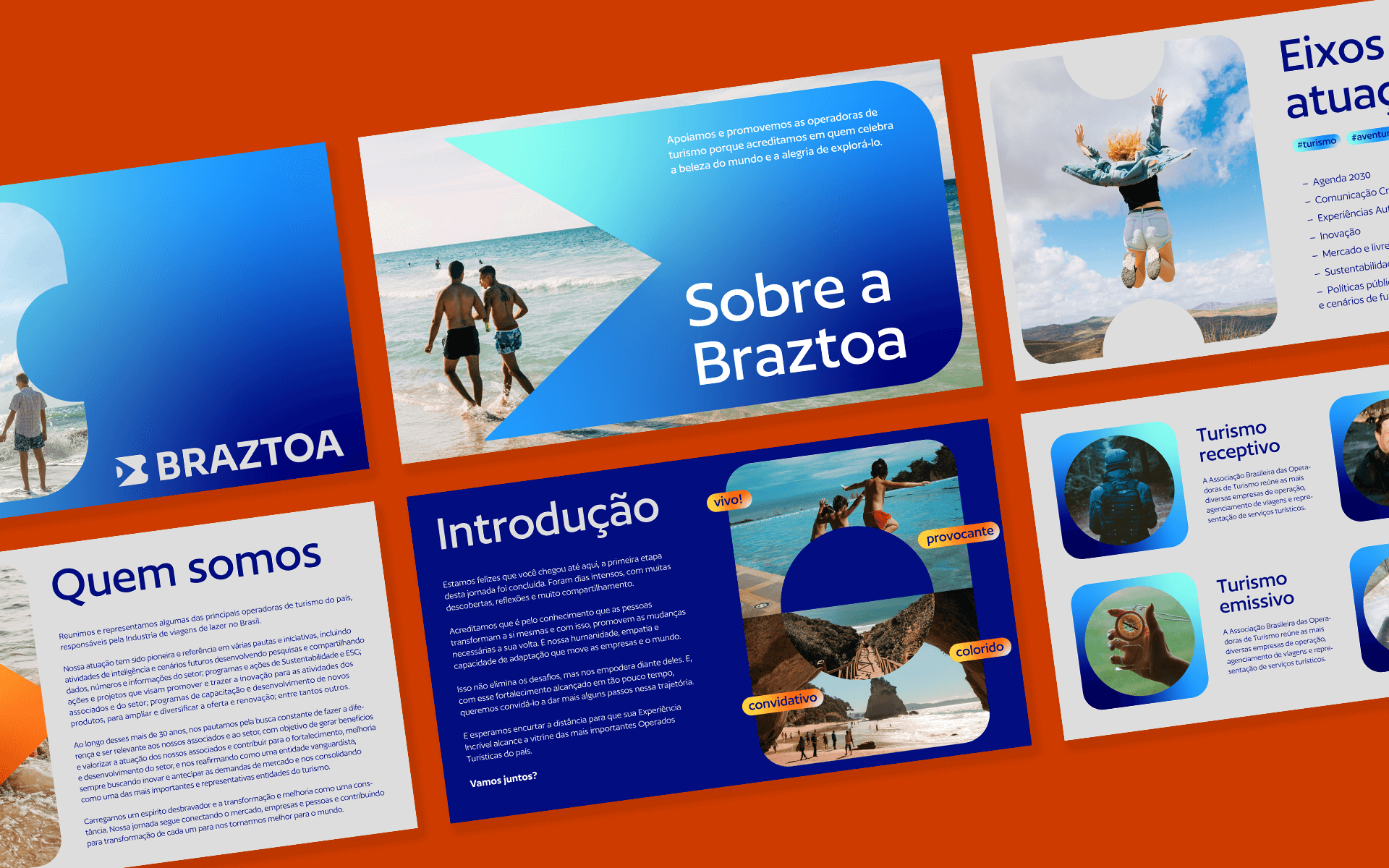
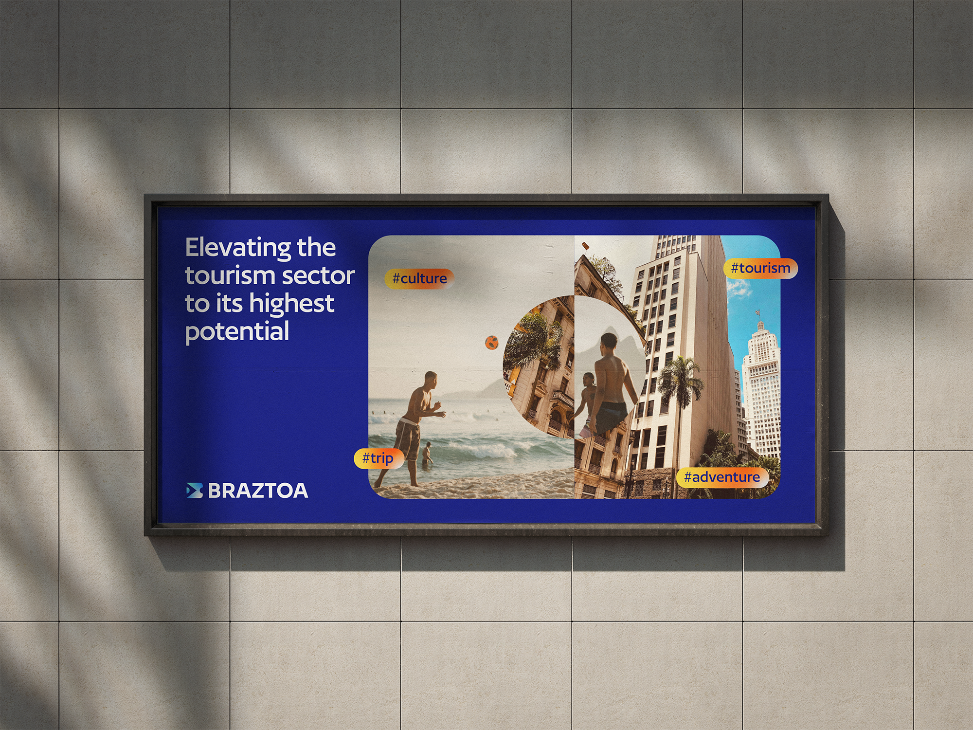
We defined a new brand purpose capable of uniting both members and the internal team around a shared mission: to drive the Brazilian tourism market forward, celebrating the beauty of the world and the joy of exploring it. This purpose is brought to life through a clear value proposition: positioning Braztoa’s member operators as key players in creating memorable travel experiences, both in Brazil and abroad.

Verbal Identity
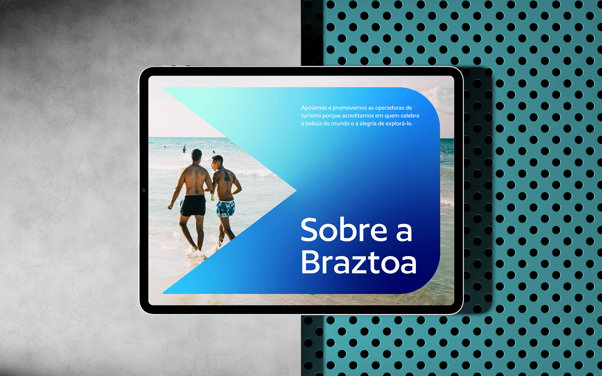
Associations often fall into distant, overly formal, and convoluted language. For Braztoa, we took a different path. We redefined the brand’s tone of voice to strengthen its connection with members and make its communication more human, accessible, and engaging.
Tourism is a joyful, experience-driven industry, and Braztoa needed to reflect that same energy. The new voice is confident, approachable, and optimistic. It’s forward-looking without sounding cold, and lively without needing to rely on slang or informal language. It invites conversation and inspires collaboration.
Visual Identity
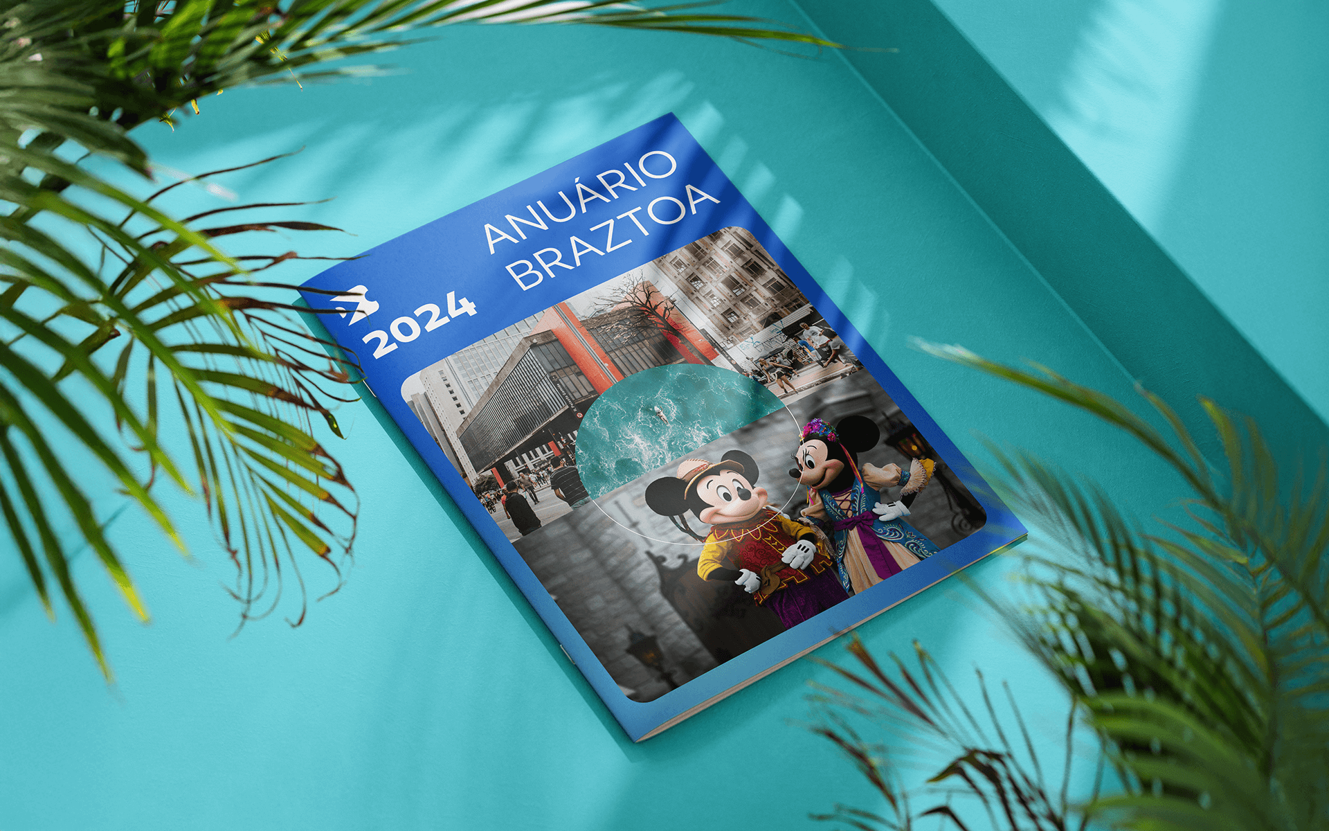
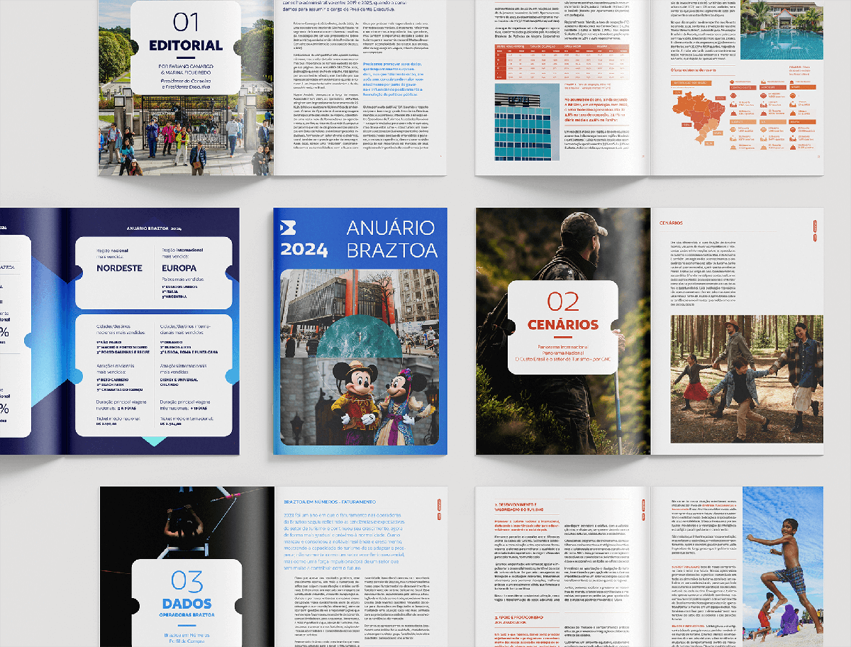
Braztoa’s rebranding was grounded in a semiotic analysis of the brand’s most recognizable and meaningful symbols for its members. These strong, familiar signs served as a foundation for the visual redesign, ensuring continuity while opening space for transformation.
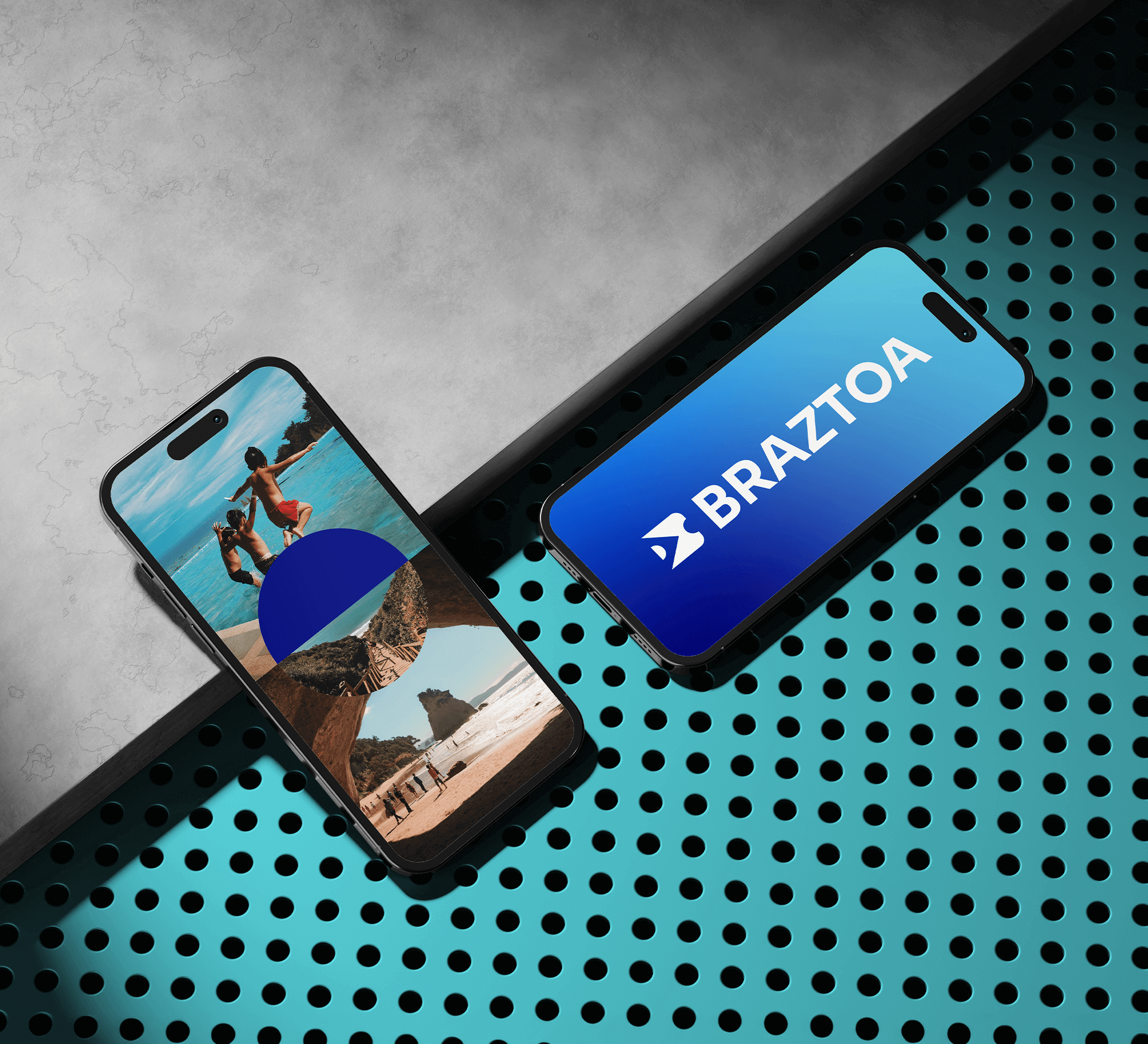
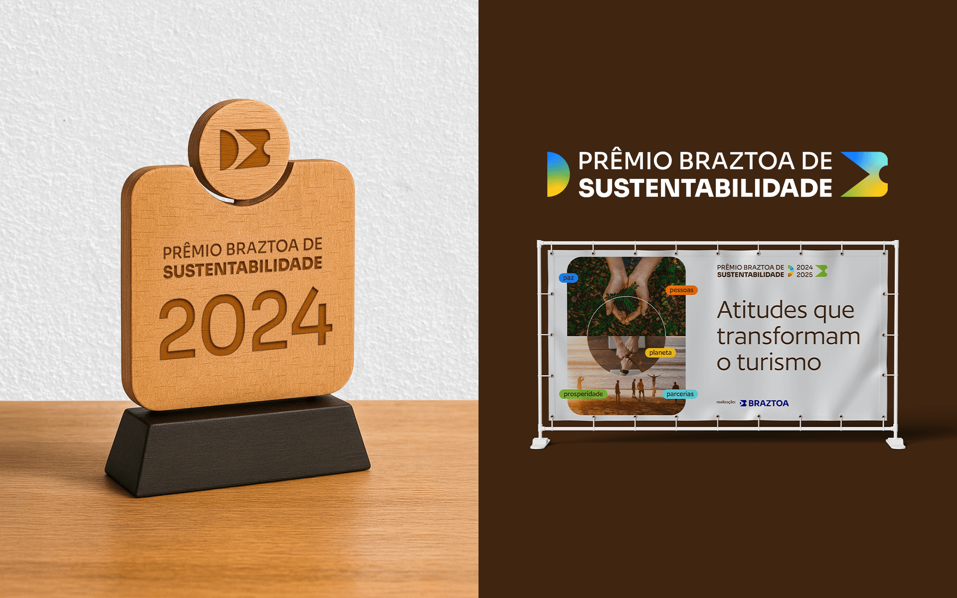
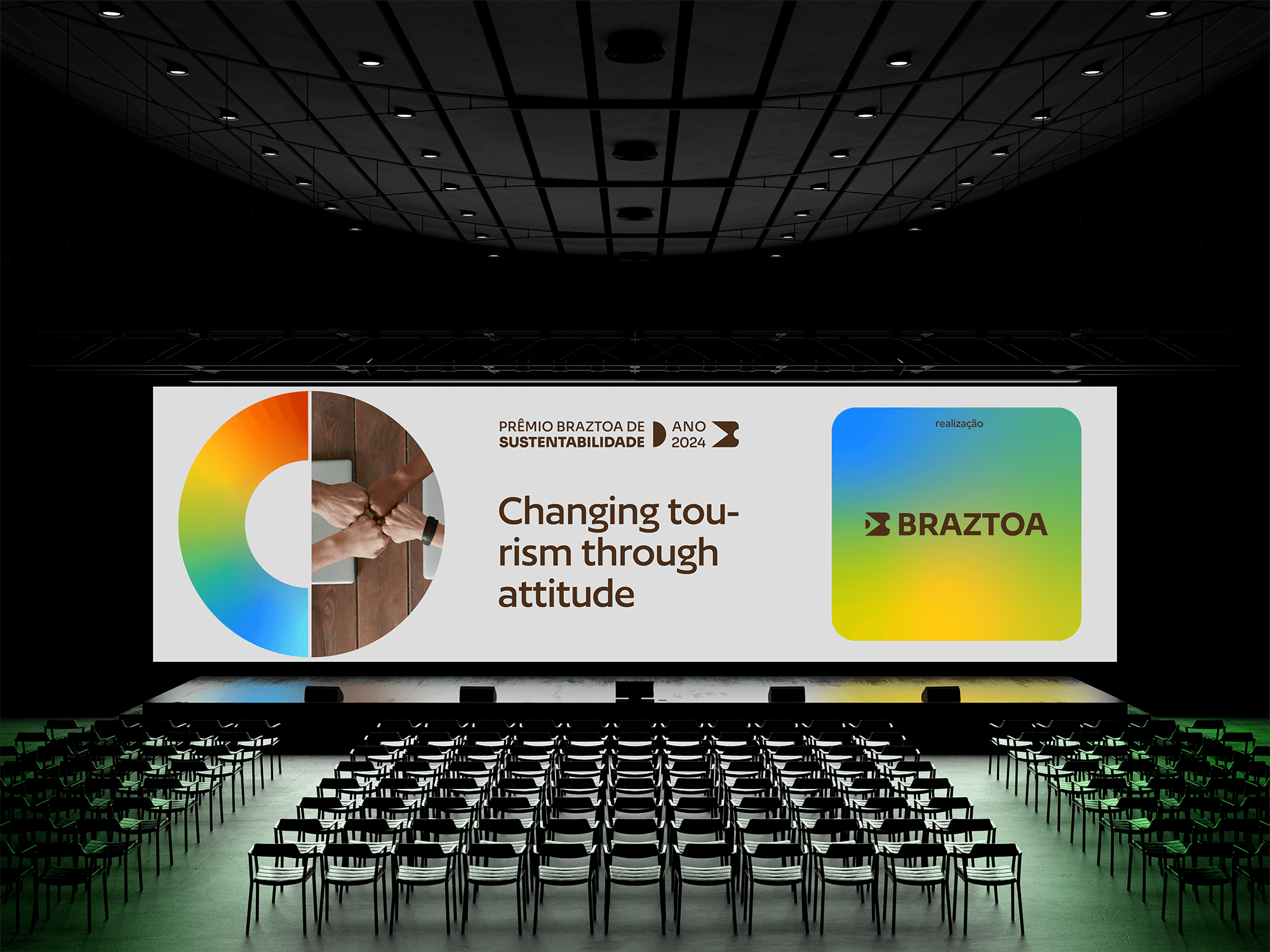
The iconic blue was preserved, now in a brighter tone. The new all-caps logo reinforces presence and credibility. Visual elements such as the Brazilian flag and the forward-pointing arrow highlight Braztoa’s national identity and future-oriented vision, while subtly evoking a travel ticket.
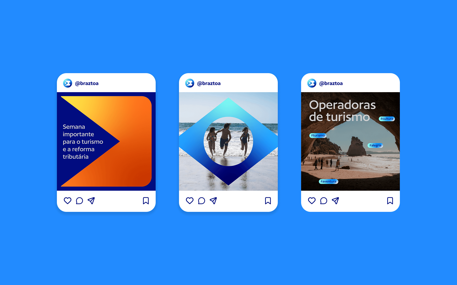
The color palette was expanded to incorporate vibrant tones that express the diversity, dynamism, and joy of travel. These colors also serve a strategic role in organizing the association’s various areas of activity within its brand architecture.


Branding and Visual Identity: Motora
Strategic Direction: Luize Araújo
Strategy and writing: Luize Araújo, Isabele Souza
Art Direction: Luize Araújo
Designers: Luize Araújo, Julia Sales, Júlia Lago, Maria Stéfanni Carvalho
Case design: Júlia Chaves, Luize Araújo
Case design: Júlia Chaves, Luize Araújo
