Branding for a Transportation and Logistics Solution
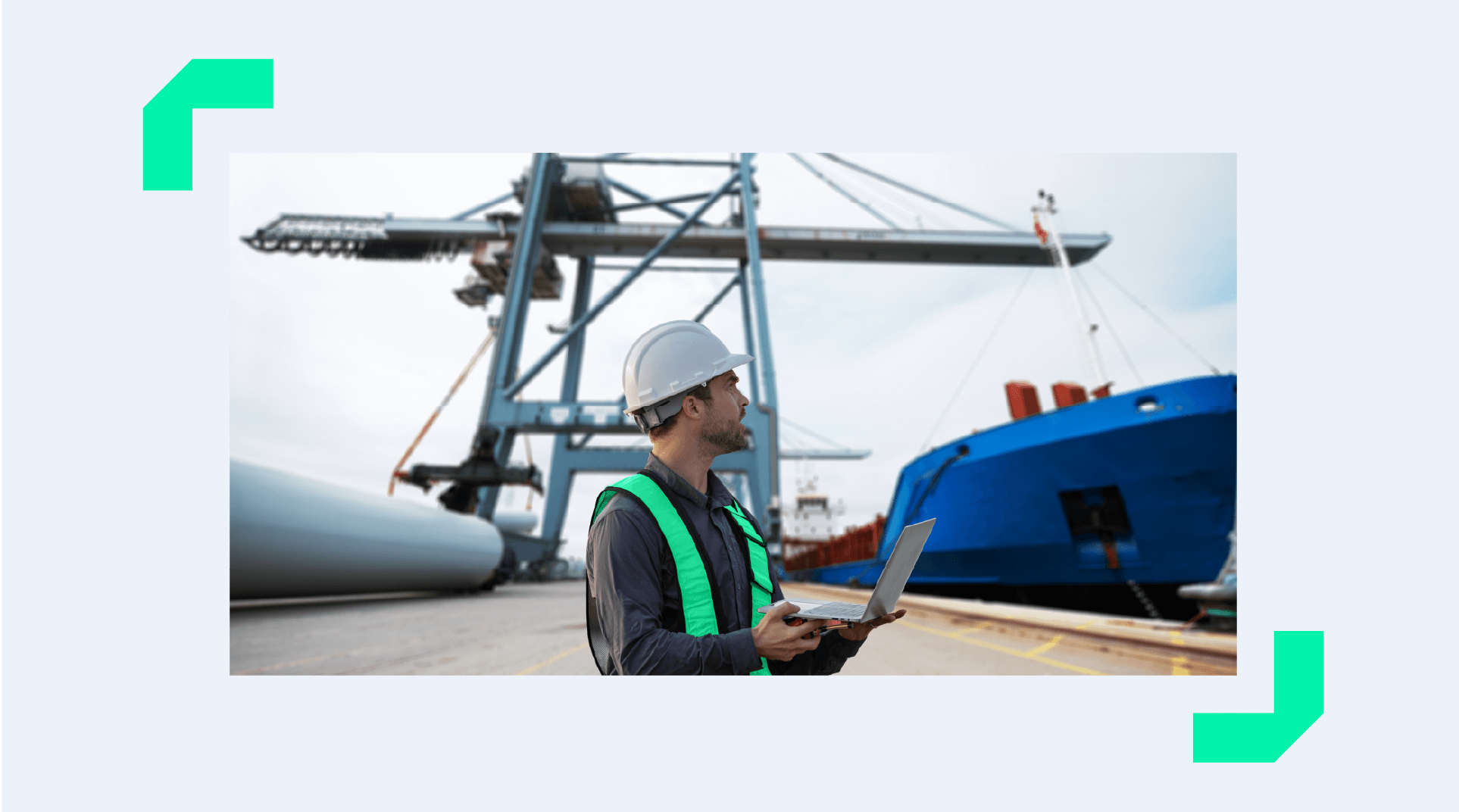
Cargoplot is a Dutch technology-driven logistics solution designed to transform the experience of small and medium-sized importers and exporters. In an industry dominated by complex and bureaucratic processes, the brand emerges as an agent of change, simplifying processes, promoting transparency, and giving control back to the companies that drive global trade.
Here, technology and proximity come together to transform the logistics experience into something clear, reliable, and accessible. Every detail, from language to aesthetics, has been designed to reflect this new perspective on international transport: a brand that believes transparency is power and that places its customers in control of their own operations, with autonomy, clarity, and human support.
Our goal with the project
Reposition Cargoplot as it entered a new stage of maturity, evolving from a promising start-up into a solid, international, purpose-driven brand.
This move required a new identity, capable of communicating technology and credibility, without sacrificing the accessibility and collaborative approach that have always defined the brand.
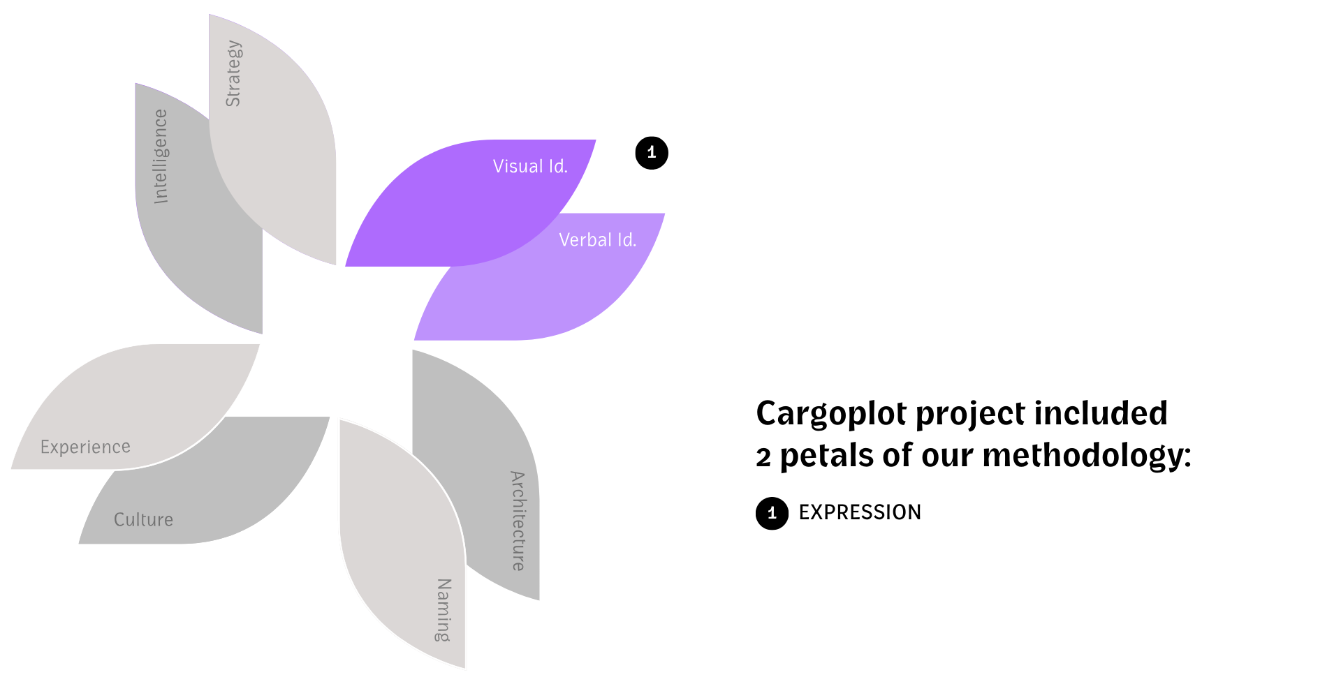
Challenge Summary: To translate the essence of Cargoplot, a technical but human brand, through a cohesive visual and verbal language that communicated strength, innovation and transparency.
Insight and Strategy
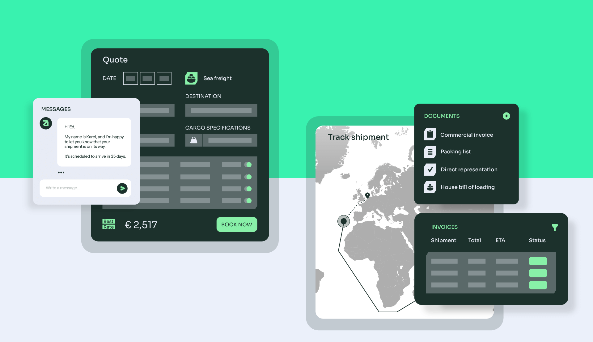
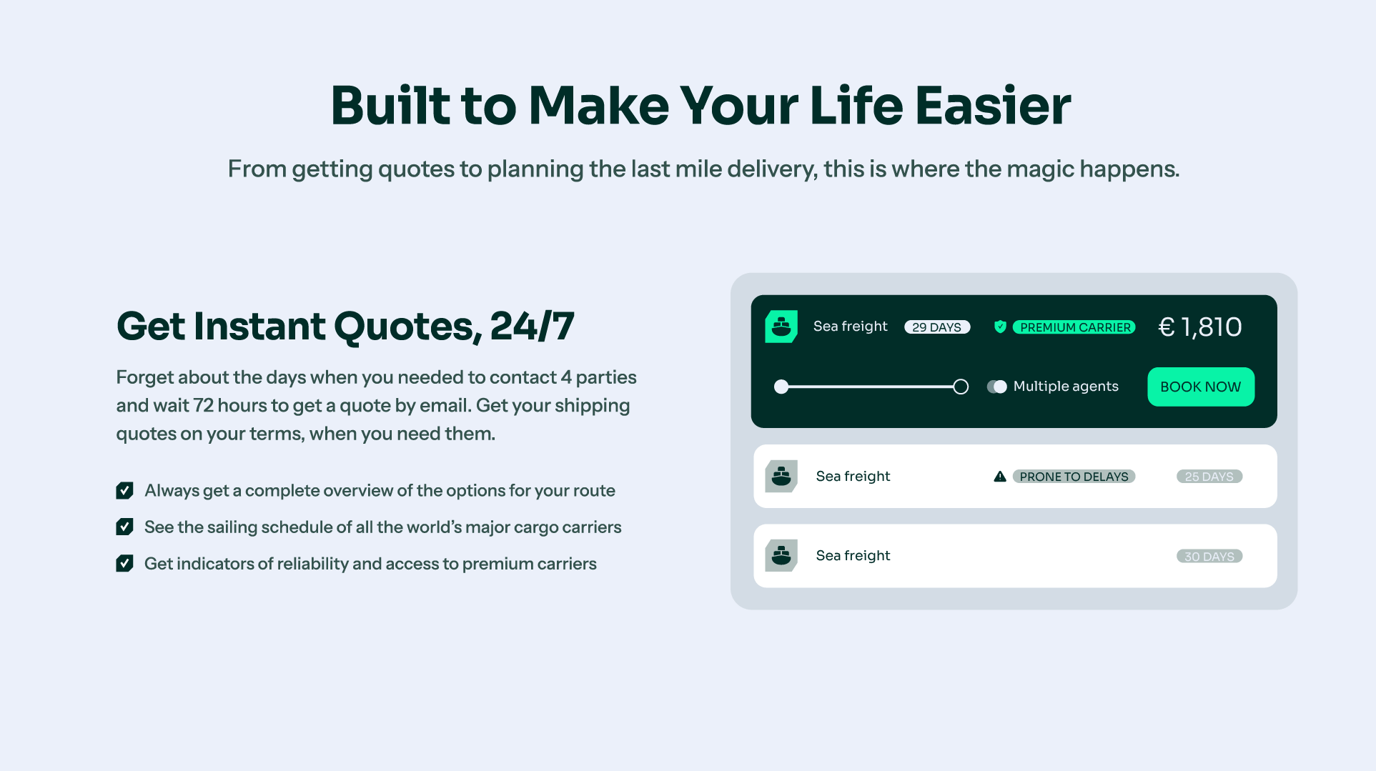
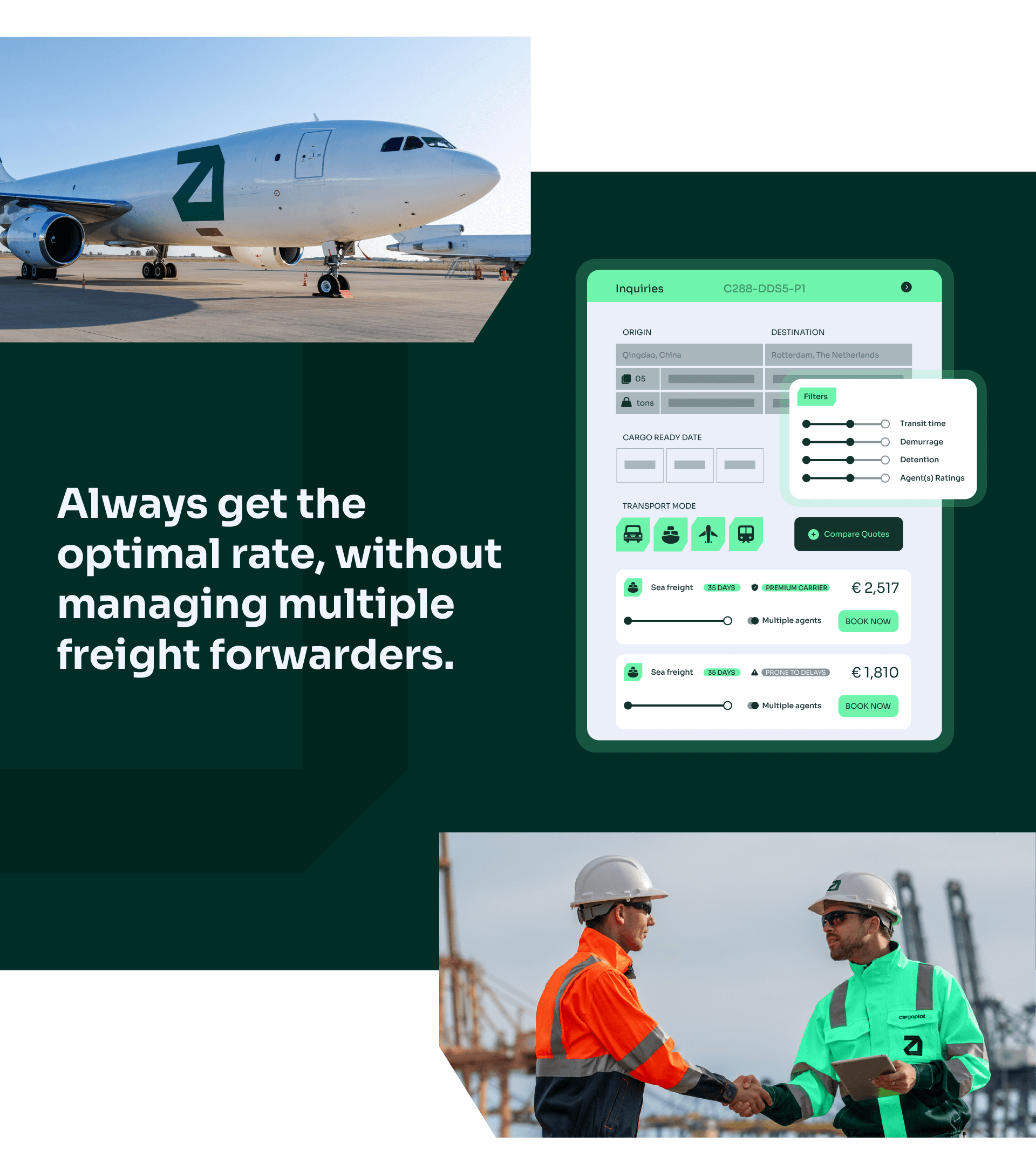
The starting point was recognizing that Cargoplot delivers control, predictability, and autonomy. Its unique selling point lies in simplifying complexity by connecting companies directly and transparently with freight partners.
The strategy is built on four core pillars: radical transparency, with clear pricing and processes; customer control, giving users the power to choose, compare, and decide; data-driven efficiency, using smart automation to speed up decisions and reduce errors; and purposeful innovation, where technology serves people, not the other way around. These pillars shape a brand that communicates with clarity and acts with purpose.
Verbal Identity
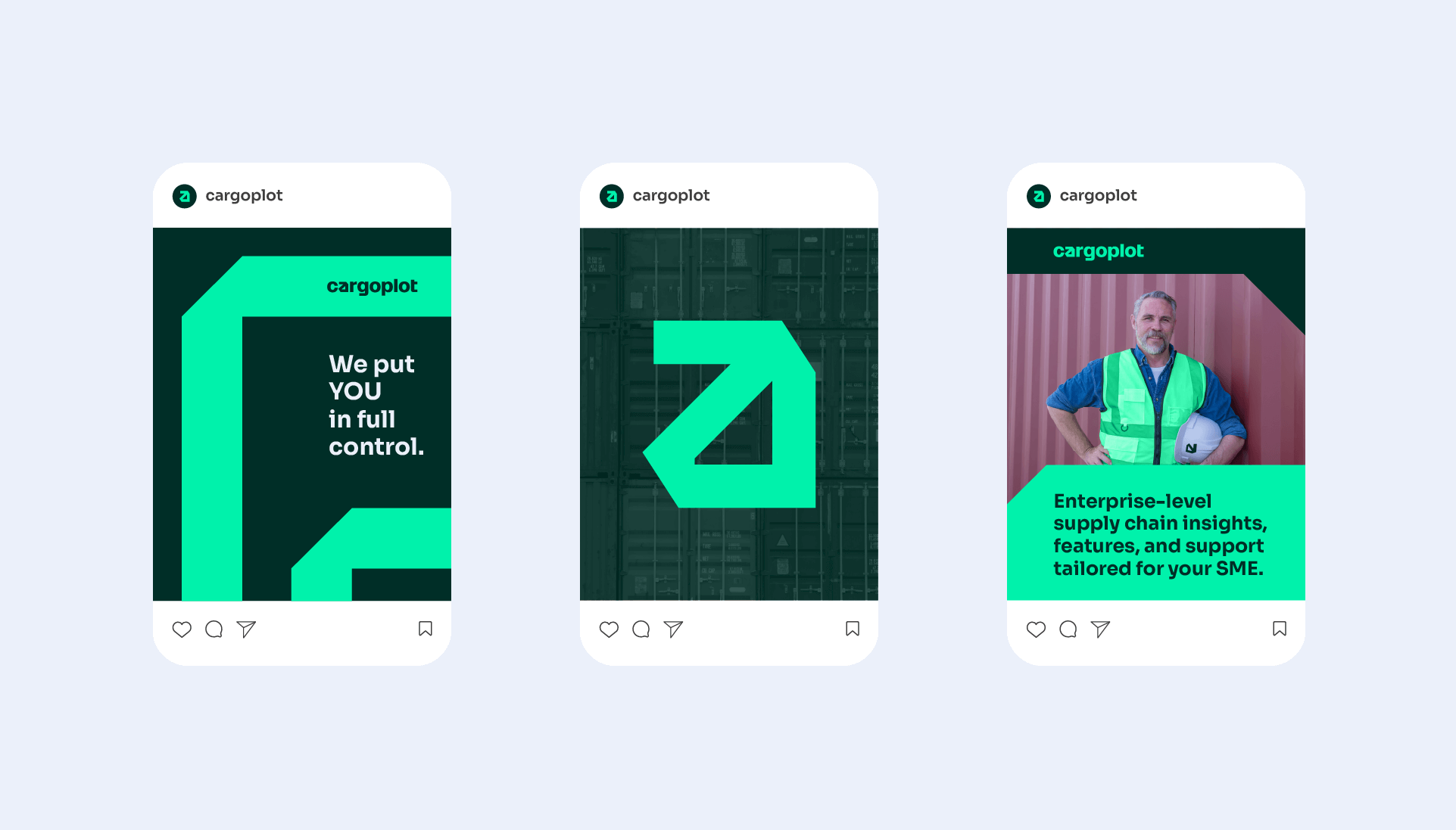
Cargoplot’s voice is direct, confident and approachable. The brand communicates clearly, and always with the aim of simplifying. Messages are short, active and transparent, reinforcing the confidence of those who master what they do, explaining what the market complicates.
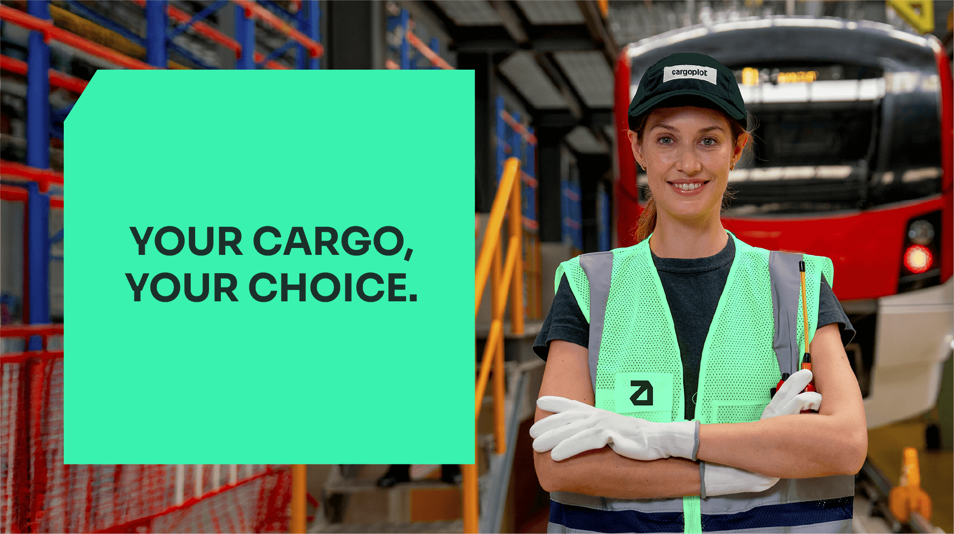
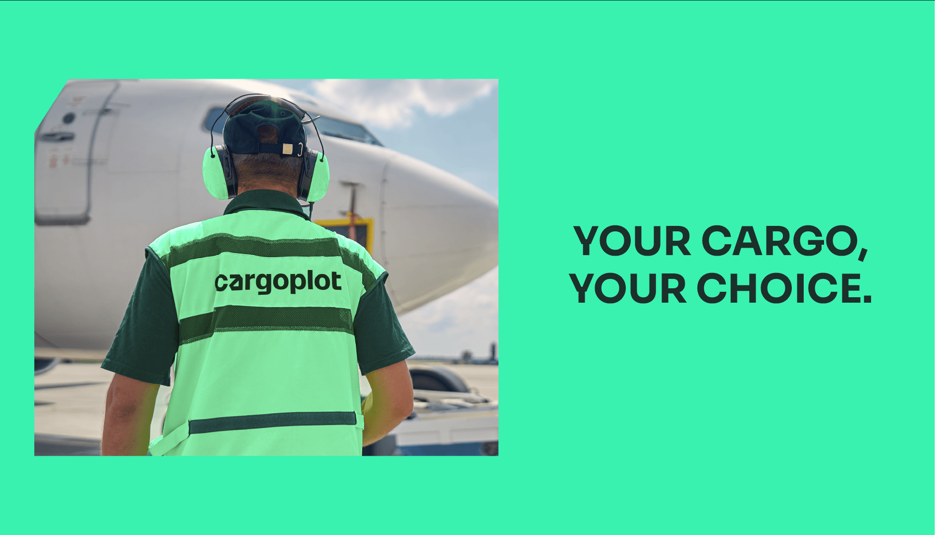
The slogan ‘Your cargo, your choice’ sums up the philosophy that guides all communication: putting the customer in charge, with total visibility and autonomy.
Visual Identity
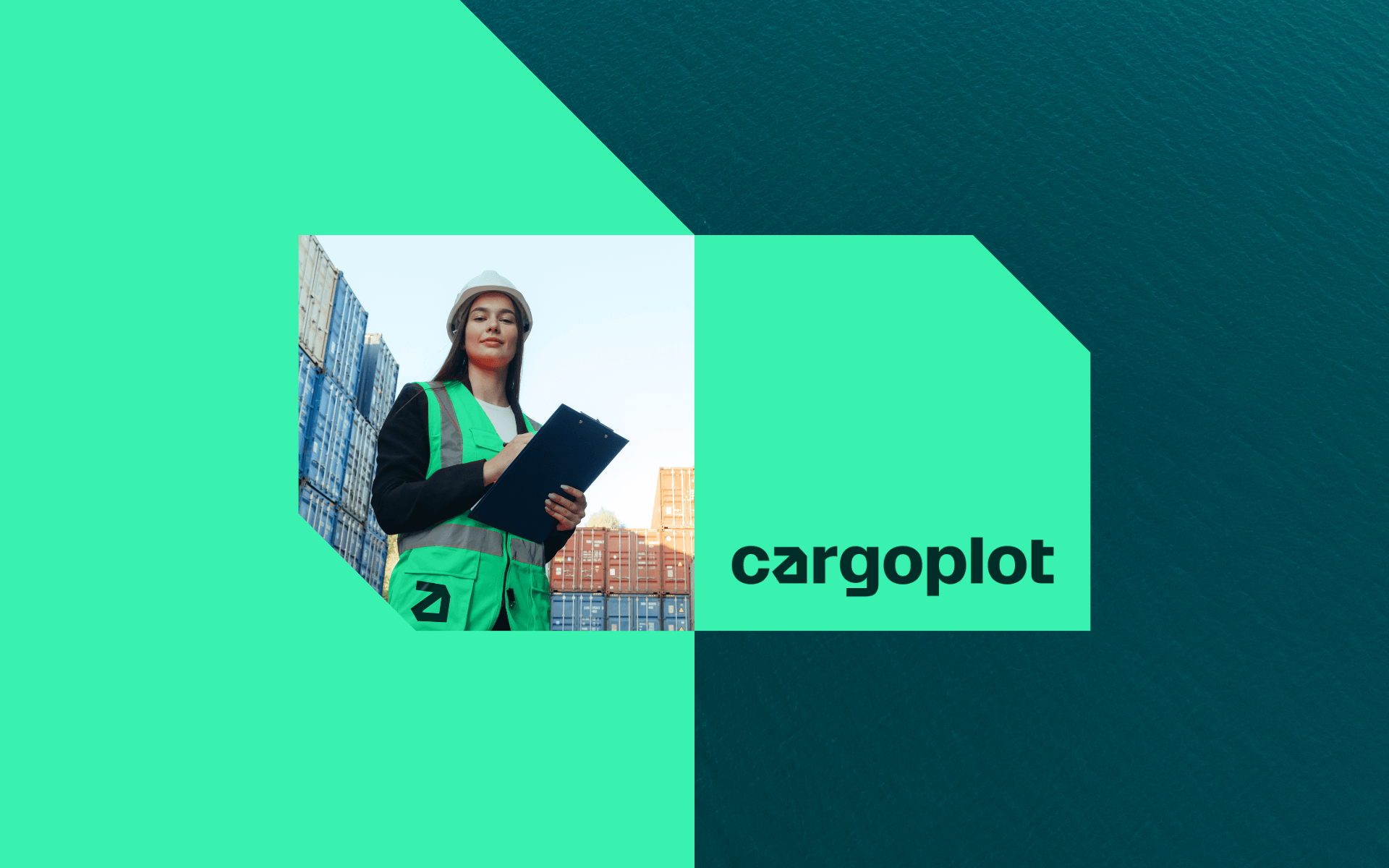
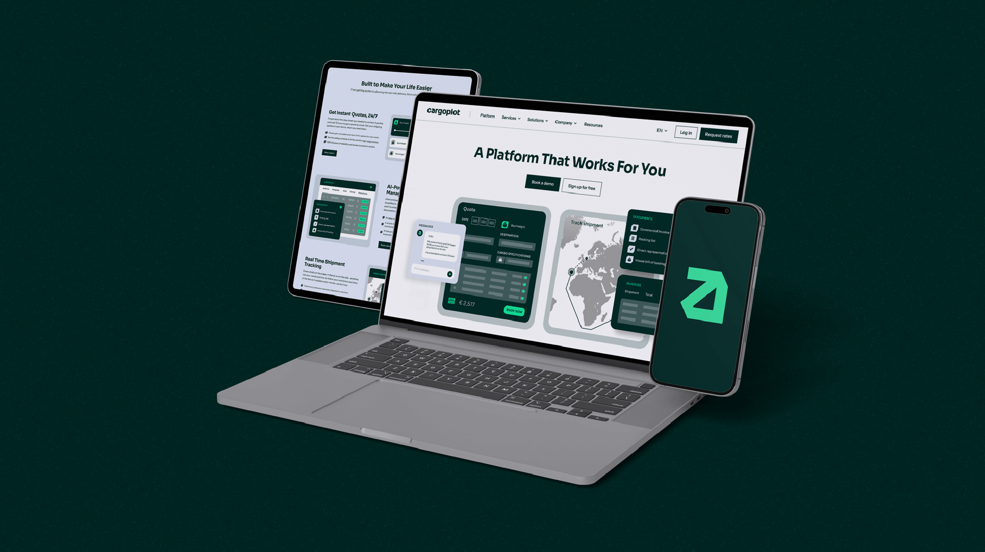
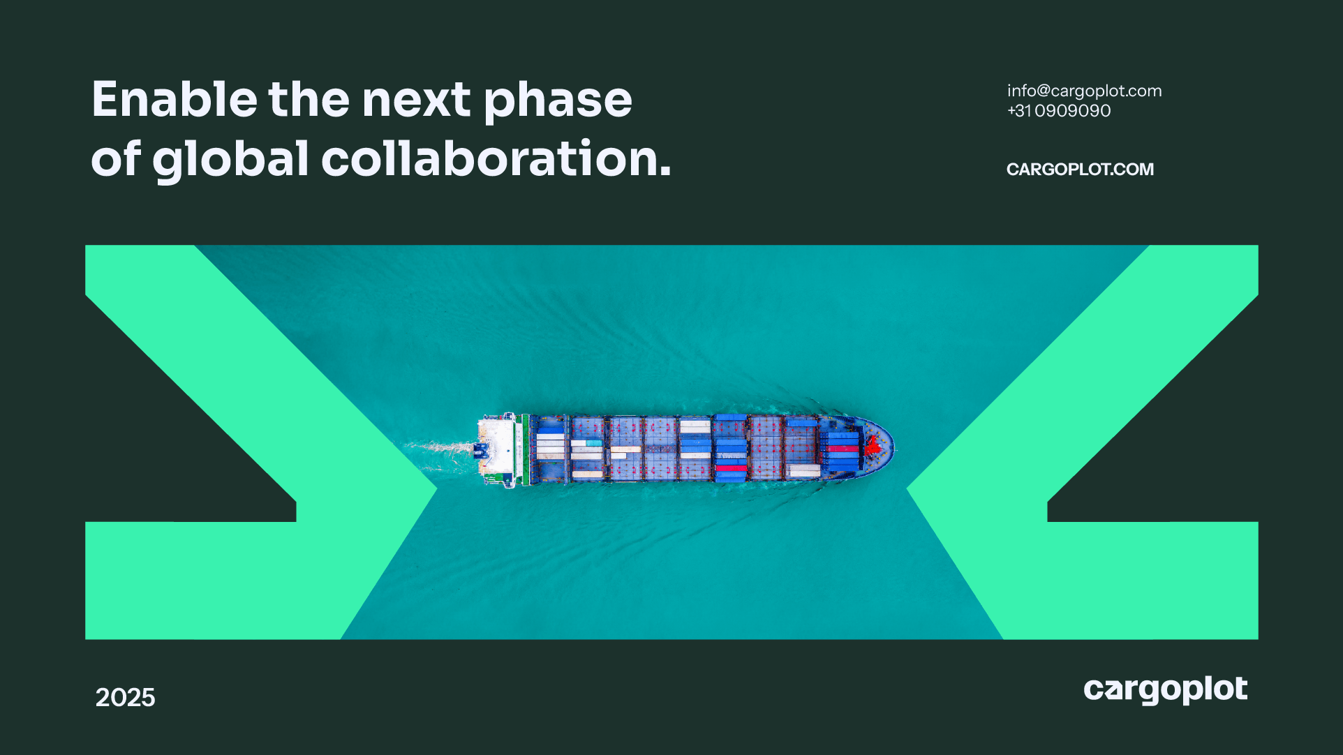
The visual identity reflects technology and trust, balanced with simplicity and a sense of closeness. The new symbol is derived from the letter ‘a’ in Cargoplot, featuring an upward arrow that represents growth, direction, and efficiency. Its geometric shapes and precise angles echo the form of boxes and containers, reinforcing the brand’s connection to the logistics world.
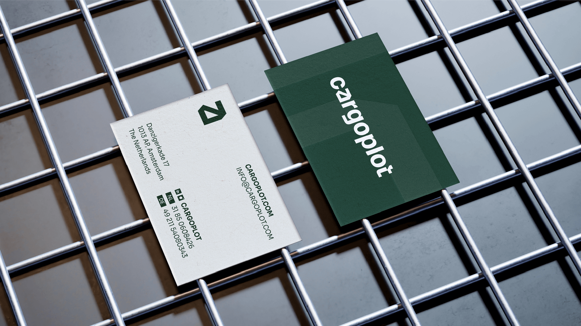
The color palette pairs dark green, which conveys solidity and professionalism, with neon green, a proprietary color that signals innovation and stands out clearly among competitors. Neutral shades of grey bring balance, adding sophistication and versatility to the system. Graphic elements are drawn from the symbol itself, forming modular and dynamic structures that introduce rhythm and movement into compositions. The identity is impactful and consistent across both digital interfaces and printed materials.
Branding and Visual Identity: Motora
Creative Direction: Luize Araújo
Art Direction: Luize Araújo
Strategy and Writing: Luize Araújo, Clement Thibault
Designers: Júlia Chaves, Luize Araújo, Maria Stéfanni Carvalho.