Commotion is a platform that brings together marketing, community and customer support in one place. Through artificial intelligence, the brand creates meaningful experiences for consumers, facilitating product discovery in an intelligent, engaging, and data-driven way. Its purpose is to connect technology and emotion to build more human relationships between brands and people, transforming interactions into lasting connections.
Our goal with the project
To translate Commotion’s innovative positioning into a visual identity that conveys technology, community, and a premium experience, while enhancing the brand’s emotional and aesthetic impact.
Challenge Summary: To create a visual expression that combined innovation and sophistication without compromising the sense of closeness at the heart of the brand. It was essential to balance the platform’s technological appeal with a more human and emotional visual language.
Insight and Strategy
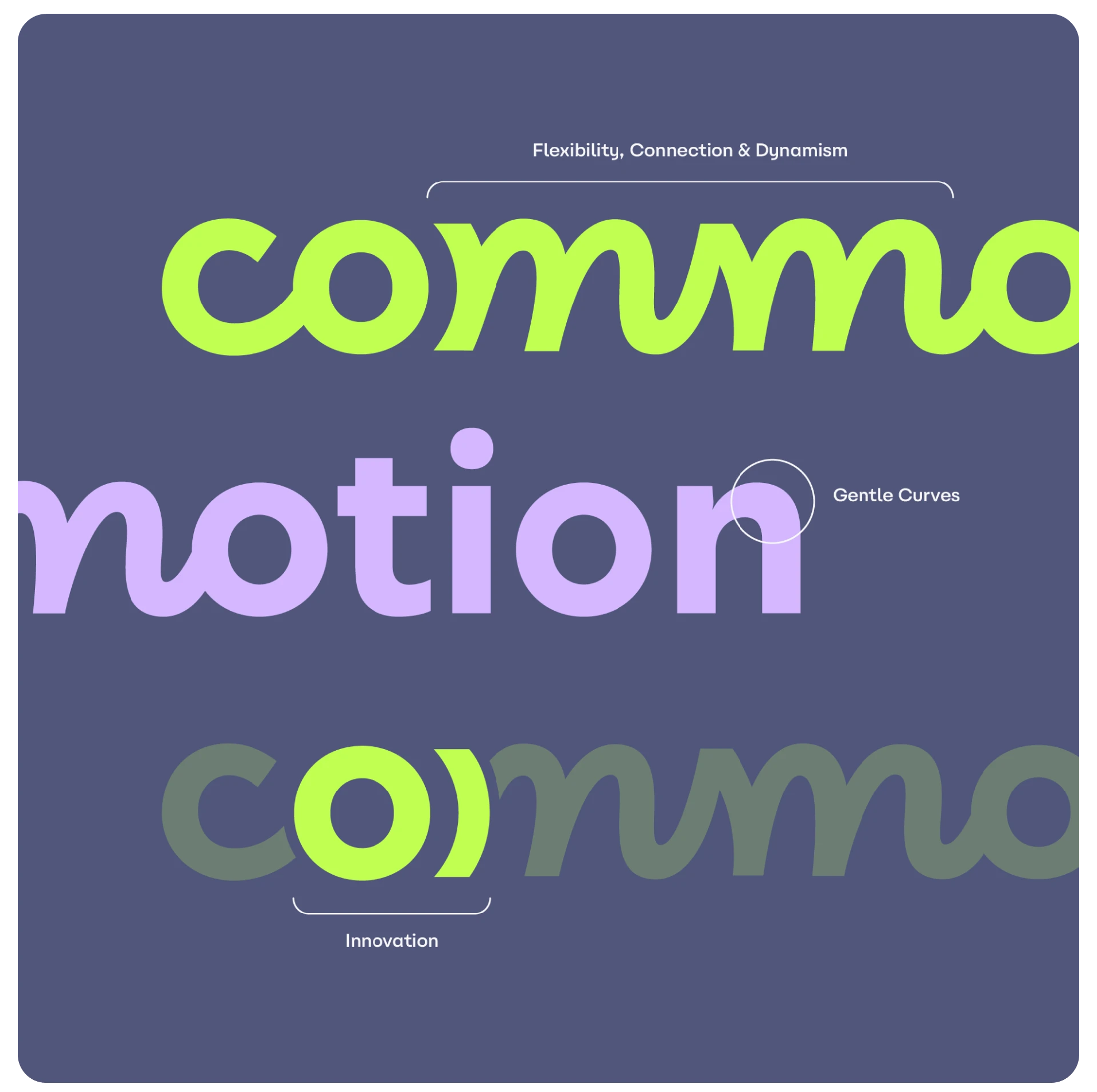
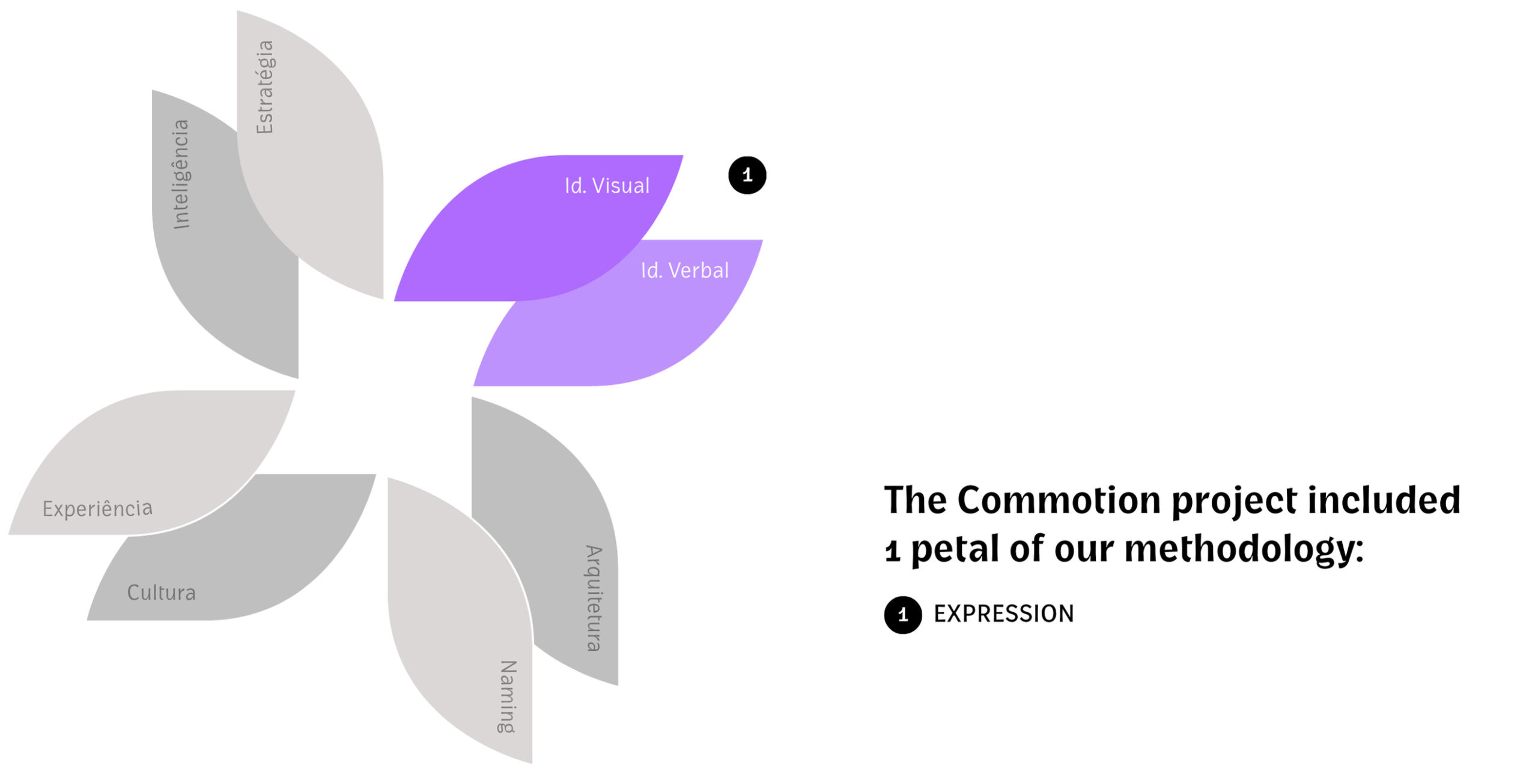
The insight came from the name itself, as ‘Commotion’ brings together the ideas of community and movement. The strategy was to translate this concept into a visual identity, ensuring that each shape and composition reflected dynamism and integration. The identity was built on three pillars: technology, expressed through bright colors and contemporary lines; community, represented by fluid shapes and interconnections; and emotion, conveyed through rhythm and contrast.
Verbal Identity
Commotion’s voice is young, direct, and empathetic. The brand speaks with clarity and confidence, maintaining a welcoming and inspiring tone in any context.
Visual Identity
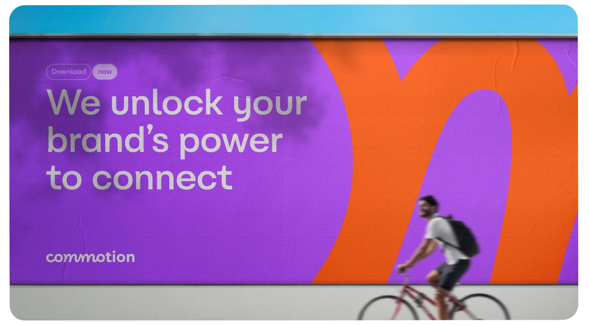
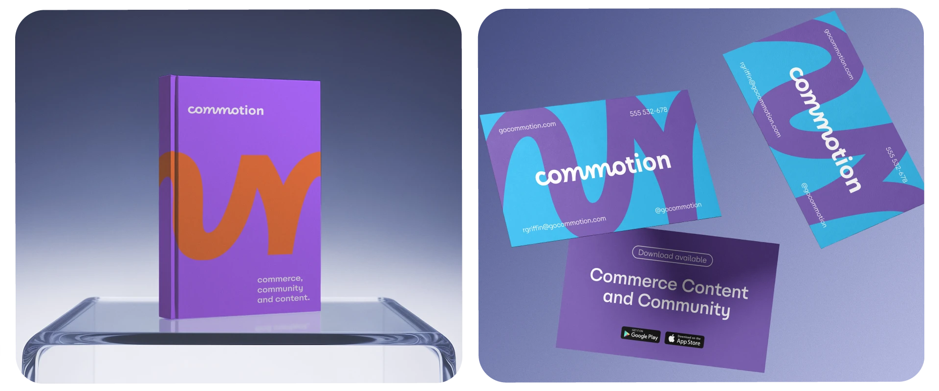
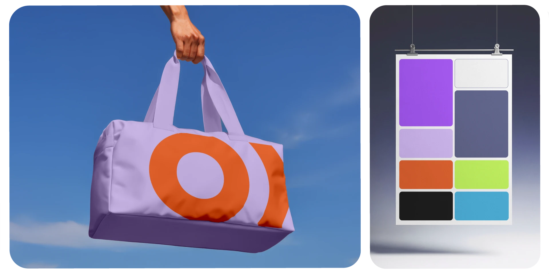
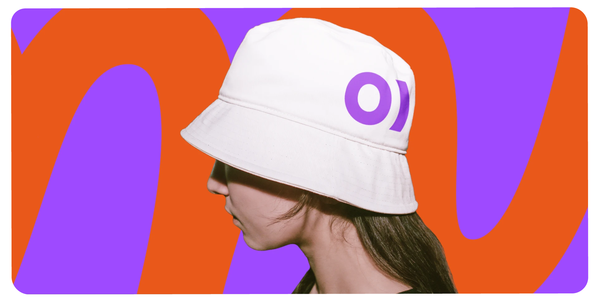
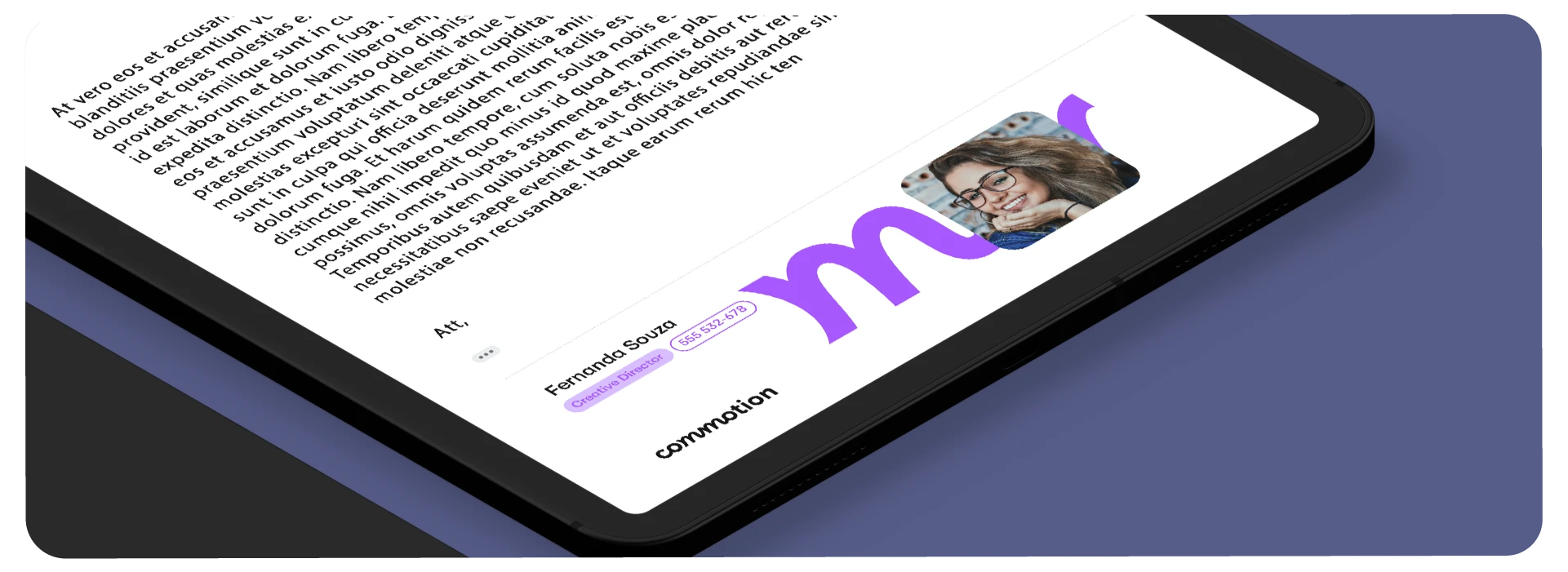
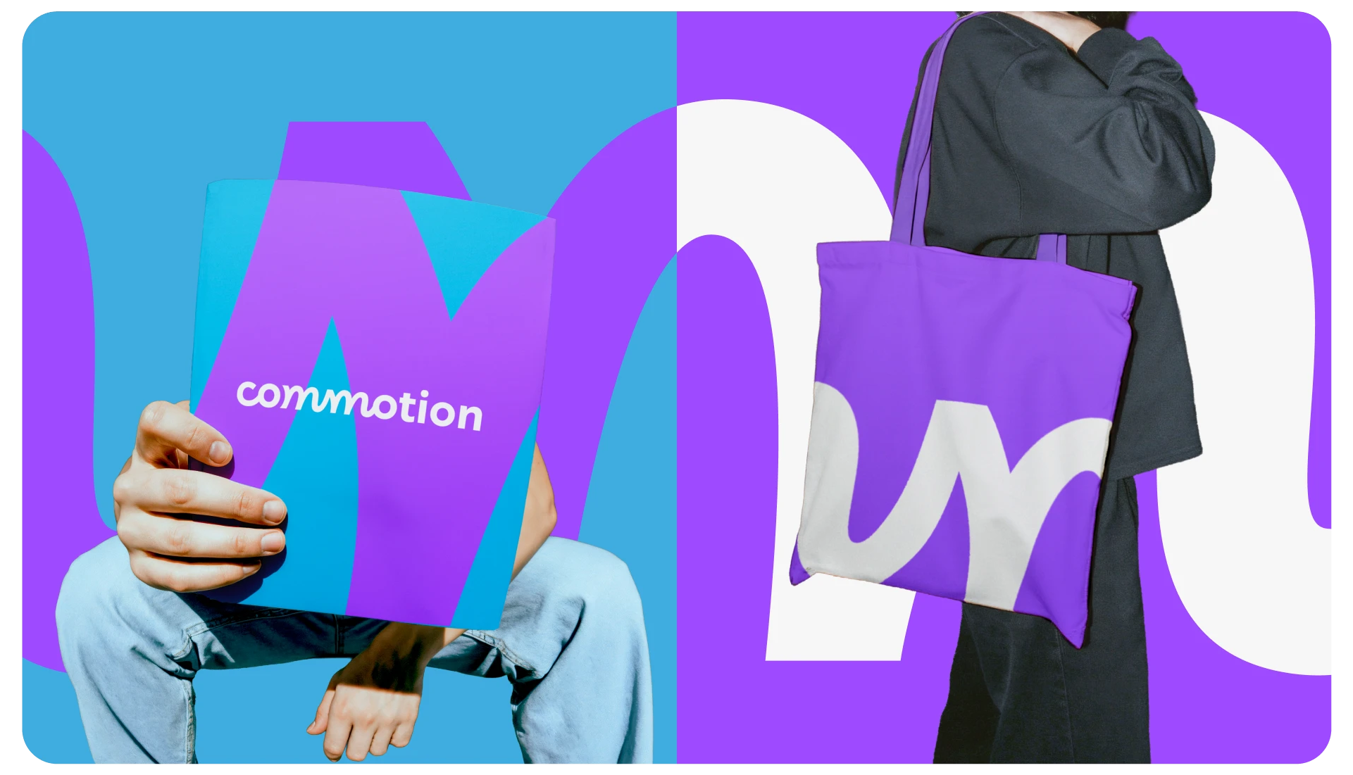
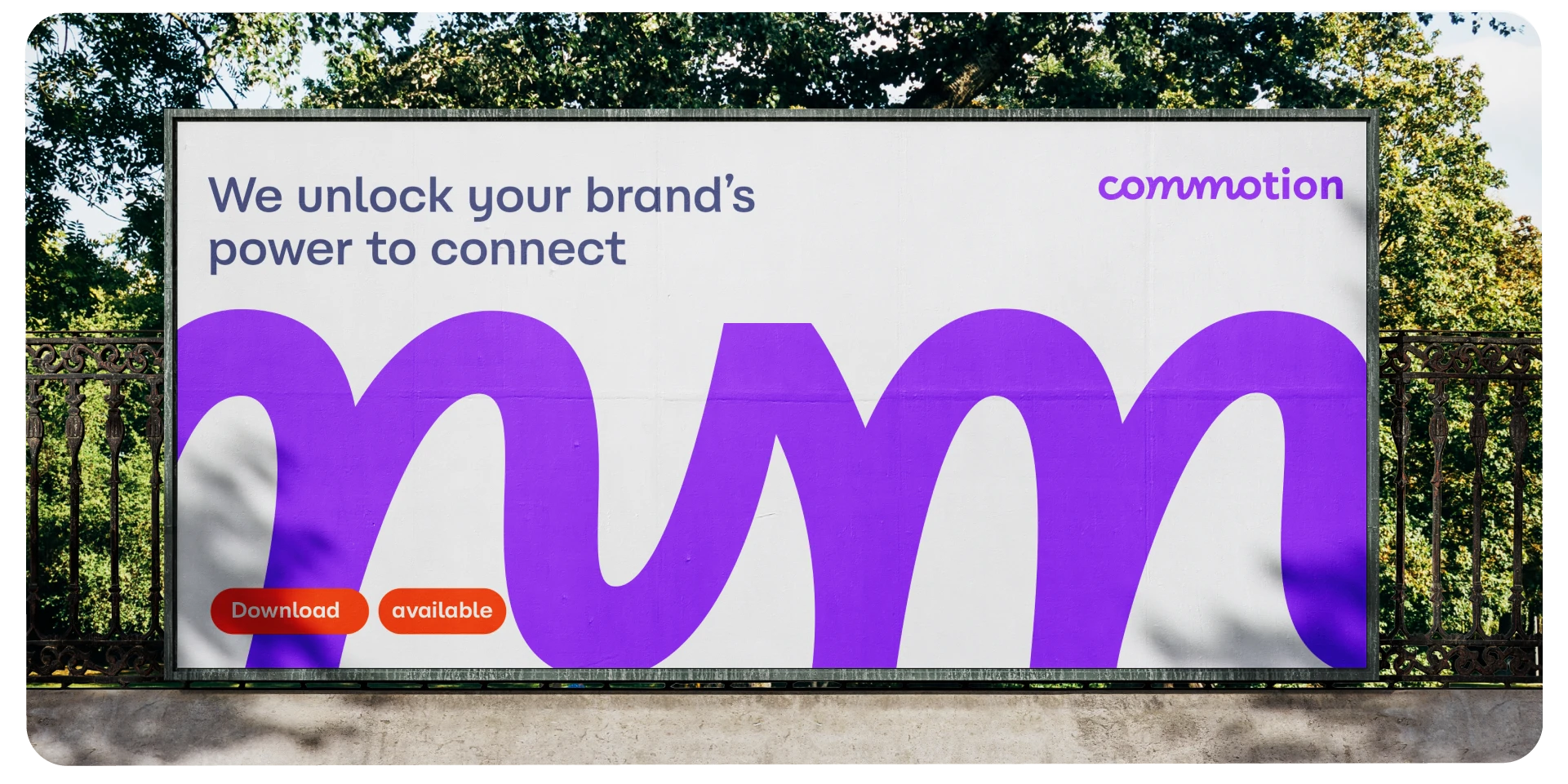
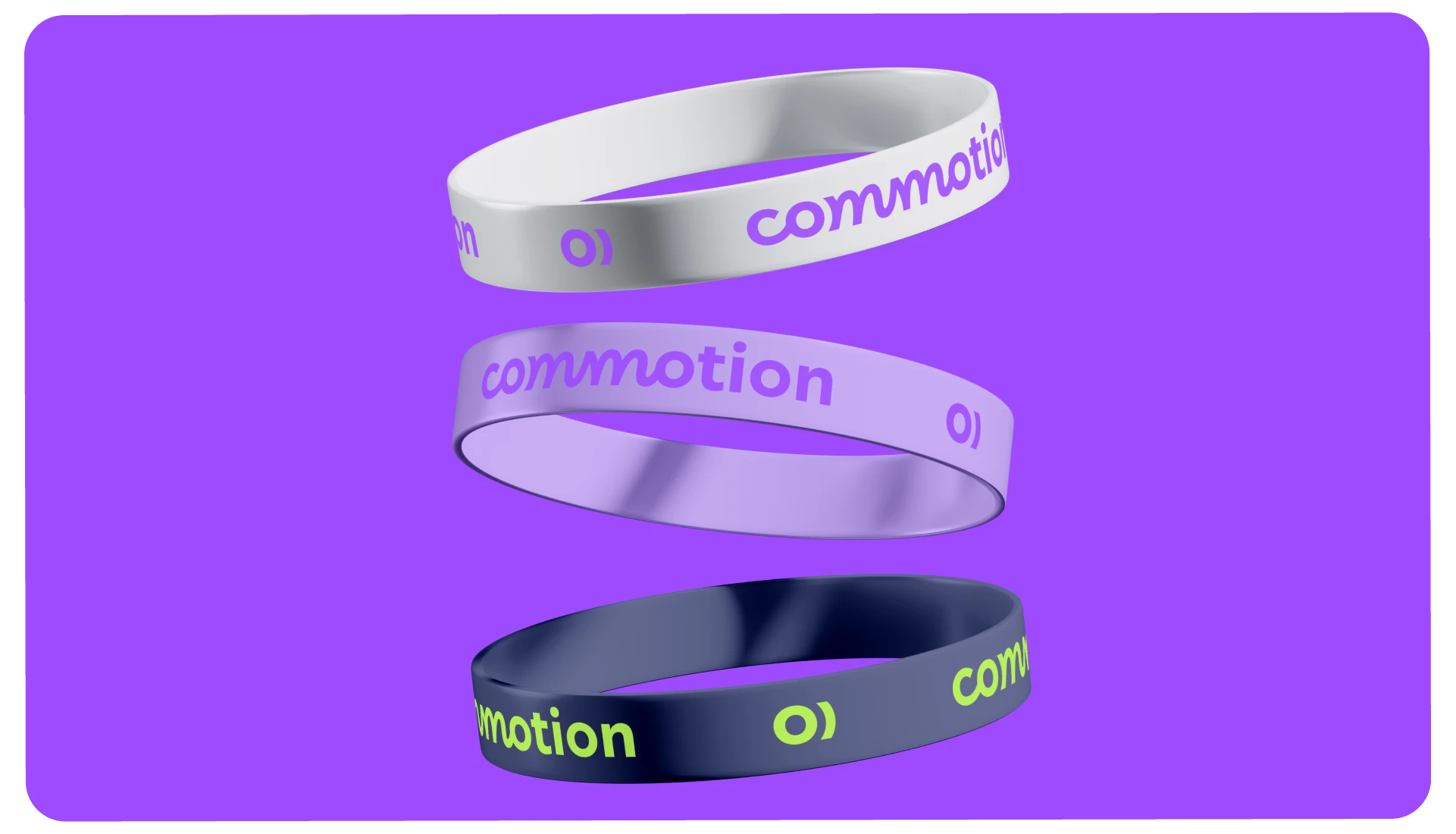
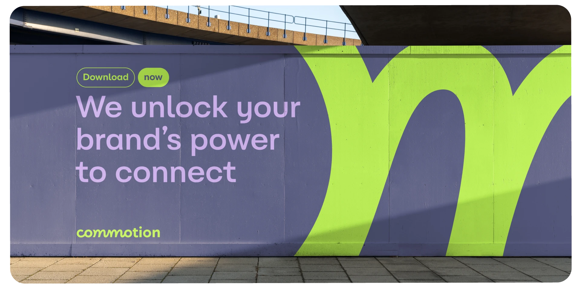
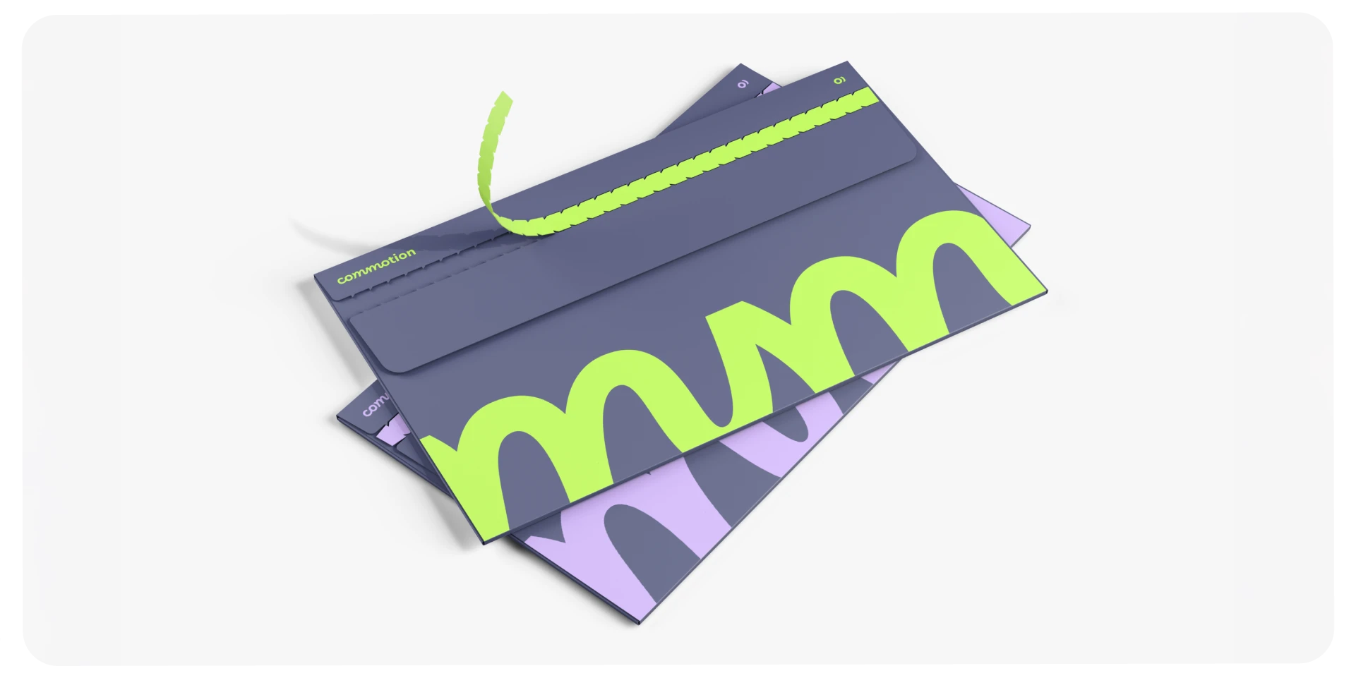
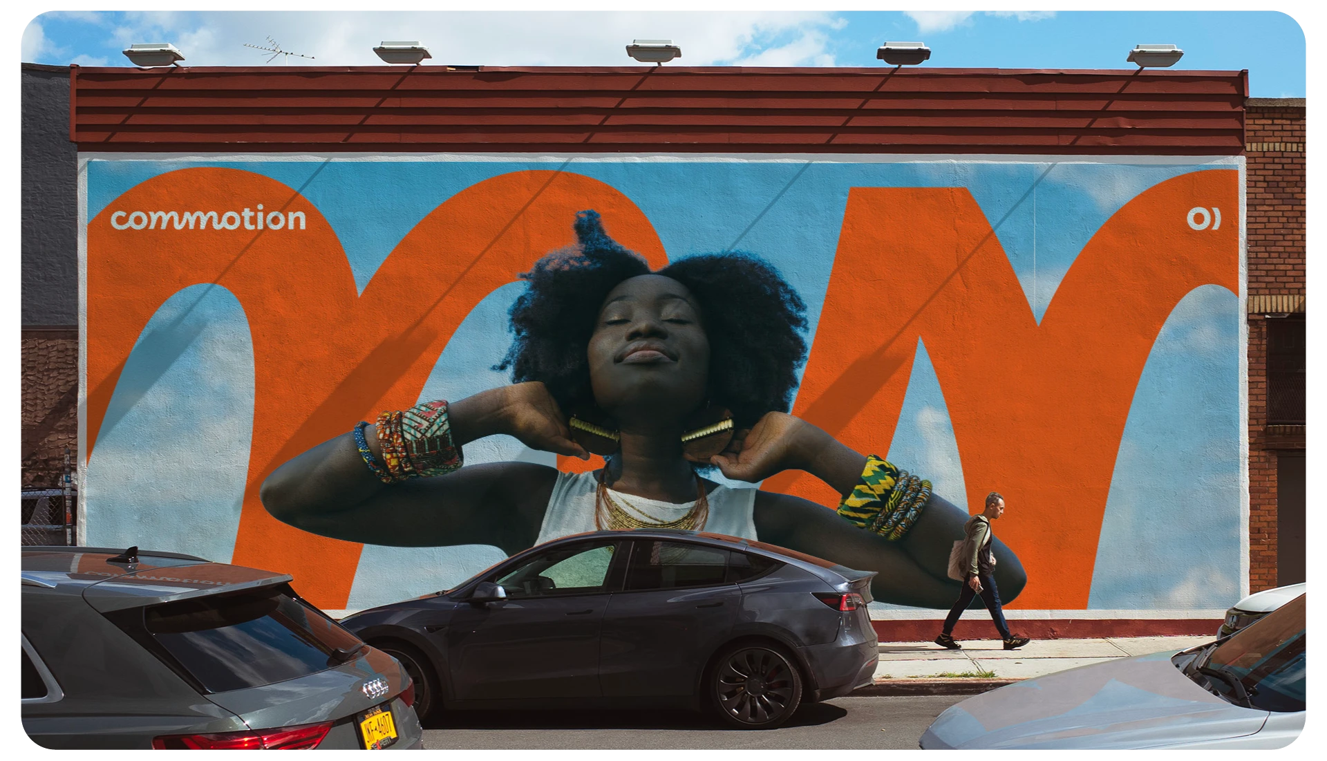
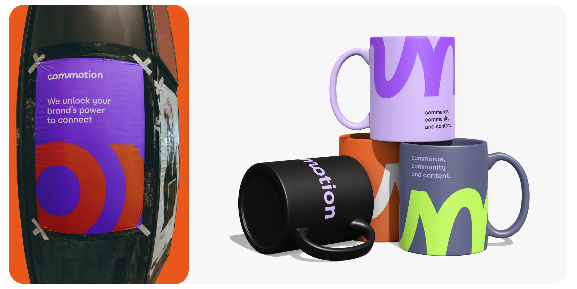
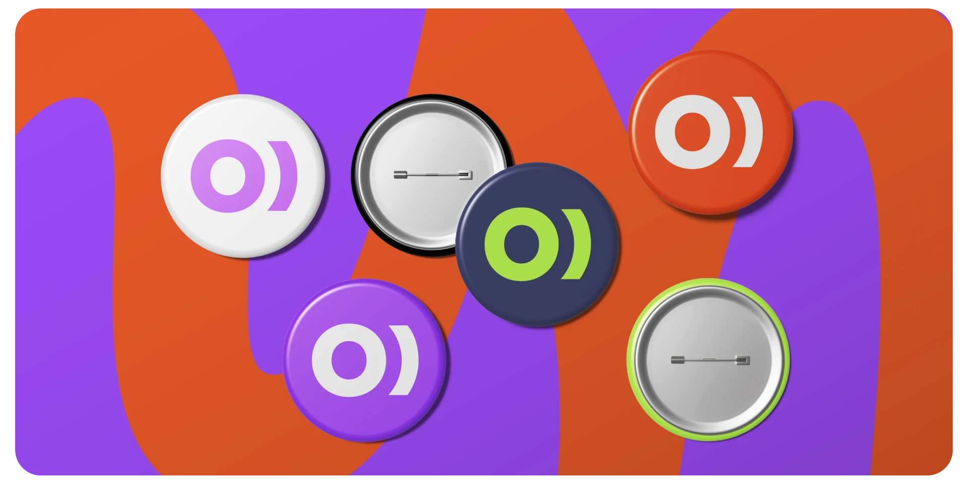
Commotion’s innovative and flexible personality is reflected in the fluid, dynamic letterforms of the logo, which convey movement and collaboration. Every visual element was designed to reinforce the brand’s premium and emotionally engaging experience, striking a balance between technological precision and human fluidity.
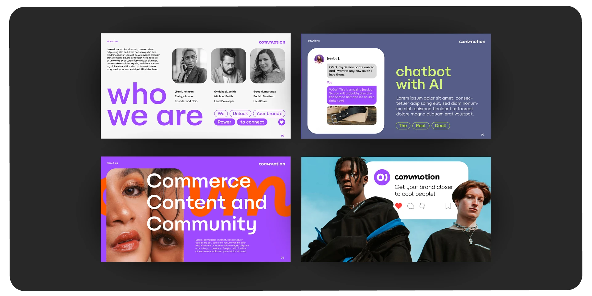
The visual system centers on vibrant colors, elegant contrasts, and bold layouts that feature striking photography as the focal point.
Visual and Verbal Identity: Motora
Creative Direction: Luize Araújo
Art Direction: Luize Araújo, Júlia Lago
Designers: Luize Araújo, Júlia Lago, Maria Stéfanni Carvalho, Julia Sales