Dier, a dreamy brand from Bahia, Brazil, is synonymous with handcrafted, origin-based chocolate. From cultivating cacao trees to producing the bars, every step is carefully overseen by experts, ensuring a truly unique experience. Committed to health, quality, and sustainability, Dier chocolates are made from tree to bar without preservatives, gluten, or refined sugar. Currently, three out of Dier’s four products are completely vegan.
Our goal was to create a unique visual language for Dier Chocolates’ packaging, capturing the essence of the brand and making it easier to introduce new products to the market. Based on the concept of “dream to bar,” we aimed to convey the sense of dreaminess and magic that is intrinsically tied to the experience of enjoying a Dier chocolate, while highlighting its artisanal approach and commitment to quality.
Inspired by the concept of dreams and magic associated with chocolate, we developed an approach that transforms each piece of Dier chocolate into an experience. Our goal was to connect consumers with the idea that every bite is more than just chocolate – it’s the fulfillment of a wish, a sensory journey into a dreamlike world.
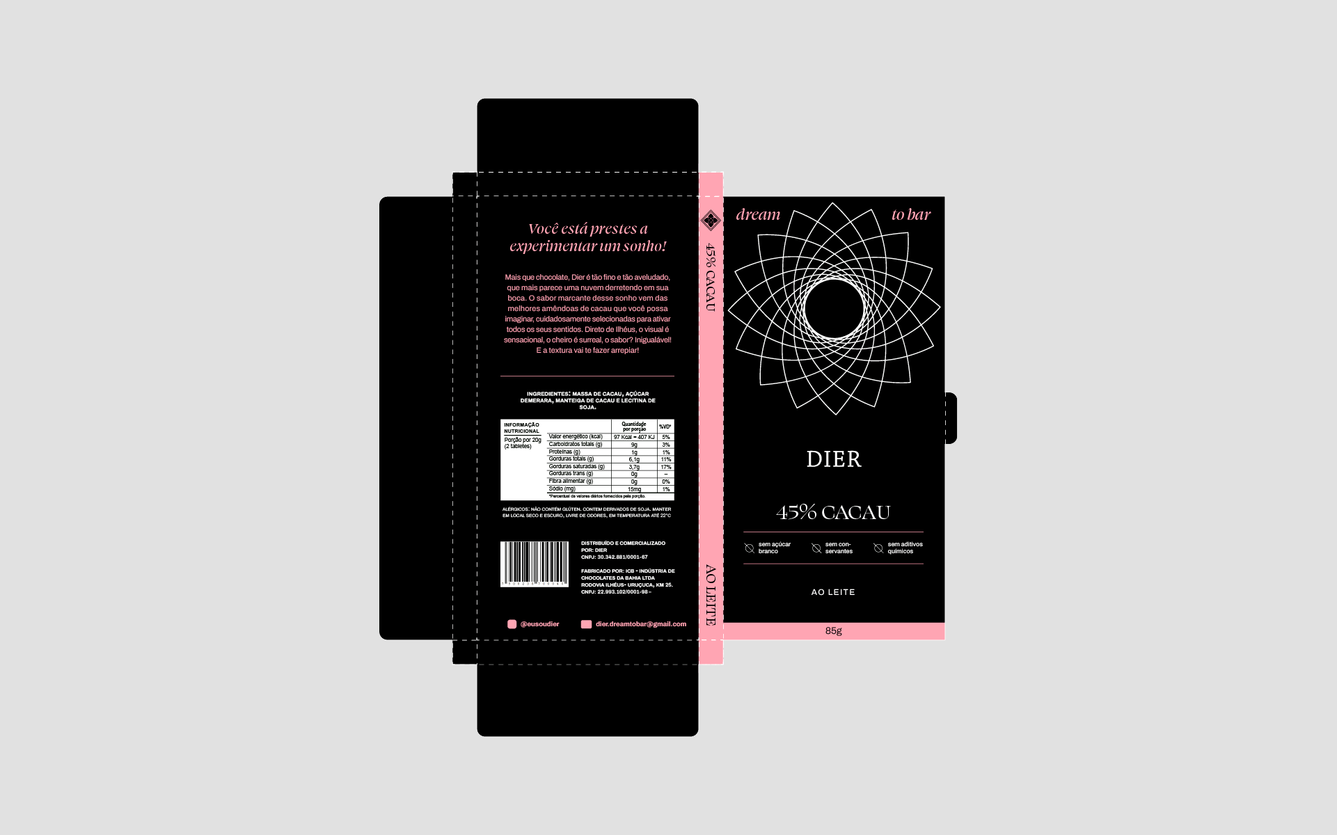
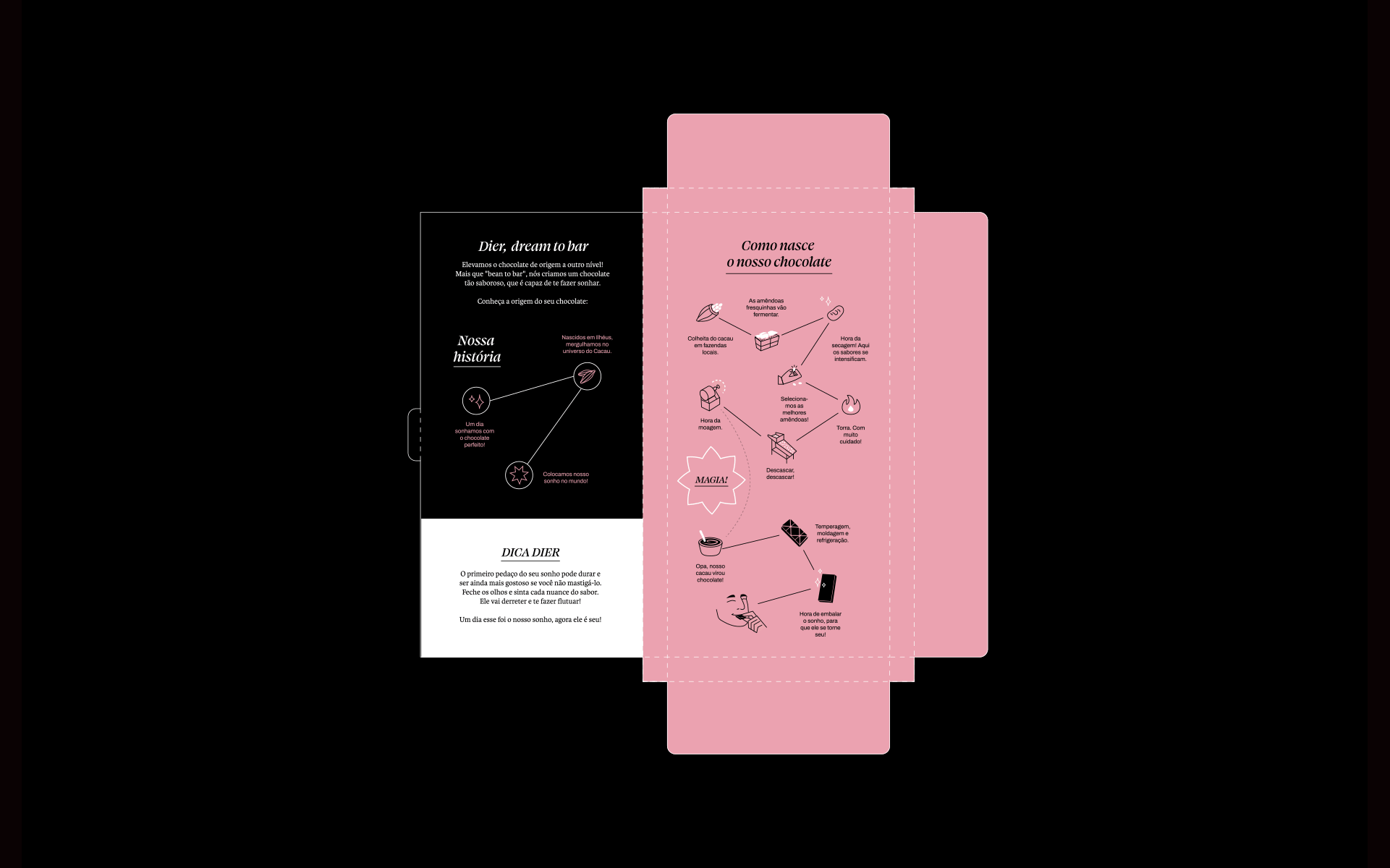
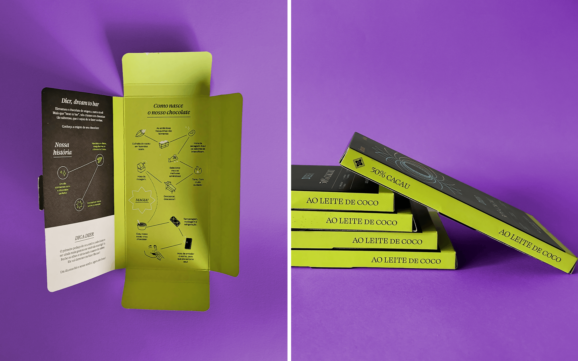
For the verbal language, we crafted a storytelling that resonates with the slogan “a chocolate dream,” inviting consumers to embark on a journey of wonder and discovery with every bite. The choice of texts featured on the packaging was designed to enhance the consumer’s immersion into the “magical universe of Dier,” reinforcing the brand’s core attributes. To achieve this, we developed texts that present the brand’s story, explain the chocolate-making process, and highlight the unique qualities of Dier chocolate—contributing to the perception of the sensory delight that comes with tasting it.
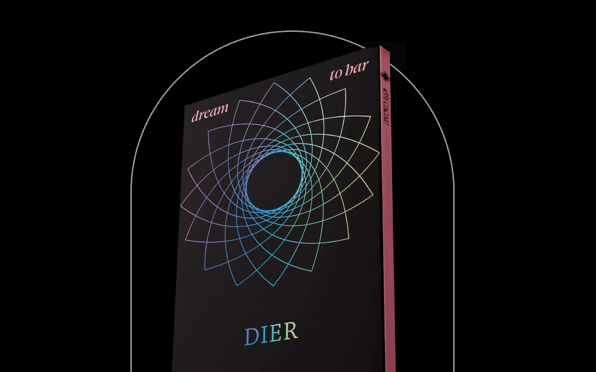
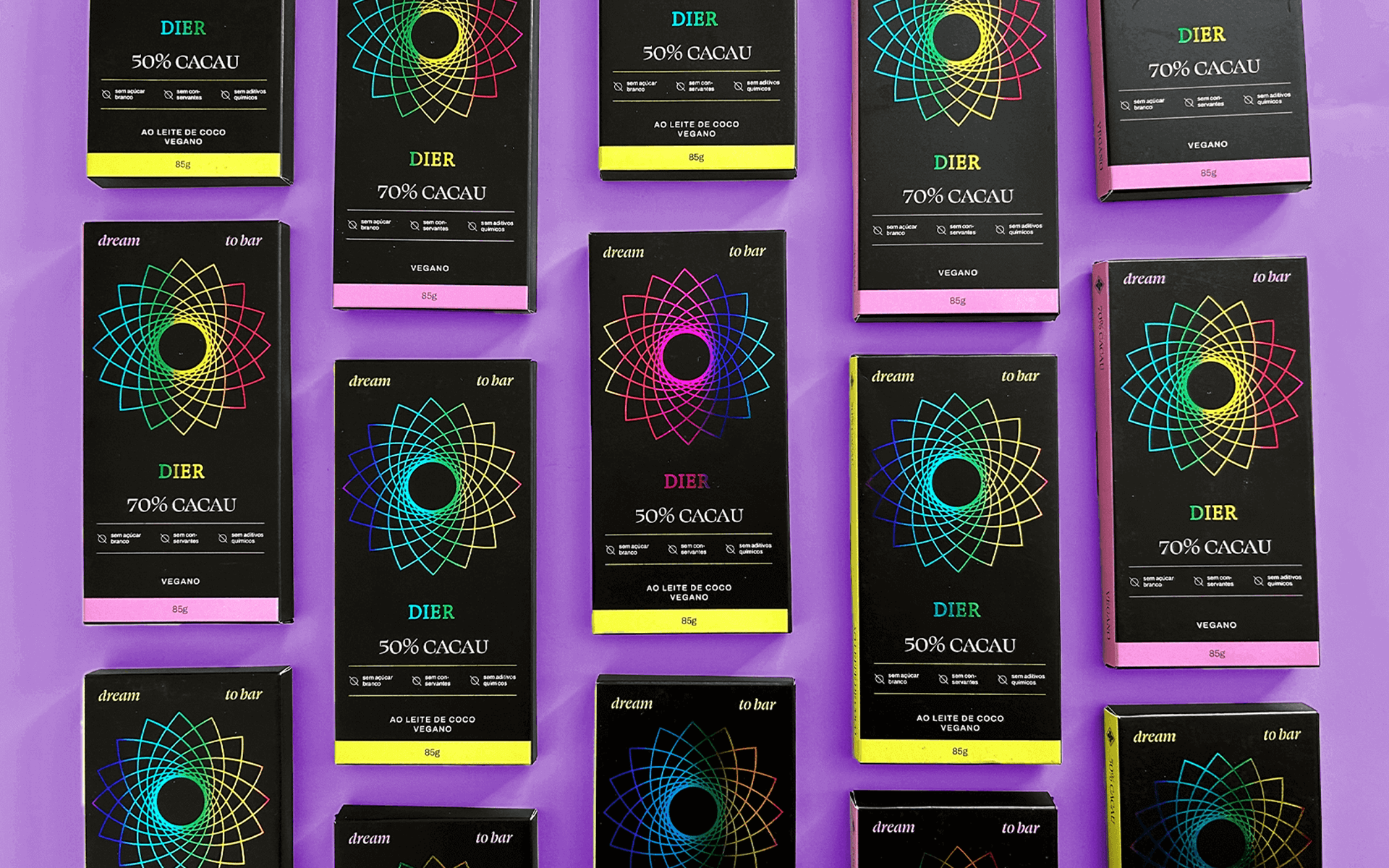
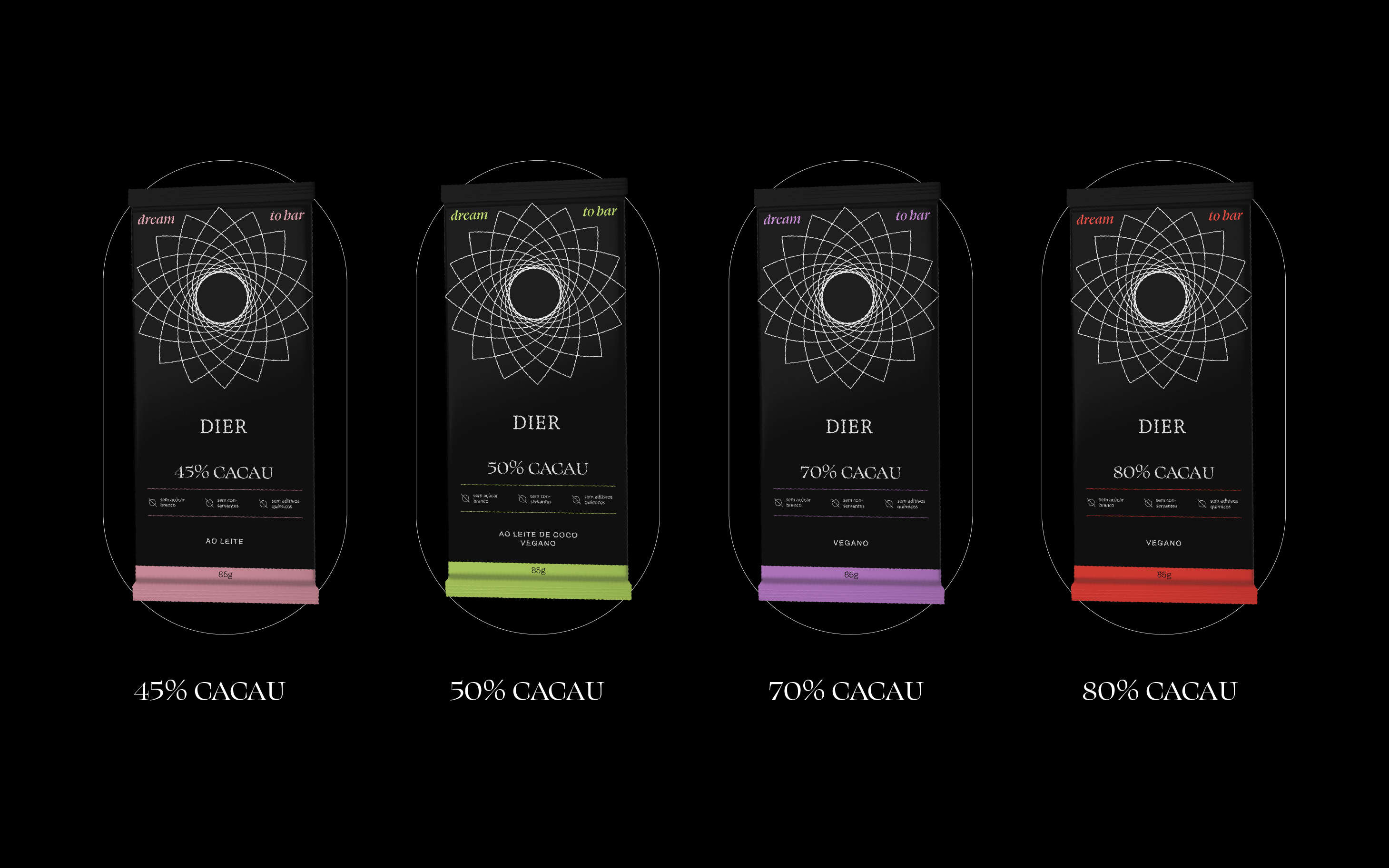
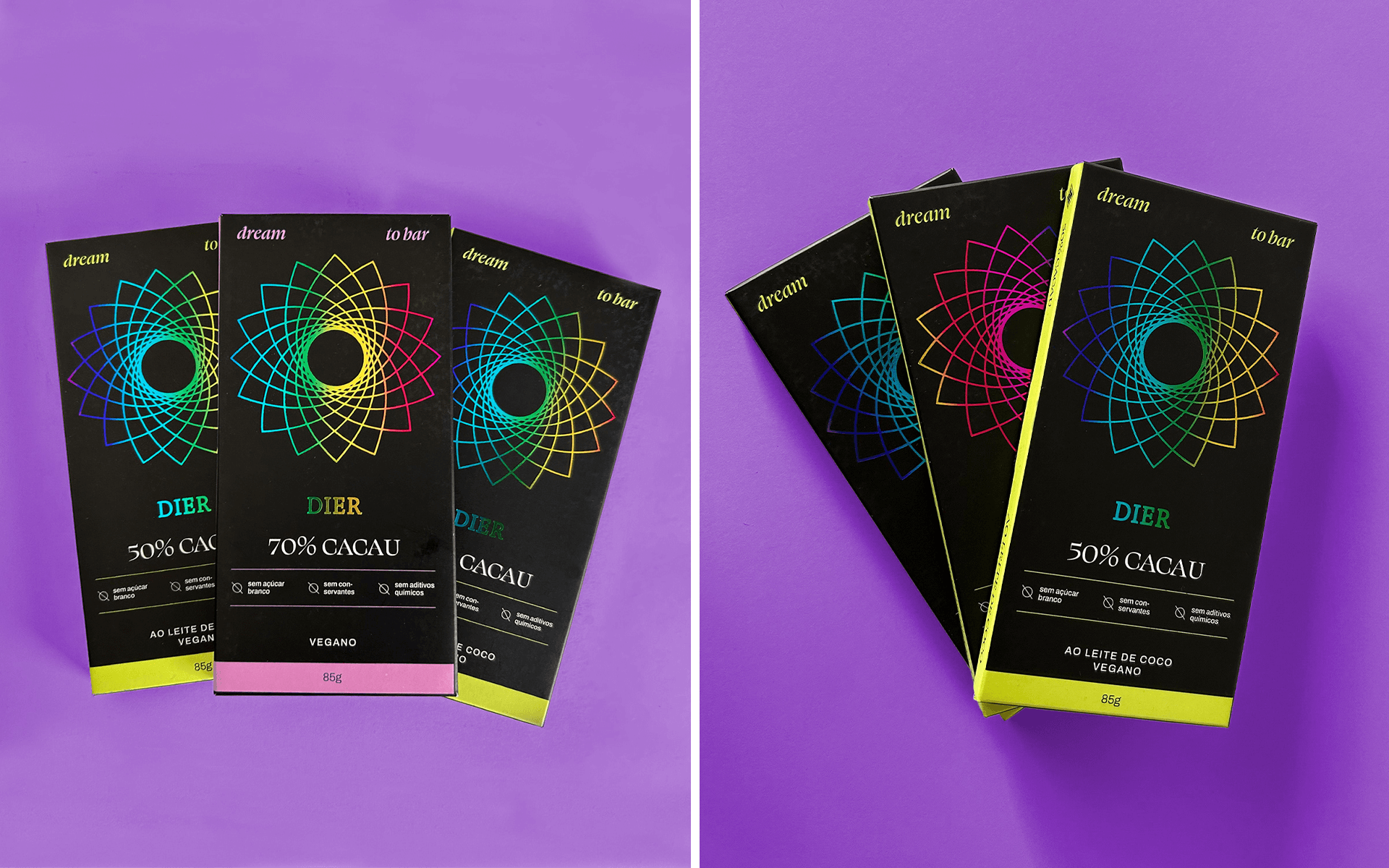
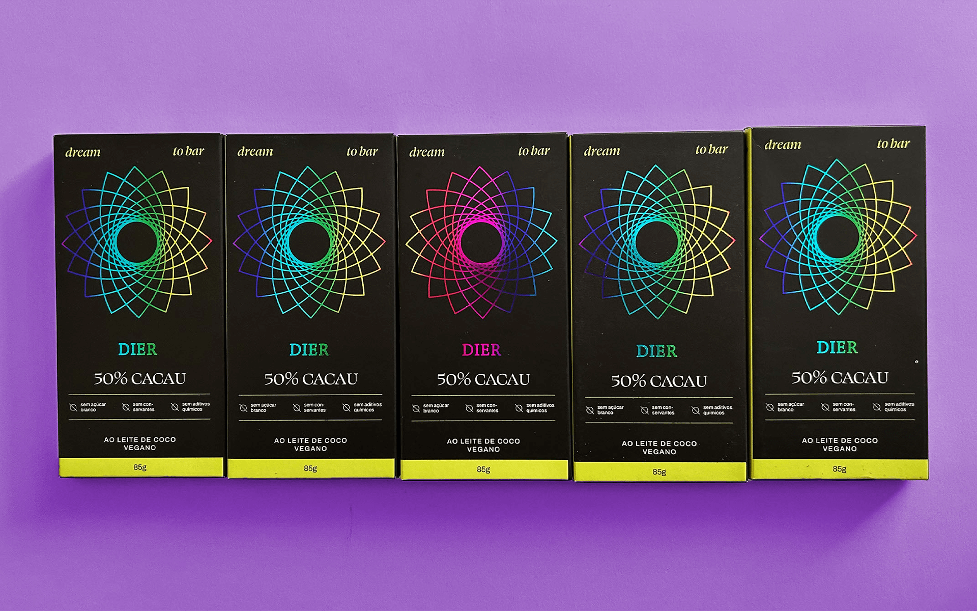
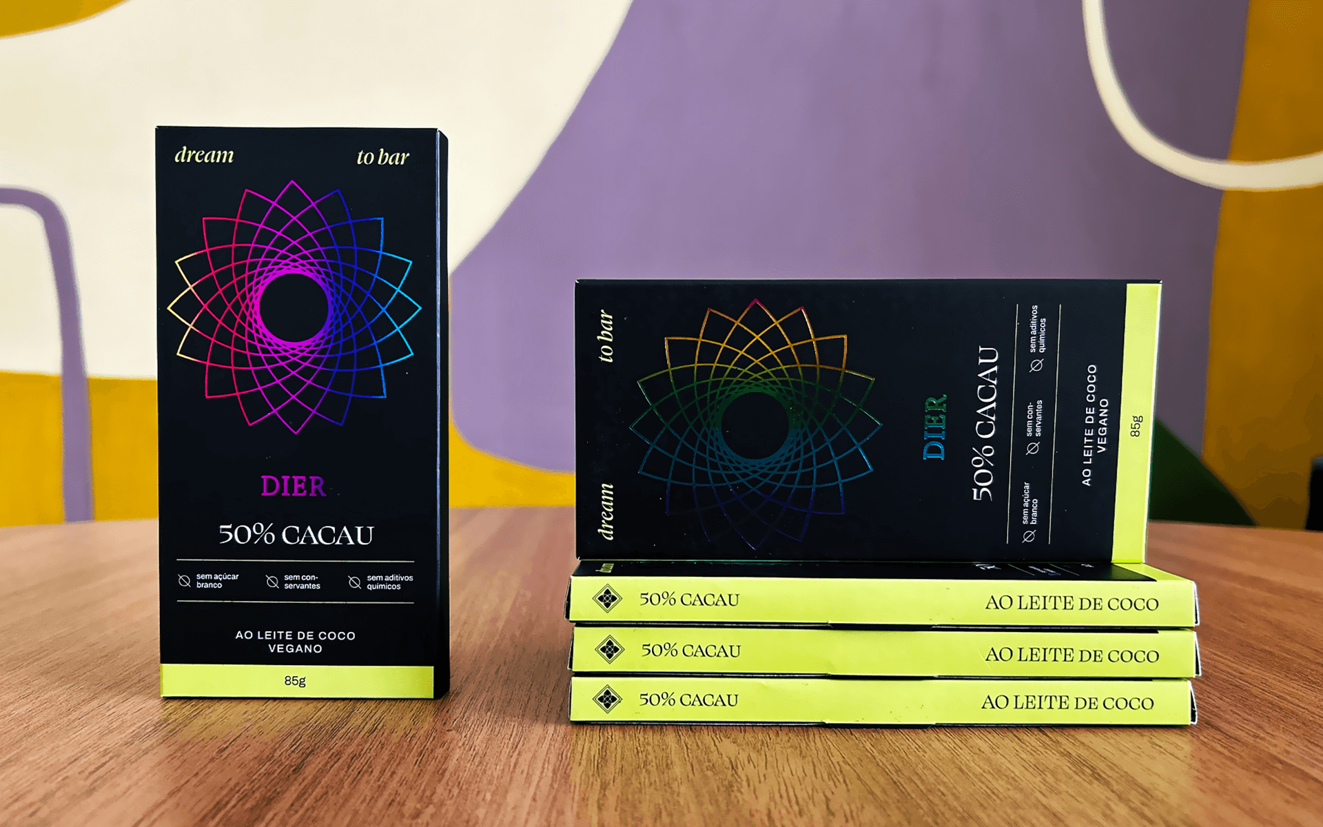
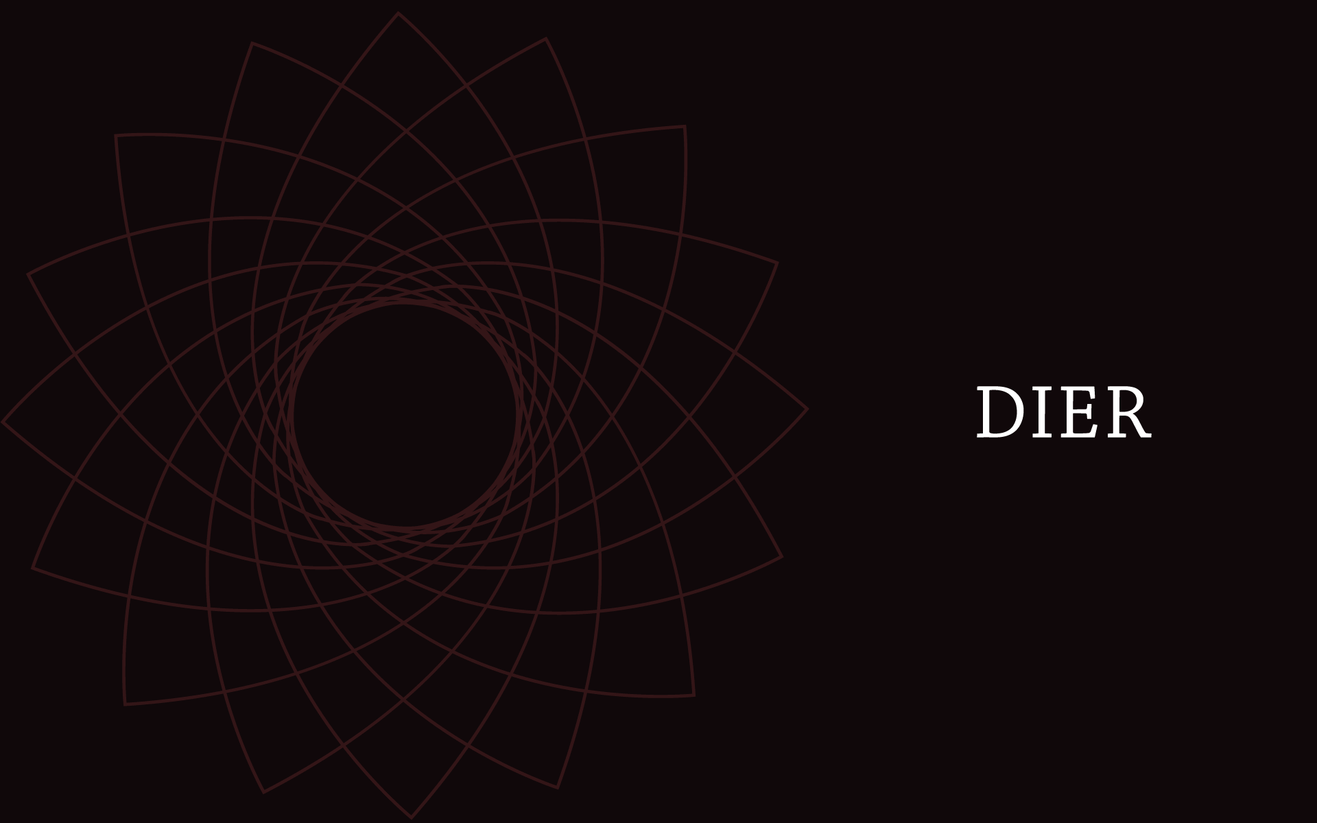
To visually convey the concept of dreams, we incorporated a reimagined version of the dreamcatcher—an artifact of Indigenous origin believed to protect dreams (in the most literal sense) from nightmares. To add an extra touch of magic, charm, and sophistication, we chose to have the design printed on holographic paper. An elegant serif typeface complements the visual language, bringing even more sophistication to the overall aesthetic. To differentiate between product varieties, we created color variations across the packaging, while maintaining a strong connection and cohesion through the central visual element: the dreamcatcher.
Packaging: Motora
Art Direction: Luize Araújo
Designers: Julia Sales, Luize Araújo, Juliana Argollo and Júlia Lago