Emefarma is one of the largest pharmaceutical distributors in Southeastern Brazil and has been a key player in the industry since 1988. Over the decades, the brand has played a vital role as a link between manufacturers and pharmacies of all sizes, from major retail chains to small-town drugstores.
Rebranding for Emefarma
Project goal: To position Emefarma as a leading, reliable, and solid company. A close, enthusiastic partner capable of driving the growth of the pharmacies within its network.
Challenge Summary: How can tradition and innovation be aligned to mark a new chapter in the history of Emefarma, a well-established and widely recognized distributor? How can the brand’s image be updated without losing its most recognizable assets or weakening its crucial role in supplying the pharmaceutical sector?
Insight and Strategy
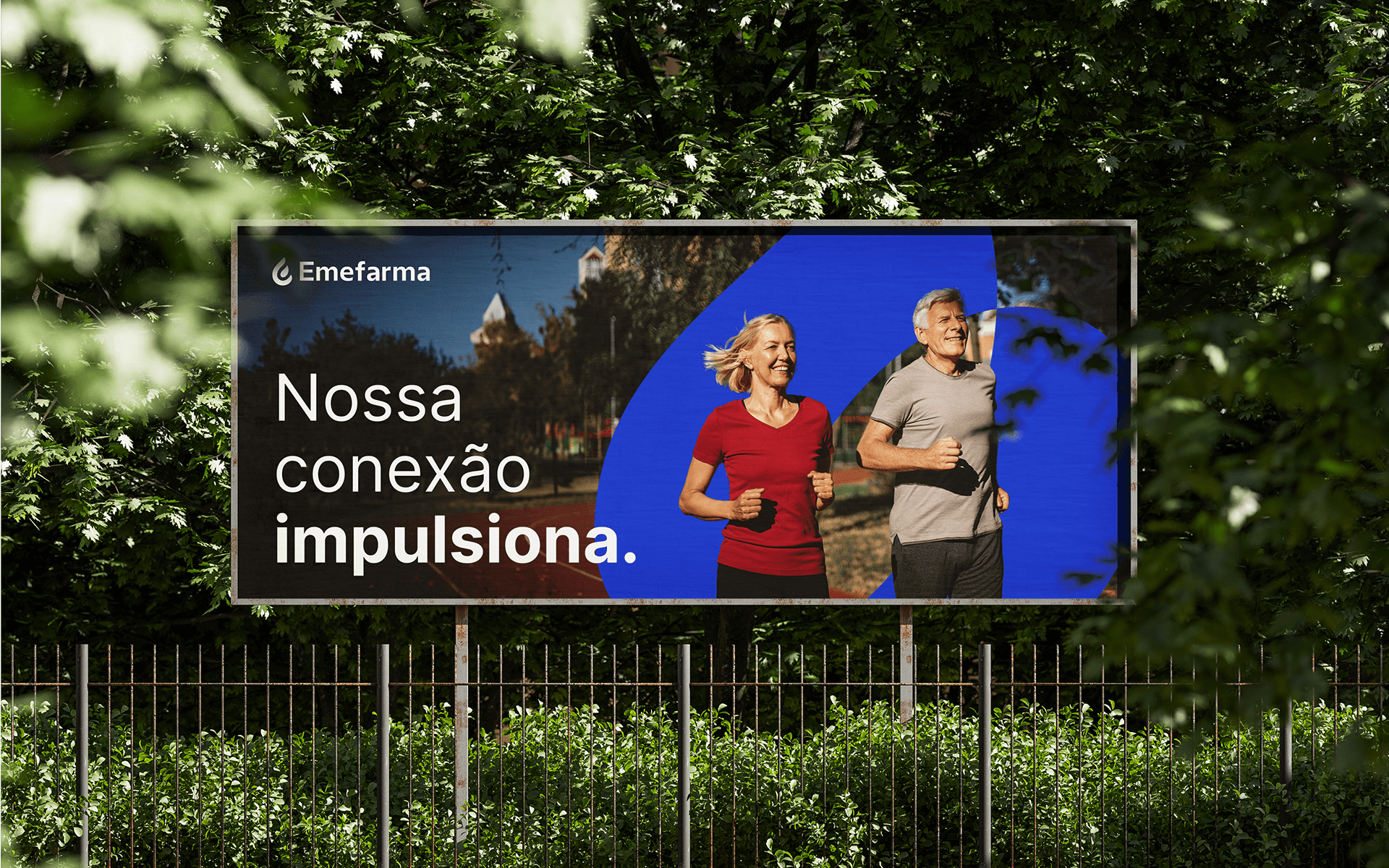
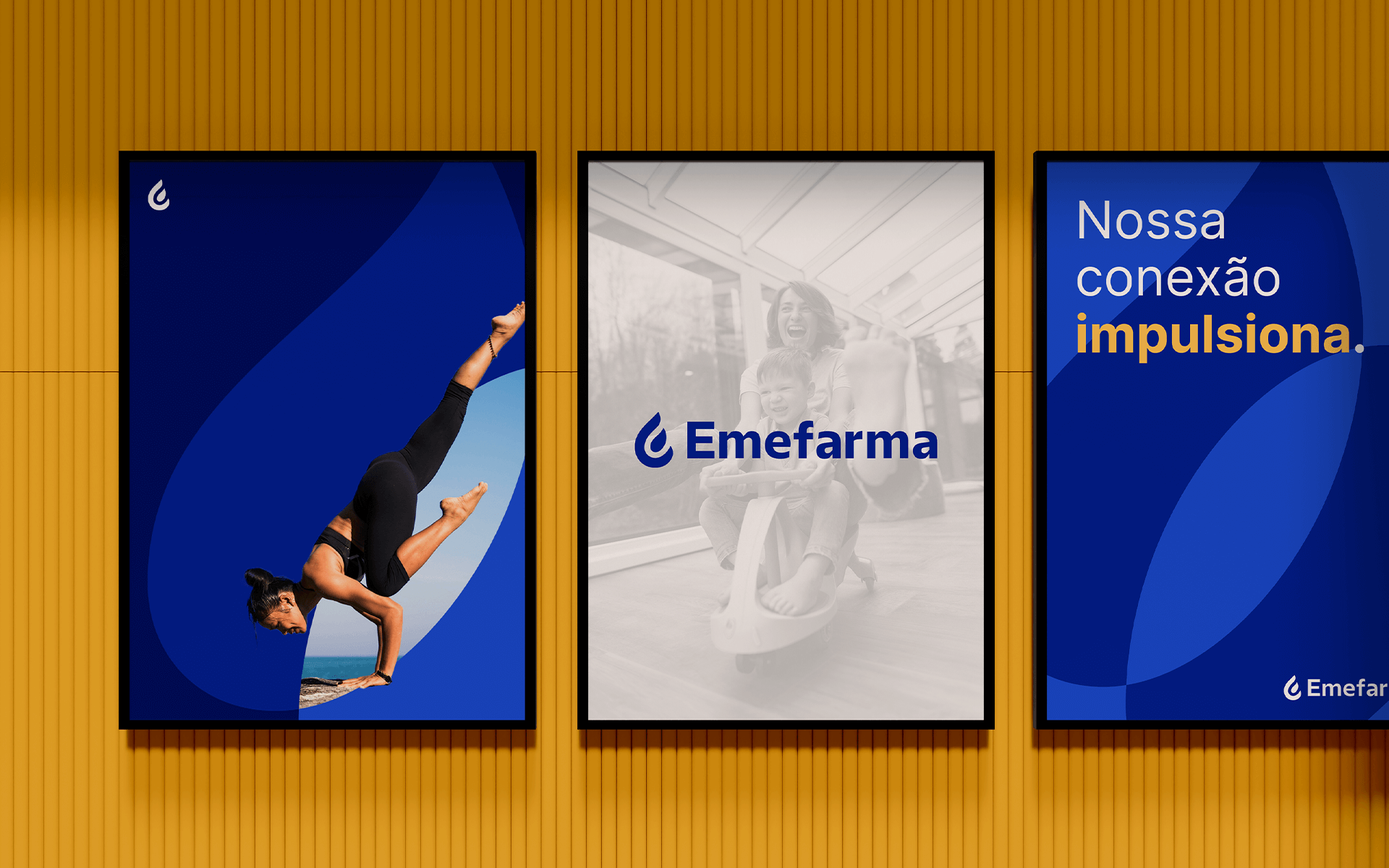
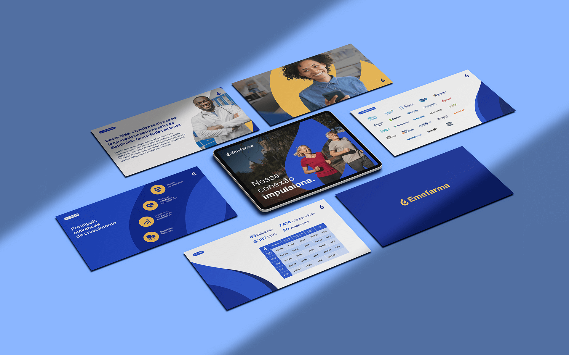
We identified that Emefarma’s essence lies in its ability to connect key partners to drive the sector’s growth. From this insight, we developed the slogan “Driven by connection” and built an entire visual and verbal system to express that concept.
We positioned Emefarma as a strong, approachable, and human leader: a true strategic partner that moves businesses forward to promote health, convenience, and well-being.
Verbal Identity
Emefarma’s tone of voice was designed to balance accessibility and warmth with a sense of reliability and inspiration.
Its communication reinforces a collaborative culture by using the first-person plural, highlighting teamwork and shared commitment. The language is clear and straightforward, avoiding unnecessary formality or technical jargon, while still conveying the drive of a true leader.
The brand values objective and efficient communication, using a positive vocabulary that builds trust and signals growth. These choices support Emefarma’s positioning as a partner that puts its clients at the center of every relationship.
Visual Identity
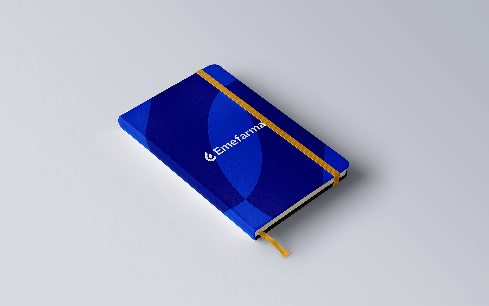
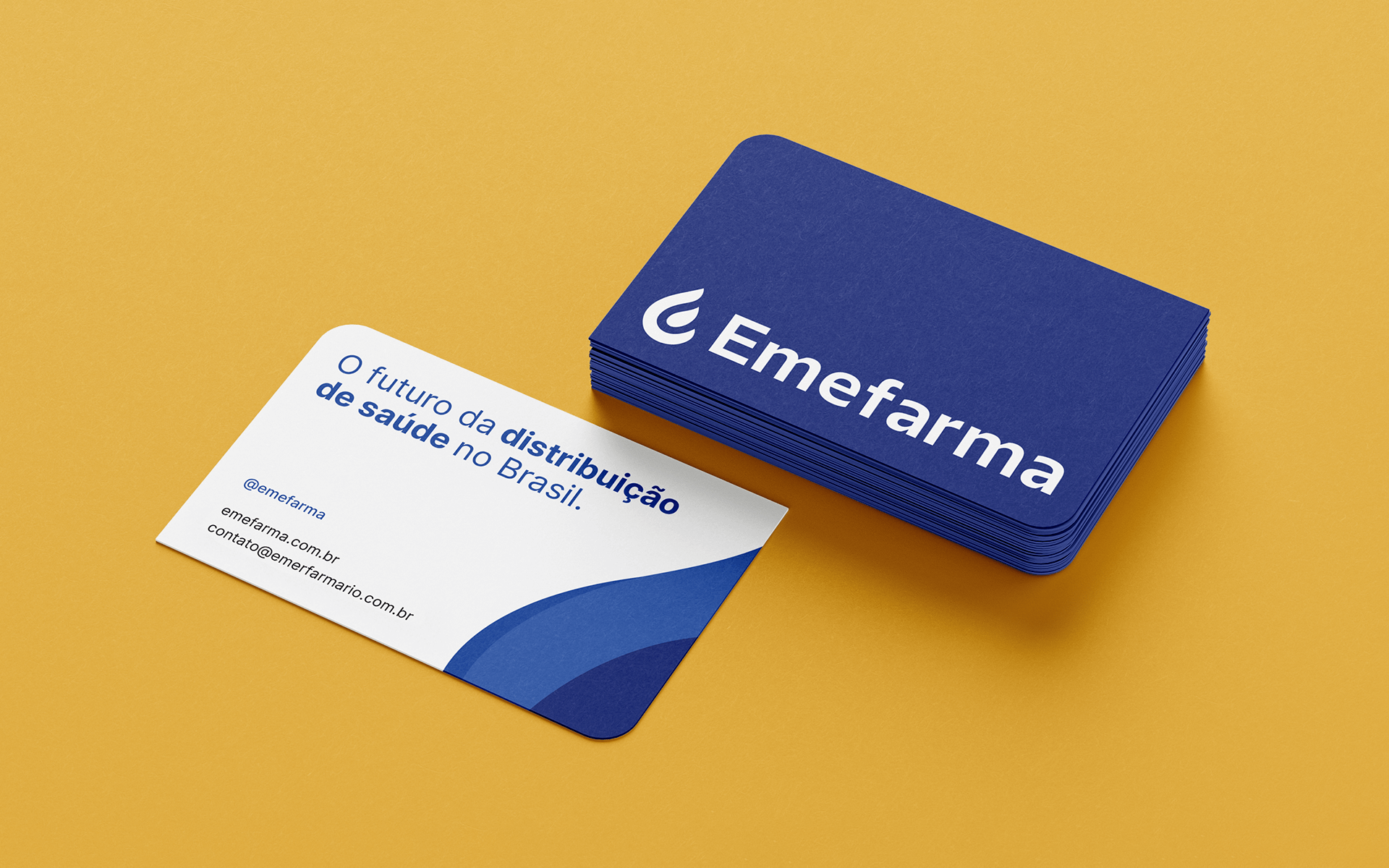
The modernization of Emefarma’s visual identity began with a symbol rich in meaning. It can be seen either as the letter “E” or as a torch, representing victory and human warmth. This visual signature conveys vitality, resilience, and leadership, reaffirming the distributor’s commitment to driving progress in Brazil’s pharmaceutical sector.
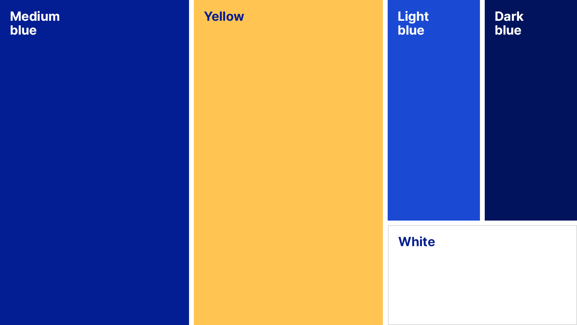
The color palette, centered around shades of blue and yellow, reflects trust, innovation, and agility, while also ensuring clarity and the visual impact needed to stand out from competitors.
Graphic elements derived from the symbol enhance visual recognition and reinforce the brand’s dynamic communication, representing connection and integration.
Branding and Visual Identity: Motora
Strategic Direction: Luize Araújo
Strategy and Writing: Luize Araújo, Isabele Souza
Art Direction: Luize Araújo
Designers: Júlia Chaves, Júlia Lago, Luize Araújo, Maria Stéfanni Carvalho