Client
The Casa Socioambiental Fund (formerly the Socioambiental Fund CASA) is a non-governmental organization operating worldwide. It is an organization with more than 15 years of history, pioneer in the socio-environmental debate in Brazil. Casa was the first Brazilian socio-environmental fund, created in 1994 and has been expanding the frontiers of its operations since then.
Challenge
With such a long history, Casa had already changed its name twice in an attempt to translate properly its operation, without the focus of its work being confused with housing organizations. This was one of the fundamental points of the project. In addition to this issue, we also had the challenge of creating a mature and light brand, able to move between the environments of large international foundations and small local groups of communities supported by its projects.
Solution
After the branding dynamics, the spirit of co-creation and collaboration present in the corporate culture and in the way in which Casa works is even more clear. We’ve noticed that the organization has a unique way of acting, being a vector between the demands of small communities and the resources of large foundations, always making this distribution and access process as easy as possible. The Casa Fund is a welcoming place and a guide for the groups it supports. It is thanks to this relationship, in fact, that they have, today, an impact network with impressive capillarity and more than 1,700 projects supported throughout Latin America.
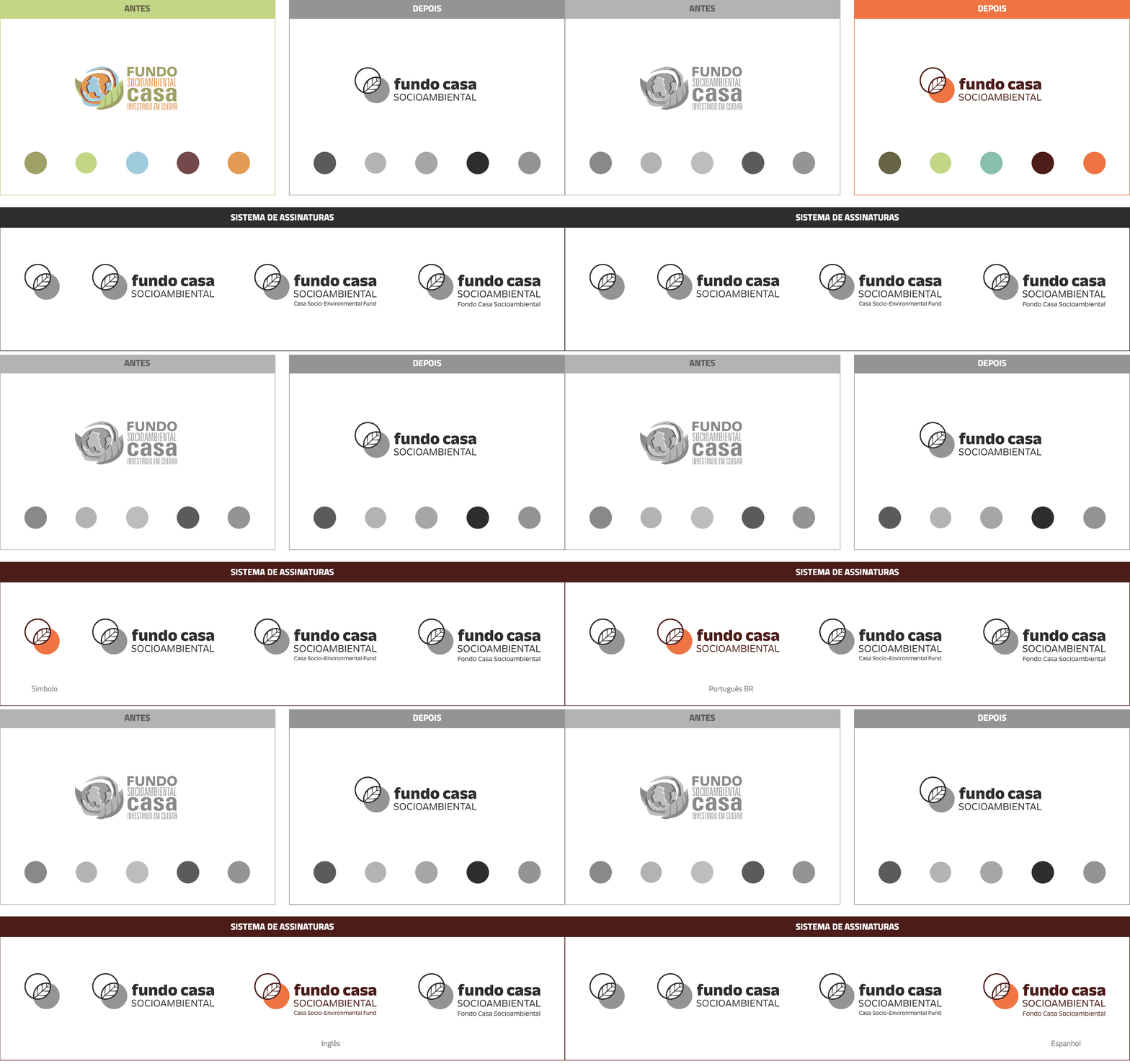
Having identified its differential, we proposed a change in the structure of the organization’s name, so that it gained a new meaning, without losing its recognition capacity and the reputation built in its more than 15 years. Socioenvironmental Fund CASA (Socioenvironmental Support Center) became the Casa Socioambiental Fund. The subtle repositioning gives up the acronym to interpret Casa (“home”, in Portuguese) as a place of shelter and affection.
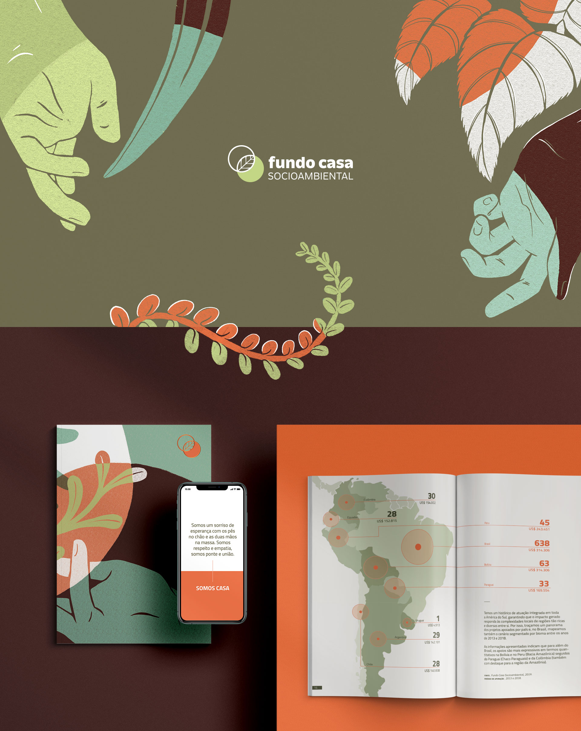
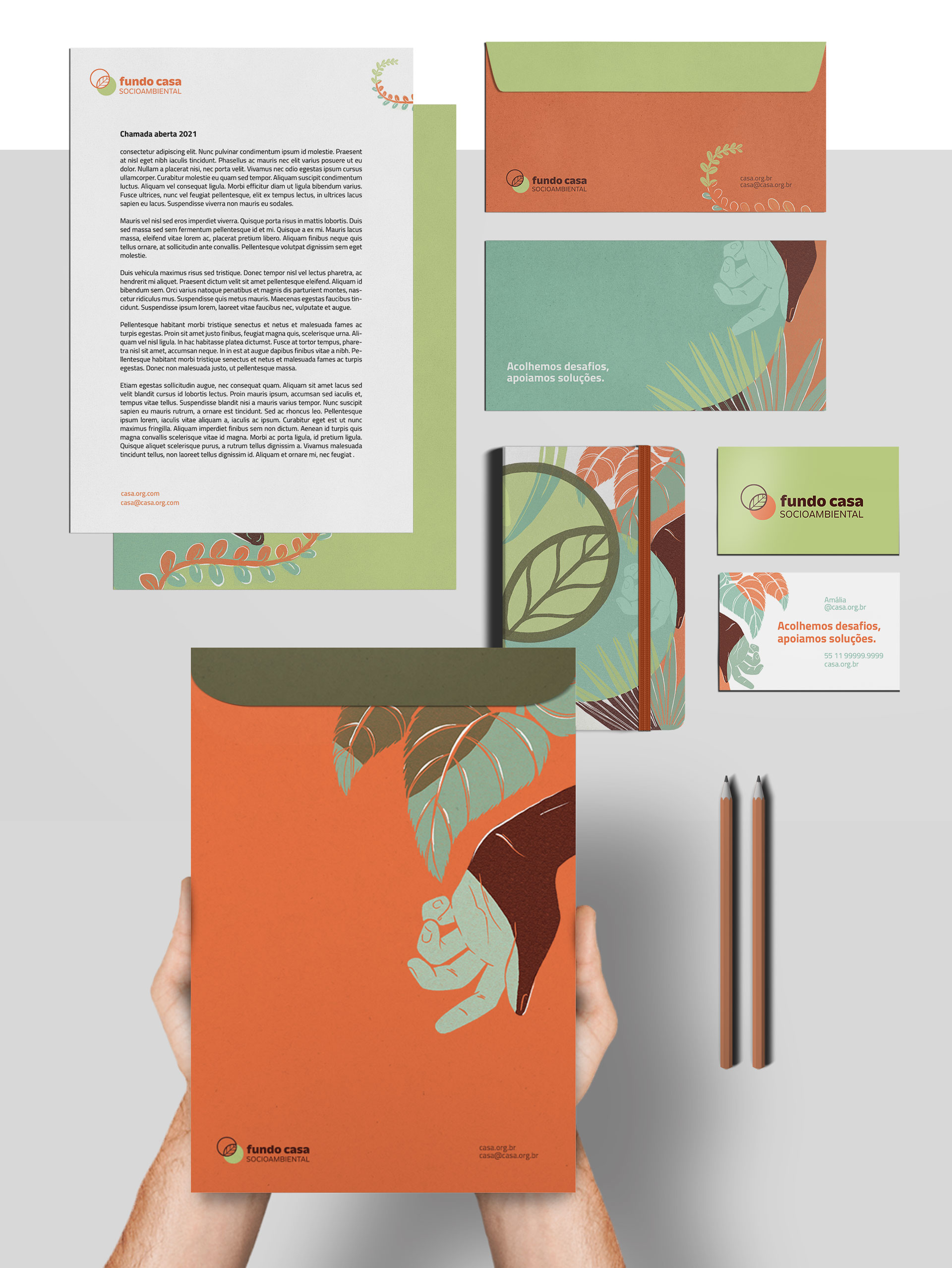
For the brand voice, we opted for a light, inviting and hopeful language. We sought to distance ourselves from the tone of urgency, so common in the sector. For the logo, we symbolized the intersection between the two spheres that are constantly in balance within the organization: local demands and international or large organizations support, that would never reach the communities to which Casa’s network has access by themselves.

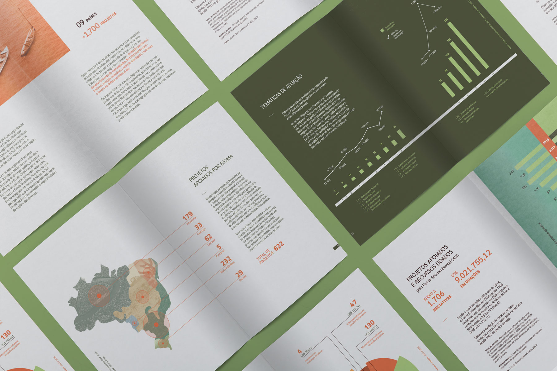
Branding and visual identity: Motora
Strategic Direction: Juliana Argollo, Luize Araújo.
Strategy and writing: Juliana Argollo, Luize Araújo.
Art Direction: Juliana Argollo, Luize Araújo.
Designers: Juliana Argollo, Luize Araújo and Júlia Lago.