Visual Identity for cultural events
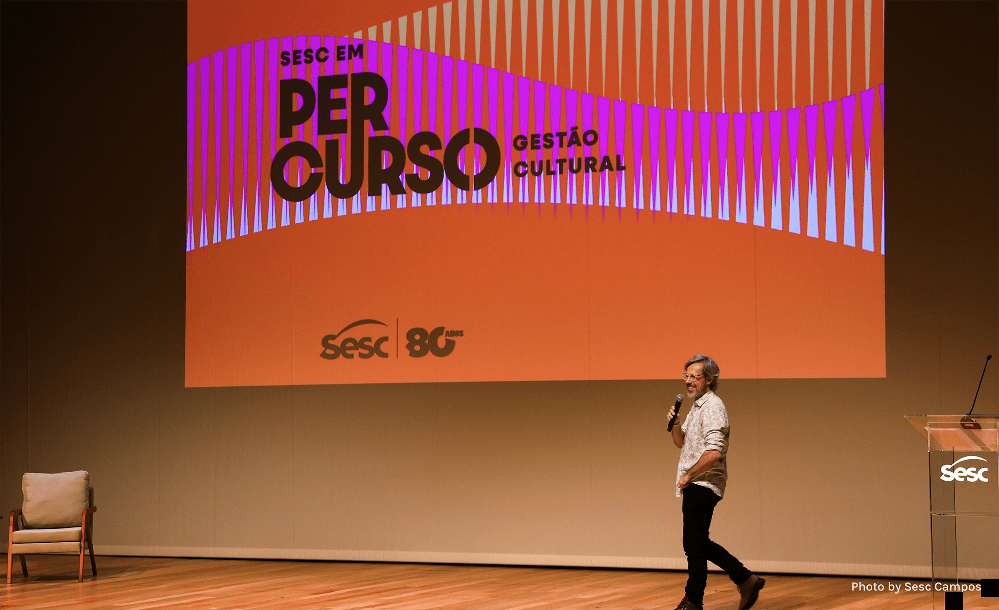
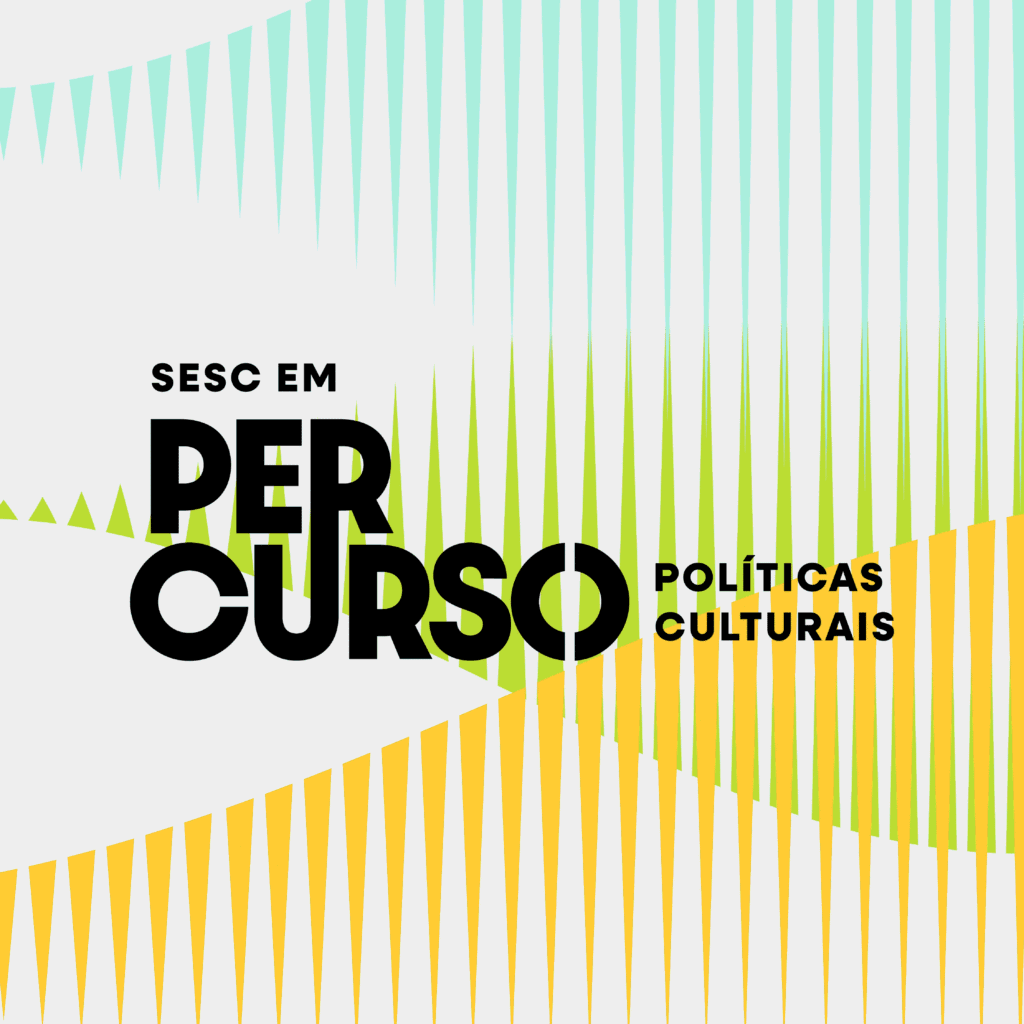
Nationally known for the cultural events and activities organized by its centers across Brazil, Sesc needed a brand and visual identity for its new technical training program focused on the organization itself, called “Sesc em Percurso” (Sesc on Route).

Our Goal with the Project
To develop the branding and visual identity for “Sesc em Percurso”, a program focused on technical courses that introduce the concepts and internal workings of Sesc.
Challenge Summary: The project’s main challenge was to devise a visual system that was dynamic, light, and youthful, striking the perfect balance between technical rigor and accessibility without appearing overly formal. Furthermore, the identity needed to be flexible and sustainable to accommodate future editions of the program covering different themes.


Strategy and Visual Identity
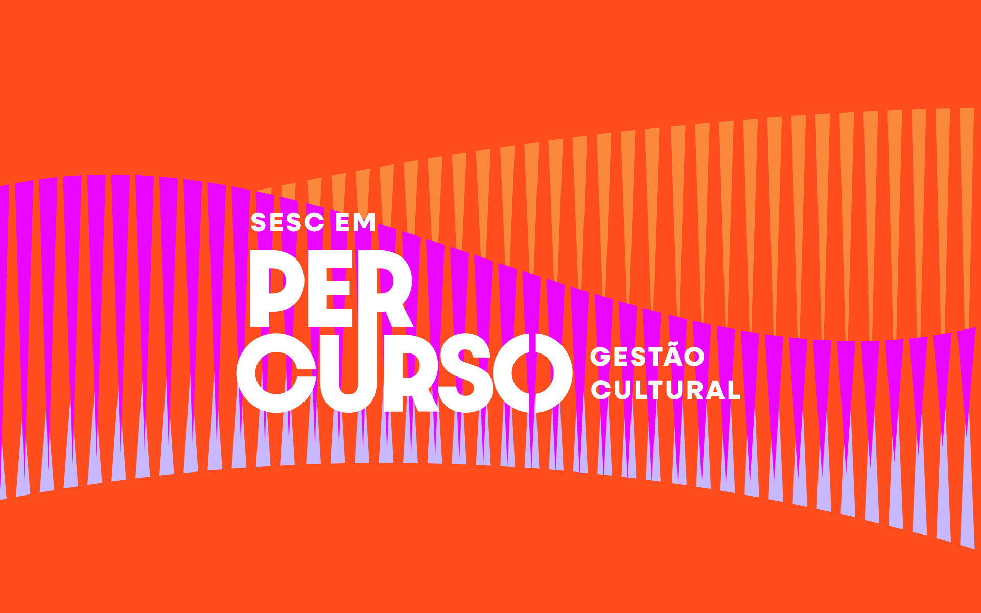
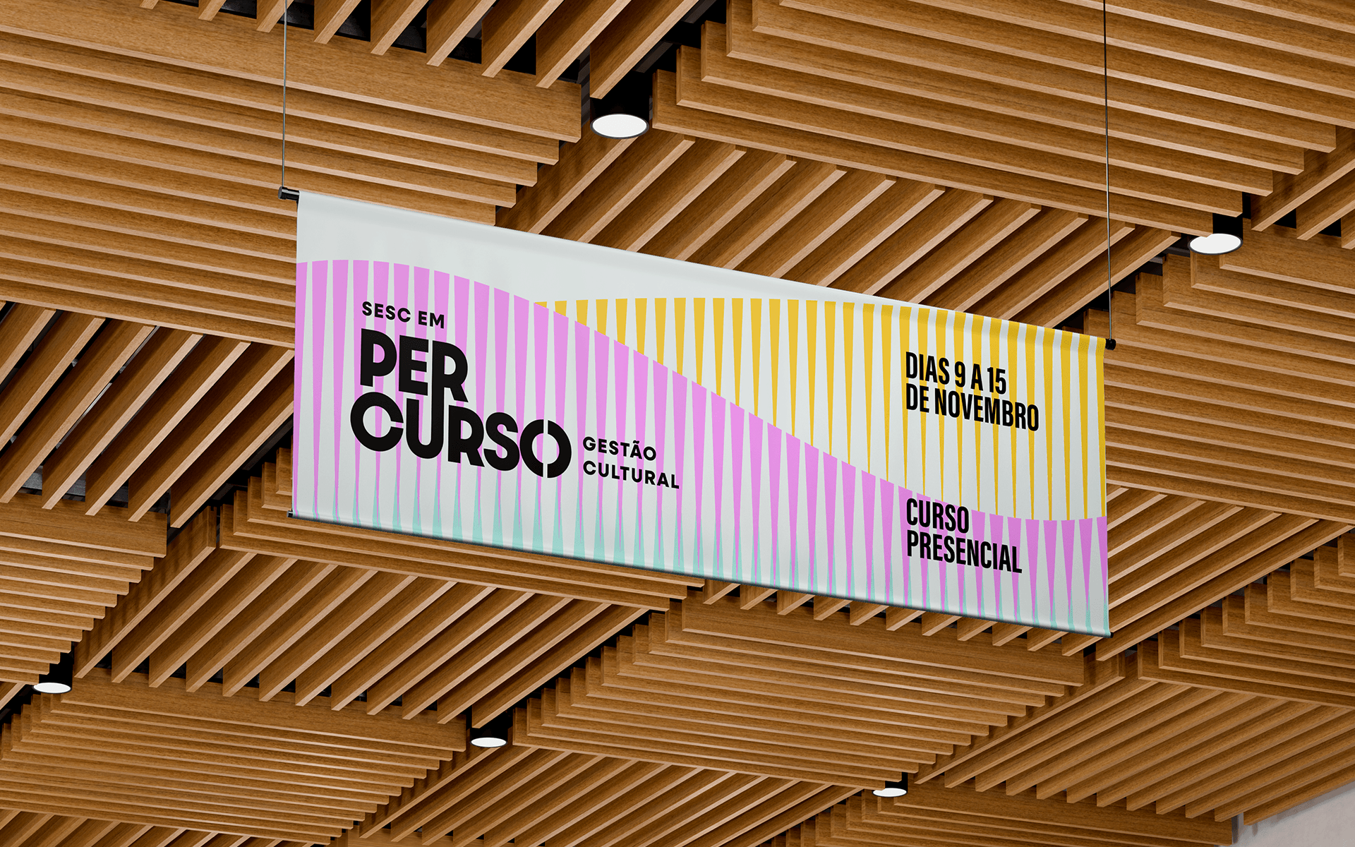
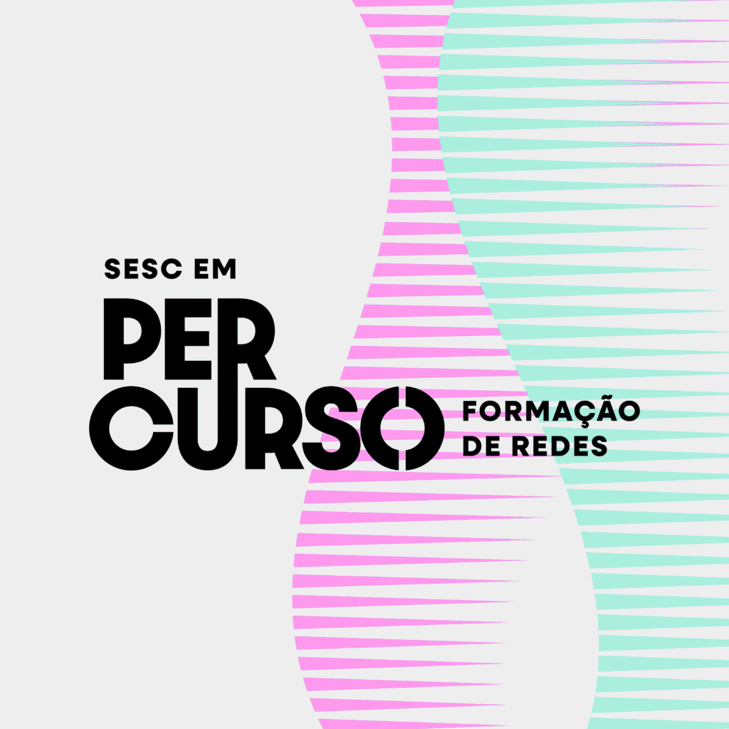
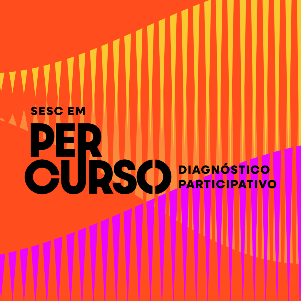
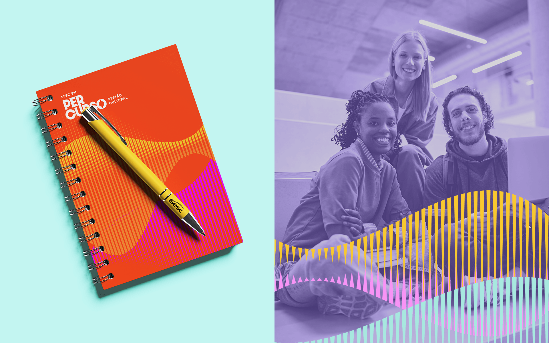
To create a visual solution that connected with the public and allowed for future developments, the strategy was based on the idea of movement, continuous learning and connection. The central concept mixes the name of the course (route) with elements that symbolize different stages of learning and intersections of moments.
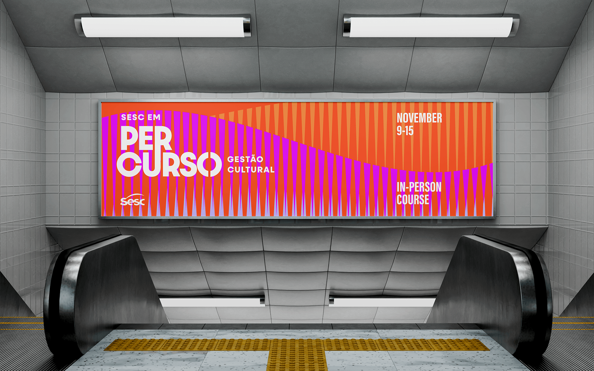
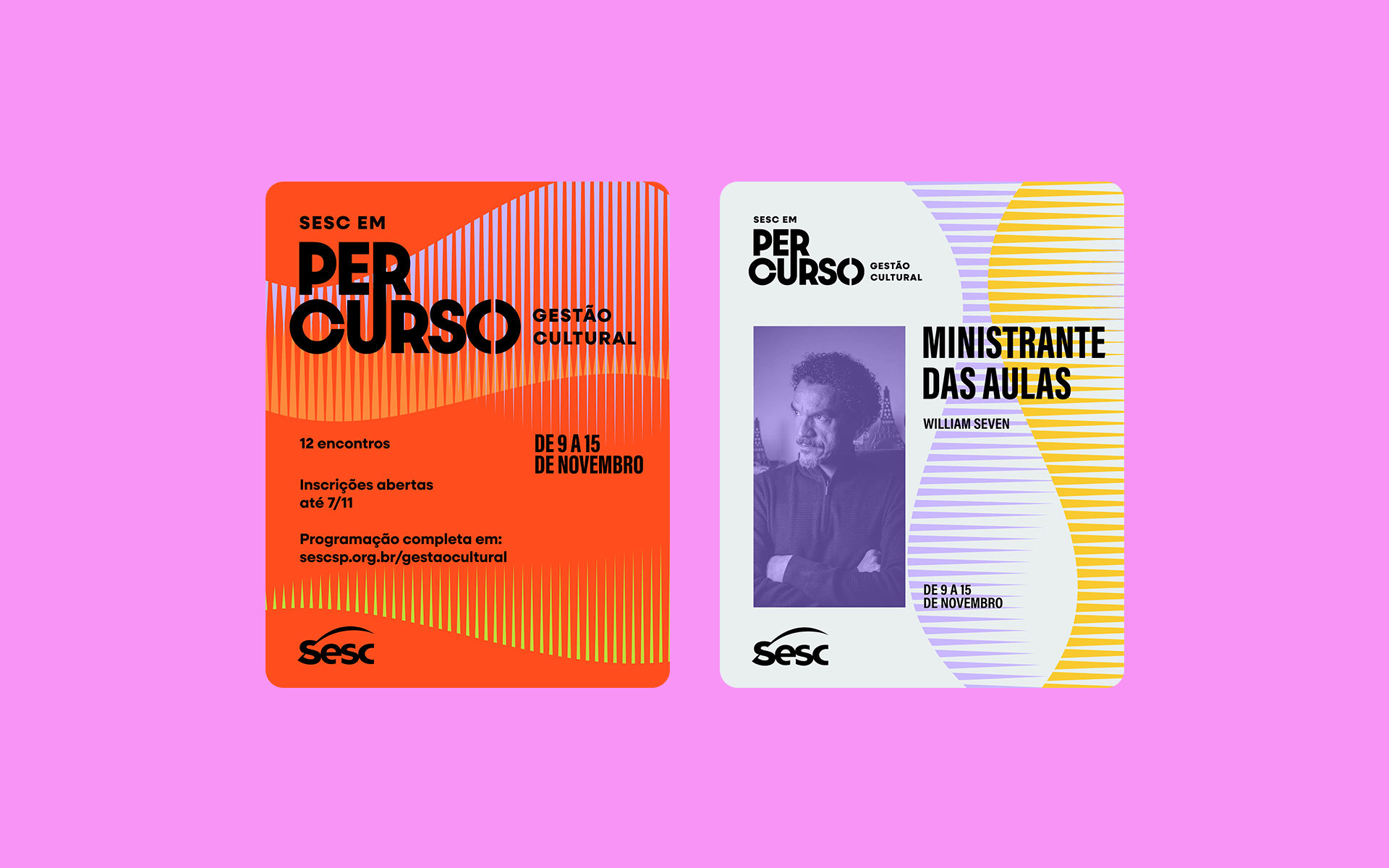
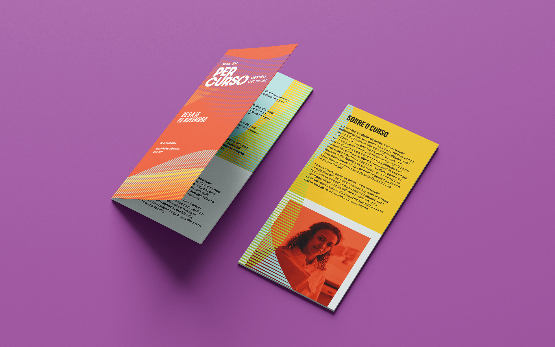
Visually, the concept is represented by colorful lines that intertwine to represent the meeting of people from different areas, levels of experience and repertoires that cross paths during the courses.
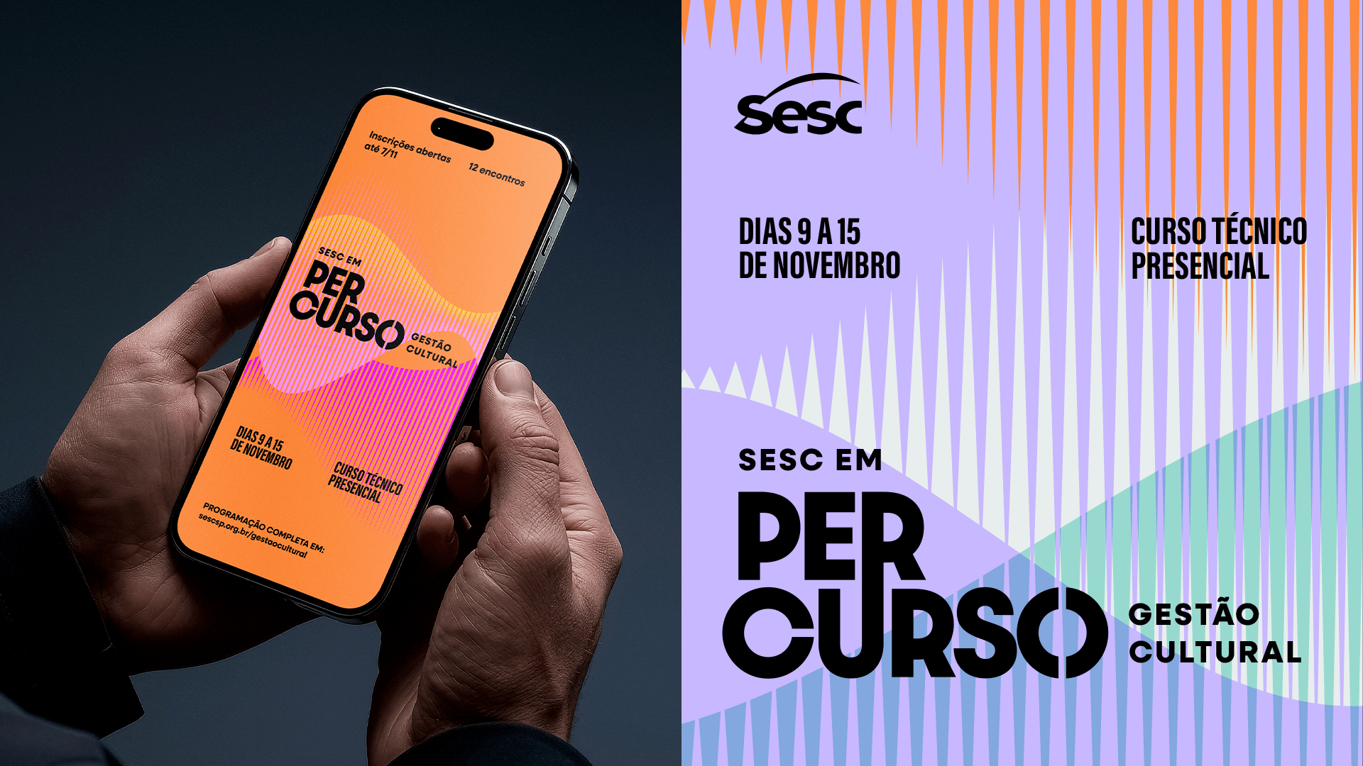
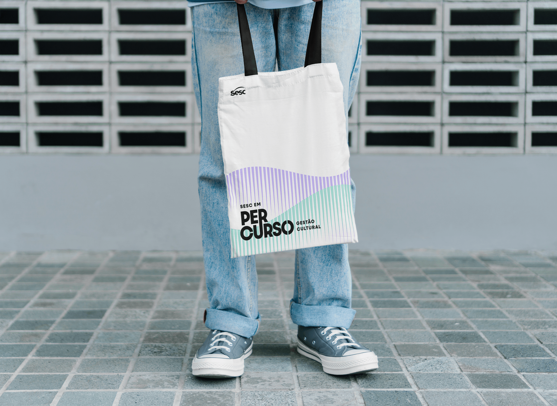
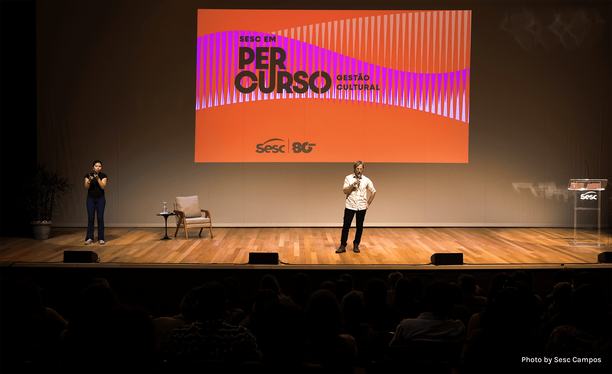
Furthermore, a modular visual logic was structured that allows the parent brand (“Sesc em Percurso”) to maintain its visual consistency while adapting easily and fluidly to new themes in future editions. The graphic system was designed to easily unfold into digital pieces, printed course materials and signage, maintaining a recognizable identity regardless of the central theme and color of each edition.

Visual Identity: Motora
Art Direction: Júlia Lago
Designers: Júlia Lago, Juniper Chloe de Oliveira, Maria Stéfanni Carvalho
Case Design: Júlia Chaves
Photography: Sesc Campos