Visual Identity for a business in Corporate Training
Skillab is a corporate training company for medium/large companies, which will operate throughout Latin America, using a methodology that already has 20 years of support in the market. Through the motto “serious play”, Skillab differentiates itself from competitors by the use of games and gamification in training, with in-company workshops.
Our goal with the project
To reposition the brand to engage directly with directors and leadership at large corporations, consolidating its image as a strategic, solid partner equipped for high-stakes corporate environments.
Challenge Summary: Convey the brand’s essence as professional, robust, committed, and enterprise-ready while maintaining the fun and lighthearted character that defines the training games.
Visual Identity
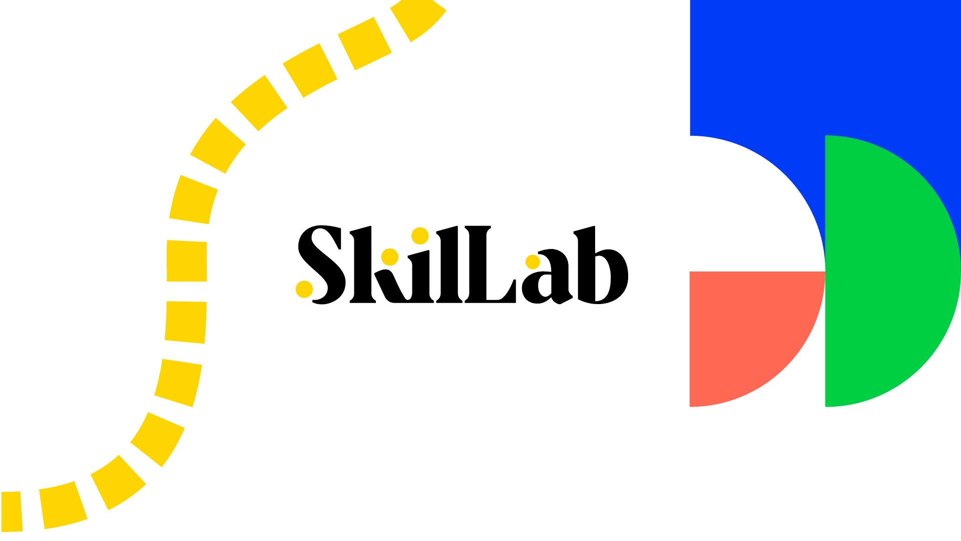
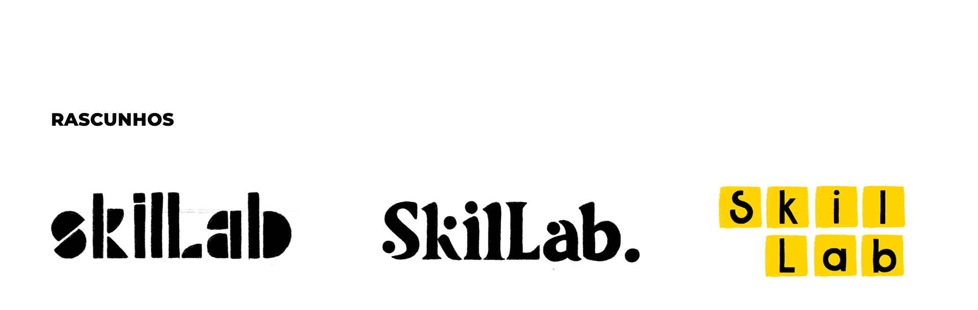
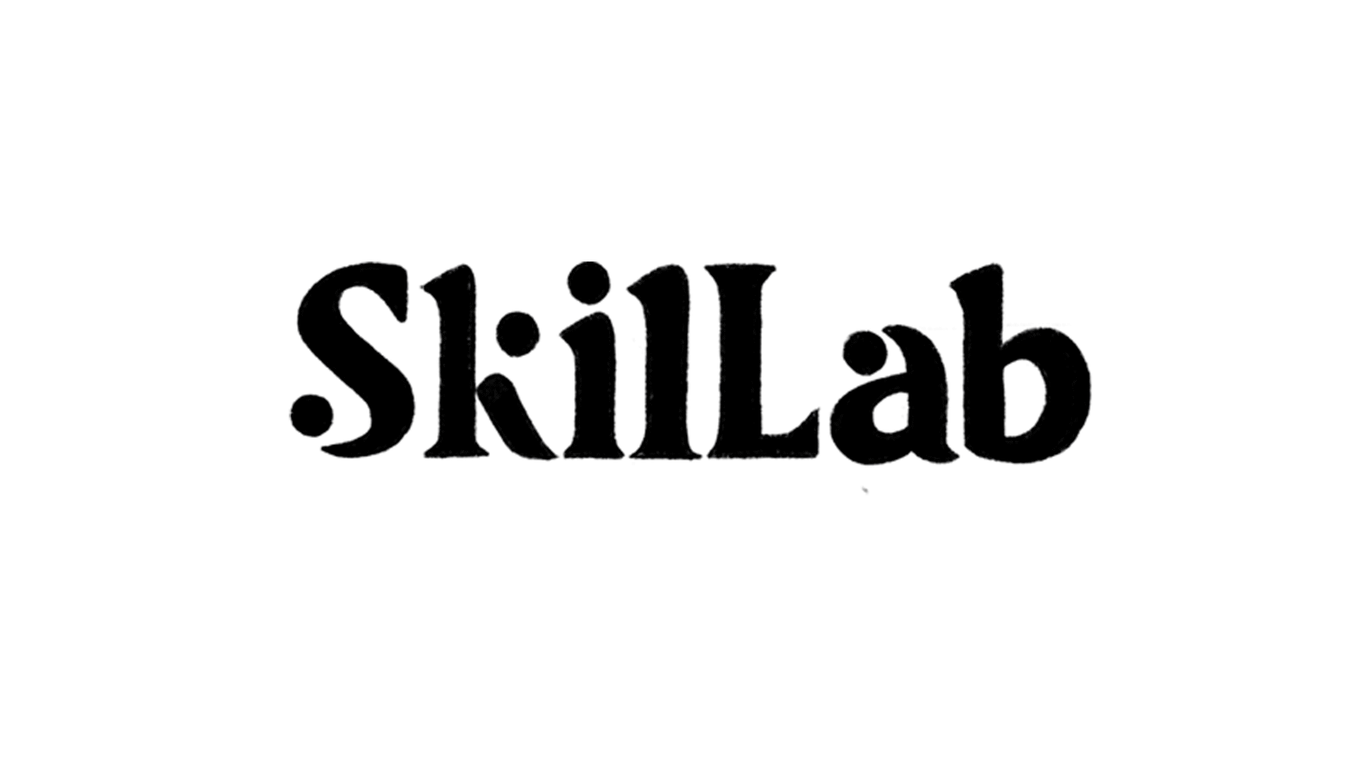
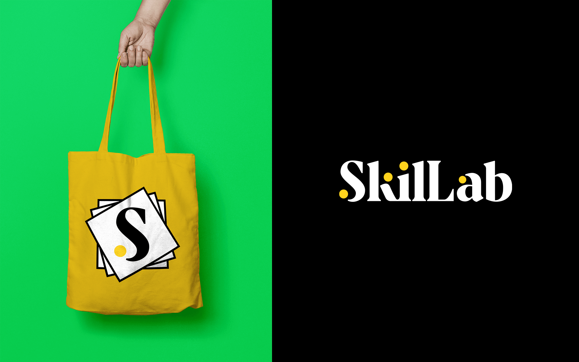
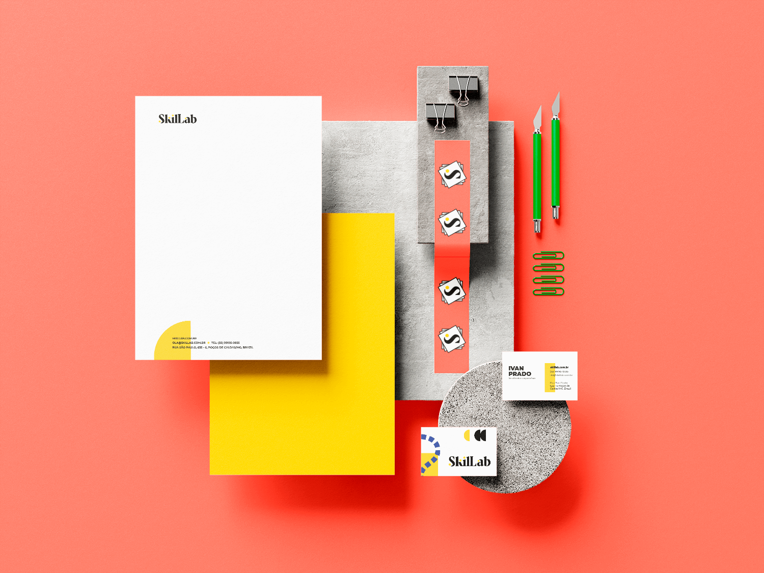
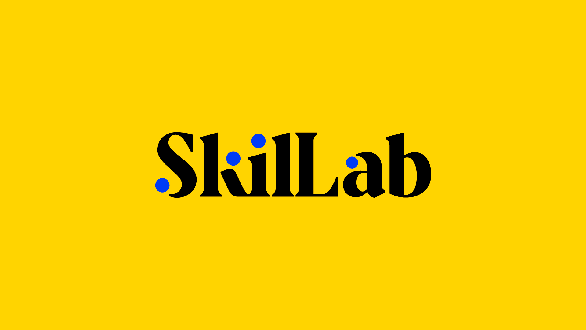
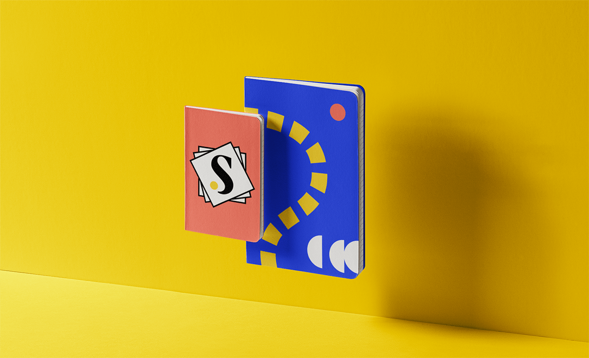
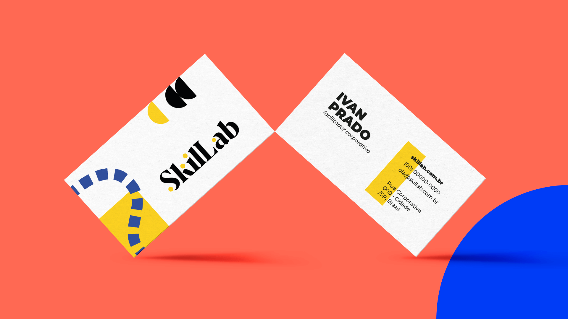
The final serif-style lettermark has a modern reinterpretation, with the dynamics of color and movement of colored circles. This combination unites ideas of fun and innovation, linked to corporate games, to a serious image, of credibility and security, consistent with the average ticket of consulting services. The monogram works as a simplified version of the logo and its design refers to the use of post-its, a sign that is very present in the daily life of this area, but little explored in the brands of competitors.
The brand’s color palette plays with the same reference as the post-its, generating a relationship between the visual identity and an imaginary of consulting and facilitation at all times. The geometric elements and trails that make up the identity are associated with the universe of board games.
Visual Identity: Motora
Art Direction: Luize Araújo.
Type Refinement: Júlia Lago. Designers: Luize Araújo, Júlia Lago and Juliana Argollo.