Branding for a stretch ceilings company
Tensoflex is a stretch ceilings company, a leader in the Brazilian market, with a vision to expand its international presence.
Motora’s challenge was to respect the company’s legacy of over 20 years, maintaining its colors and the logo’s general aesthetic, while introducing an updated, modern, and sophisticated narrative that reflected the brand’s current moment and the place it already occupies in the minds of its customers.
Strategy and Insight
Understanding, through interviews with Tensoflex’s clients, its market leadership position in both quality and innovation, we positioned the company as an expert and innovator. The line, “What could you create if there were no limits?” guides the brand manifesto and encapsulates the creative potential of working with Tensoflex by your side.
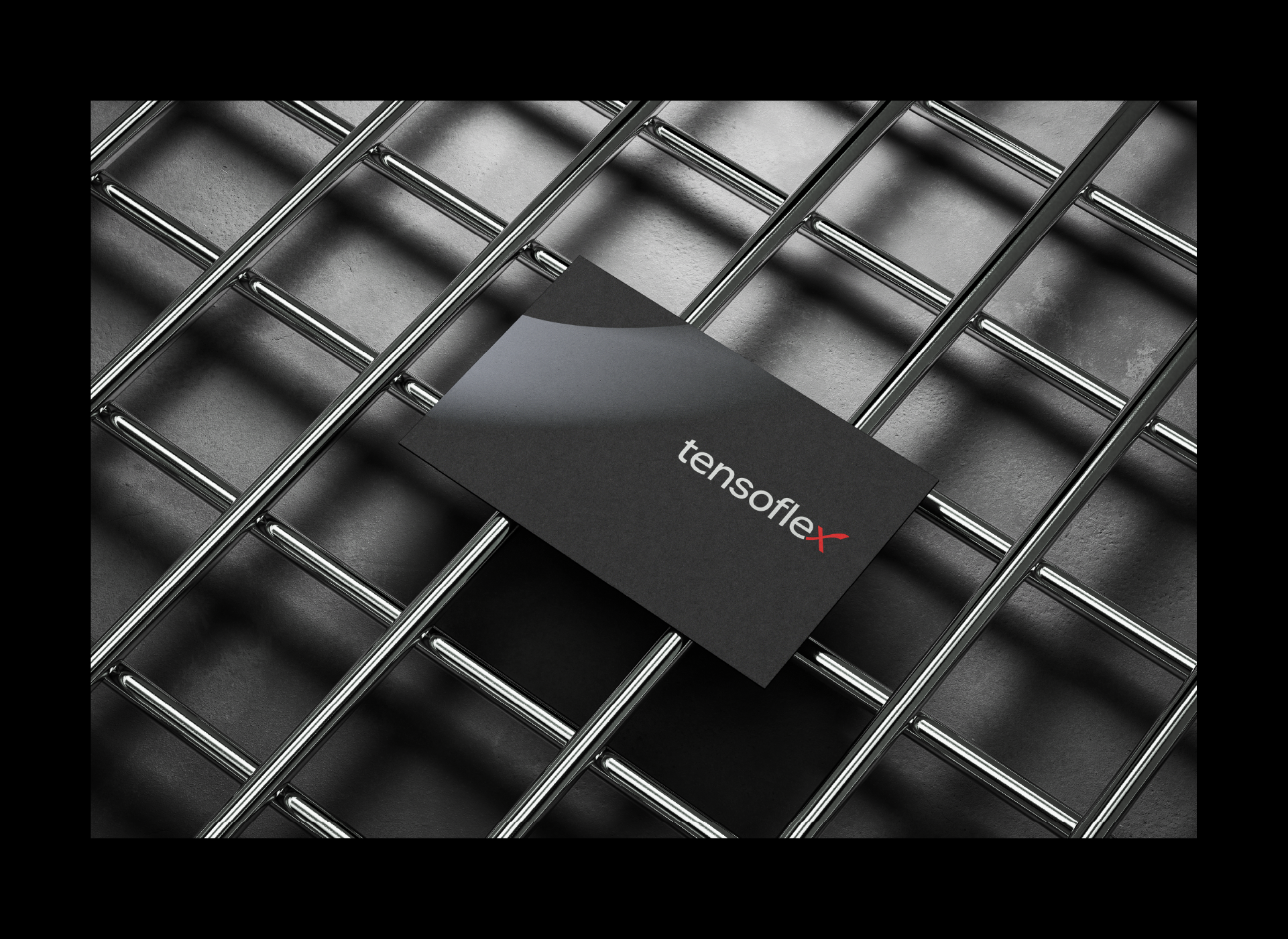
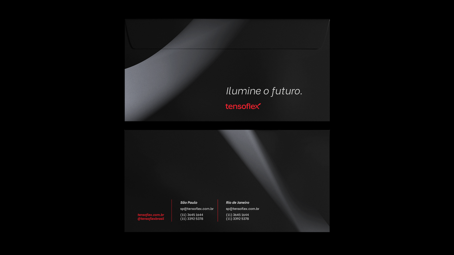
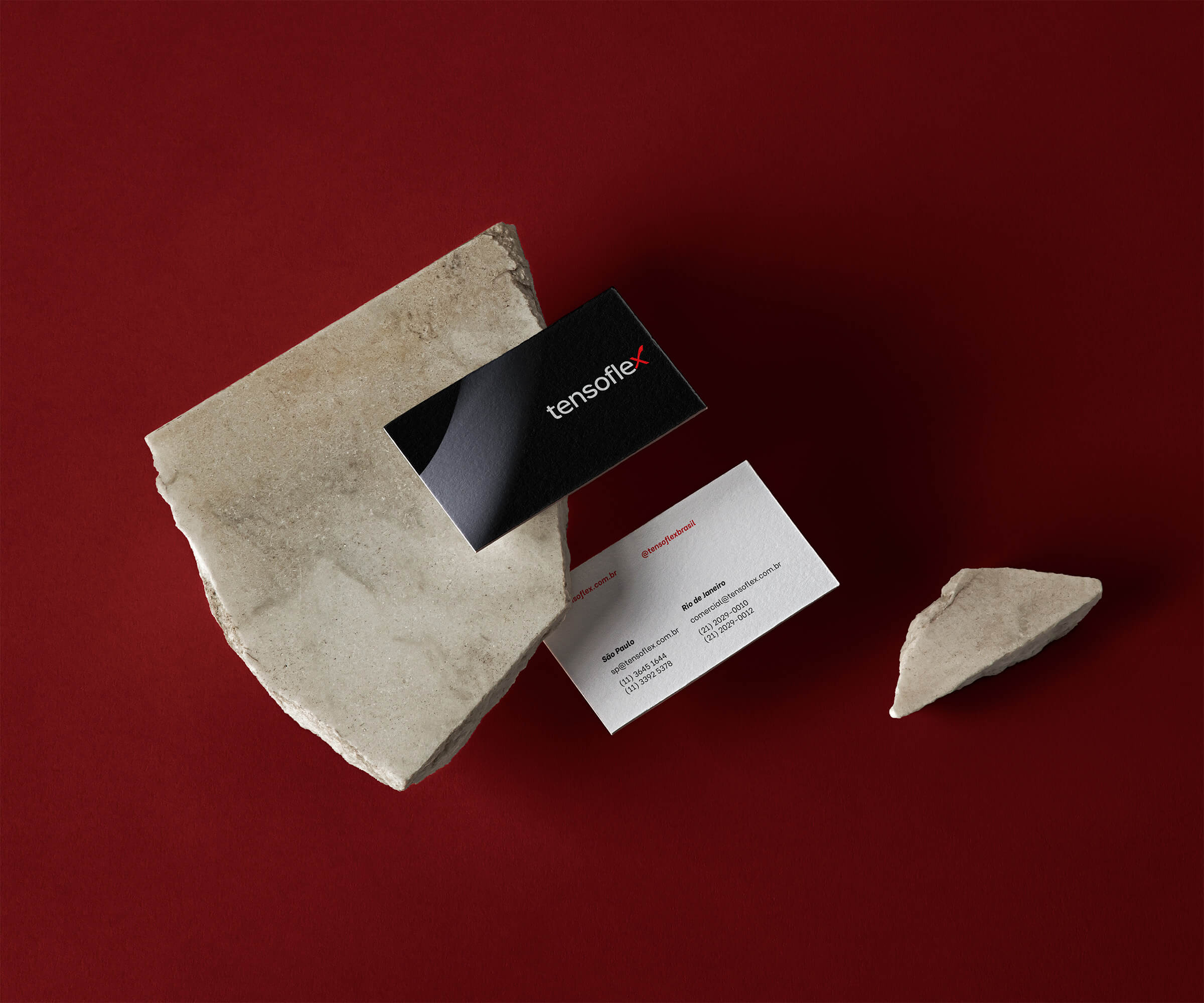
The brand developed for Tensoflex is a modernization of the previous logo, which was already established in the market. The typography is updated to a geometric style, evoking the brand’s technological concept. The curves are softer, and the overall design brings more lightness compared to the previous brand.
Its symbol, represented by the letter X in its name, is adjusted to dialogue directly with the letter “e”, having its curves redesigned to bring more fluidity and harmony.
Visual Identity
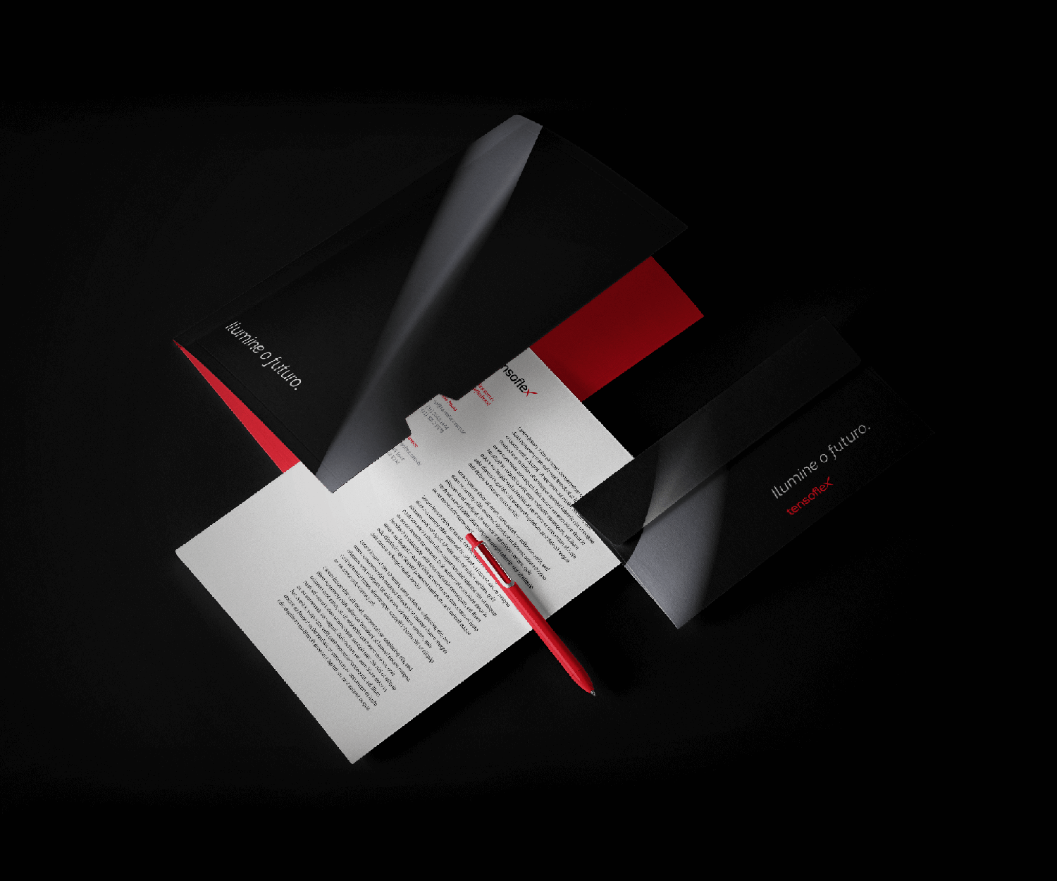
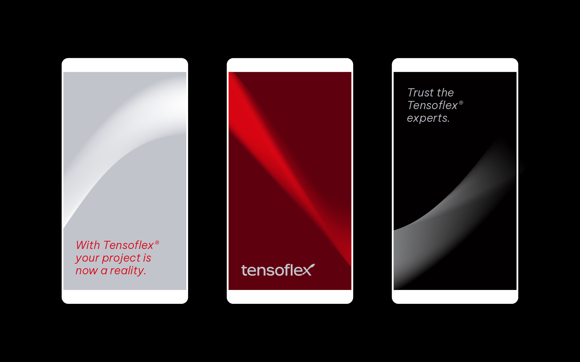
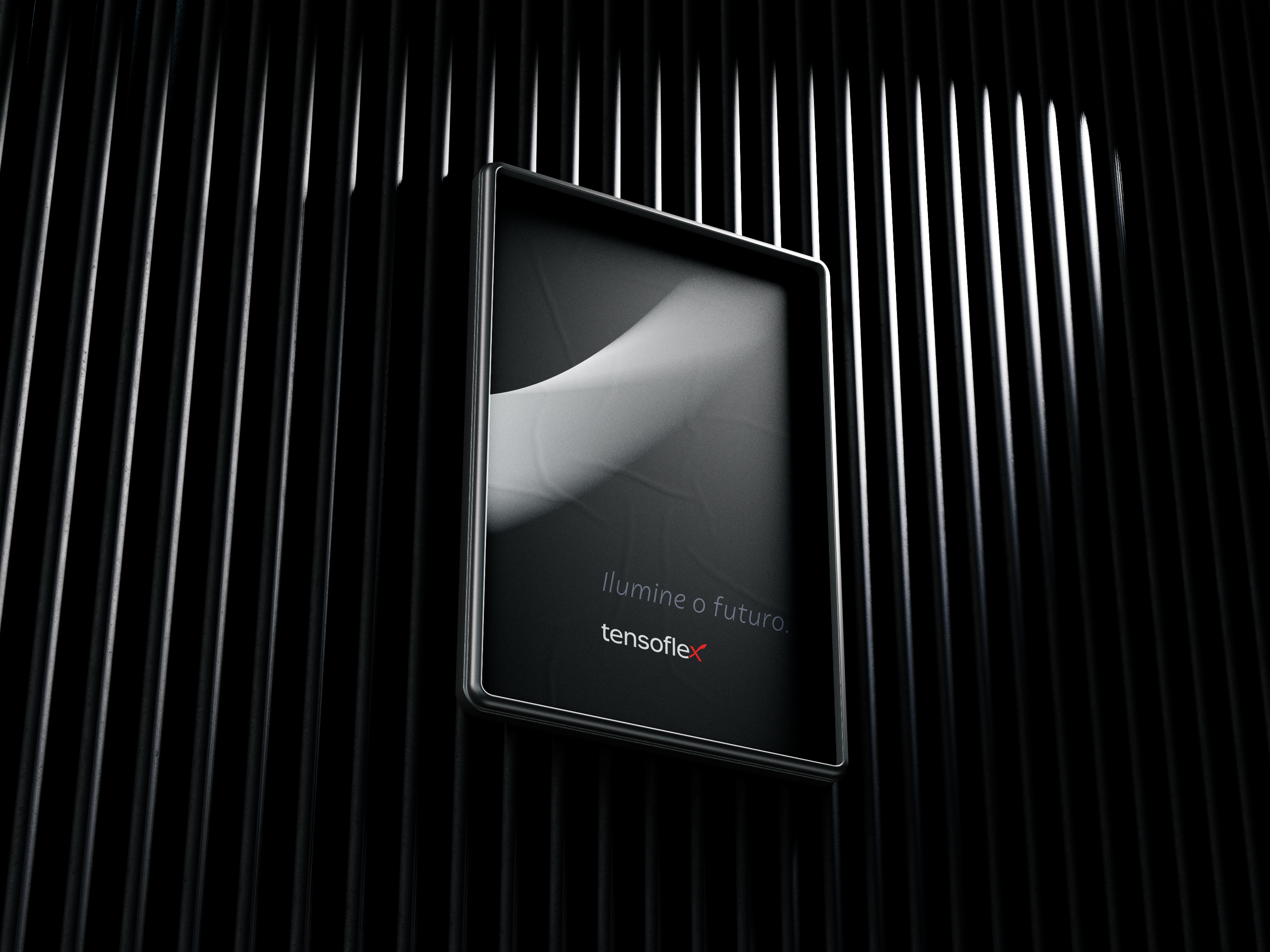
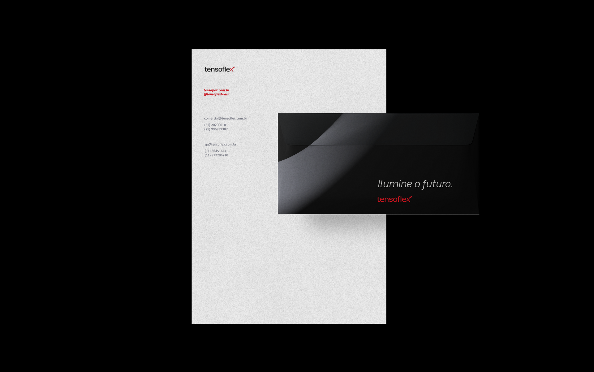
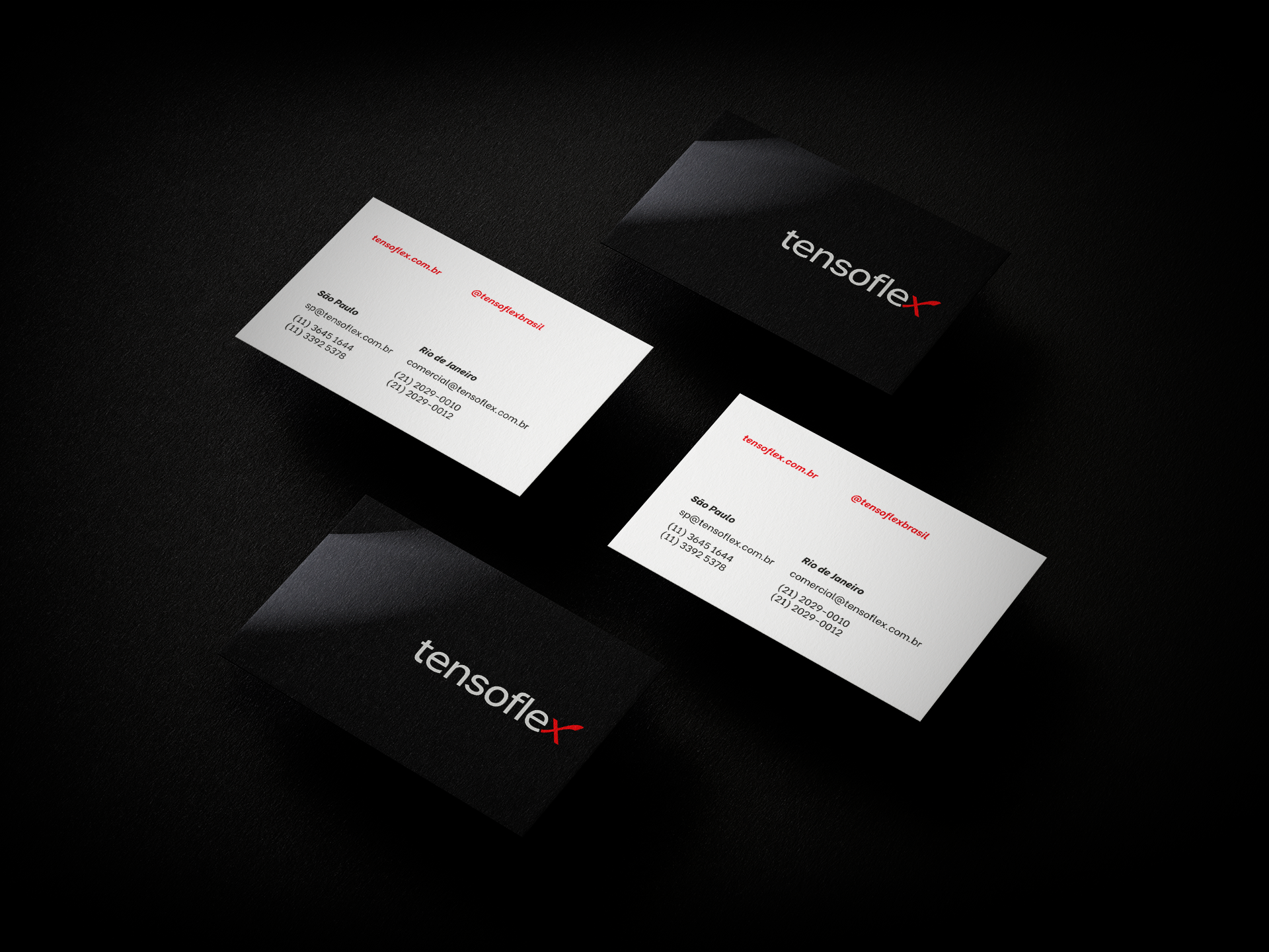
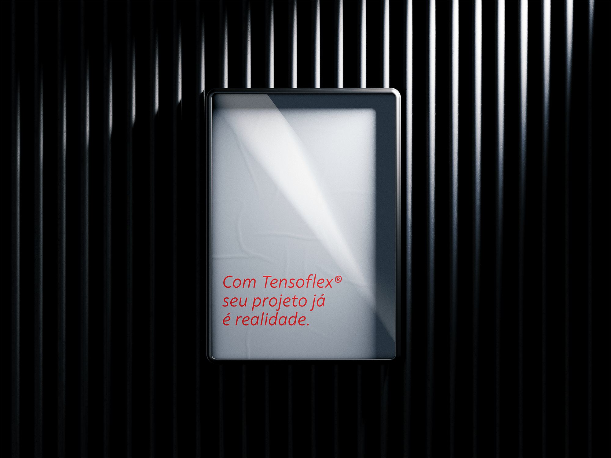
The remainder of its visual identity reinforces Tensoflex’s sophisticated positioning: the sober colors convey seriousness, while the fluid and gradient graphics evoke modernity.
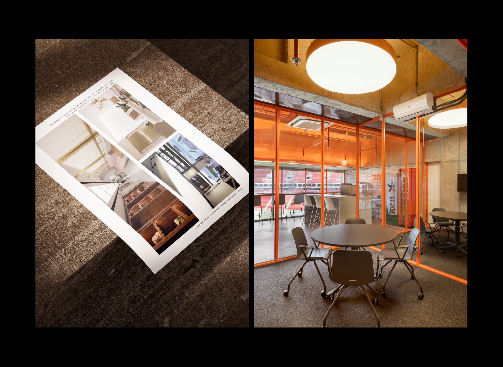
The clean layouts create space for the product photos to take center stage, showcasing all the possibilities that Tensoflex brings to architectural projects.
Type Refinement: Juliana Argollo, Júlia Lago
