Lampião da Esquina: Design as a Tool for Pride, Memory and Queer Resistance
Before the rainbow became a symbol of pride, there was already a Lampião shining on the corner
Today, when June arrives, brands of every size dress their communications in rainbow colors. Some do it with real commitment. Others do it simply to avoid being left out of the conversation. But long before LGBTQIAPN+ Pride Month became part of the institutional calendar, there were people fighting for the most basic right of all: the right to exist publicly.
Understanding this history matters because every brand, even when it is not speaking directly about diversity, carries a powerful responsibility in the way it communicates.
Communication helps shape the collective imagination. It influences who is seen as belonging, who is welcomed and who is allowed to occupy certain spaces.
When a social group is left out of communication materials, whether consciously or not, people are pushed to the margins. They are excluded from visibility, from recognition and, often, from access.
It was in this context that resistance movements such as Lampião da Esquina emerged. Launched in April 1978, during Brazil’s civil-military dictatorship, the newspaper circulated until 1981 and became one of the most important landmarks in the history of LGBTQIAPN+ press in Brazil. According to the Centro de Documentação Prof. Dr. Luiz Mott, CEDOC LGBTI+, Lampião was the first nationally circulated newspaper made “by” and “for” homosexuals in the country.
But to reduce Lampião to a newspaper “about homosexuality” would be far too little. It was also a language project, a piece of political design and a graphic artifact that confronted the conservative morality of its time not only through what it said, but through the way it presented itself.
A newspaper that stepped out of the ghetto
In late-1970s Brazil, the idea of an LGBTQIAPN+ community as we understand it today did not yet exist. What was beginning to take shape was the Brazilian Homosexual Movement, in a context marked by censorship, police persecution, the pathologization of homosexuality and media representations that were almost always caricatural, derogatory or violent.
It was in this setting that, inspired by a visit to Brazil from Winston Leyland, editor of one of the most relevant publications of the homosexual movement in the United States, a group of openly homosexual journalists began the conversations that would lead to the creation of Lampião da Esquina.
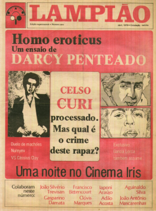
Issue 00, still considered experimental, introduced the newspaper’s editorial board: Adão Acosta, Aguinaldo Silva, Antônio Chrysóstomo, Clóvis Marques, Francisco Bittencourt, Gasparino Damata, João Antônio Mascarenhas, painter Darcy Penteado, film critic Jean-Claude Bernardet, writer and filmmaker João Silvério Trevisan and anthropologist Peter Fry.
That same issue also presented the newspaper’s manifesto-editorial, titled “Saindo do Gueto” (“Coming Out of the Ghetto.”) It told readers that the paper’s goal was to destroy the standard image of the homosexual as someone condemned to shadow, shame or unhappiness. Its proposal was simple and radical: to occupy the newsstands and speak about politics, culture, sexuality, violence, pleasure and everyday life from a perspective that had, until then, almost always been silenced.
In many ways, Lampião was doing what today we might call brand positioning. It clearly defined who it wanted to represent, which conversations it intended to provoke and what worldview it stood for.
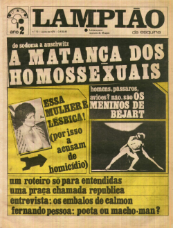
This positioning was also present in the name itself. “Lampião” means lamp or lantern: something that lights up, reveals, makes visible. But the name also carried a provocation. The newspaper’s graphic mark referred to the hat worn by cangaceiros, figures historically associated with virility and masculine bravado in Brazilian culture. Lampião took that symbol and subverted it from within, challenging the very imagery of Brazilian masculinity.
Judge it by its cover: the design that confronted the dictatorship
Unlike the familiar saying that tells us not to judge a book by its cover, Lampião da Esquina invited readers to do exactly the opposite. In that context, design became a tool of confrontation: a visual summons that forced readers, from the very first glance, to judge the silence and oppression of the period.
The covers, manually laid out by Aguinaldo Silva and Adão Acosta, two of the newspaper’s founders and, in practice, designers, even if they did not carry that title at the time — were especially important because the paper was not only selling information. It was offering recognition.
And this conversation remains relevant today.
If mainstream media still pushes dissident bodies, desires and identities into invisibility, then the simple act of placing certain issues on the agenda is already political. Whether in advertising campaigns, catalogs, packaging, websites or social media, design helps define what can be seen as normal, desirable or possible by repeatedly showing some representations and excluding others.
Lampião da Esquina broke that cycle by taking on the responsibility of illustrating existence. By choosing which faces and bodies to highlight, the newspaper did more than denounce violence. It disputed the public imagination, offering references for possible, healthy lives that society at the time tried to erase.
Typography, collage and photography on the covers of Lampião
Looking at the covers of Lampião, typography appears as another gesture of resistance. Journalistic seriousness was constantly subverted by a design that refused stability. Heavy weights and uppercase letters were not simply tools for visual hierarchy; they were deliberate tactics to capture attention amid the visual noise of the newsstands.
The design was not afraid of experimentation. Graphic interventions, ornaments, dynamic alignments and words in varying weights created a rhythm that resisted any attempt at a domesticated or overly clean aesthetic, so common in the traditional press.
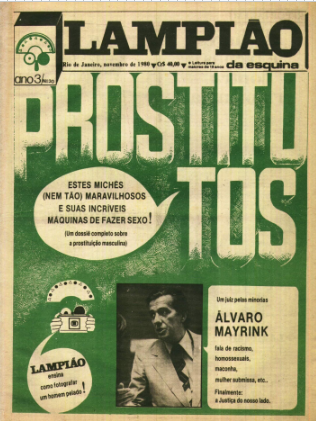
In issue no. 30, the word “PROSTITUTOS” (“male prostitutes”) appears prominently over a textured background, in direct dialogue with the photograph of Álvaro Mayrink. By placing the headline next to the image of a judicial authority, a symbol of power and virility, the design exposes the hypocrisy of a structure that judges and marginalizes certain subjects while being crossed by the very same contradictions.
Lampião built a voice of its own. It did not follow a strategic brand manual, but it was forged in the urgency of being heard. The arrangement of elements changed from one issue to the next, but there was a clear recurrence of proximity and connection.
On one side, typography leapt from the page, using direct and forceful words such as “slaughter,” “homosexuals” and “bichas”, a reclaimed and confrontational term in Brazilian Portuguese, to grab the reader’s attention and name the urgencies of the time. On the other, photography chose the human. Portraits were often framed from the waist up, focused on facial expression and intimate environments.
Together, these elements created a powerful balance: while the headlines shouted and demanded attention, the portraits brought the naturalness of existence, humanizing resistance.
Representing without reducing
One of the most interesting aspects of Lampião’s covers is that they did not limit themselves to denouncing violence. The newspaper did report persecution, murders and prejudice. But its covers also insisted on showing creation, humor, pleasure, collective organization and possible ways of living.
From the perspective of design and representation, this choice is fundamental. Instead of showing only violated bodies, Lampião created images of presence. It became a meeting place: a space where politics was discussed with the same urgency as pleasure and everyday life, proving that existence itself was an act of rebellion.
This is an important lesson for any company that wants to address diversity. Representing social groups only through their pain reinforces stereotypes just as much as ignoring them does. Showing complexity is also a form of respect.
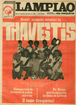
Issue no. 32 is a good example. Its cover brings together eleven travestis, a dog and a football, forming a team. The image presented travestis through a register that was unusual in the press of that time: one of coexistence, affection and everyday life.
An intersectional graphic project
Although Lampião was created by an editorial board made up of gay men, the newspaper opened space for issues that went beyond male homosexuality. Its covers addressed feminism, abortion, racism, the Black movement, amnesty, workers, travestis, lesbian identity, the Church, male prostitution, state violence and culture.
This does not mean the newspaper was free from contradictions. Quite the opposite: part of its importance lies precisely in the way it reveals the tensions of a movement still in formation. But visually, Lampião was already rehearsing something we might today call a more intersectional form of communication. It understood that sexuality, race, gender, class, religion and politics did not belong in separate drawers.
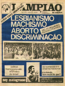
On the April 1979 cover, for example, words such as “lesbianism,” “machismo,” “abortion” and “discrimination” appear in large letters, creating a graphic surface of confrontation. The covers were not trying to be beautiful in the conventional sense of the word. They wanted to be seen.
What can today’s design learn from Lampião?
Lampião da Esquina is part of Brazilian LGBTQIAPN+ memory, but it is also part of the country’s graphic memory. Its covers show that design is not only about aesthetics, trends or composition.
The impact of those publications lies not only in the fact that they showed LGBTQIAPN+ people, but in how they showed them. When certain bodies appear repeatedly associated with violence, scandal or marginality, those associations begin to seem natural. When they appear in situations of affection, friendship, work or celebration, other ways of existing also become imaginable.
For brands, studios and creative professionals, revisiting Lampião is an important invitation. Not to turn its history into an empty aesthetic reference, but to remember that visibility has always been a dispute.
This means that positioning does not happen only in manifestos or seasonal campaigns. It also appears in the images selected for a website, in the stories that are given prominence and in the audiences that are consistently represented, or consistently forgotten.
After all, not every brand needs to take a stand on every cause. But every brand makes choices about who it represents, who it invites into the conversation and which values it reinforces over time.
Before any colorful campaign, there were censored newspapers, persecuted bodies, editors under surveillance, readers searching for recognition in printed pages and covers that had to shout in order to cut through the silence.
Lampião da Esquina reminds us that graphic choices are never neutral. And sometimes, a cover is more than a cover: it is a way of saying, “We are here.”
Skipped straight to the end? Here is the recap
What was Lampião da Esquina?
Lampião da Esquina was a Brazilian newspaper launched in 1978, during the civil-military dictatorship. It became a landmark in the country’s LGBTQIAPN+ press by addressing politics, culture, sexuality, violence and rights from a homosexual perspective. Beyond its historical relevance, Lampião also stood out for using graphic, editorial and visual resources to dispute narratives and create new forms of representation.
Why is Lampião da Esquina important to LGBTQIAPN+ history in Brazil?
Because it expanded the ways LGBTQIAPN+ people could be represented at a time when the media frequently associated them with marginality or scandal. By presenting other possible portraits of those lives, the newspaper helped transform the social imagination around this population.
What do the covers of Lampião da Esquina teach us about design?
They show that design is much more than an aesthetic matter. The choice of images, words, visual hierarchies and narratives influences the way people, groups and issues are perceived. For brands and organizations, this means that every piece of communication also helps build meaning and shape perceptions of the world.
What can companies learn from Lampião da Esquina?
The newspaper shows that communication does not only inform. It also builds perceptions and strengthens positioning, even through the most subtle decisions. An organization’s visual and narrative choices communicate values before any institutional statement does.
Does a brand need to take a stand on social causes?
Not necessarily on every cause. But not taking a position is also a position. Every brand makes choices about who it represents, which stories it tells and which values it reinforces through its communication. Even without making explicit statements about diversity, the decision not to take a stand already sends a message to the public.
Text produced by Motora based on documentary research on the newspaper Lampião da Esquina, with the support of academic sources and public archives.
Authors: Lígia Évora and Luana Petter
Sources consulted
CEDOC LGBTI+ — Centro de Documentação Prof. Dr. Luiz Mott, acervo digital dedicado à memória e à história da população LGBTI+ no Brasil.
LAMPIÃO DA ESQUINA. Direção de Lívia Perez e Noel Carvalho. Brasil: Doctela, 2016. Documentário, 80 min.
MACRAE, E. O jornal Lampião da Esquina. In: A construção da igualdade-política e identidade homossexual no Brasil da “abertura” [online]. Salvador: EDUFBA, 2018, pp. 137-164. ISBN 978-85- 232-1998-7. https://doi.org/10.7476/9788523219987.0011.
QUINALHA, Renan. Lampião da Esquina na mira da ditadura hetero-militar de 1964. Cadernos Pagu, Campinas, n. 61, e216104, 2021.