Indemil is a Brazilian company specialized in solutions for industrial ingredients with the purpose of nourishing the world’s growth. Since its foundation in 1984, Indemil has become one of the country’s leading corn processors and a reference in the cassava derivatives market.
Our goal with the project
To rebrand and reposition Indemil so that it could communicate its scale and productivity capacity as a company. They were already one of the main corn-processing businessess in Brazil but their brand didn’t reflect their capability.
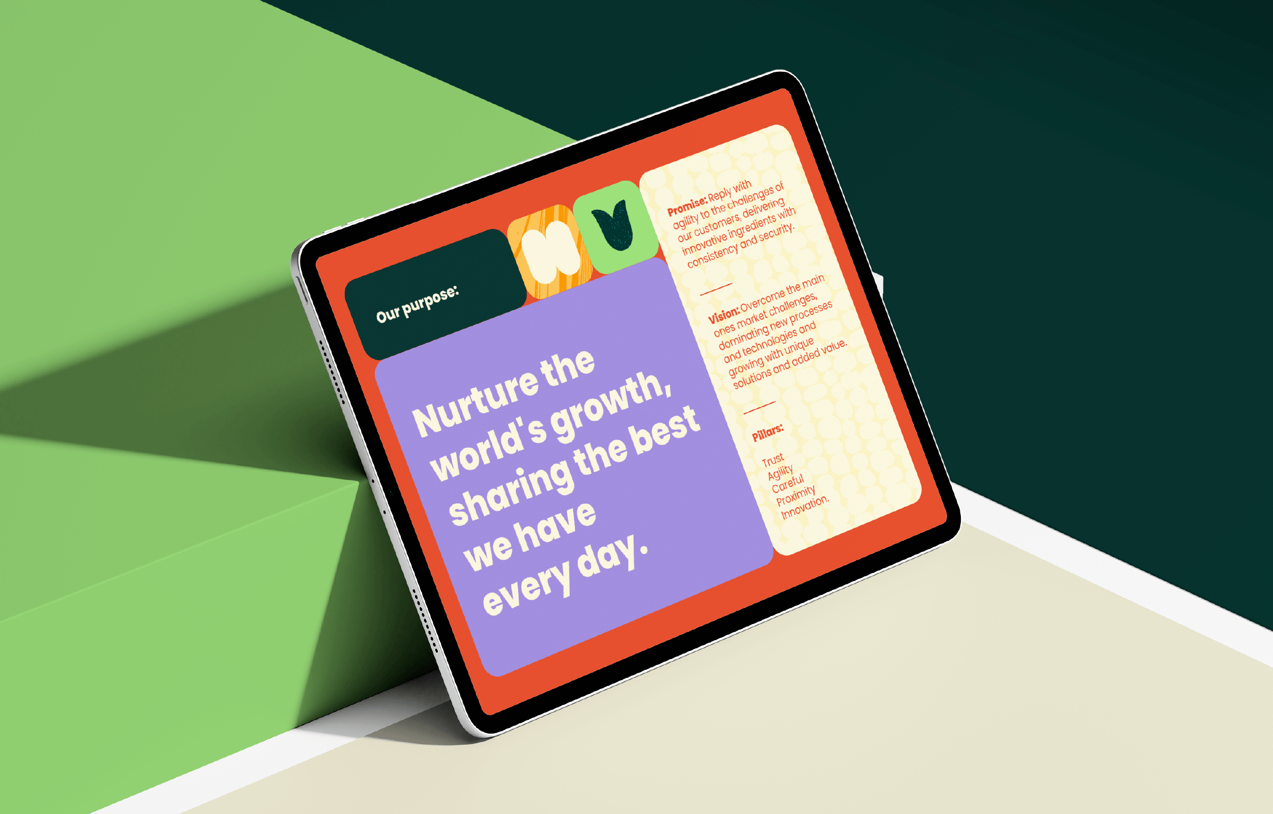
Challenge Summary: How to build a brand that conveyed robustness and credibility, and still being able to generate emotional connections? How to ensure flexibility for Indemil to relate to both the food industry and customers?
Insight and Strategy
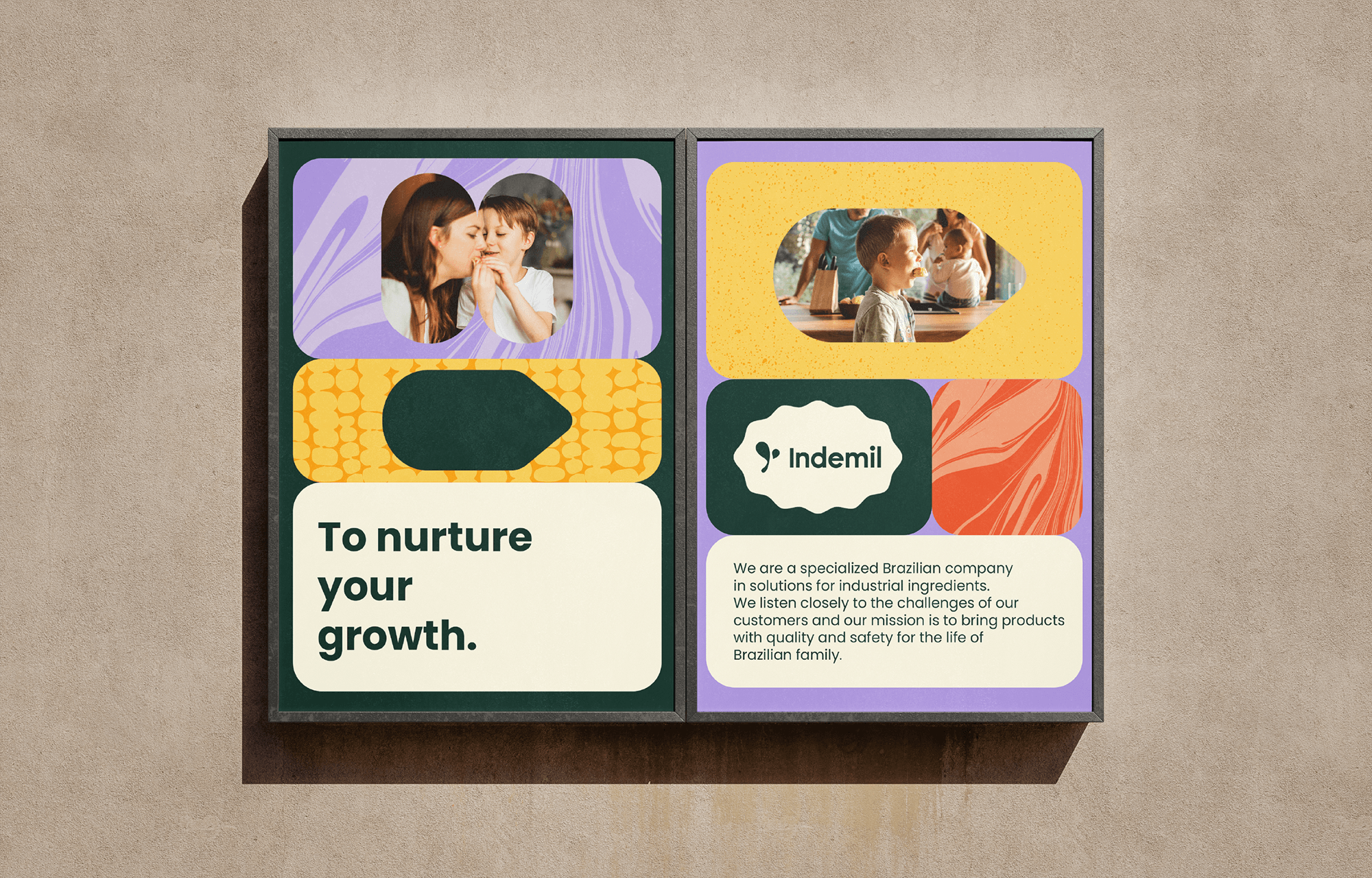
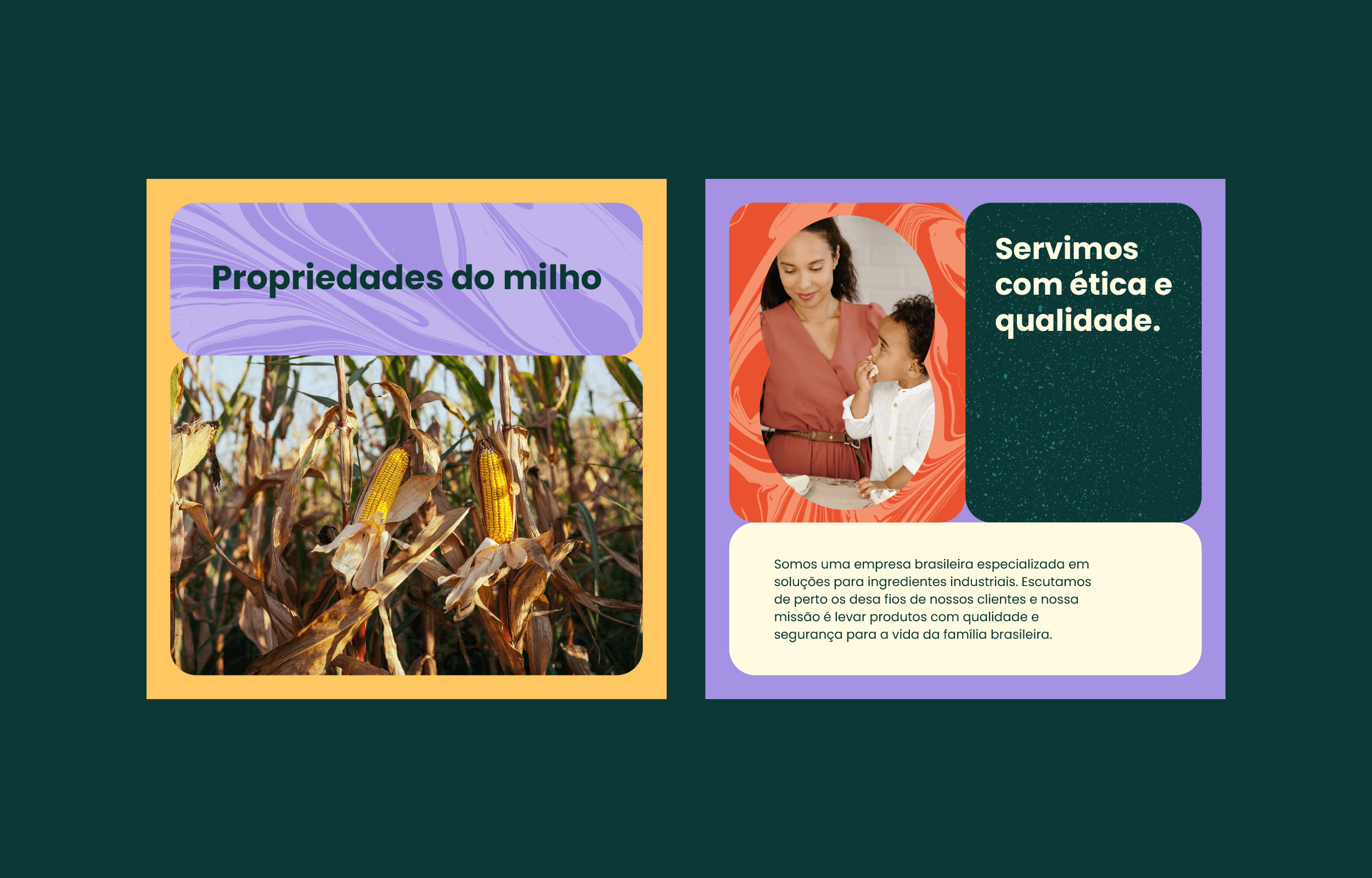
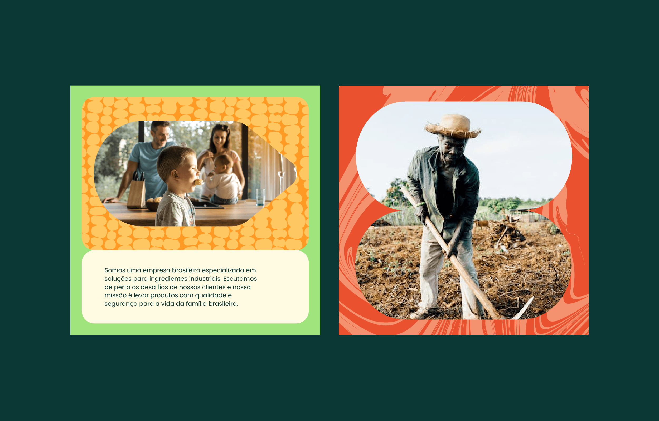
Bringing quality products safely to the Brazilian family’s table. That was the strategic starting point of our creation. Based on this positioning, we built an emotional language capable of establishing a strong emotional connection with the audience and distancing Indemil’s image from any negative connotations associated with a large industry.
Verbal Identity
All of Indemil’s verbal expression remains in the realm of protection, support, and responsibility, highlighting a commitment to quality, safety, and agility.
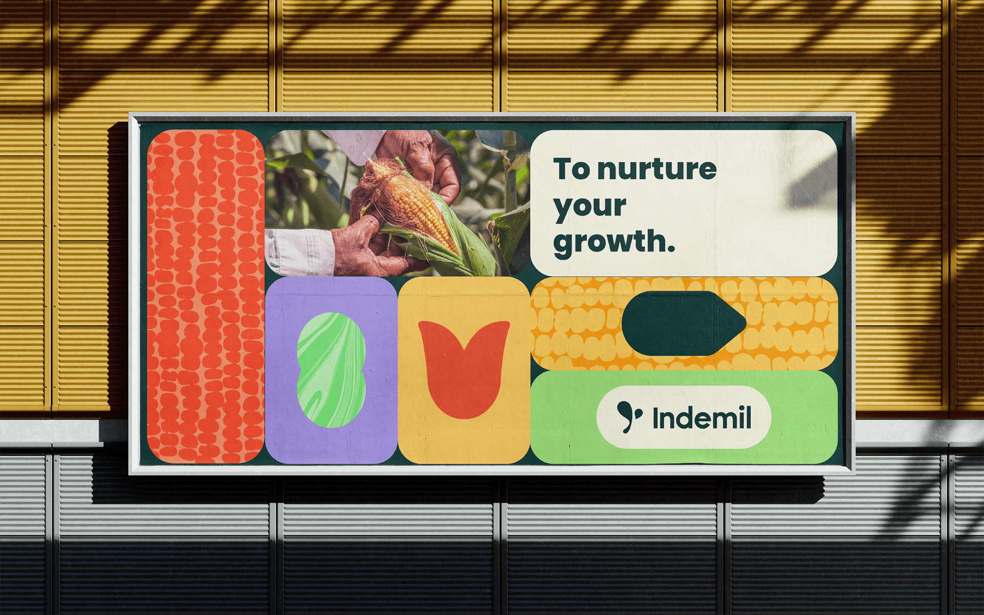
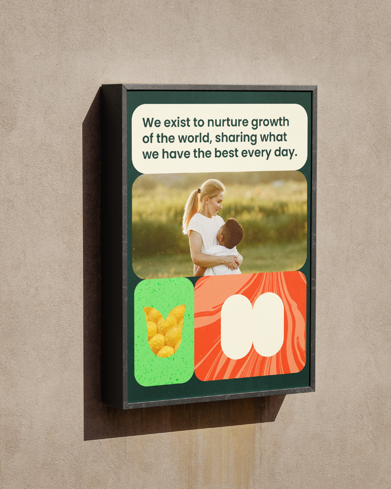
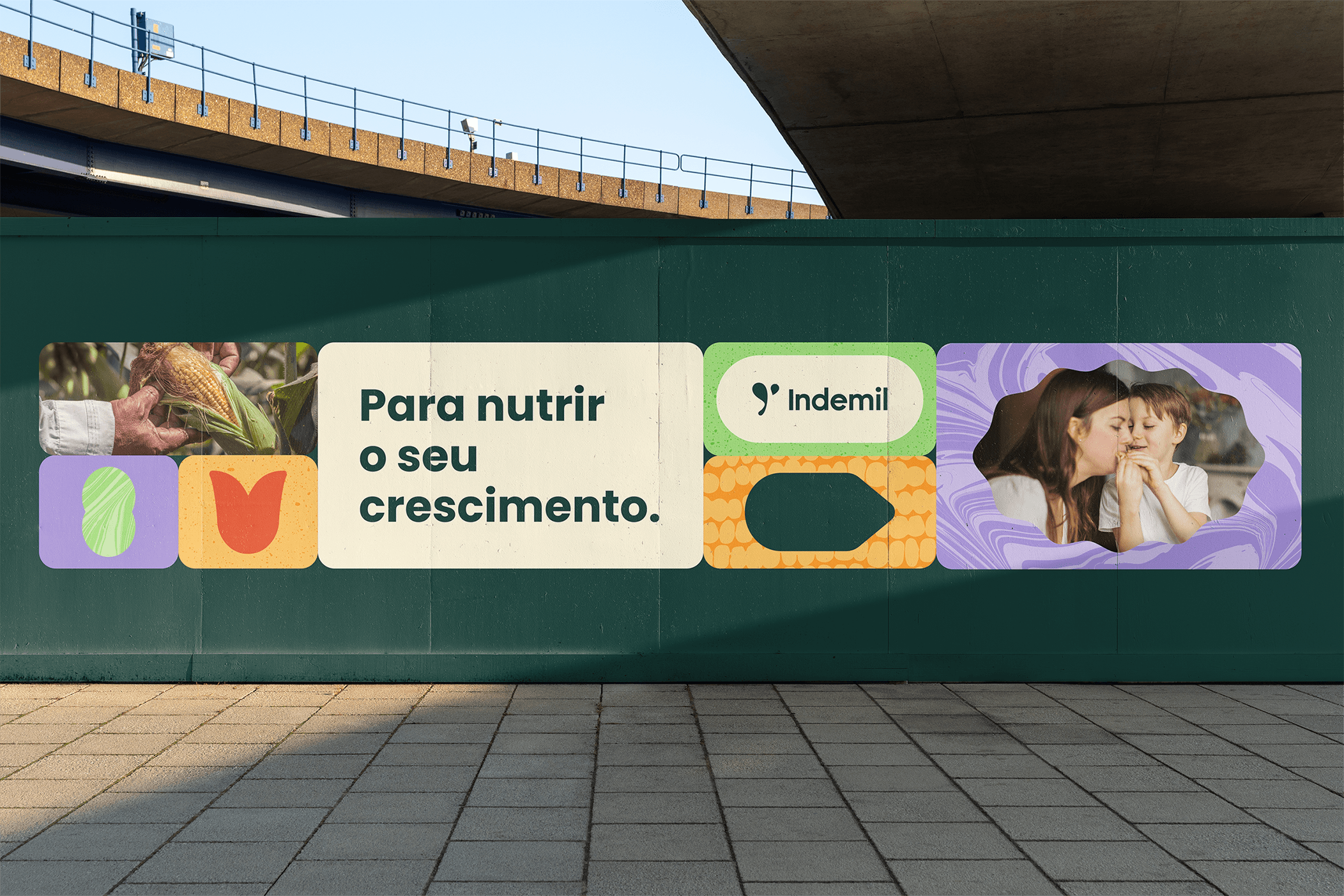
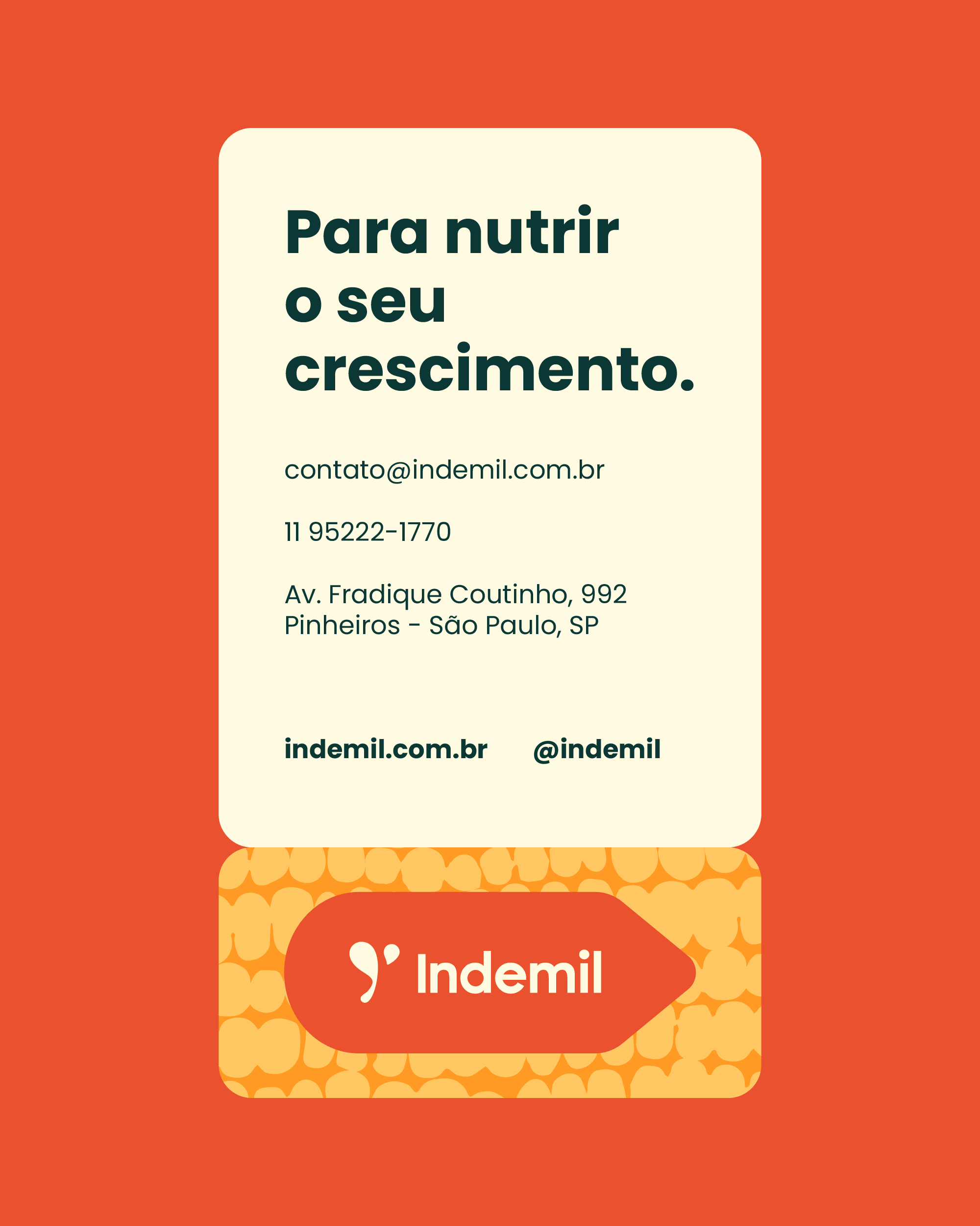
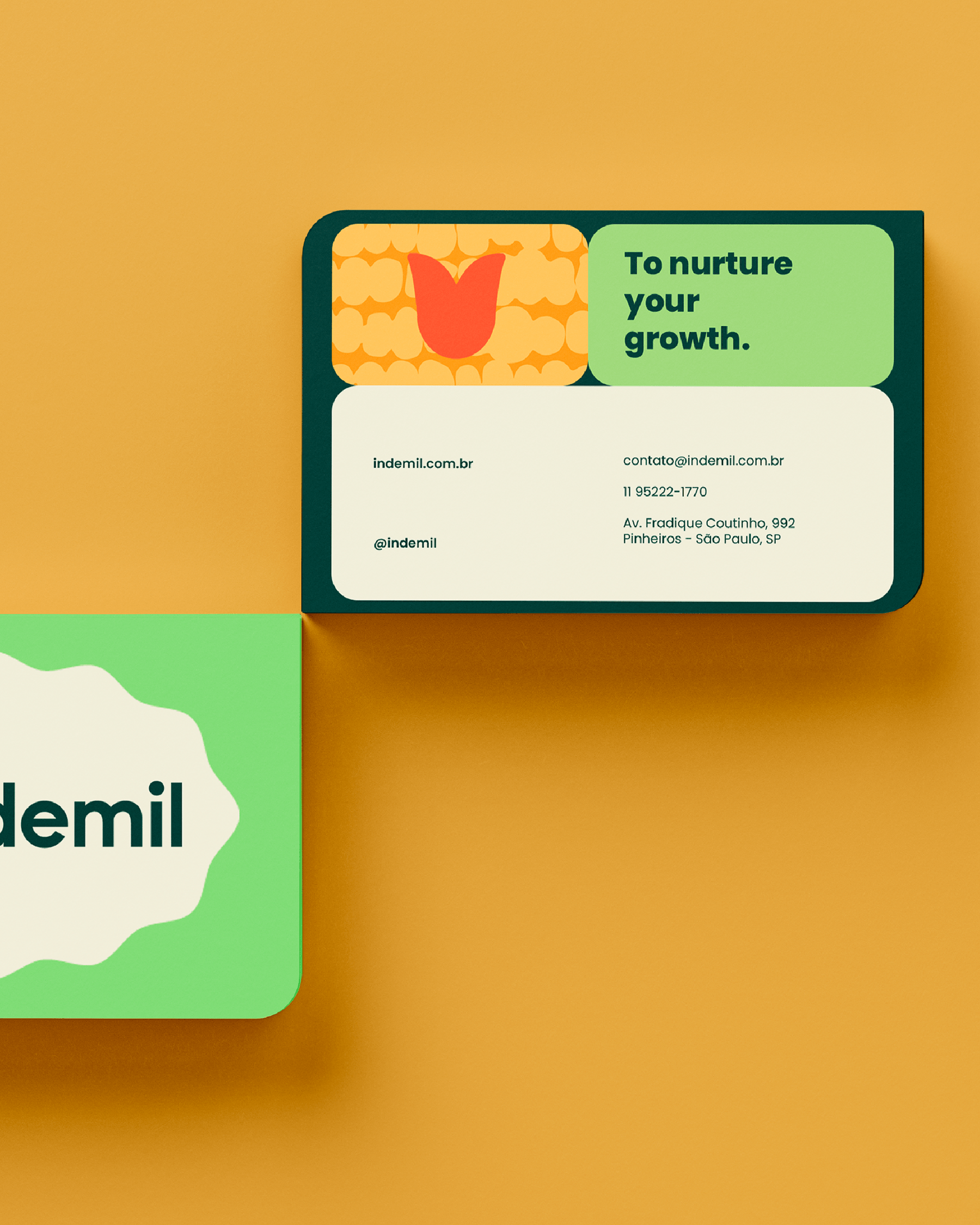
To convey the care and closeness present in the new positioning, we introduced the verb “to nurture” as the protagonist of the verbal language. In this sense, the brand’s purpose became: “nurturing the world’s growth, sharing the best of what we have every day.”
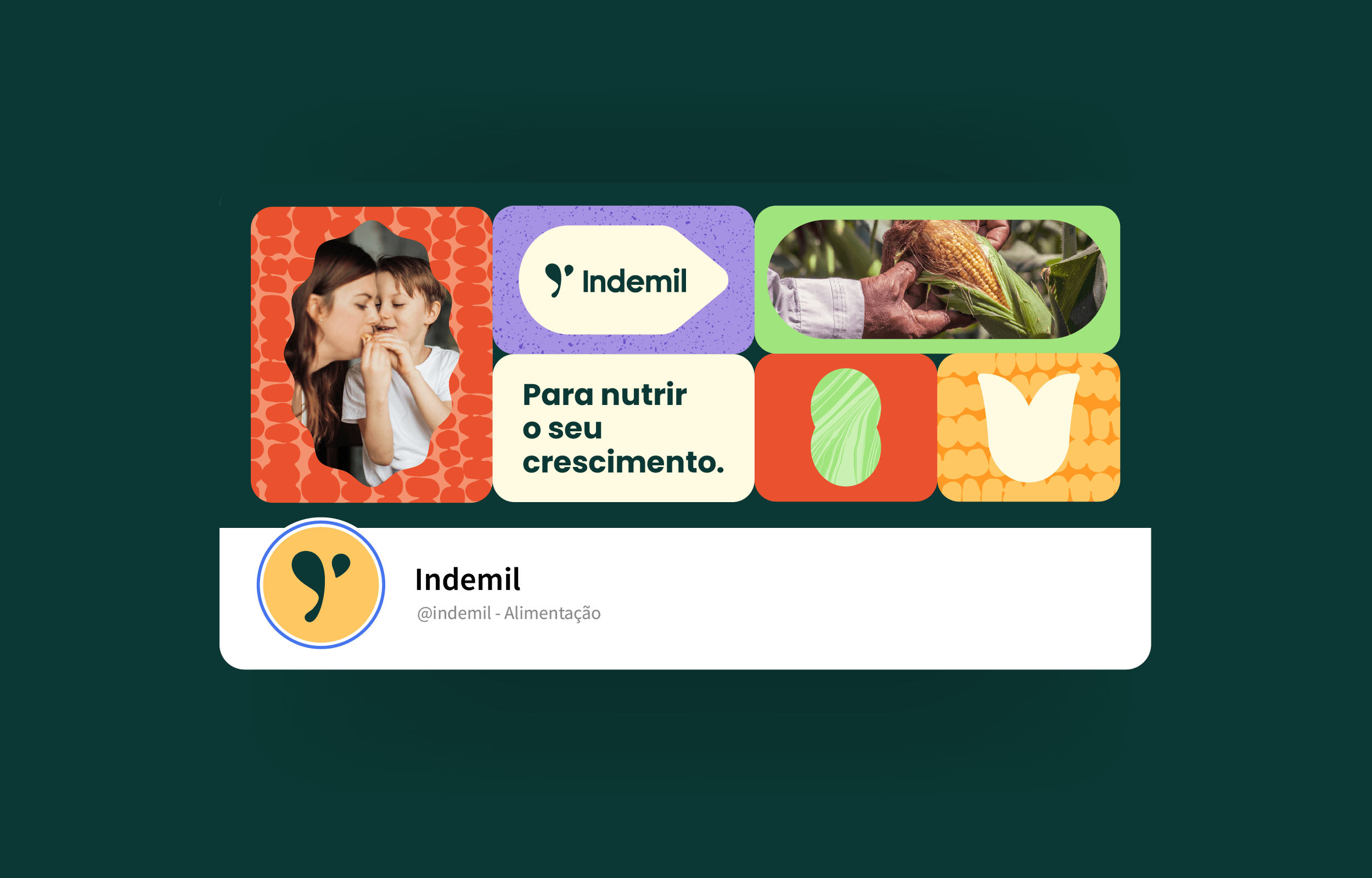
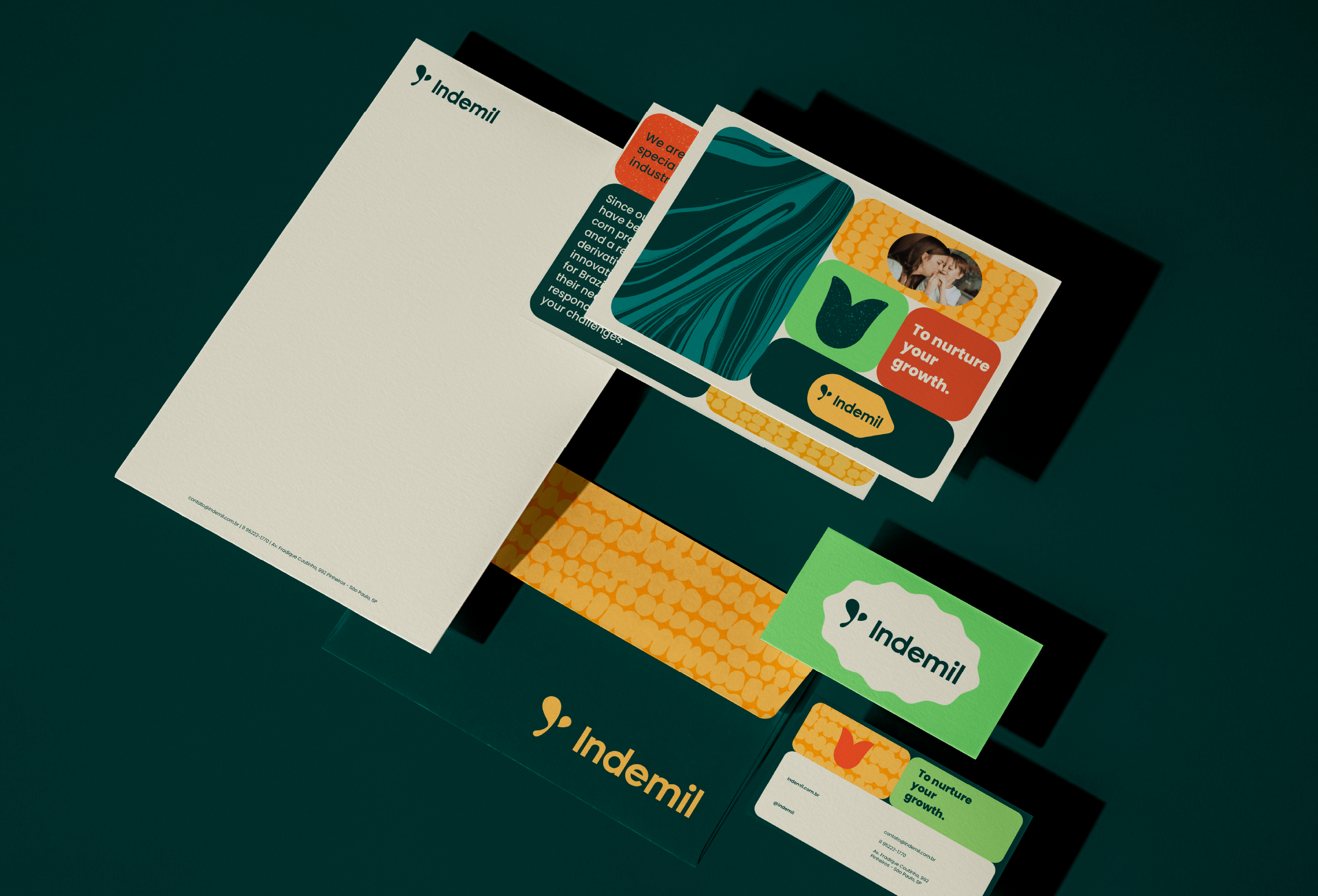
Visual Identity
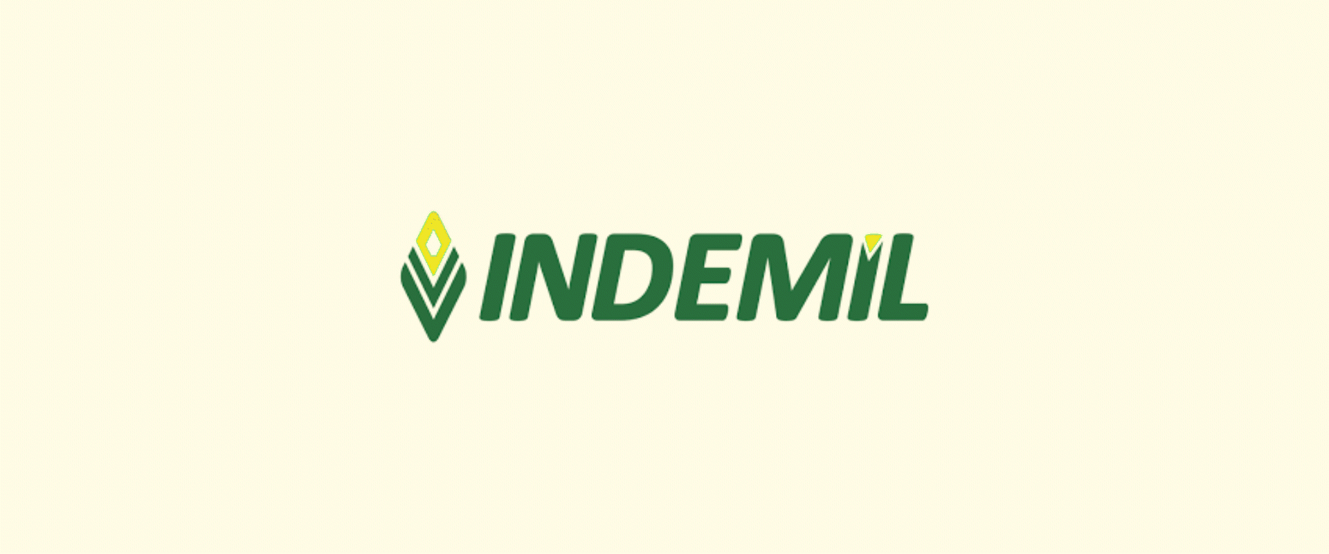
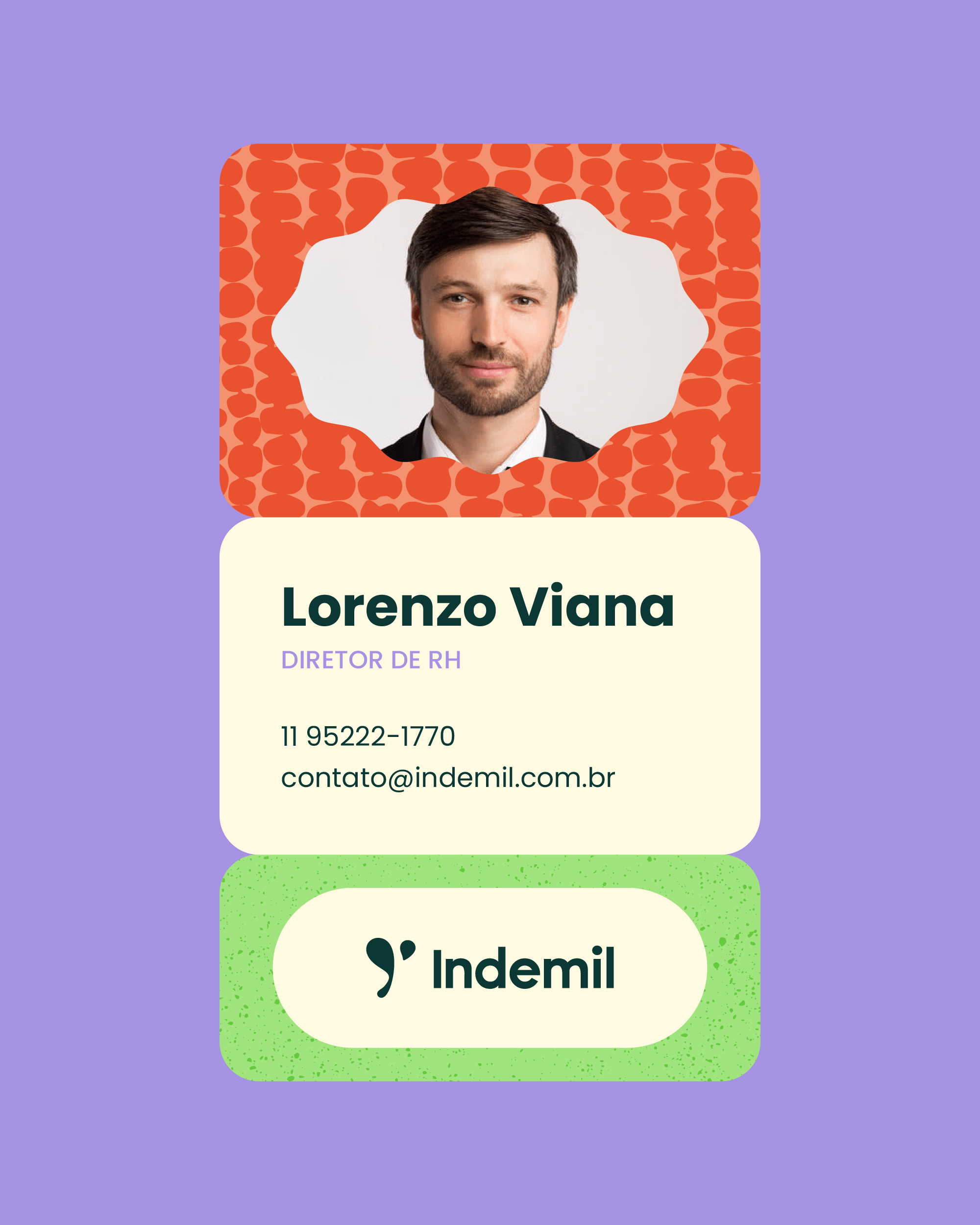
The logo consists of a symbol with an organic and fluid design that references the raw materials of food. The subtle tilt and rounded shapes give softness and delicacy to the brand while conveying movement and dynamism, reinforcing the idea of innovation and agility.
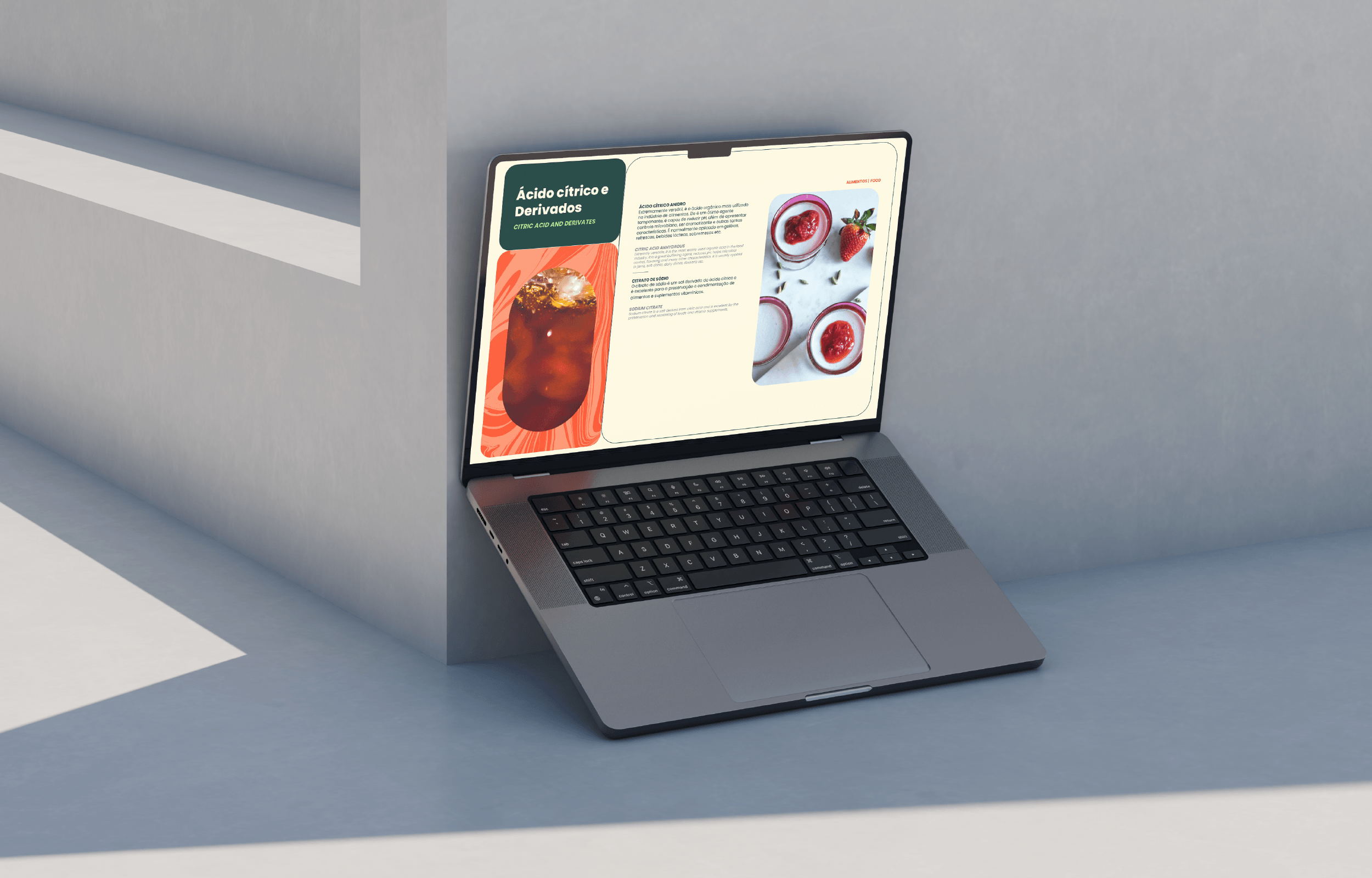
The rest of the visual identity reinforces the close and personalized aspect of the service, using vibrant colors, along with graphics, textures, and photographs that create a proprietary universe for Indemil’s communication.
Branding e Identidade Visual: Motora
Direção Estratégica: Juliana Argollo
Estratégia e Identidade Verbal: Juliana Argollo, Isabele Souza
Direção de Arte: Juliana Argollo
Designers: Juliana Argollo, Júlia Sales, Maria Stéfanni Carvalho, Júlia Lago.