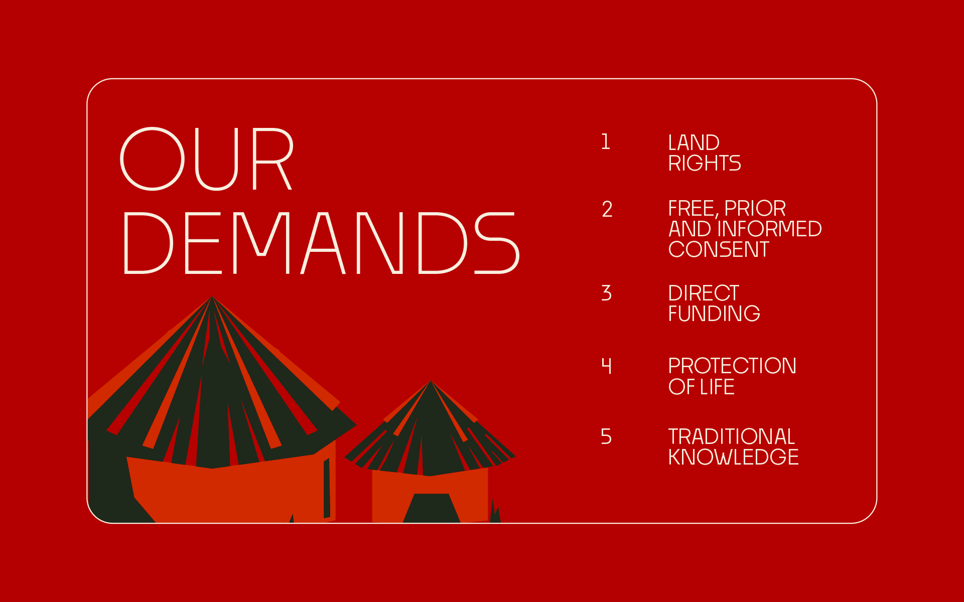
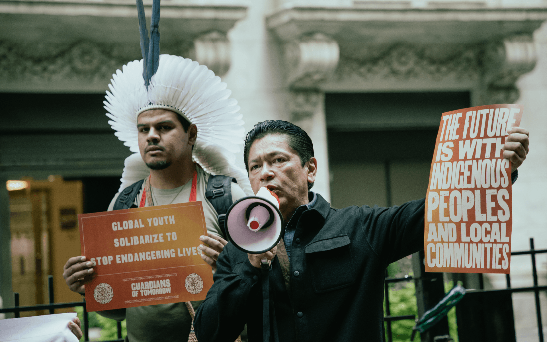
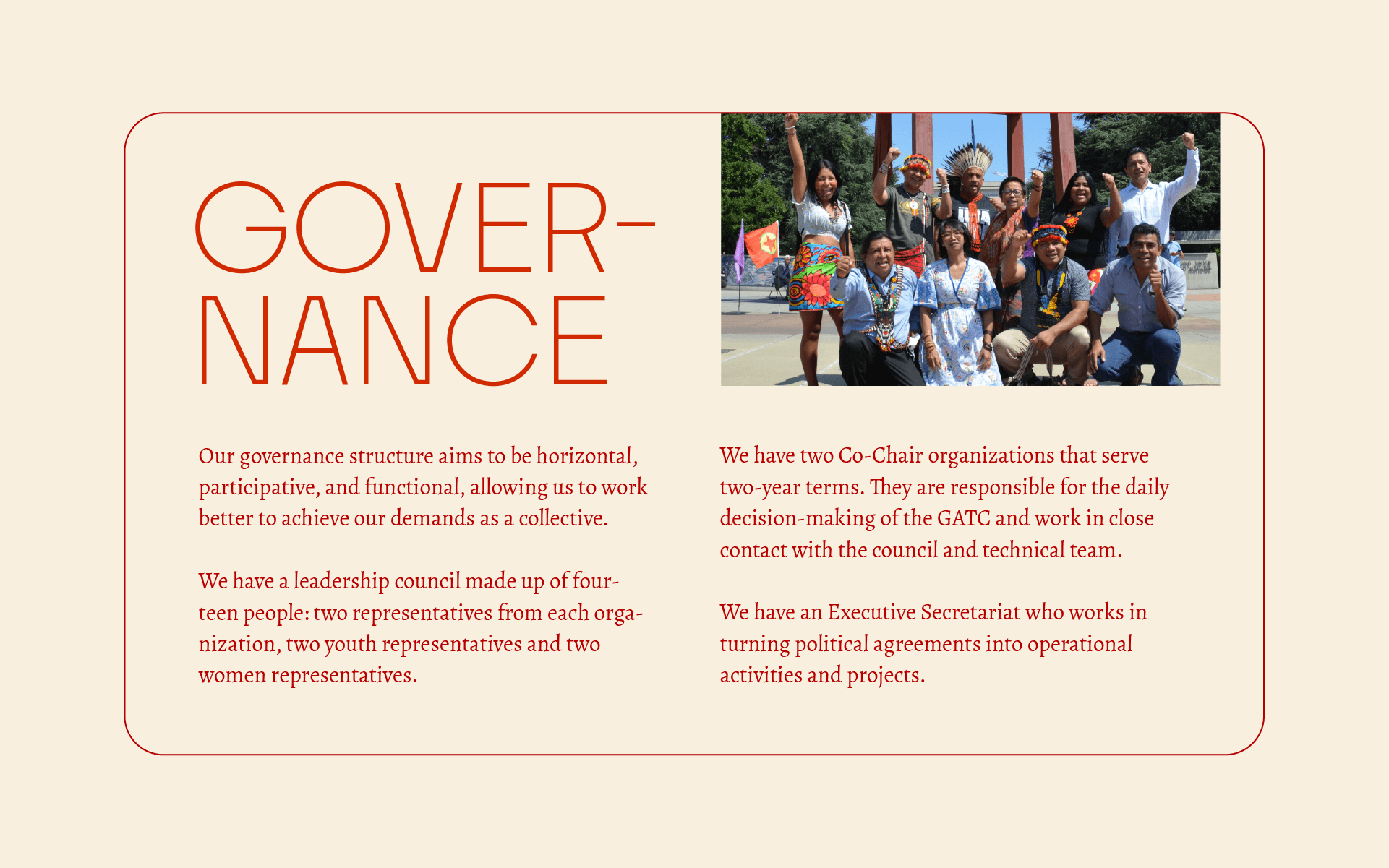
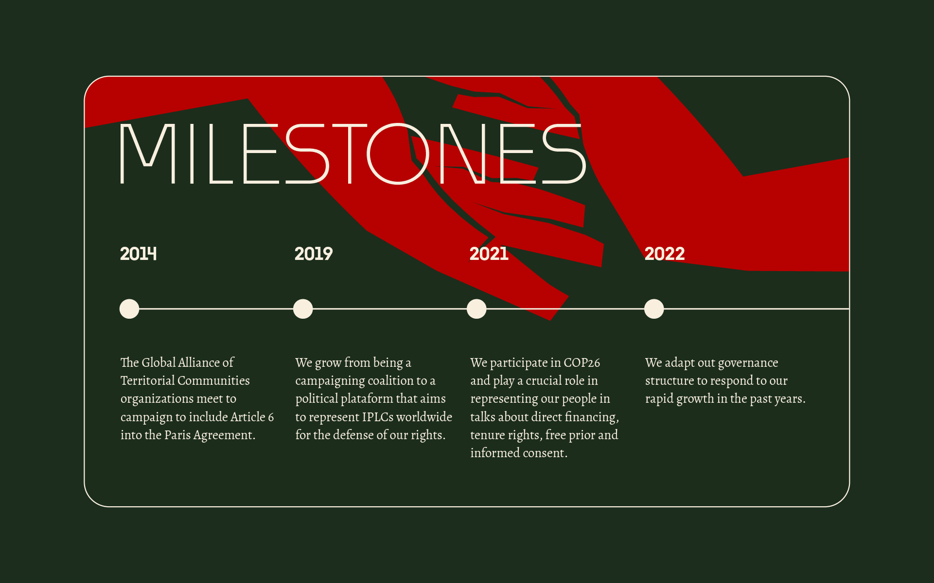
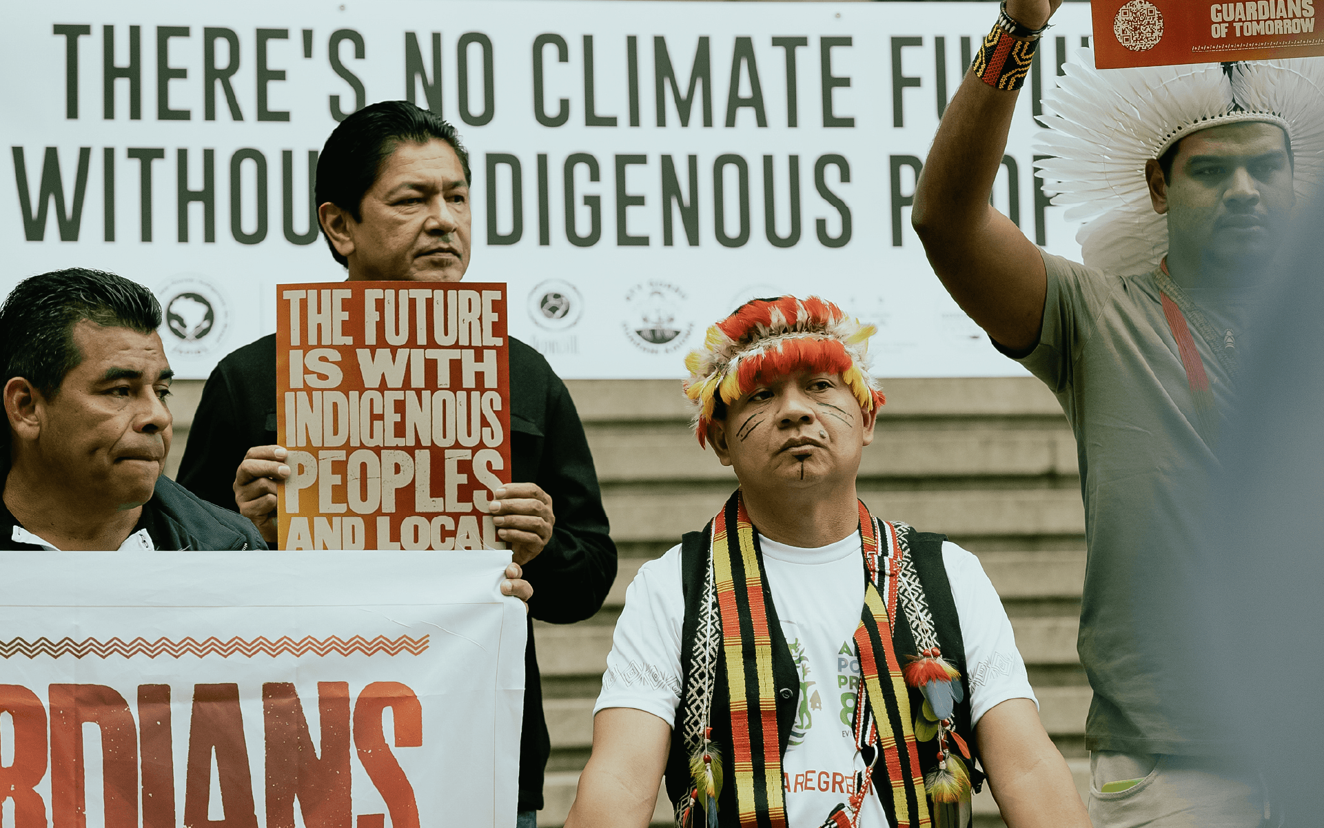
The Global Alliance of Territorial Communities, or GATC, is an international organization that brings together indigenous leaders from the Amazon Basin, Brazil, Mesoamerica, Indonesia and the Congo Basin, in search of greater representation and listening to their demands.
Our goals with the visual identity project were:
— Present the GATC as a mature and relevant organization in the international decision-making scenario.
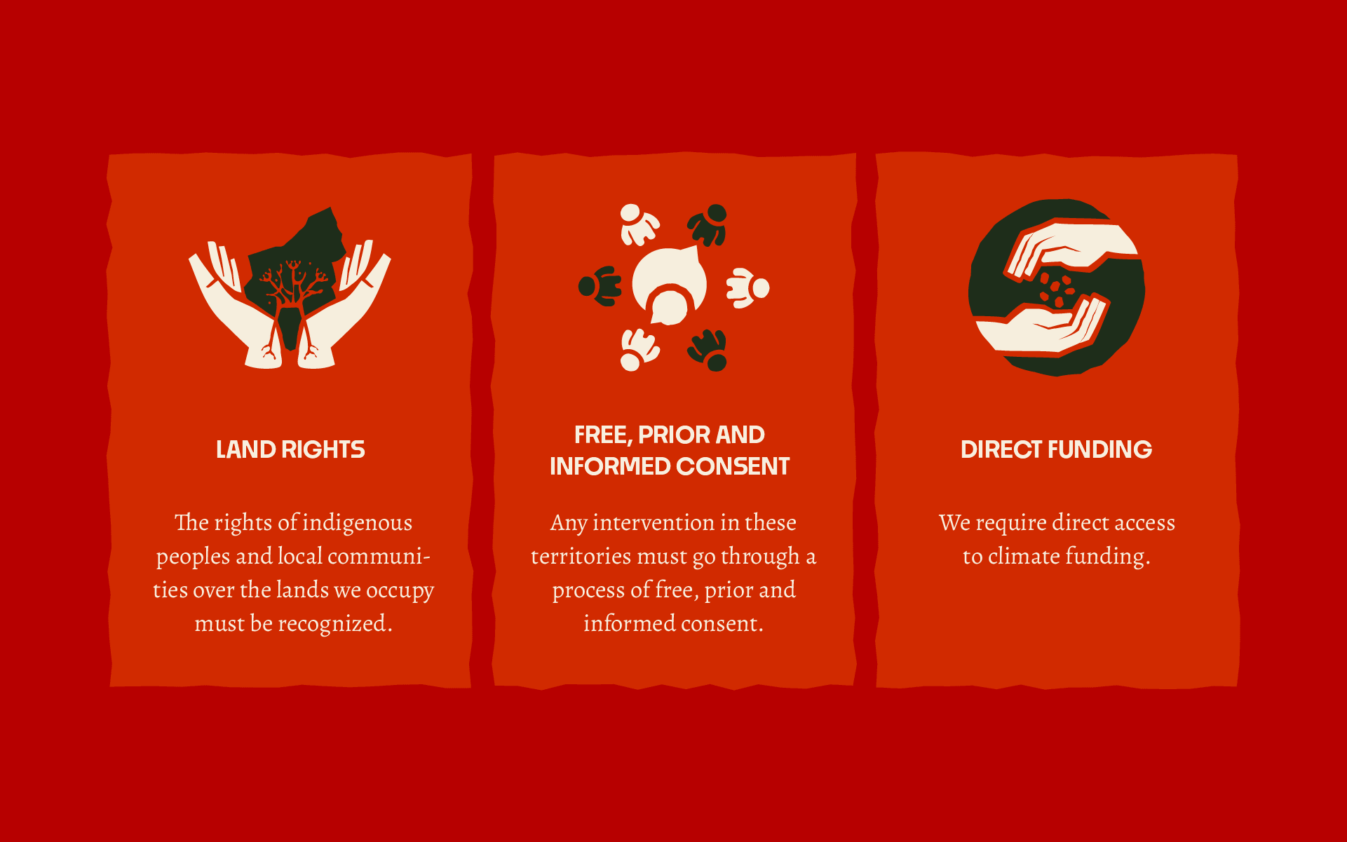
— Represent the relationship between people and nature in a modern design, without being excessively corporate.
— Ensuring that all territorial communities embraced by the Alliance felt represented by the brand, even coming from very different contexts and places.
Research and Interviews
For the project, we collected testimonials from leaders from the main organizations part of the GATC: AMAN – Indonesia, AMPB – Mesoamerica, APIB – Brazil, COICA – Amazon Basin, and REPALEAC – Congo Basin. From those conversations, we were able to define the directions for the brand and its essence.
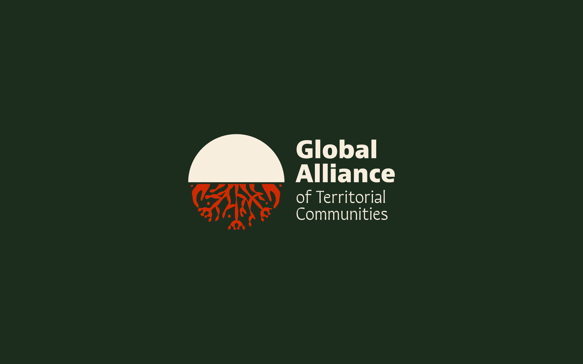
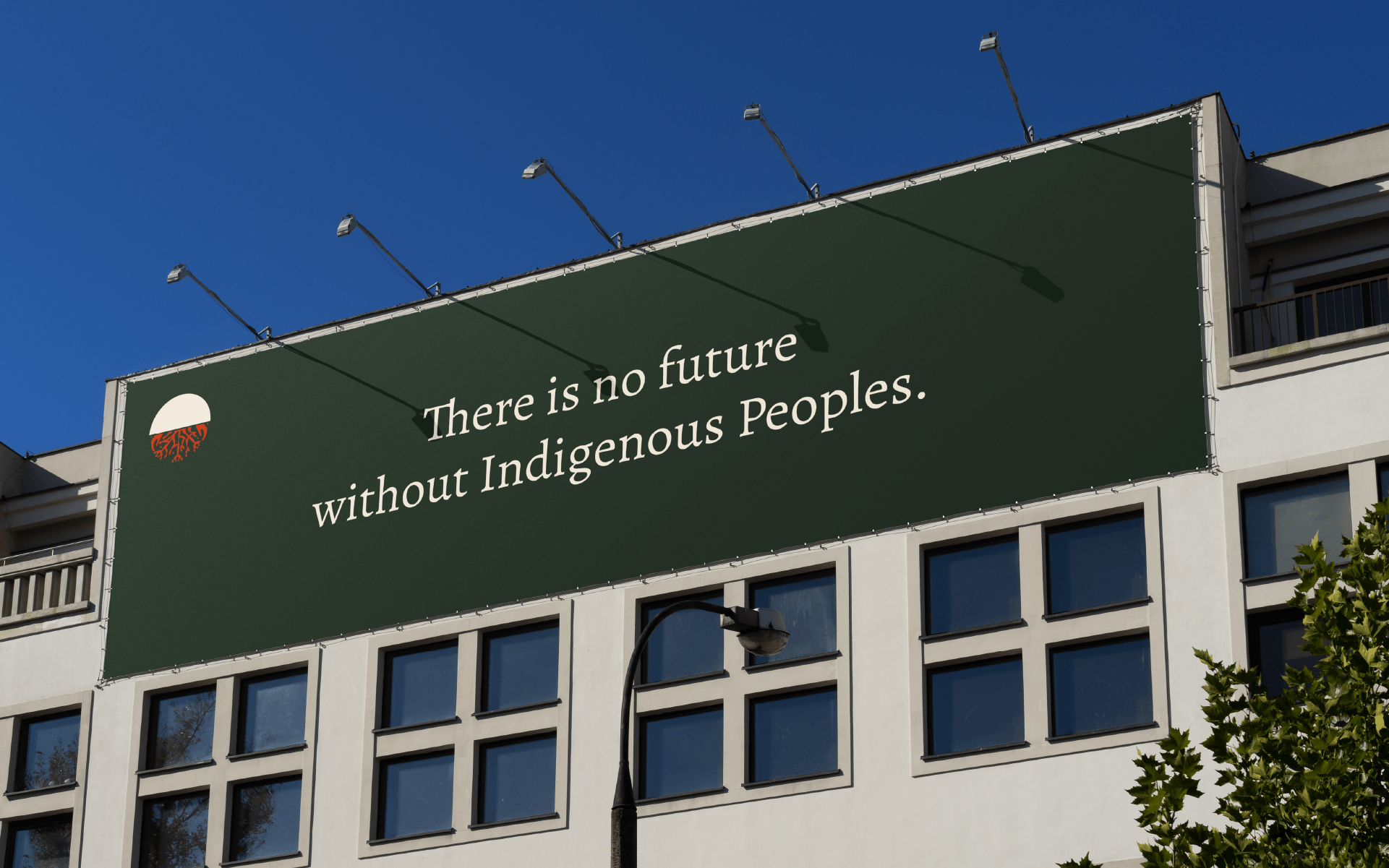
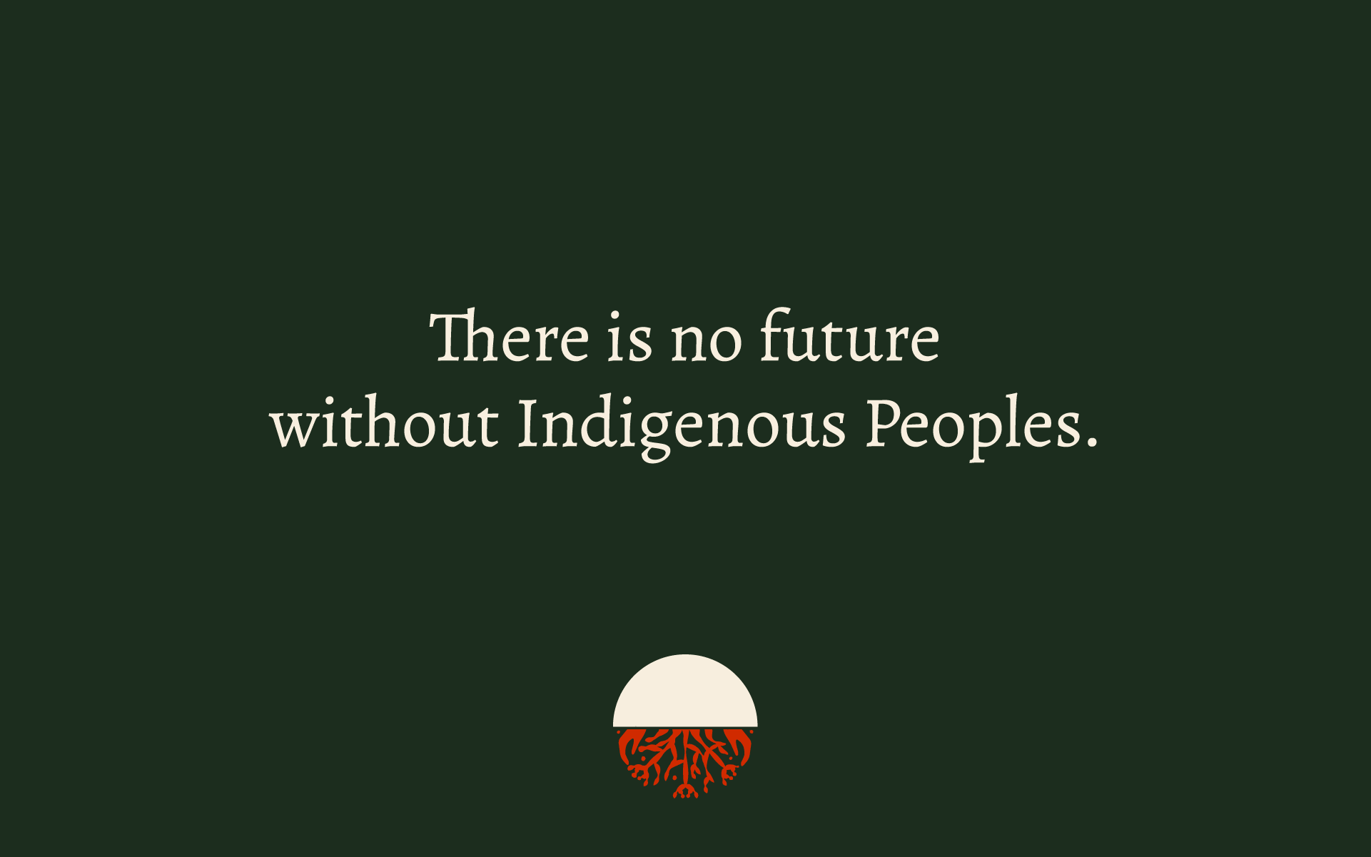
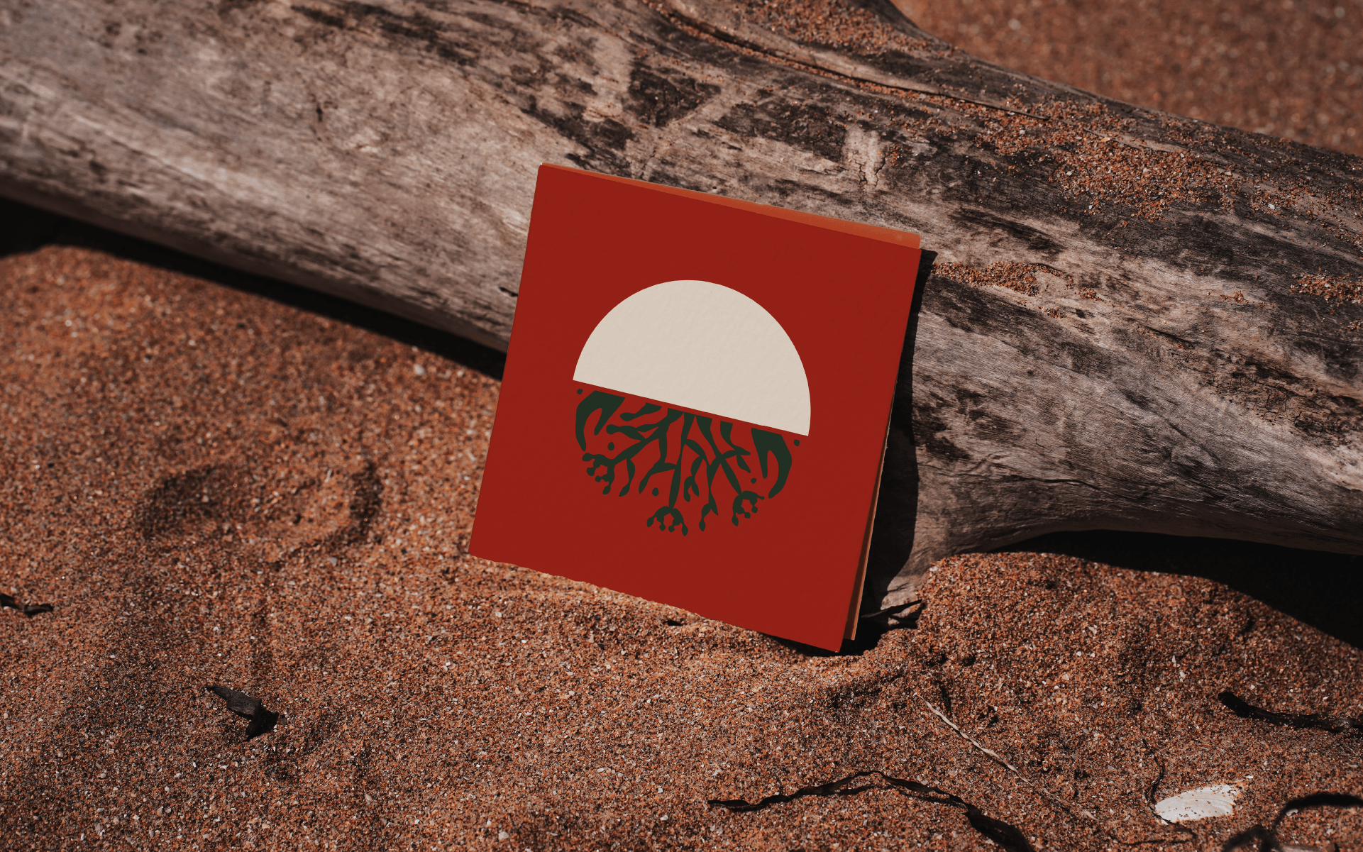
Logo
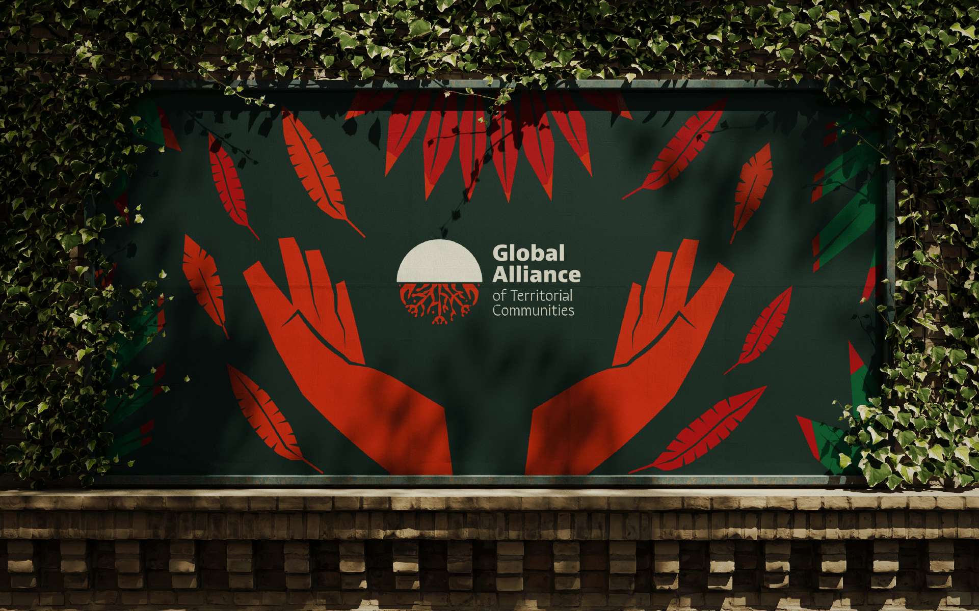
In order not to limit the logo to a specific biome, or to represent a person with a defined gender and age, we opted for a symbolic representation. We chose an asymmetrical design of organic nets inspired by roots, corals and fungi, with small hands hidden in the design. The circle filled in at the top makes reference to sunrise and the cyclic nature.
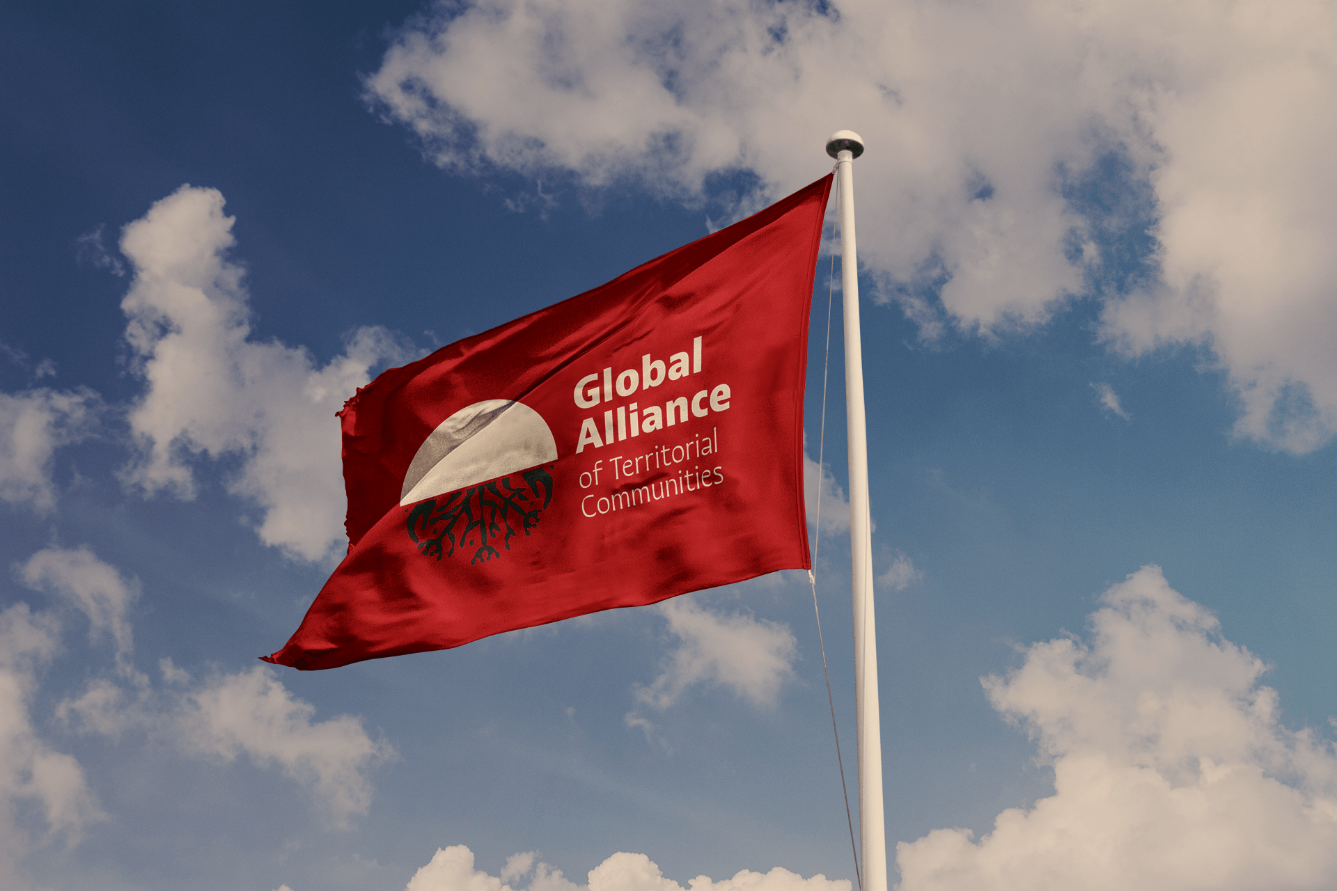
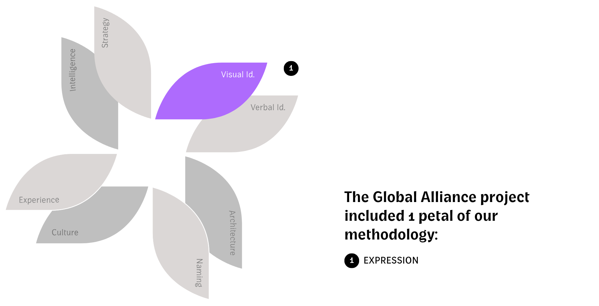
Visual Identity
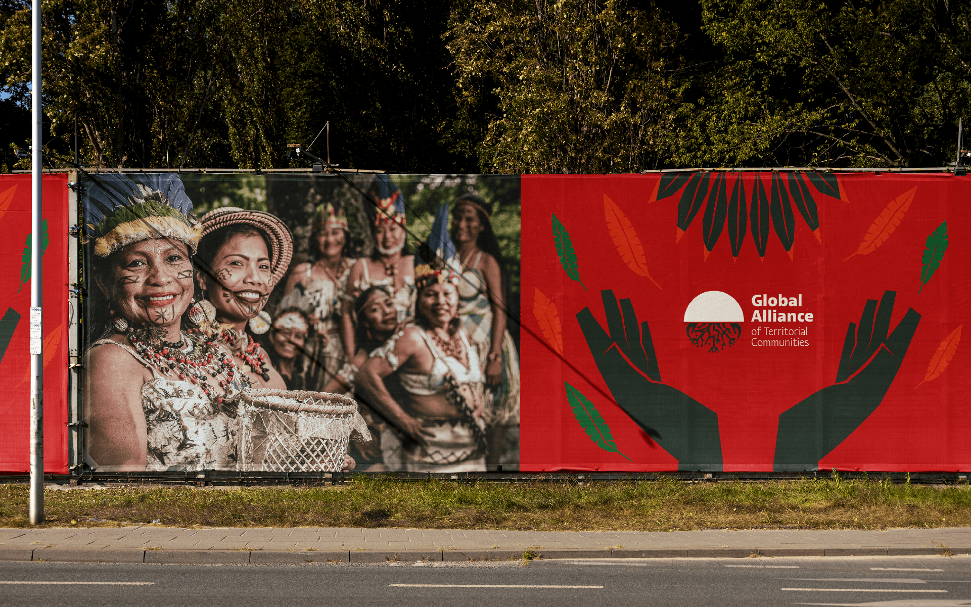
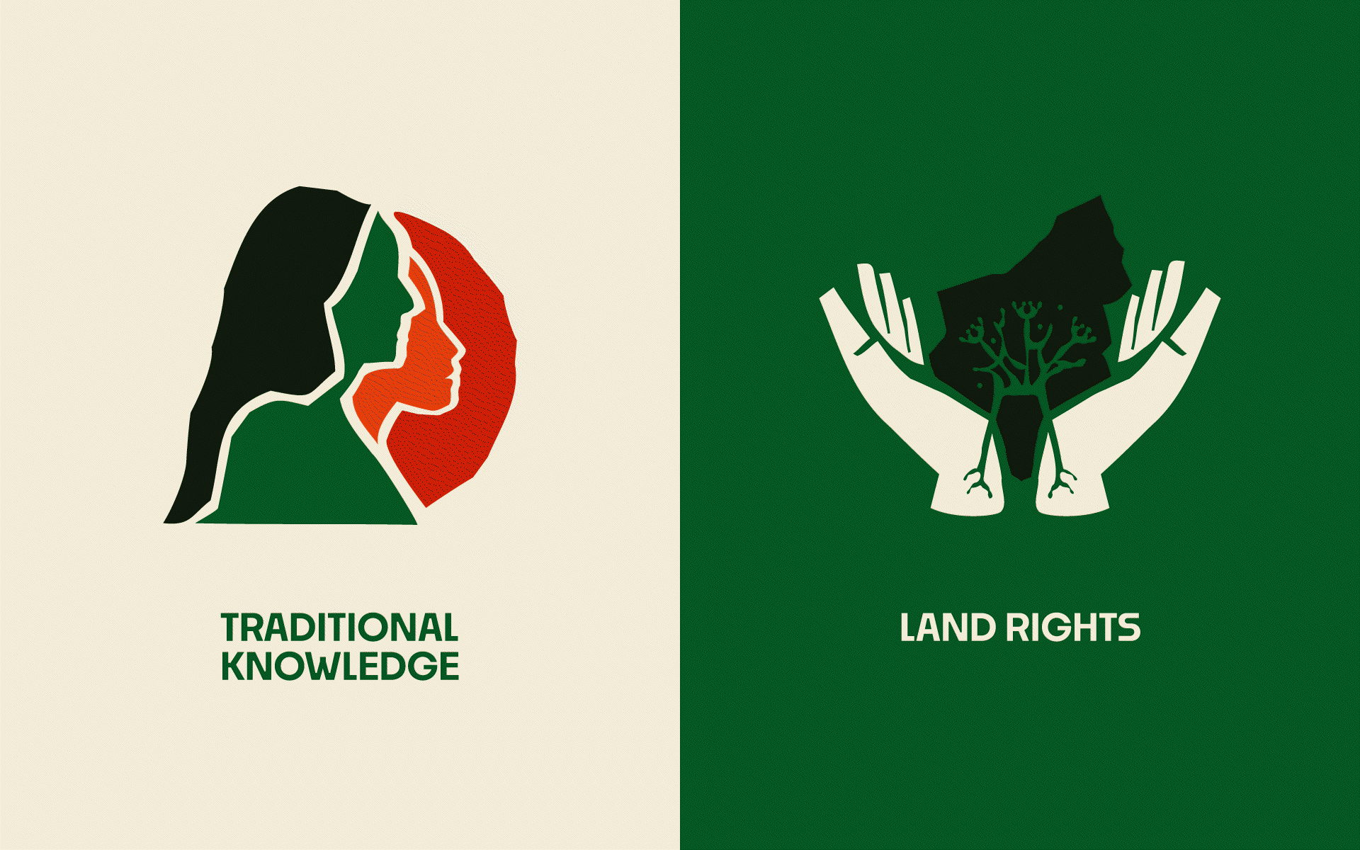
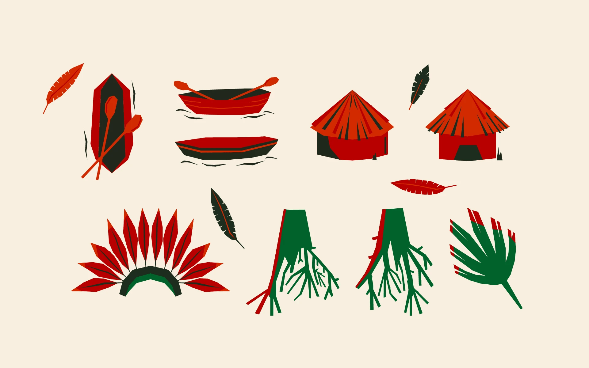
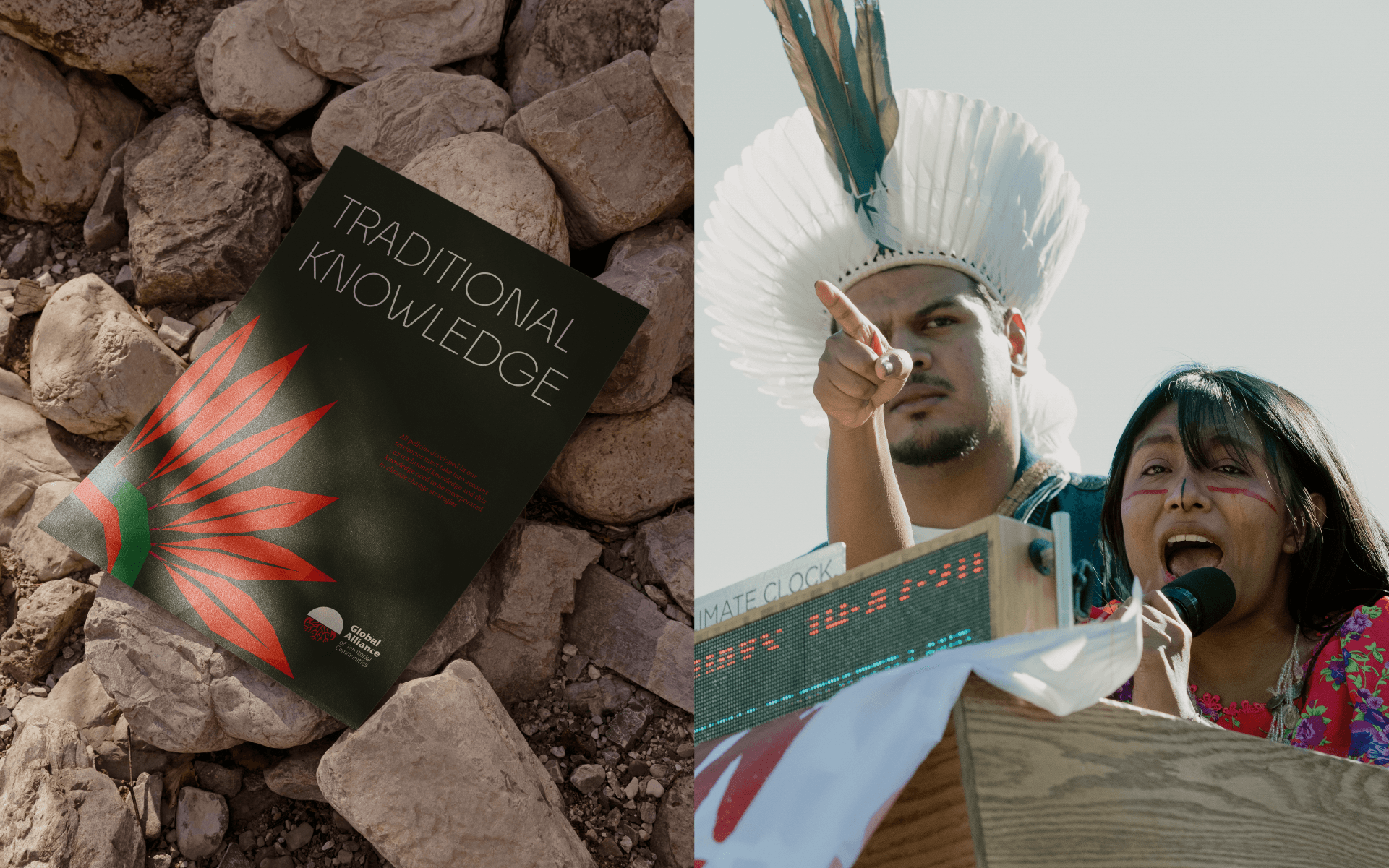
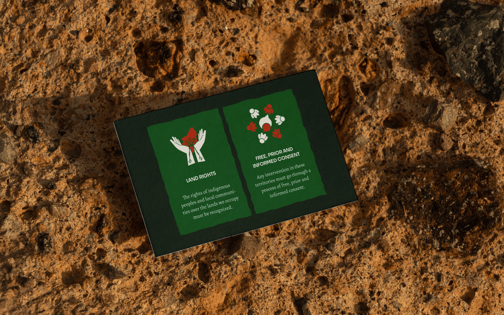
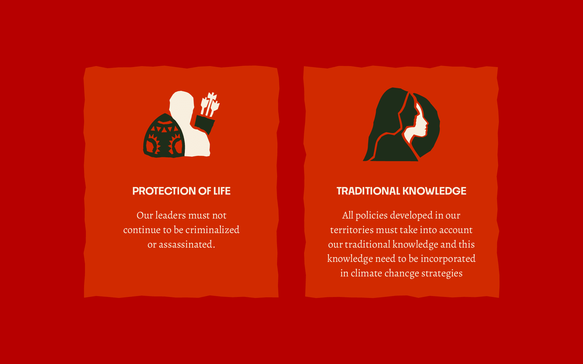
The visual identity reinforces the concept of harmony between people and mother nature. Green tones symbolize forests and oceans, while reds and oranges were chosen to symbolize humans. The illustrations created represent important cultural elements for indigenous peoples around the world and help to make the identity more dynamic.
Visual Identity: Motora
Art Direction: Júlia Lago e Juliana Argollo Illustrations and Iconography: Isabele Santos, Juliana Argollo, Larissa Constantino, Maria Stéfanni Carvalho
Designers: Júlia Lago, Juliana Argollo, Julia Sales, Luize Araújo, Maria Stéfanni Carvalho