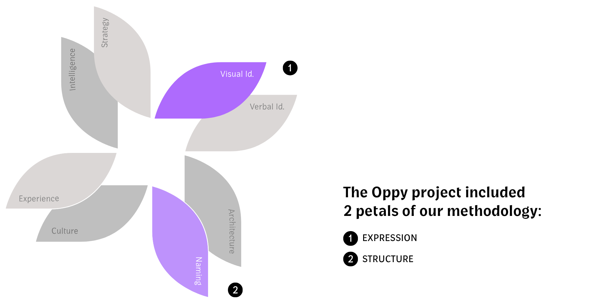
Visual Identity and Naming for a Corporate Workspace Company
Oppy was created to transform the way companies plan, build, and manage their workspaces. More than delivering corporate projects, the company offers an innovative Workplace on Demand model that combines strategy, financial intelligence, and integrated management to create more efficient, flexible environments designed to evolve alongside each business.
Its key differentiator lies in simplifying what has traditionally been a complex process by centralizing every stage of the project under a single partner. This allows clients to focus their investments and energy on what truly matters, the growth of their core business.


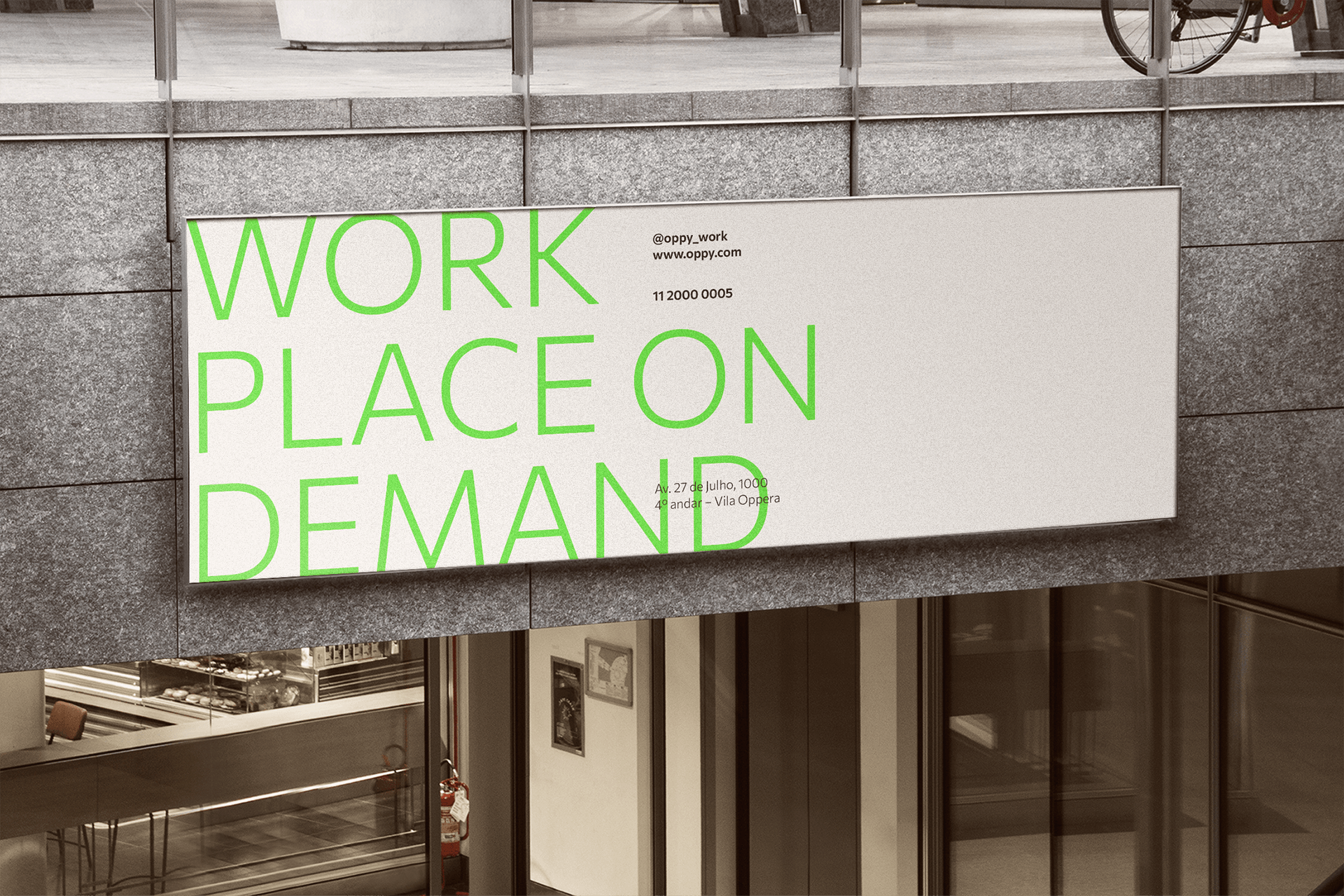
Our Goal with the Project
The primary objective of the project was to create a brand capable of expressing Oppy’s innovative approach without compromising the credibility and strength required to connect with an executive audience. It was essential to differentiate the company from its competitors, positioning it as a pioneering solution for workplace implementation and management while communicating maturity, reliability, and operational excellence.
Challenge Summary: Develop a visual identity that reflected the balance between innovation and sophistication. The brand needed to represent a flexible and adaptable business model while conveying confidence to companies seeking predictability, financial intelligence, and a strategic partner to deliver high-impact projects.

Insight and Strategy
The brand concept was built around the very essence of Oppy’s service, adaptability, flexibility, and efficiency. Just as each project evolves according to the unique needs of every client, the identity was designed to represent a fluid system capable of adapting to different contexts while maintaining consistency.
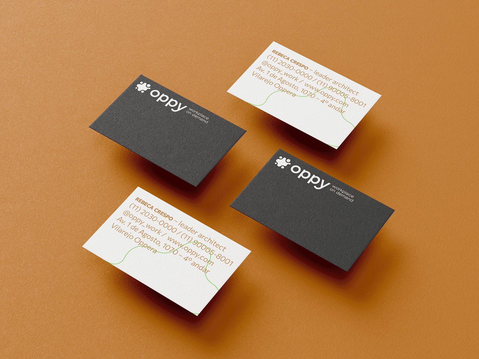
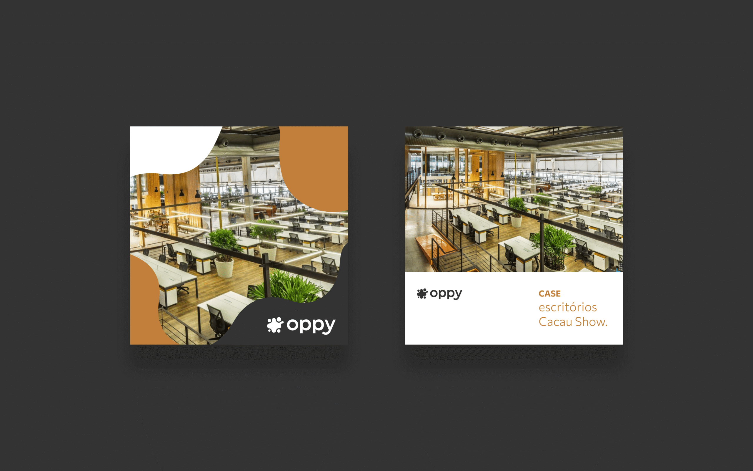
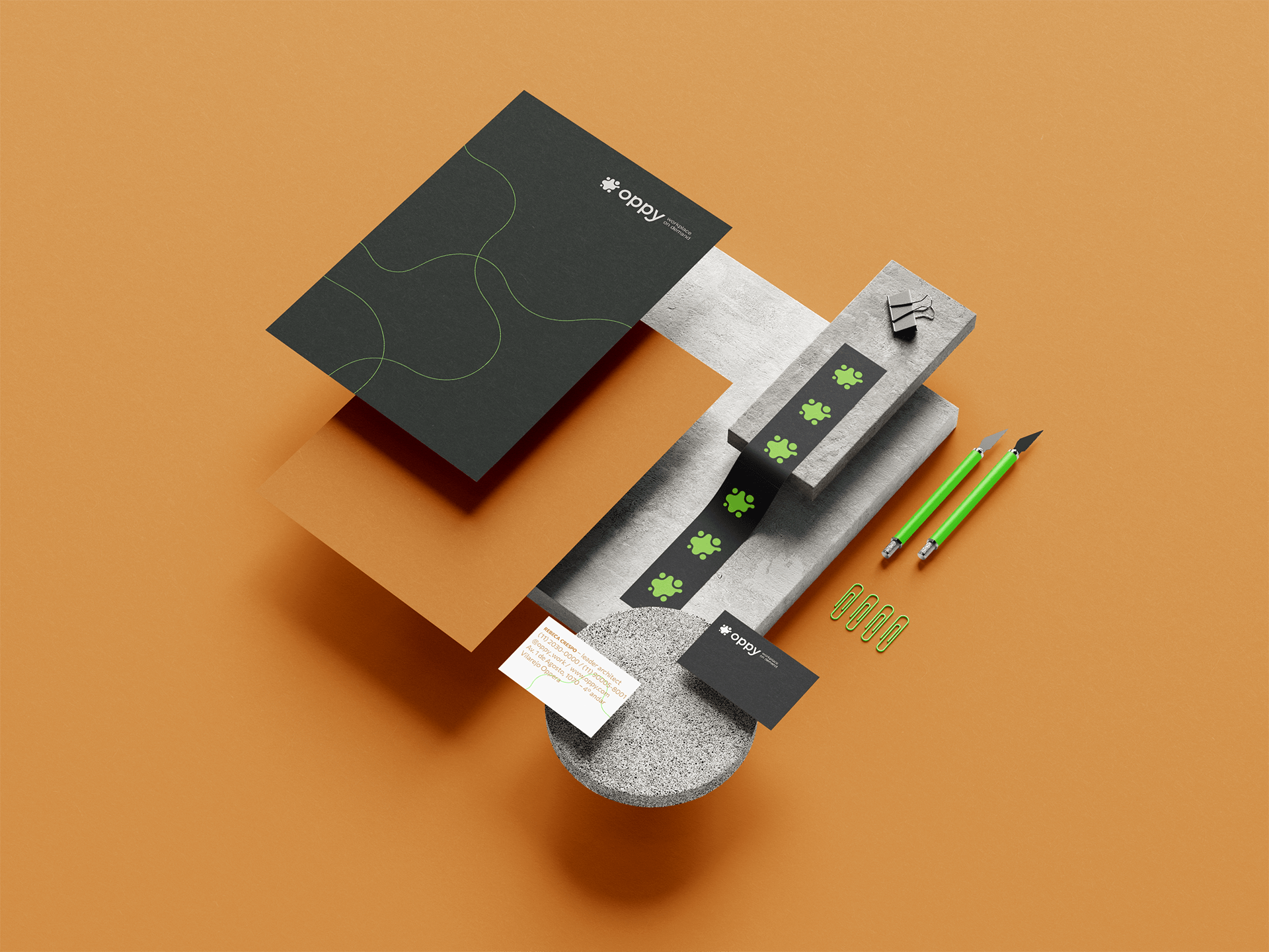
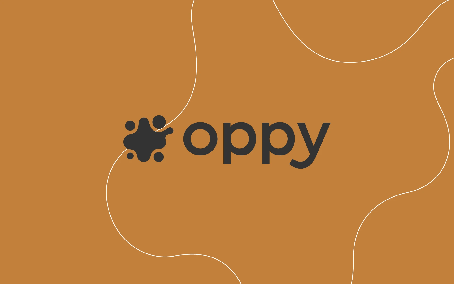
The symbol translates this concept through organic, interconnected shapes that express movement, integration, and transformation. This logic extends across the entire visual system, with graphic elements derived from the logo itself, reinforcing the idea of flexibility and creating a cohesive identity across multiple applications.
Naming - Oppy
The naming was designed to reflect the company’s innovative approach through a distinctive, simple, and memorable name. Oppy was inspired by the idea of opportunity, representing a brand that creates new possibilities and transforms the way companies plan and manage their workspaces.
Visual Identity
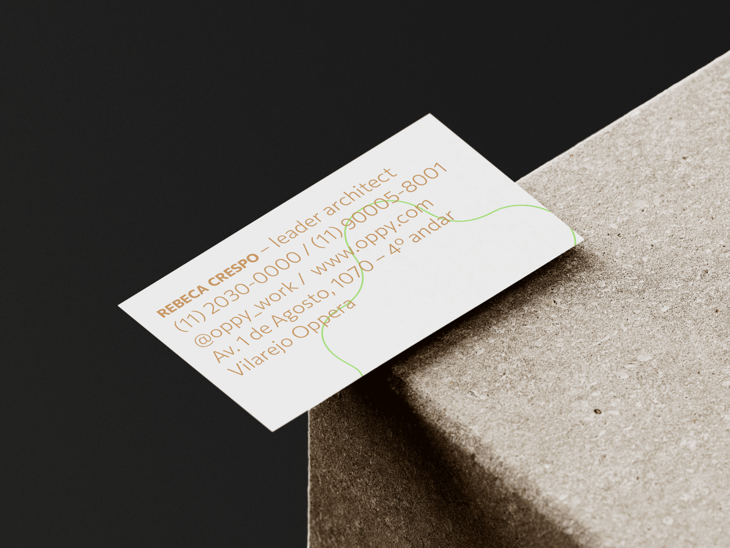
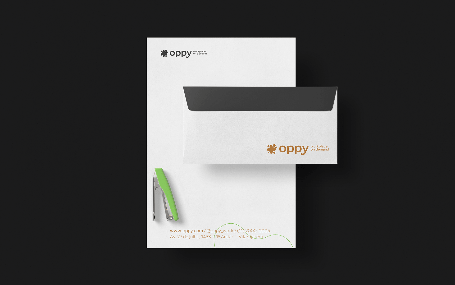
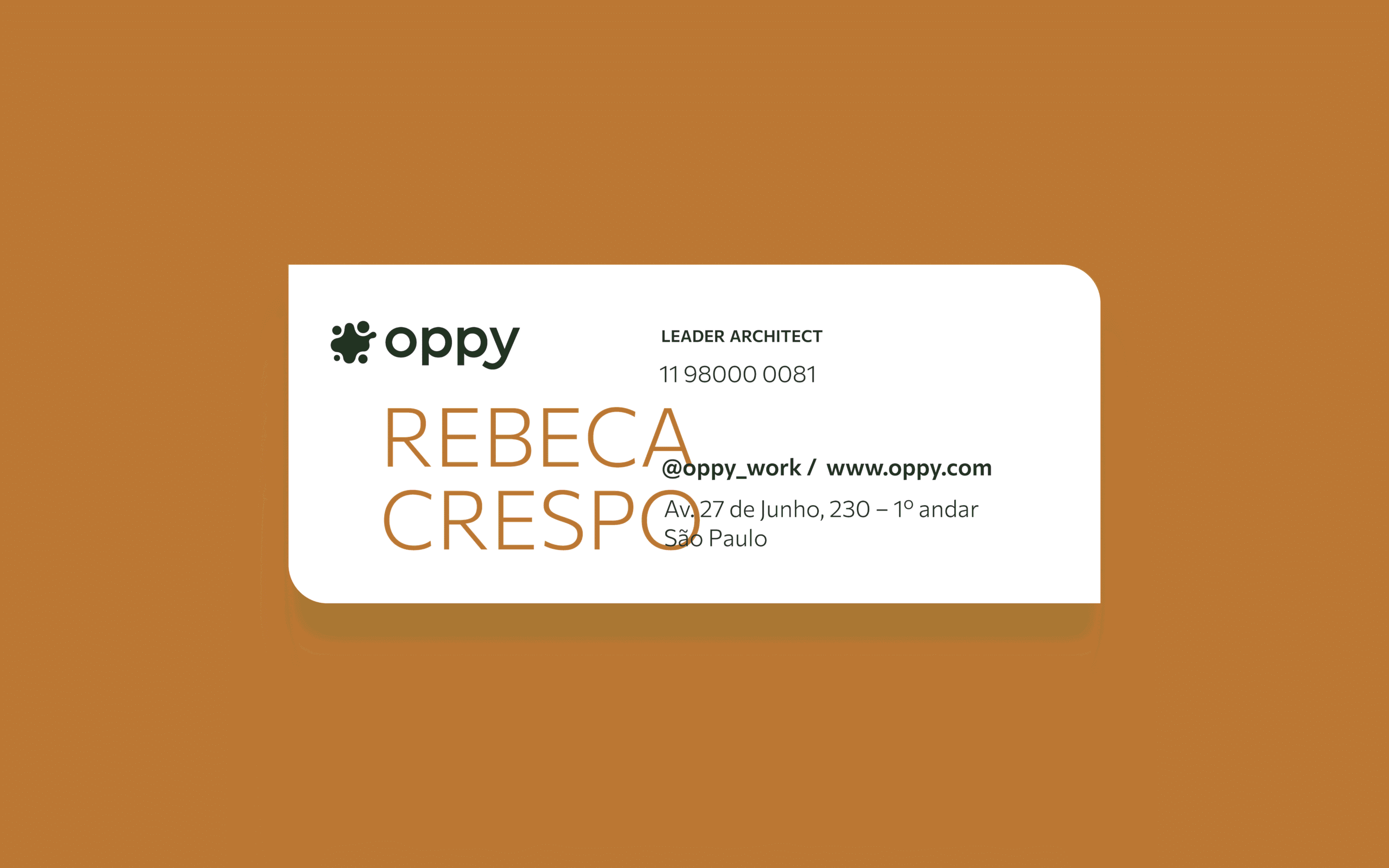
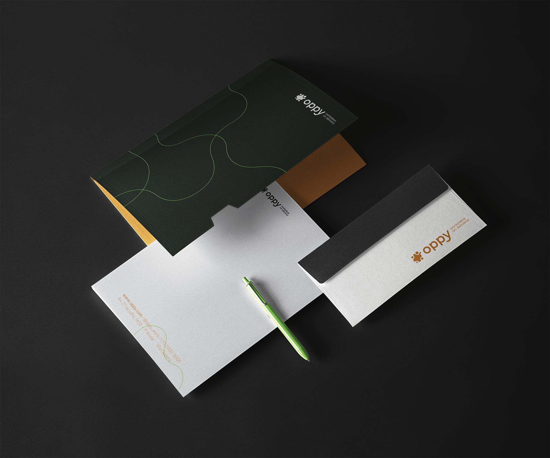
The visual identity combines sophistication and modernity to reflect Oppy’s strategic positioning. The color palette is centered around ochre, conveying maturity and solidity, supported by neutral shades of gray and white that reinforce the brand’s elegant communication. Vibrant green is used selectively as an accent color, adding energy while highlighting the company’s innovative spirit.
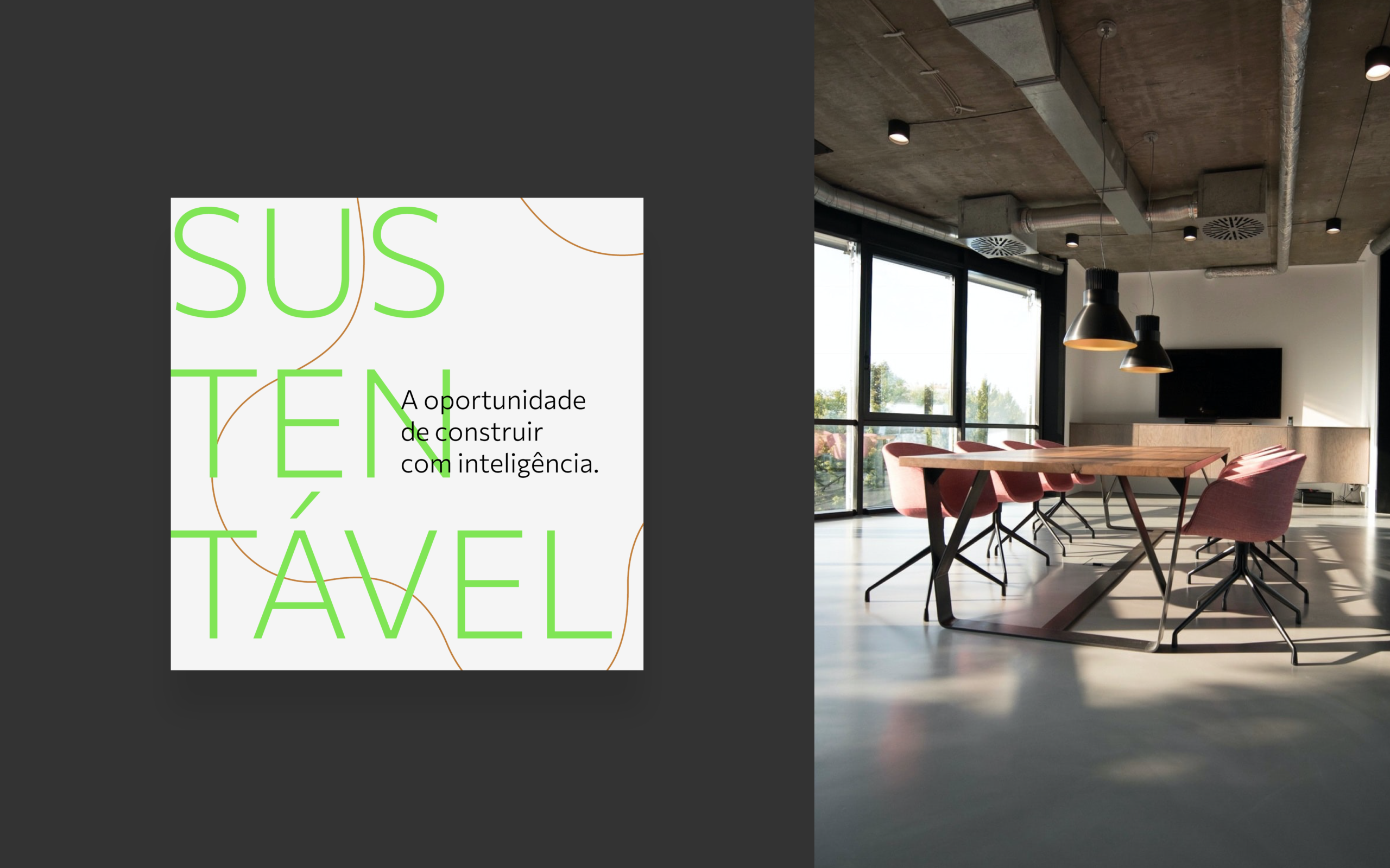
The humanist typeface contributes to a communication style that is clear, modern, and approachable, while the graphic elements derived from the symbol create a versatile visual system that performs consistently across institutional materials, commercial presentations, and digital content. The result is a cohesive identity that communicates innovation with confidence, positioning Oppy as a company ready to transform corporate environments into smarter, more efficient spaces designed for the future.
Visual identity and Naming: Motora
Art Direction: Juliana Argollo
Designers: Juliana Argollo, Júlia Lago, Julia Sales e Luize Araújo