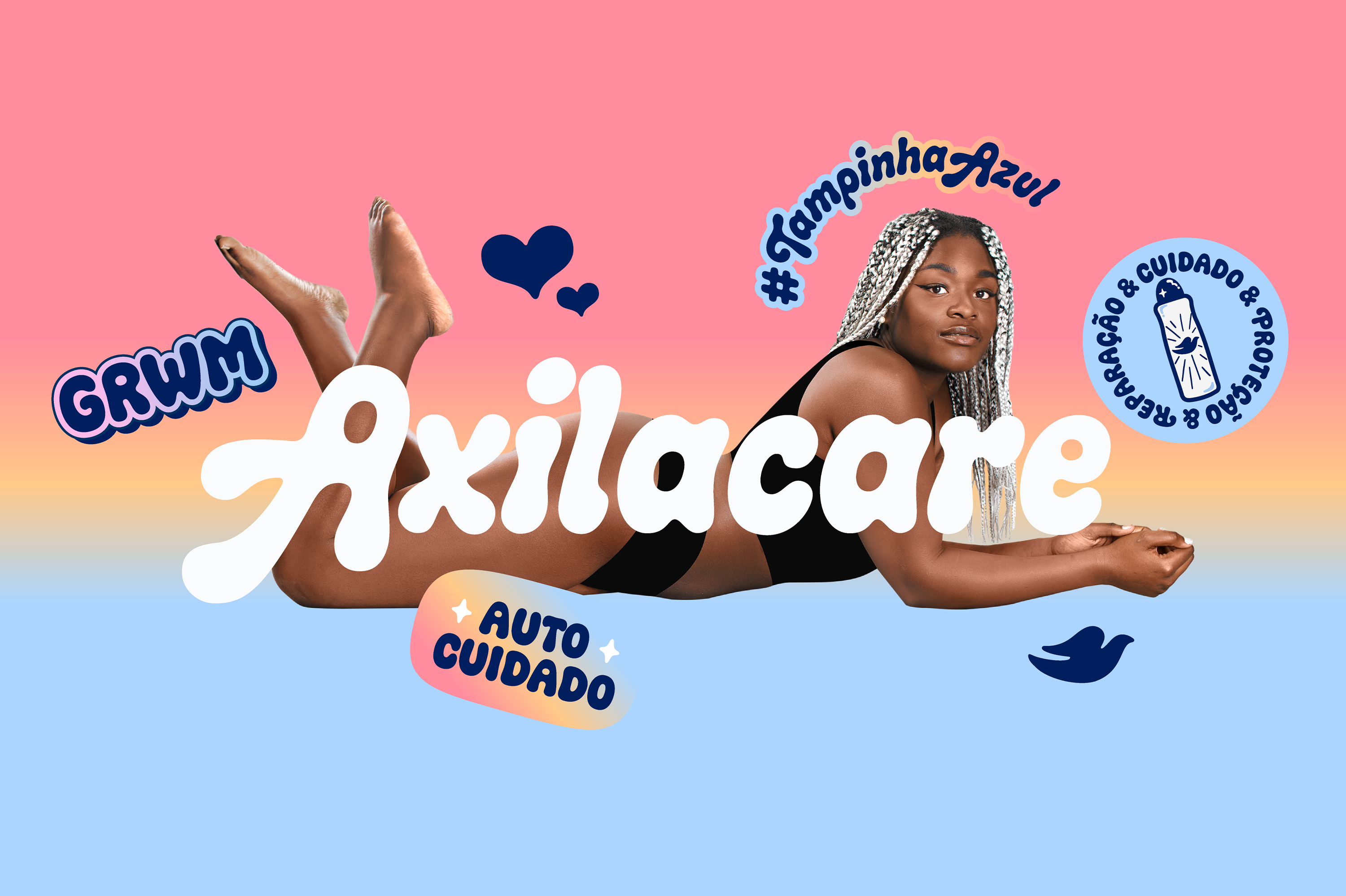
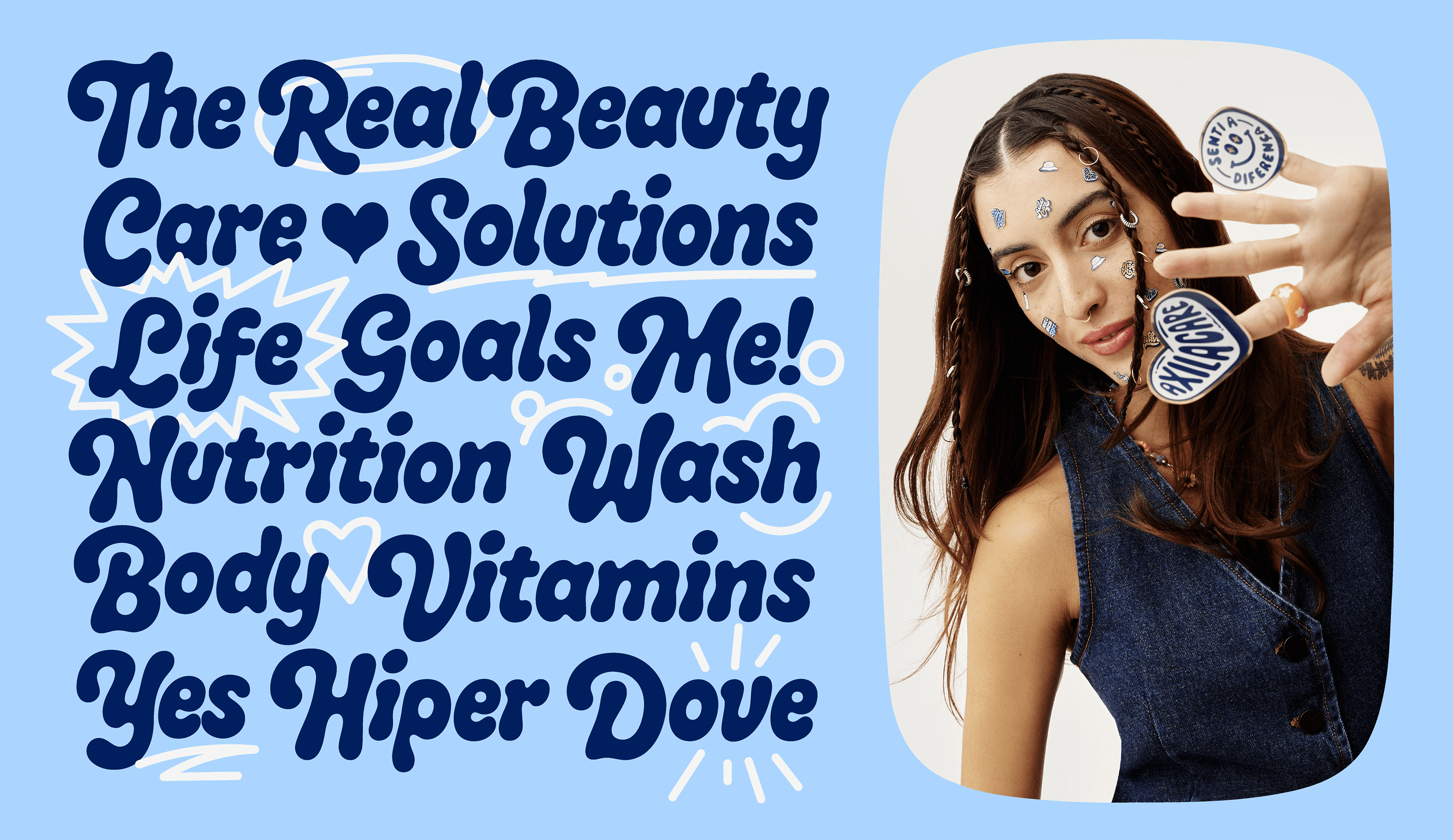
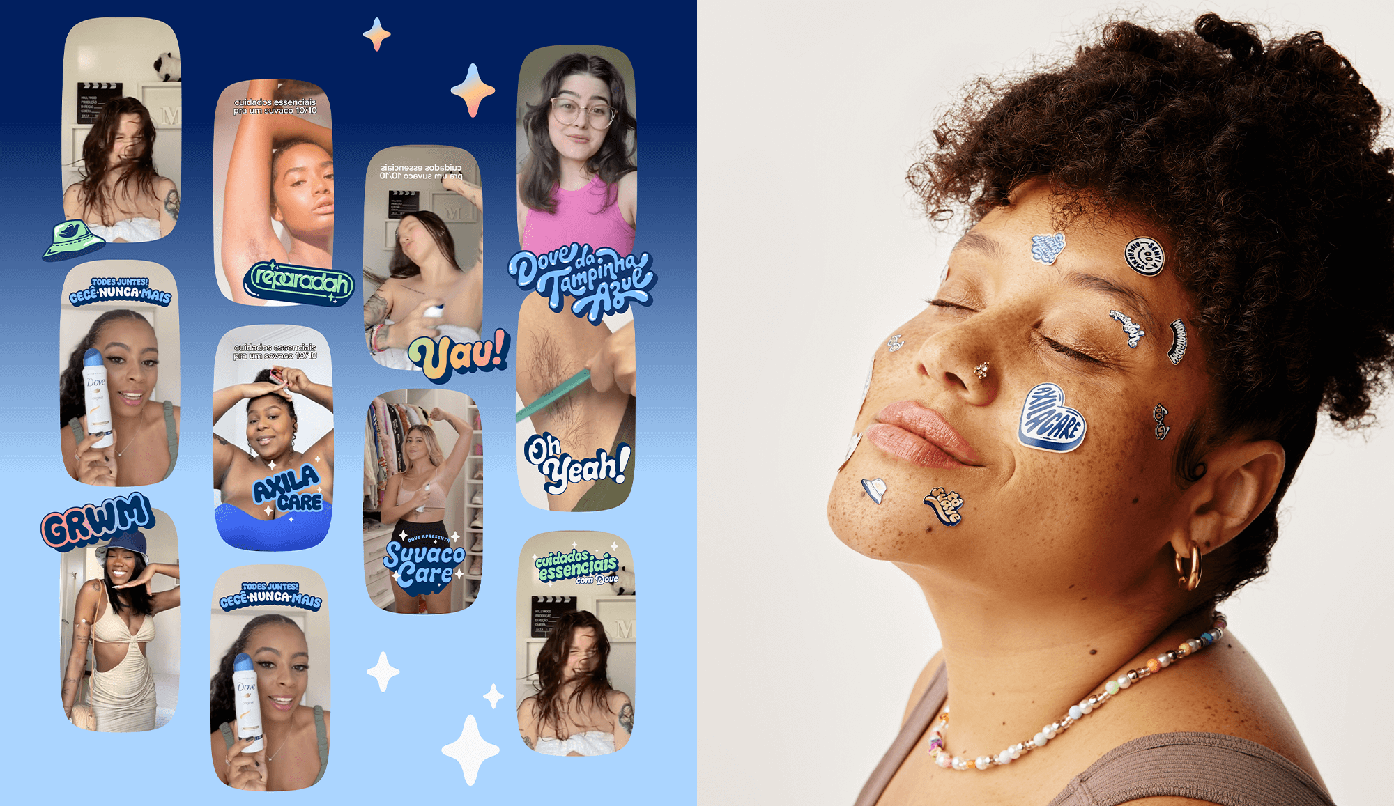
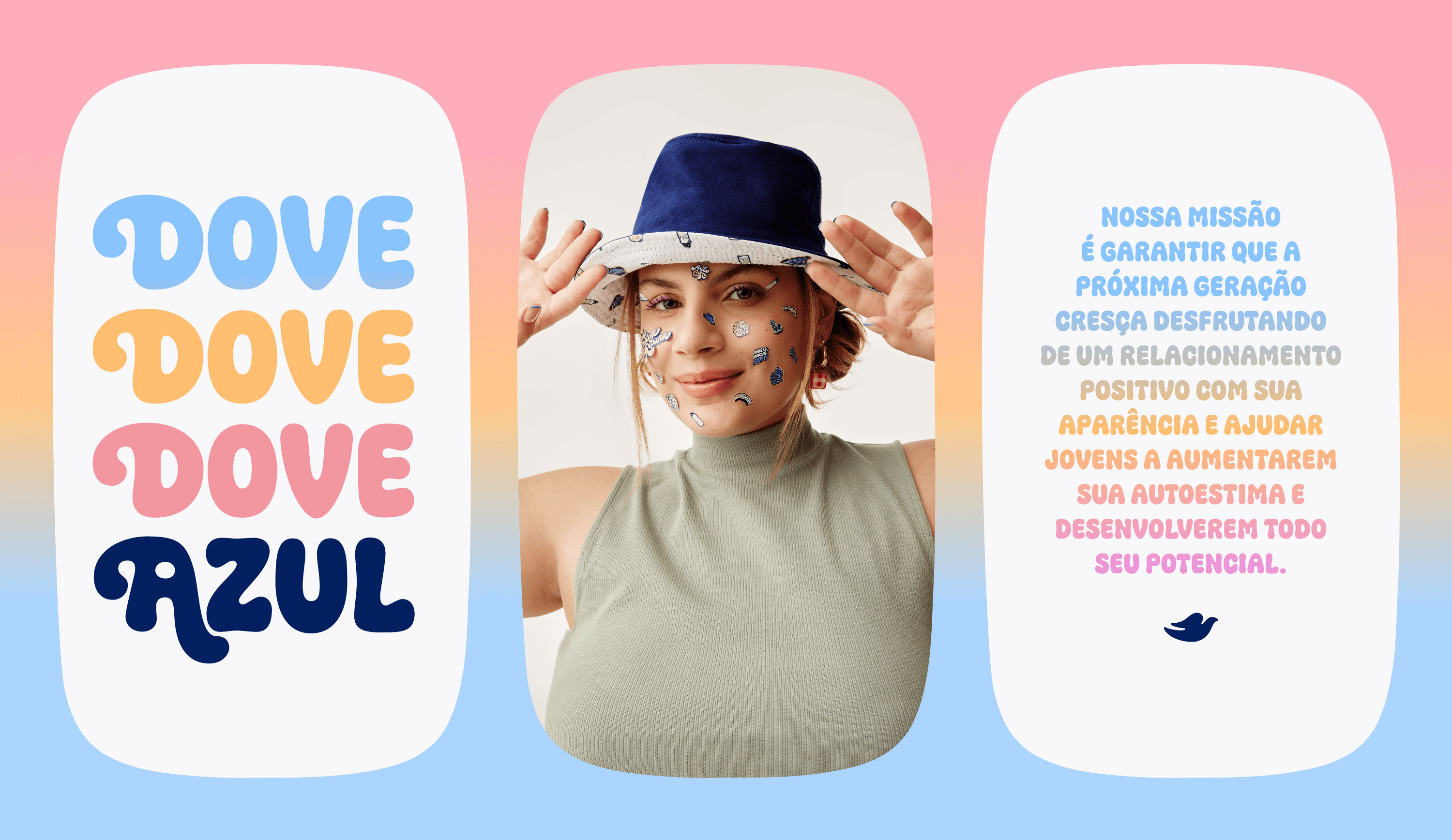
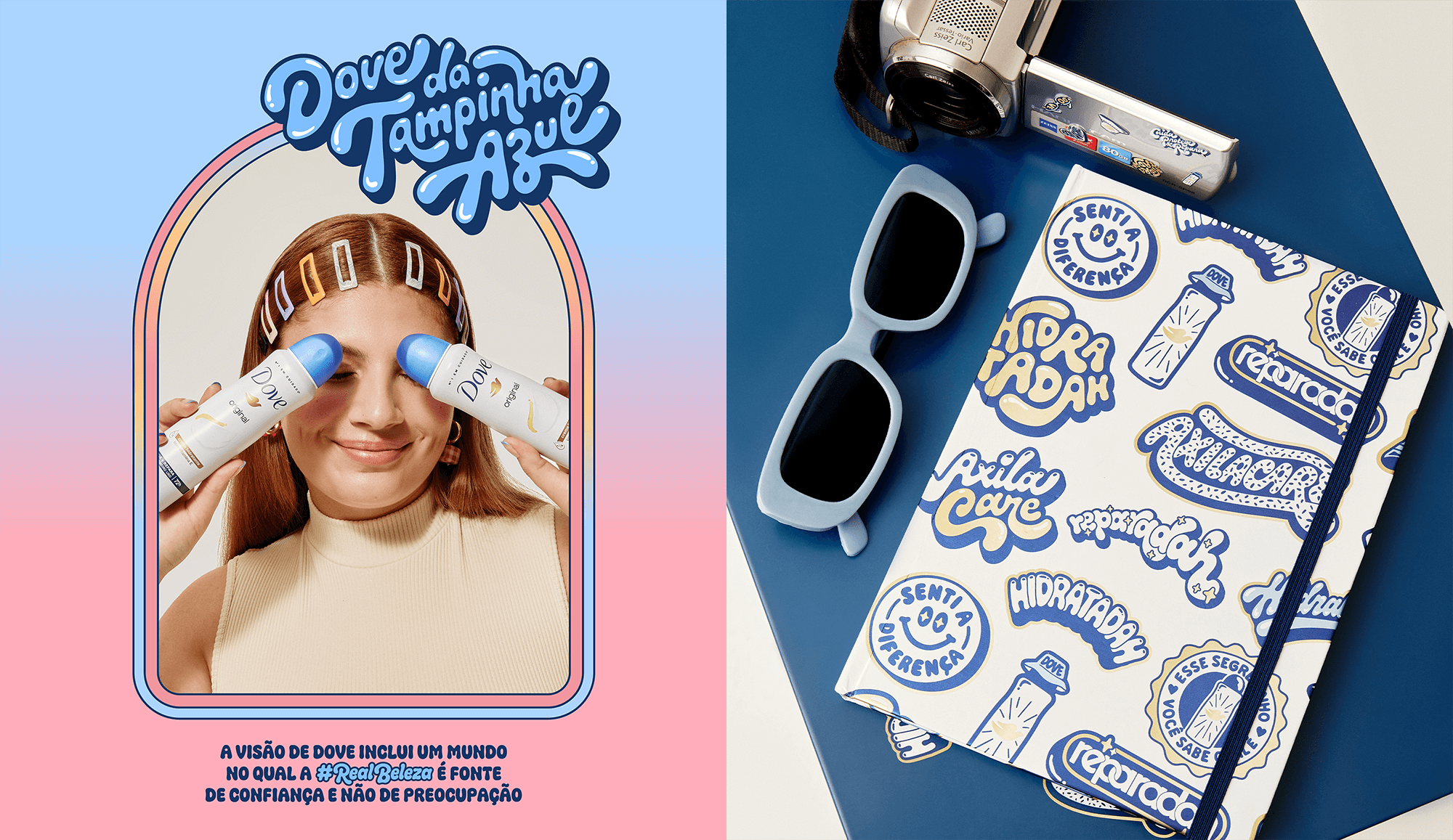
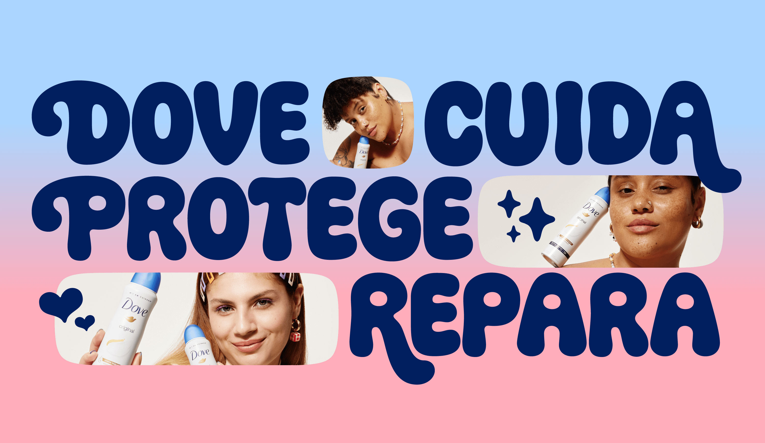
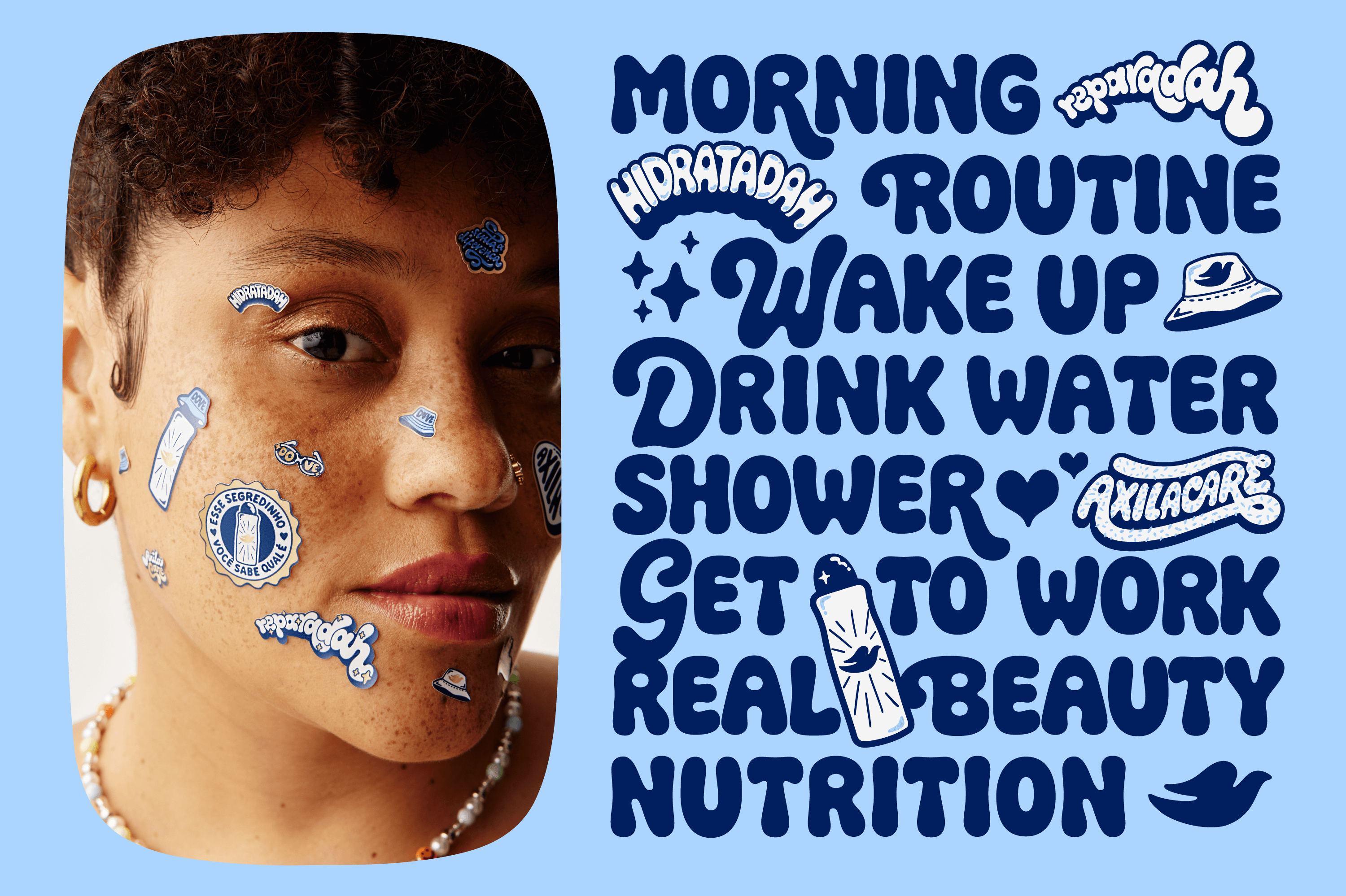
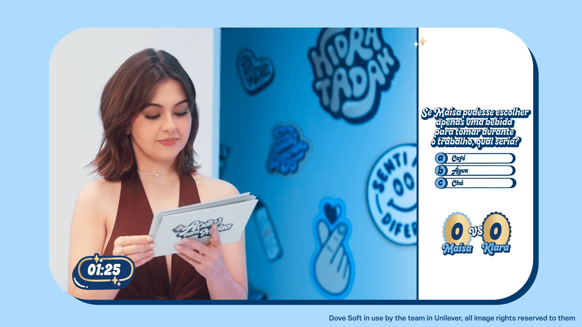
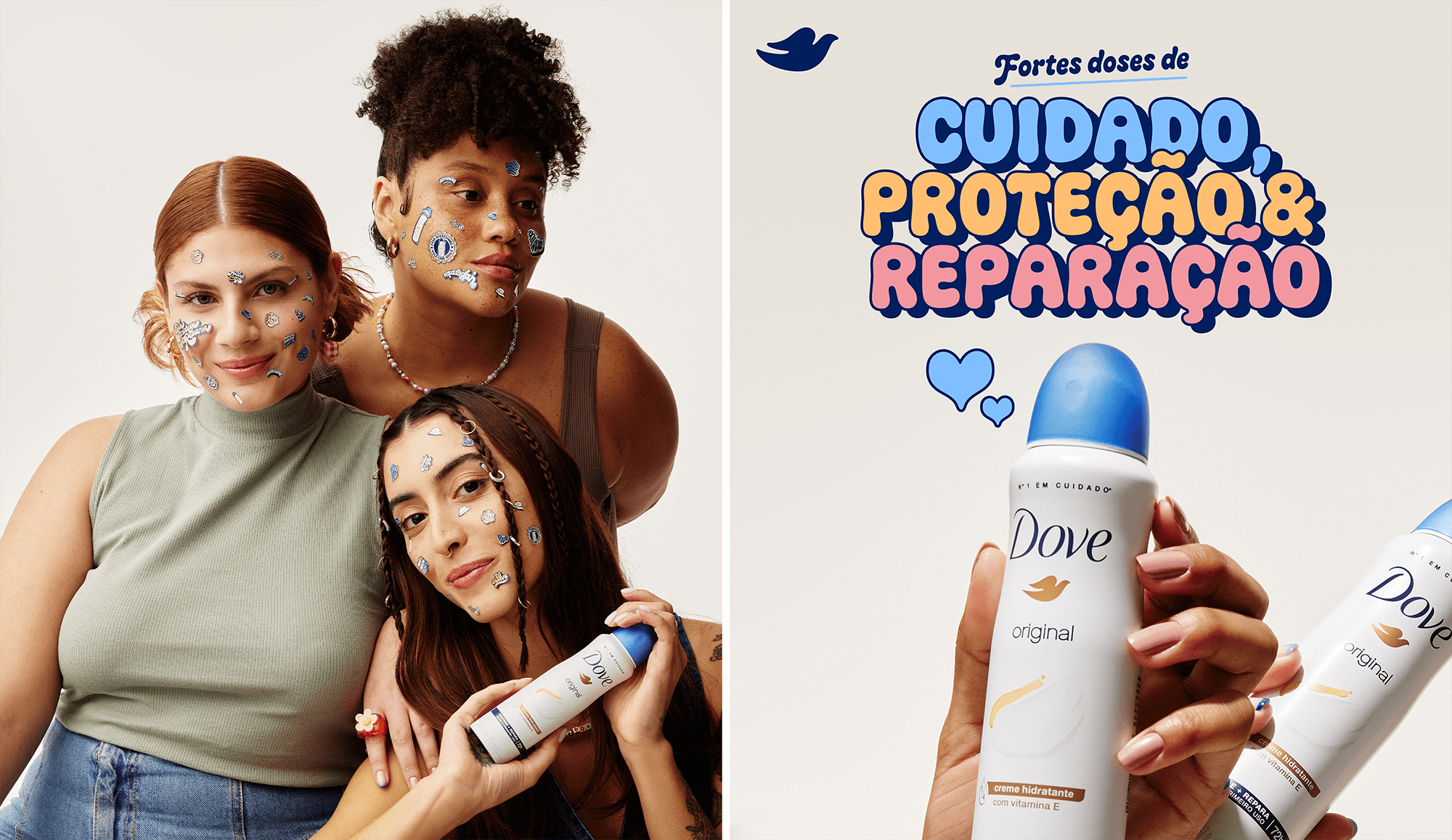
This is Dove Care and Dove Soft, two typefaces made with love for Dove’s 2023 “Tampinha Azul” campaign, celebrating the beauty of individuality and promoting a culture of acceptance.
The goal was to embrace the pillars of the brand’s positioning and maintain a consistent voice through all the assets created for the campaign. Developed using the letterings and stickers as a starting point, the two typefaces work as sisters: similar, but each with their own personality.
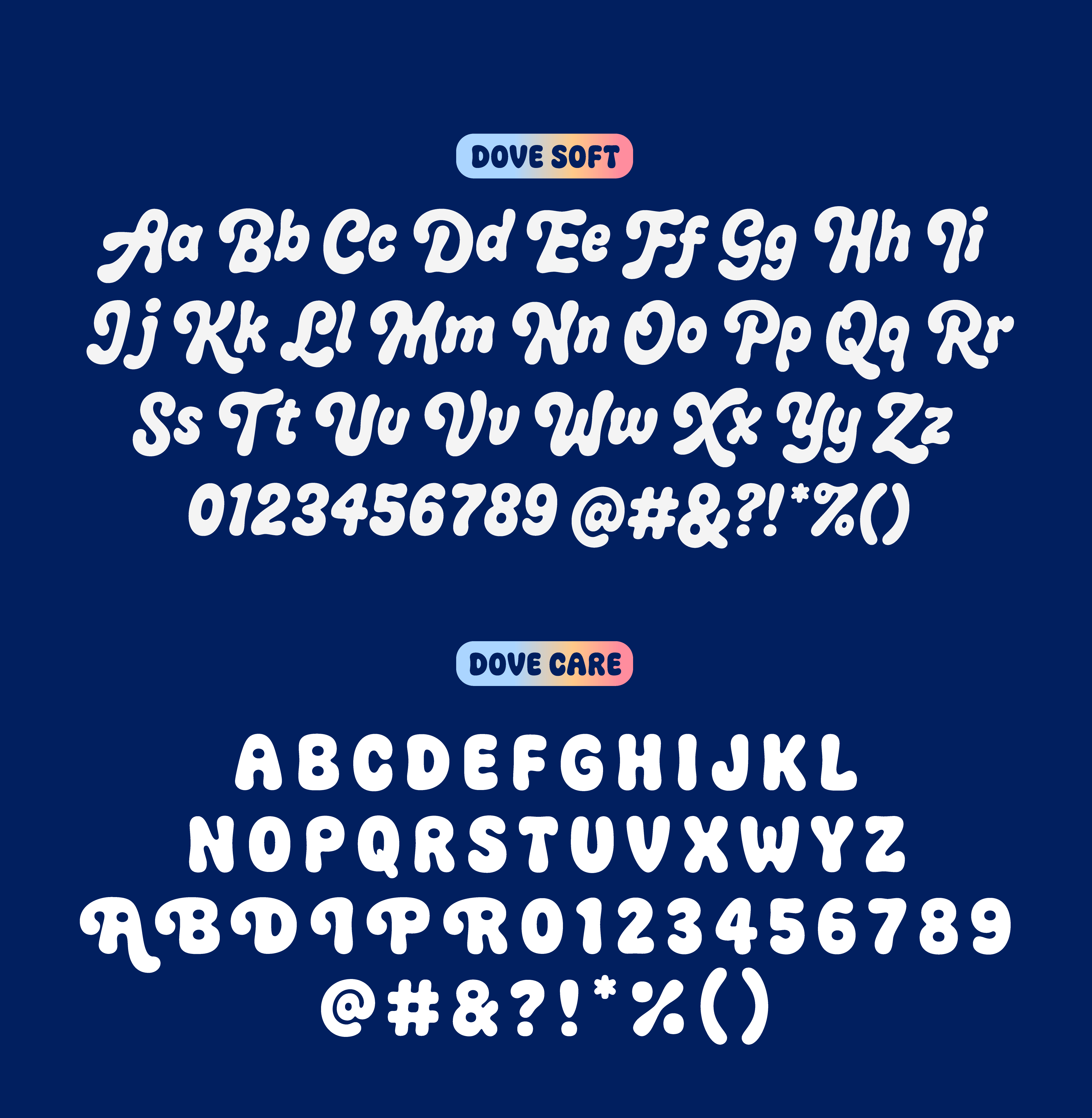
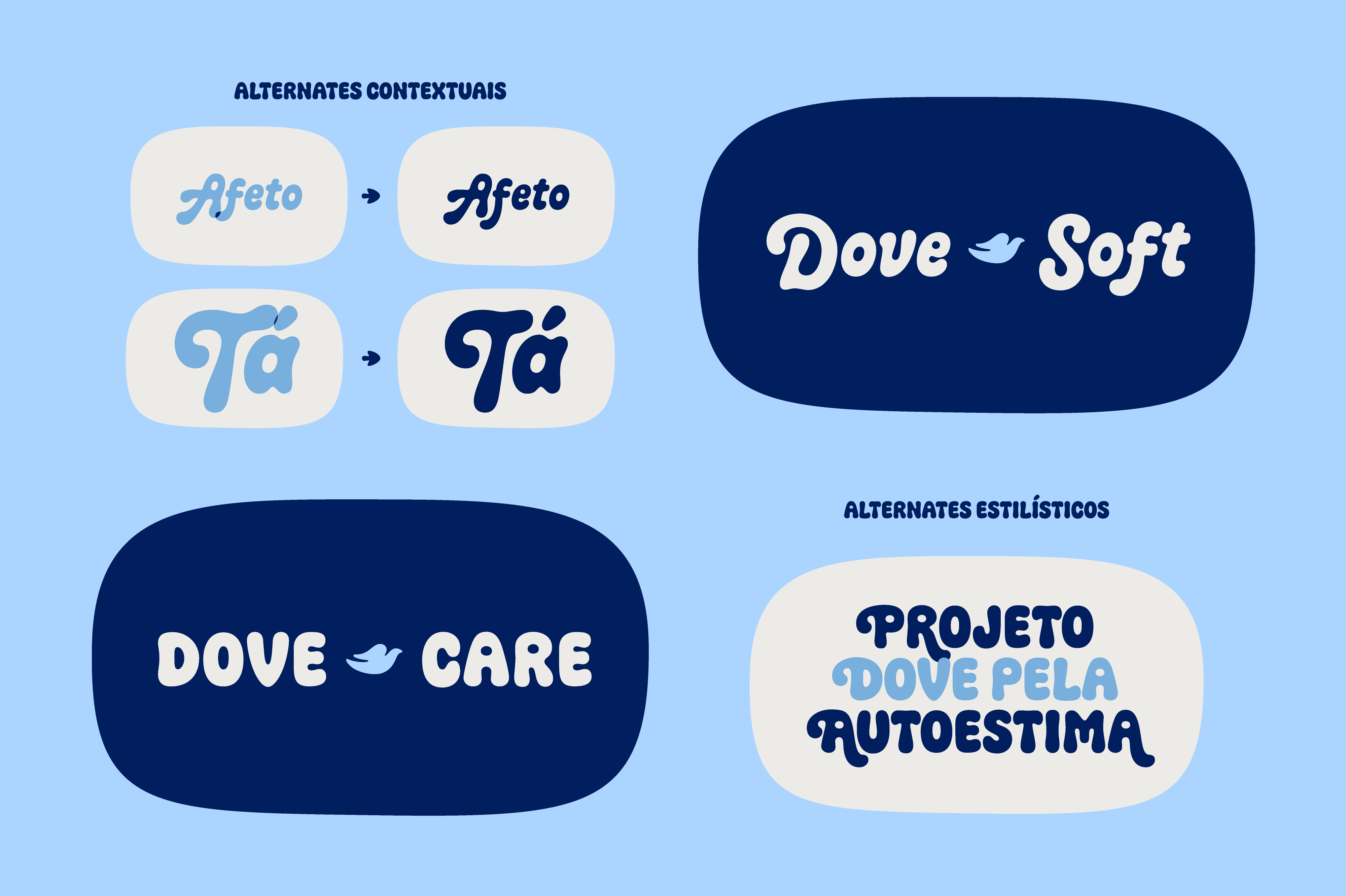
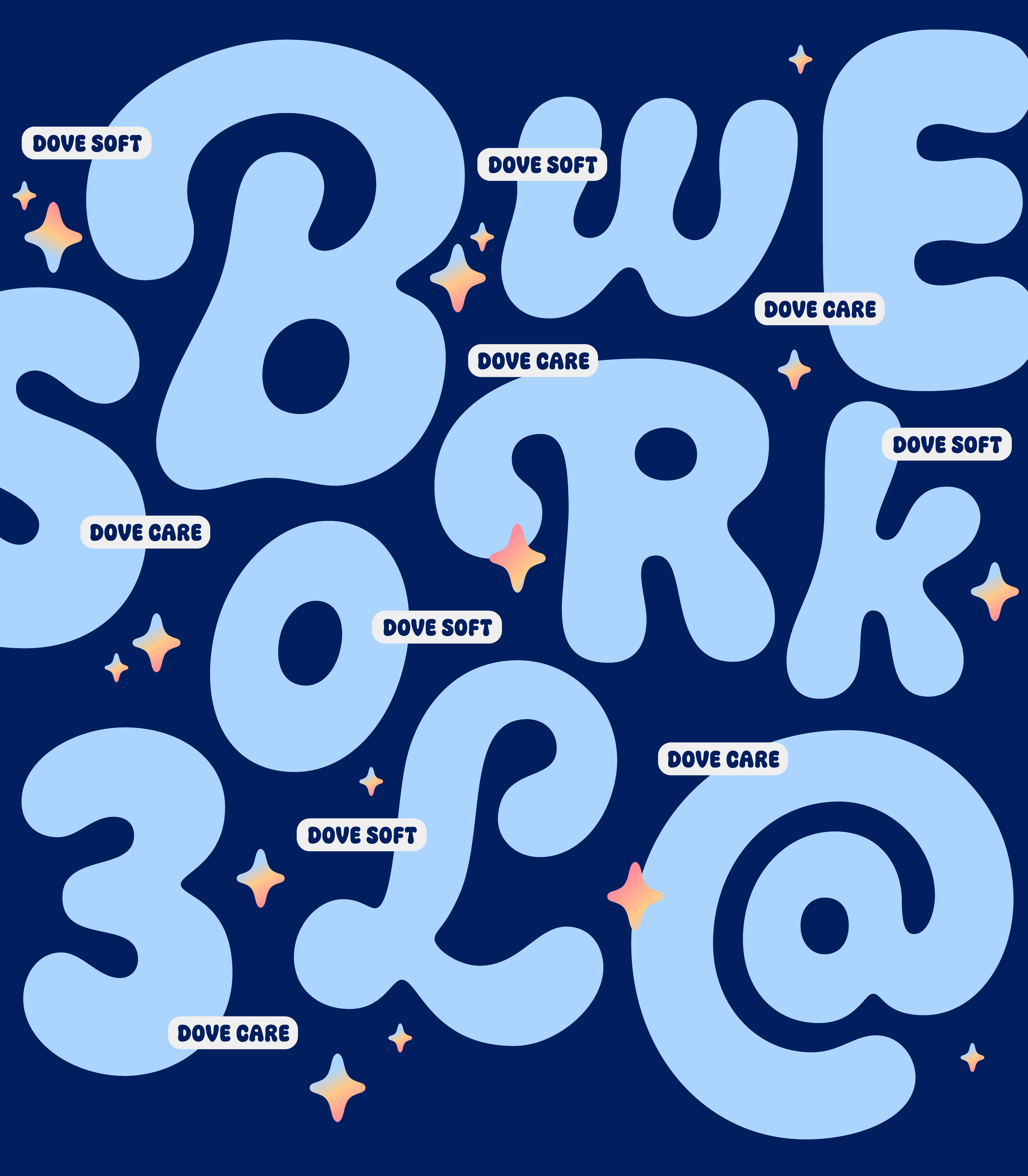
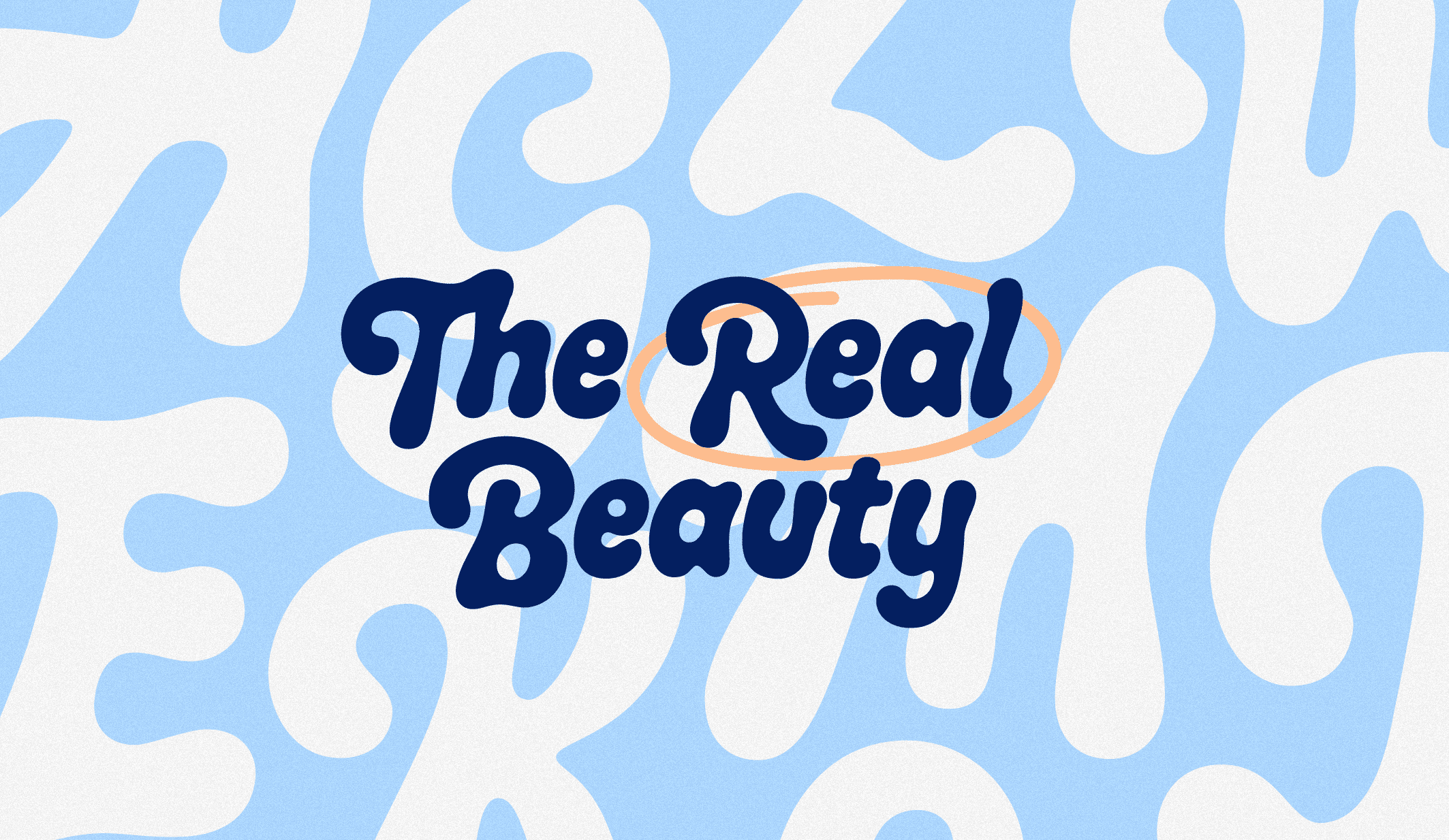
Dove Soft is a display script designed to convey a sense of playfulness and softness. It features a comprehensive character set with 137 glyphs, including upper and lower cases, soft edges, and playful forms.
Dove Care, on the other hand, is an all-caps typeface with 73 glyphs, including alternates, complementing Dove Soft while maintaining a consistent visual language.
The project was highlighted in several awards, such as the 2024 Brasil Design Award (Gold Medal in Type Design), 2024 Bornancini Award (Bronze Medal in Type Design), 2024 CLAP Awards (Platinum in Type Design), and 2024 ADG Design Biennial (Selected in Type Design).
Dove Team
Copy: Mariana Carvalho
Art Director: Thiago Mussa
Creative Director: Ricardo Miller
Dove Soft and Care Team
Lettering and stickers: Leandro Assis and Diego Justino
Type designers: Leandro Assis and Júlia Lago (Motora)