
epbr is one of the leading news agencies specializing in the oil, natural gas, and energy markets in Brazil. Founded in 2017, the company is a digital native, bringing a fresh perspective to a traditionally conservative industry. In addition to its written content, epbr has consistently embraced new media and formats, ranging from videos and live broadcasts to reels and podcasts.
This bold and adaptable approach has enabled the agency to remain agile and quickly establish itself as one of the most relevant national media outlets in the sector, earning the respect of both public institution leaders and private sector executives.


Our Goal with the Project
epbr already was a must-visit hub for anyone who wants or needs to stay informed about decision-making in the Brazilian energy market. However, when they approached us, their communication did not reflect their stature, professionalism, or, most importantly, their potential for innovation.
Challenge Summary: How to create a mature and reliable language that can connect with an extremely traditional industry without sacrificing the positioning of an innovative and daring organization, willing to experiment with different formats and provoke important discussions aligned with the demands of new generations?


Insight and Strategy
To address this question, we involved the entire epbr team and understood that creating a new name that better represented the agency would be the project’s main challenge, even more so than the positioning itself (since, although not yet well expressed, the partners’ vision of it was already well aligned).


Naming and Verbal Identity
epbr stands for “Energia e Petróleo Brasil” (Energy and Oil Brazil), and having an acronym represent the company communicated a more traditional and bureaucratic message than the partners desired. epbr’s vision for the future involves the intersection of politics and energy, the idea that this topic should interest the entire population, and that energy transition should always be at the center of these debates.
From the idea of the “center” and how the agency prioritizes listening to different stakeholders, the new name was born: eixos (axes).
The verbal identity unfolded naturally from the philosophy shared by the partners: everything begins with energy – an issue that affects absolutely everyone. Eixos is the starting point for the conversations shaping the future of energy.


Visual Identity
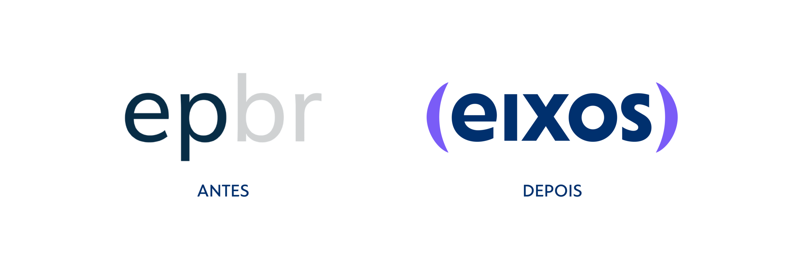
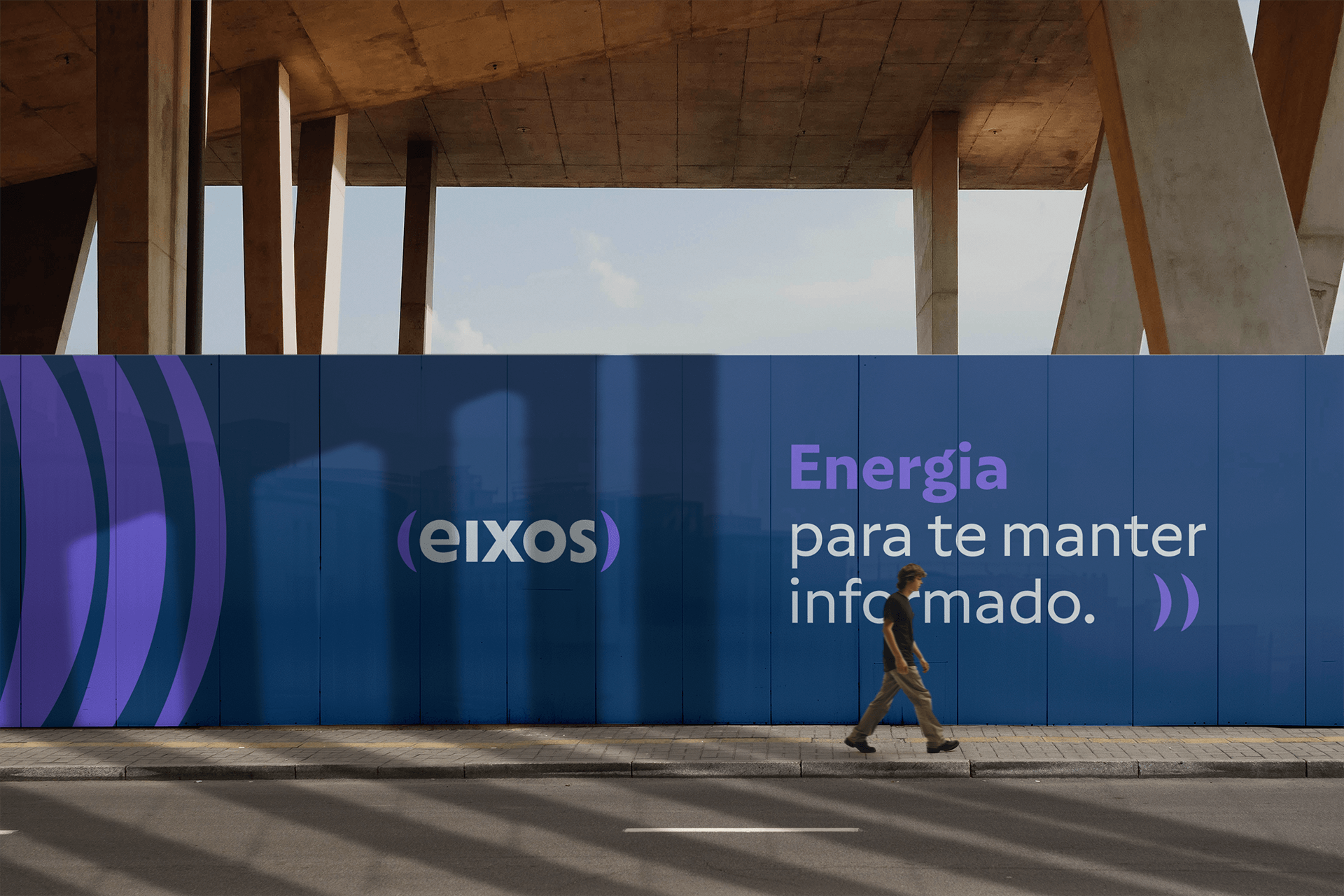
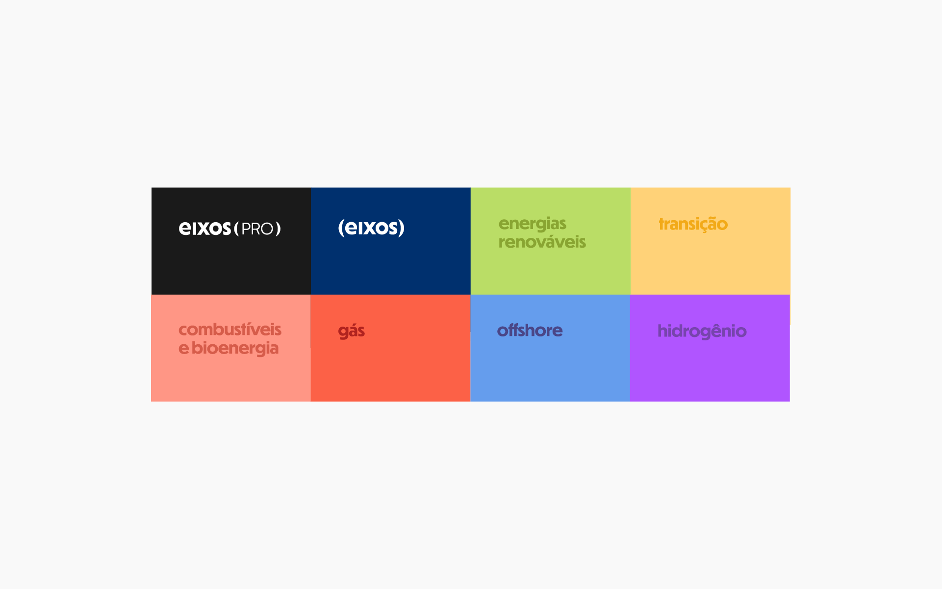
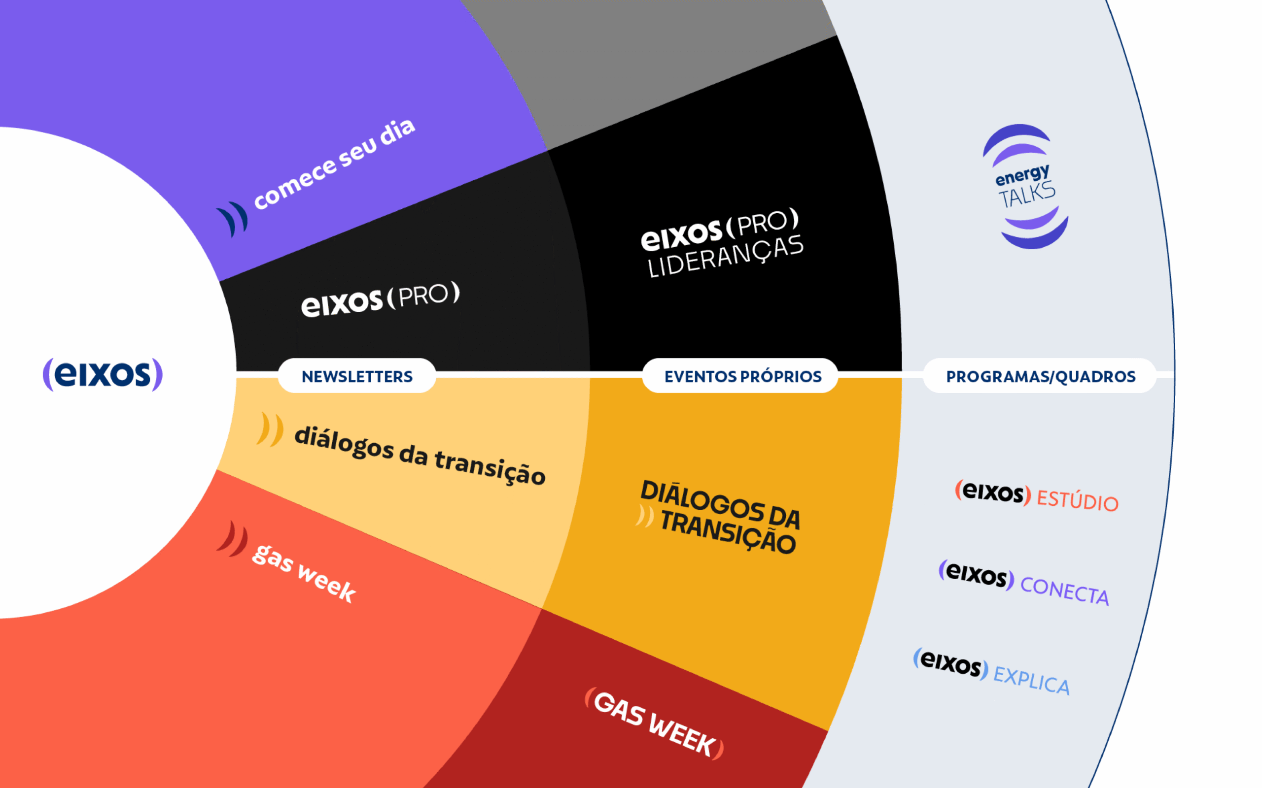
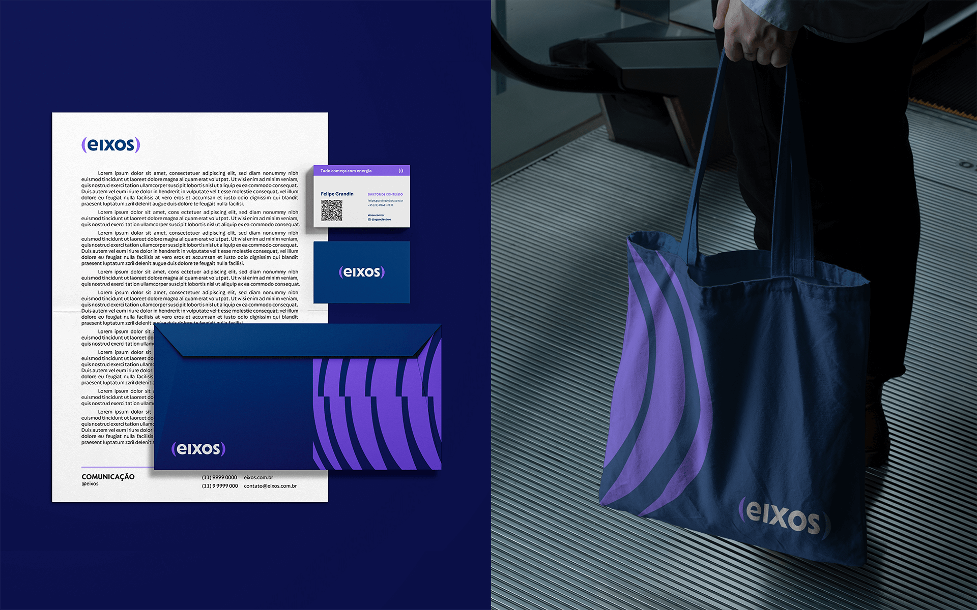
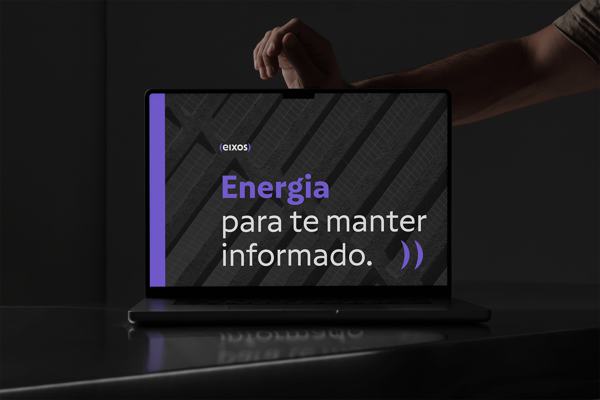
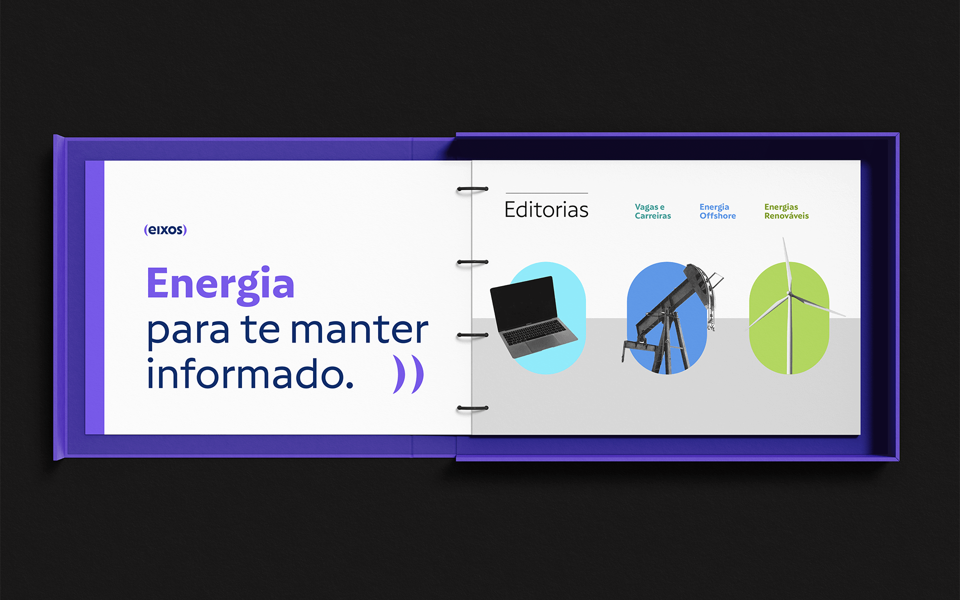
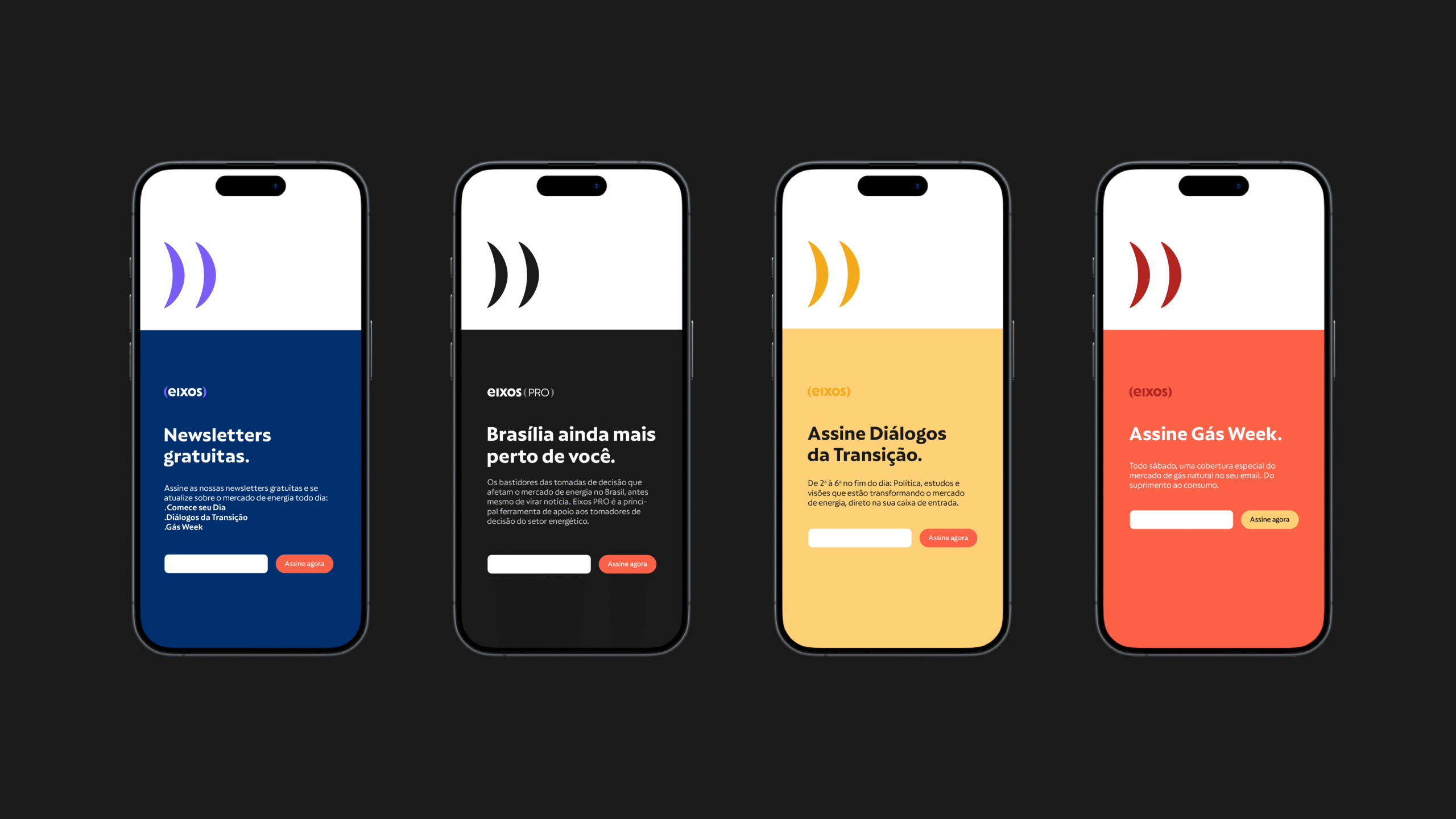
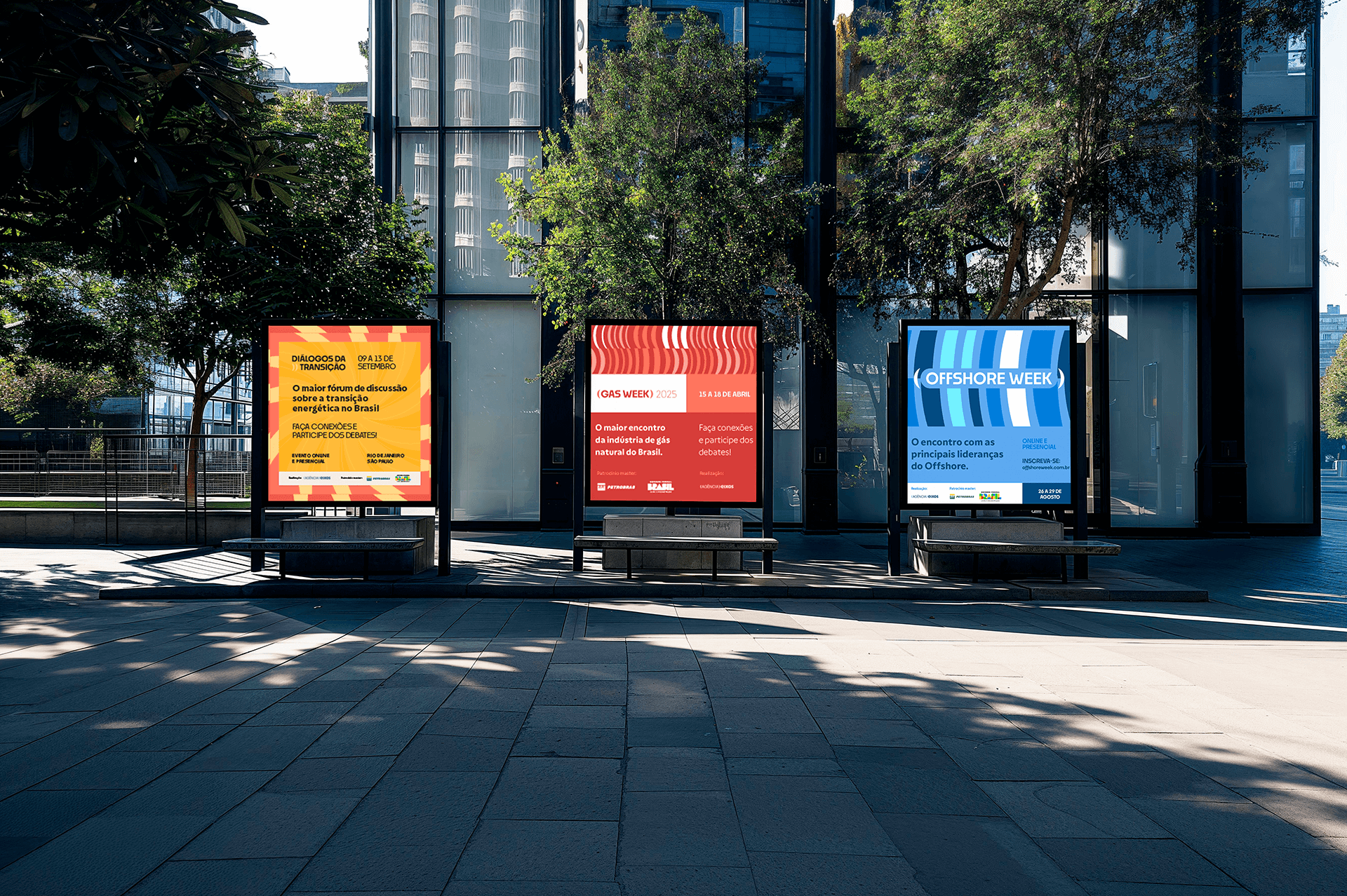
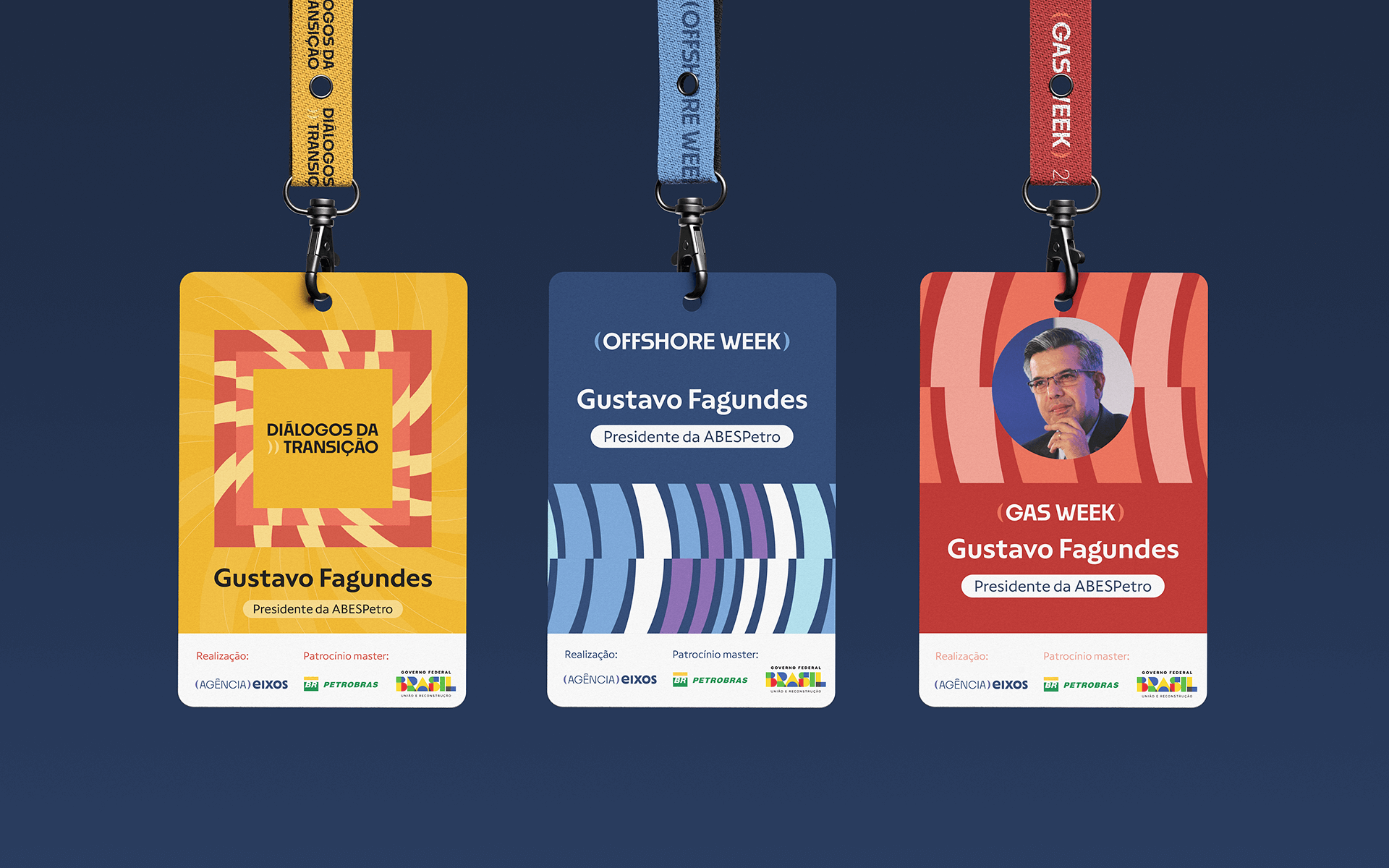
For the visual identity, we aimed to preserve the dark blue from the original brand and maintain the lowercase logo. From there, we introduced purple as a secondary color to convey innovation. Color also plays a key role in organizing the editorial structure, newsletters, and events.
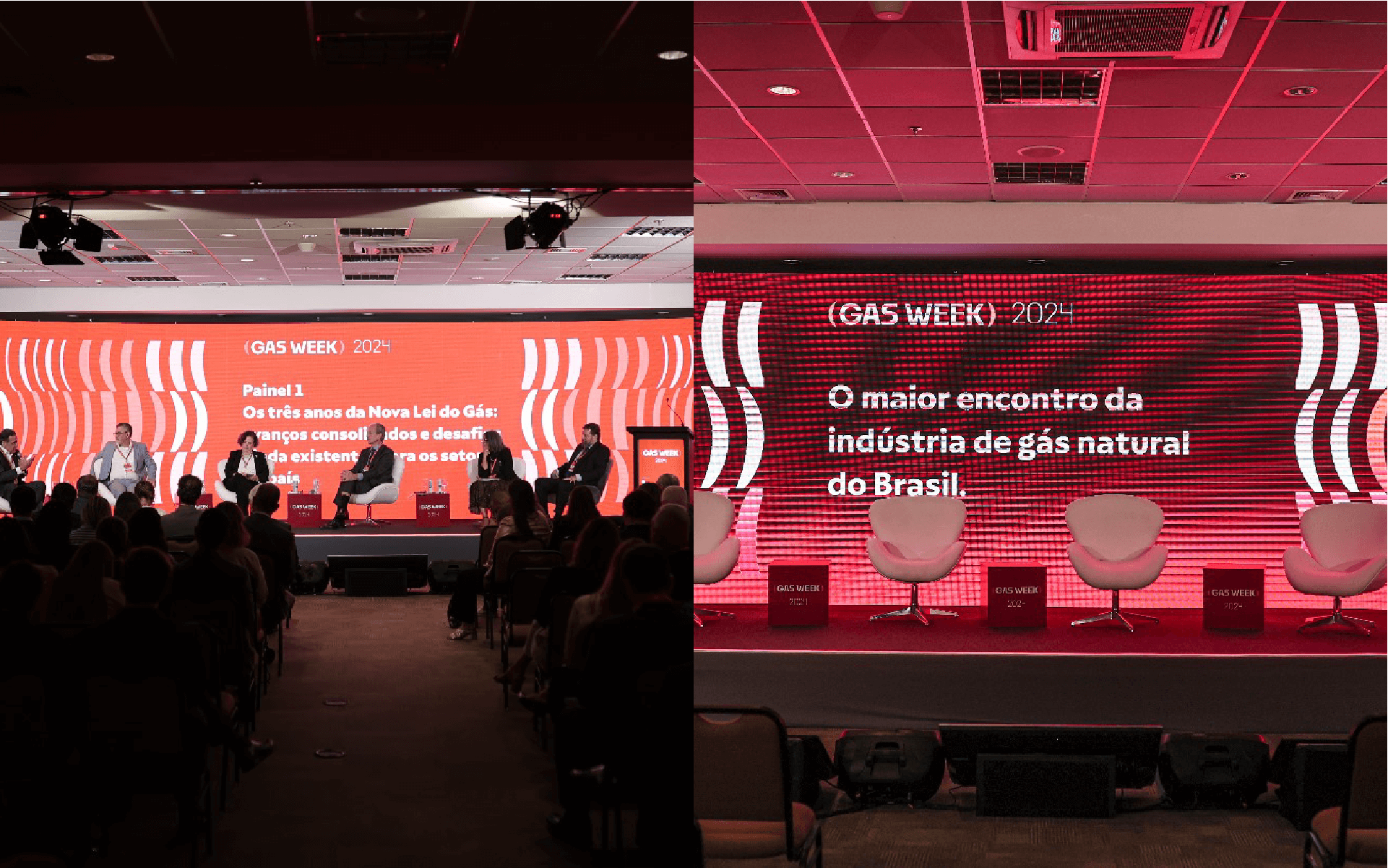
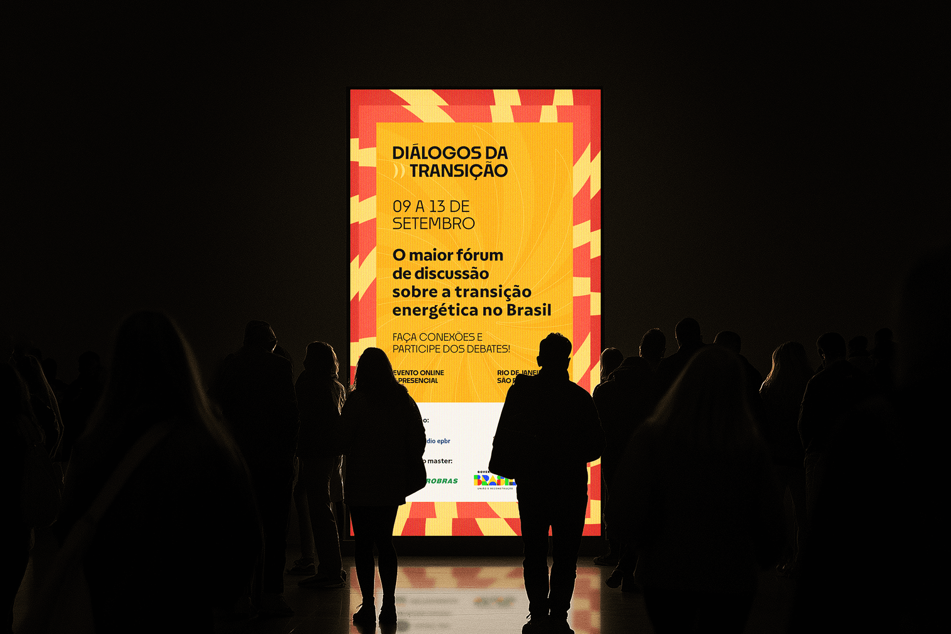
The layouts are minimalist, with the parentheses from the logo used as graphic elements. This was a fitting choice for a company whose core activity is text production and fostering dialogue.
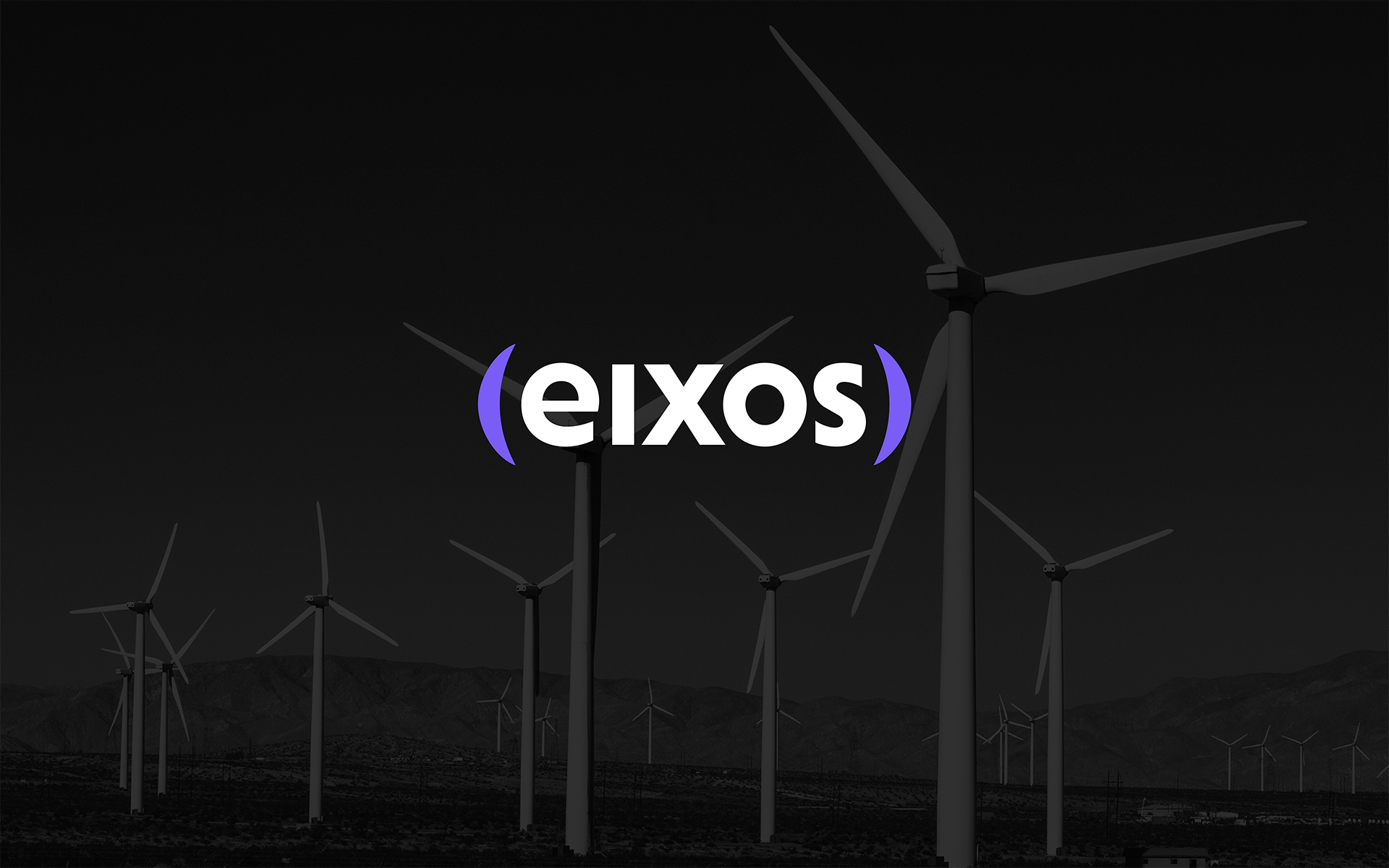
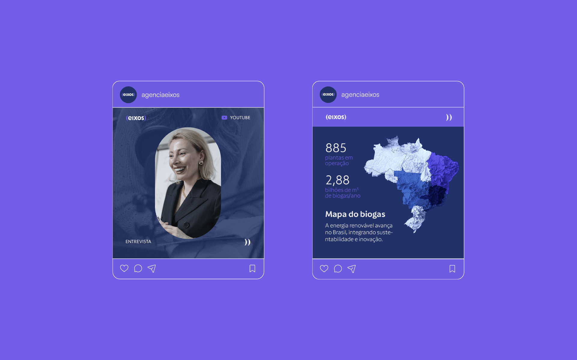
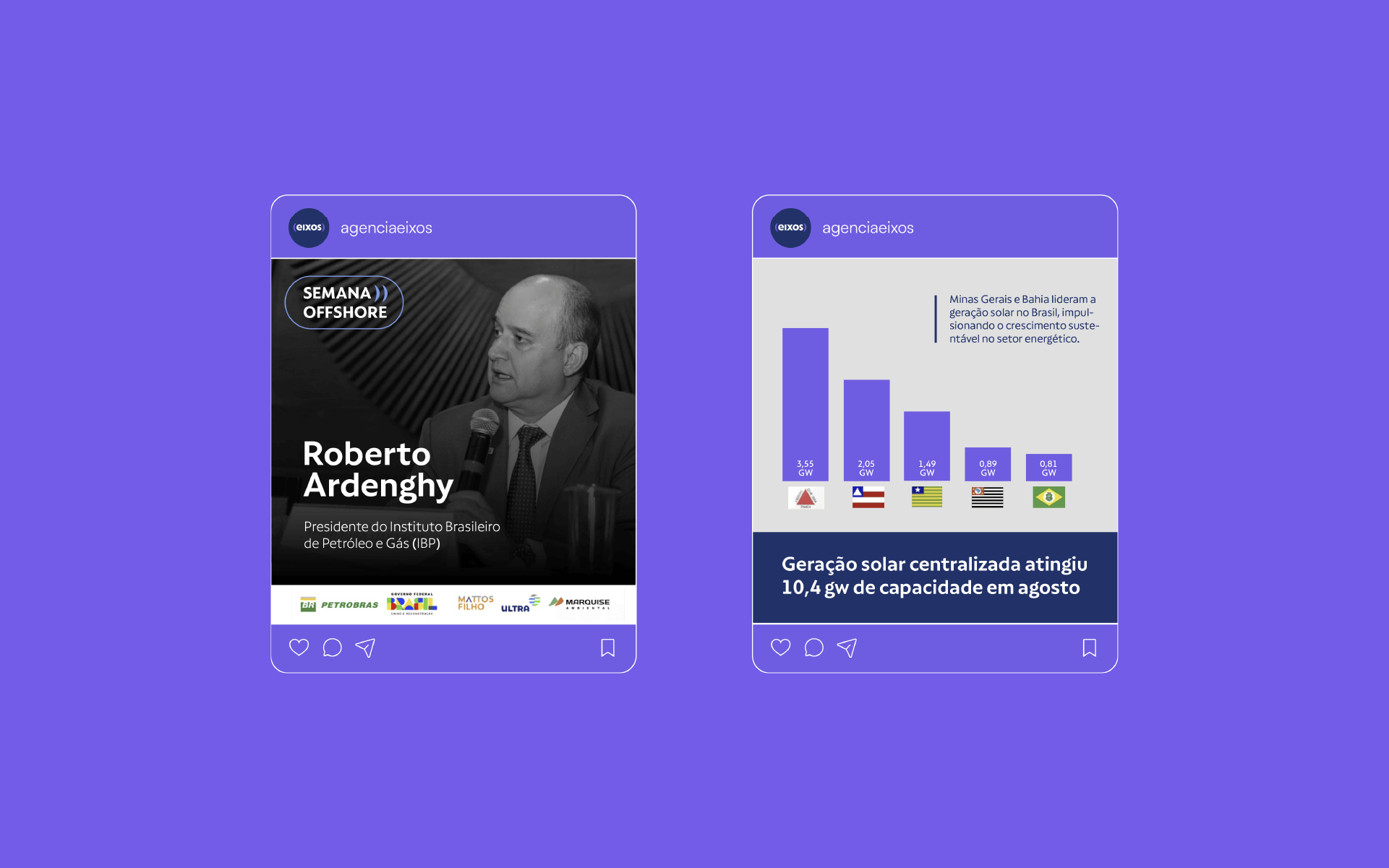
Photo curation also plays a significant role in constructing the message communicated by eixos. Given that using less attractive photos, such as natural gas production plants, can be inevitable, we directed the preference towards wide-angle shots with warm colors where the sky and sun appear vibrant and saturated. Whenever possible, images representing renewable energy production should be preferred.
Based on these premises, we successfully transitioned the epbr brand, now eixos, to a new level, much more aligned with the philosophy that already existed within the organization, among partners and collaborators.


Branding, Naming and Visual Identity: Motora
Strategic Direction: Luize Araújo
Strategy and Writing: Luize Araújo, Isabele Souza
Art Direction: Luize Araújo
Designers: Luize Araújo, Julia Sales, Júlia Lago, Maria Stéfanni Carvalho