
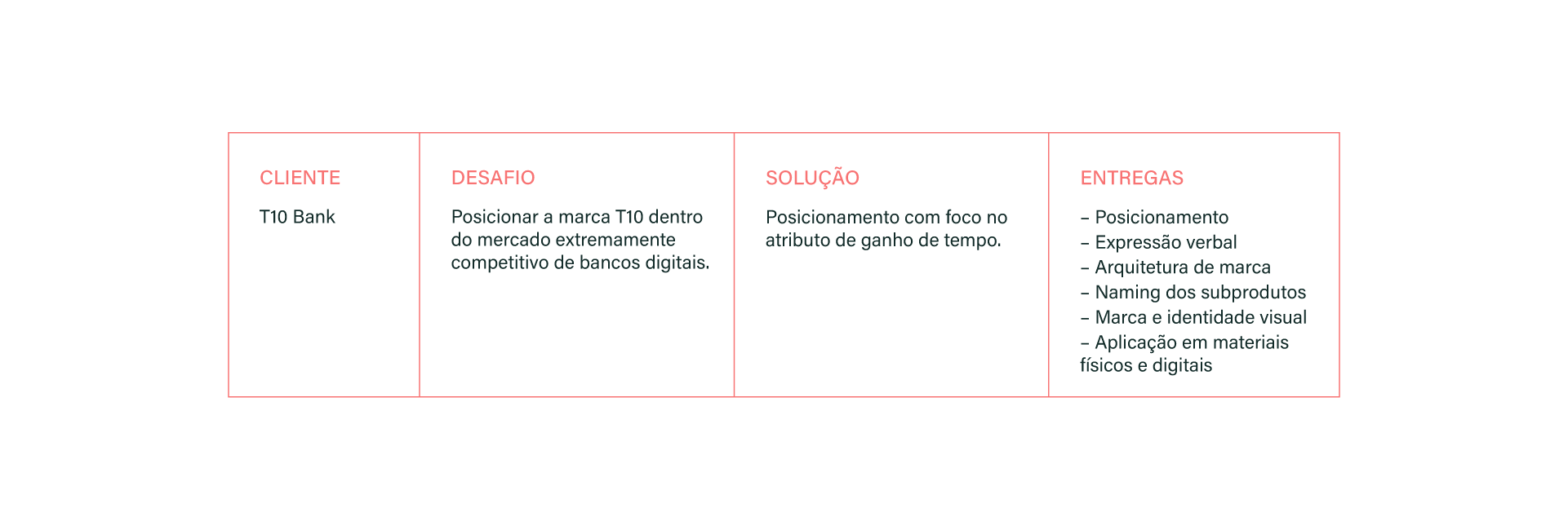
T10 Bank appears within the extremely competitive market of digital banks. With the intention of reducing the bureaucracy involved in contracting financial services for the legal entity, the demand for the branding project arose from the need to position this new fintech.
Our goals with the project:
– Highlight T10 Bank from a competition that has been adopting a similar discourse for a long time now, and is advancing increasingly to serve legal entities as well– Organize the brand’s architecture and its service portfolio in a clear way, at all points of contact.
Strategy and brand voice
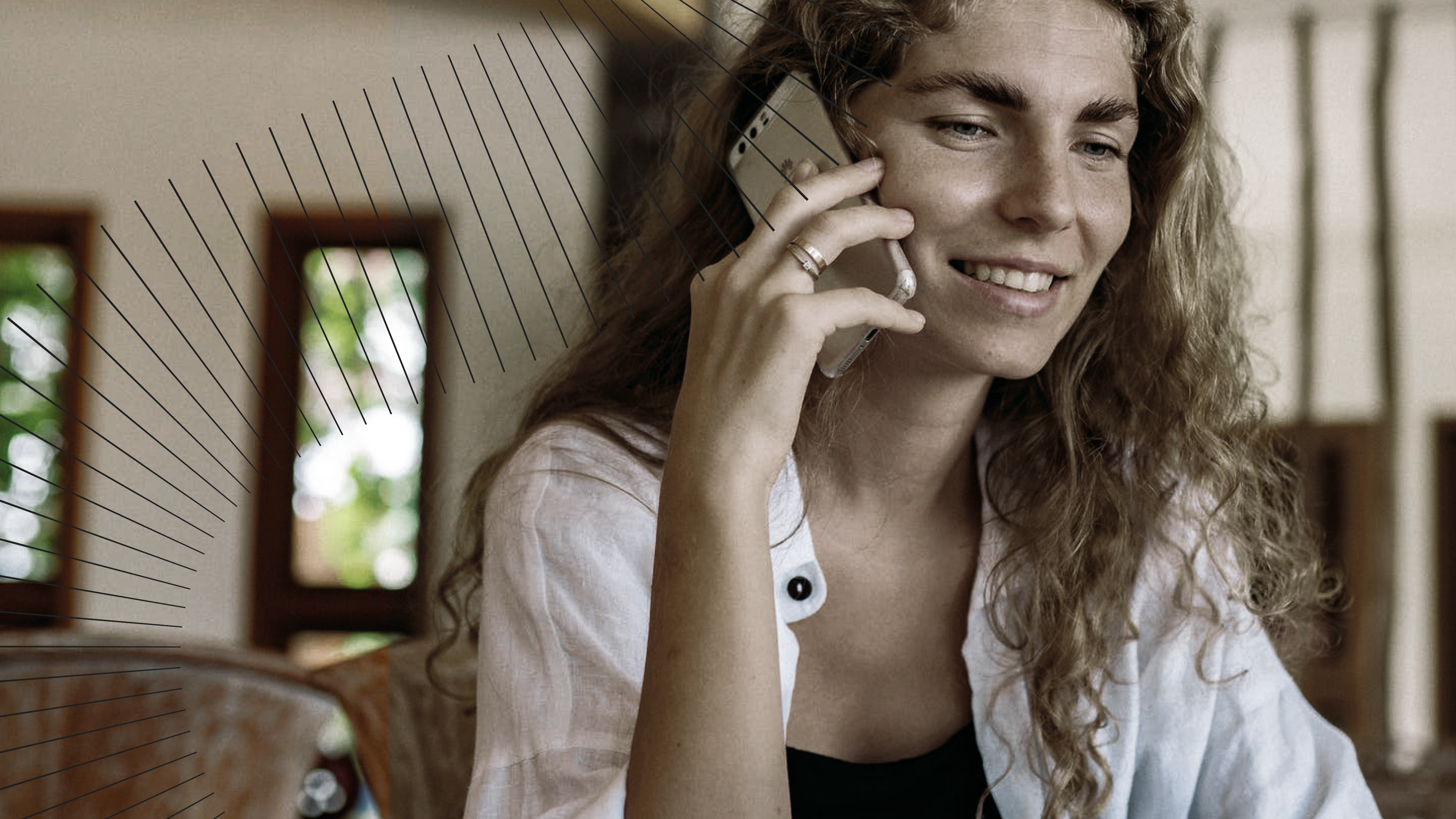
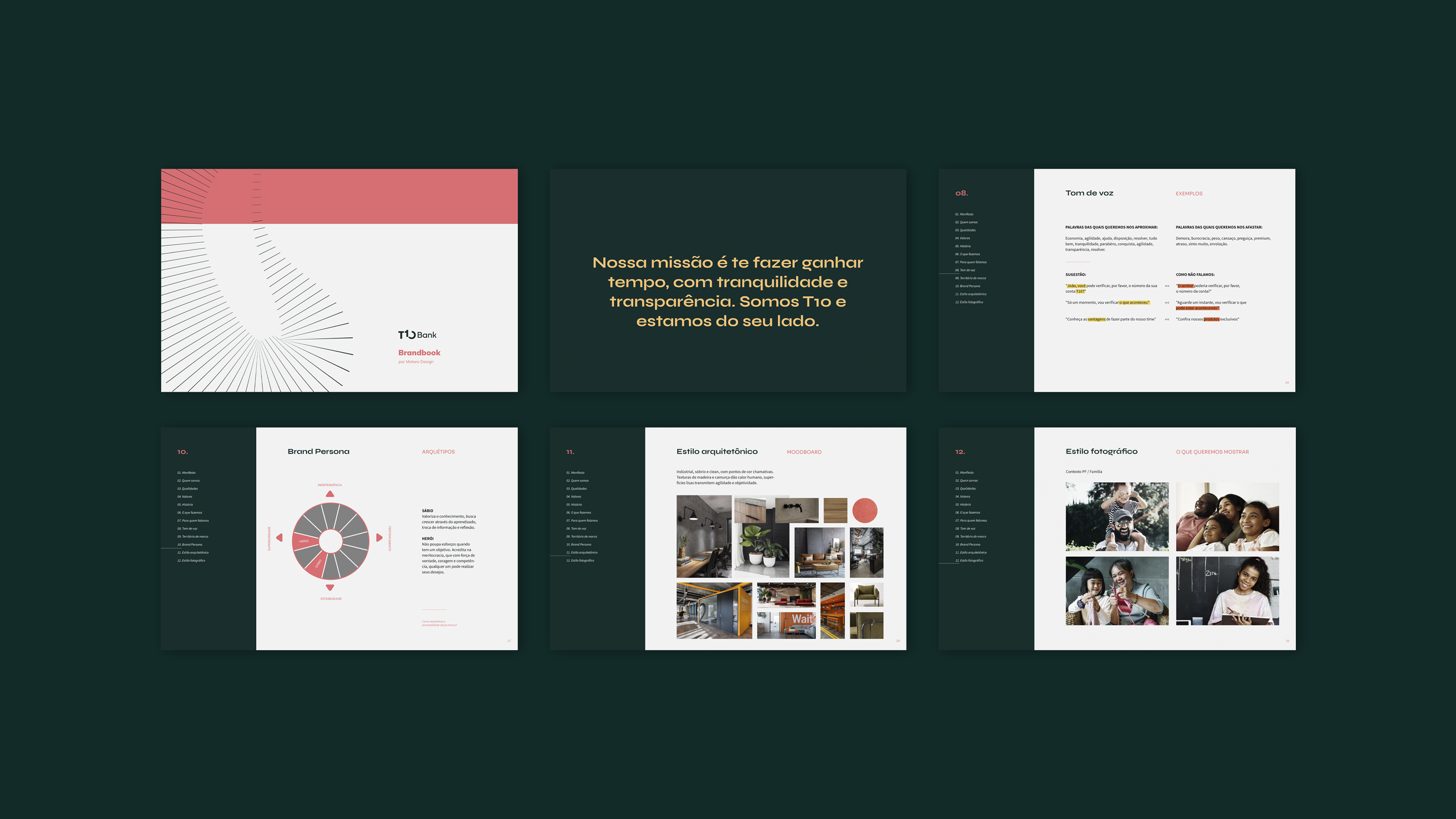
During the analysis of competitors, it was noticed that the discourses of “no bureaucracy” and “transparency” were already commonplace in the segment. To differentiate T10 Bank from the rest, we positioned the fintech as a business partner for the client and associated this with the attribute of saving time as the biggest gain. “T10 is a financial services platform for those who own their time.” Thus, we place the client as the protagonist and T10 as a facilitator, a mentor, able to offer support whenever necessary, as it understands the challenges of running a business.
Visual identity
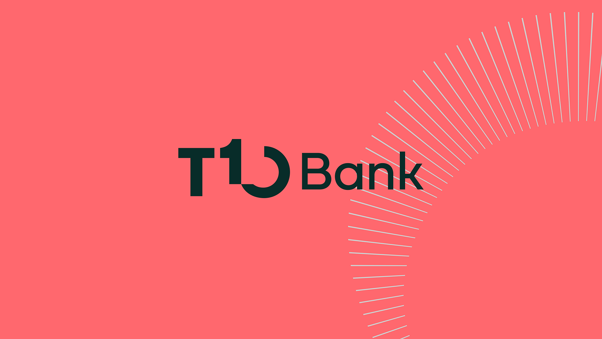
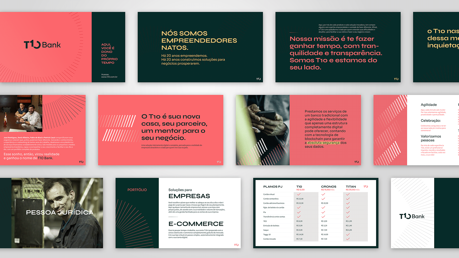
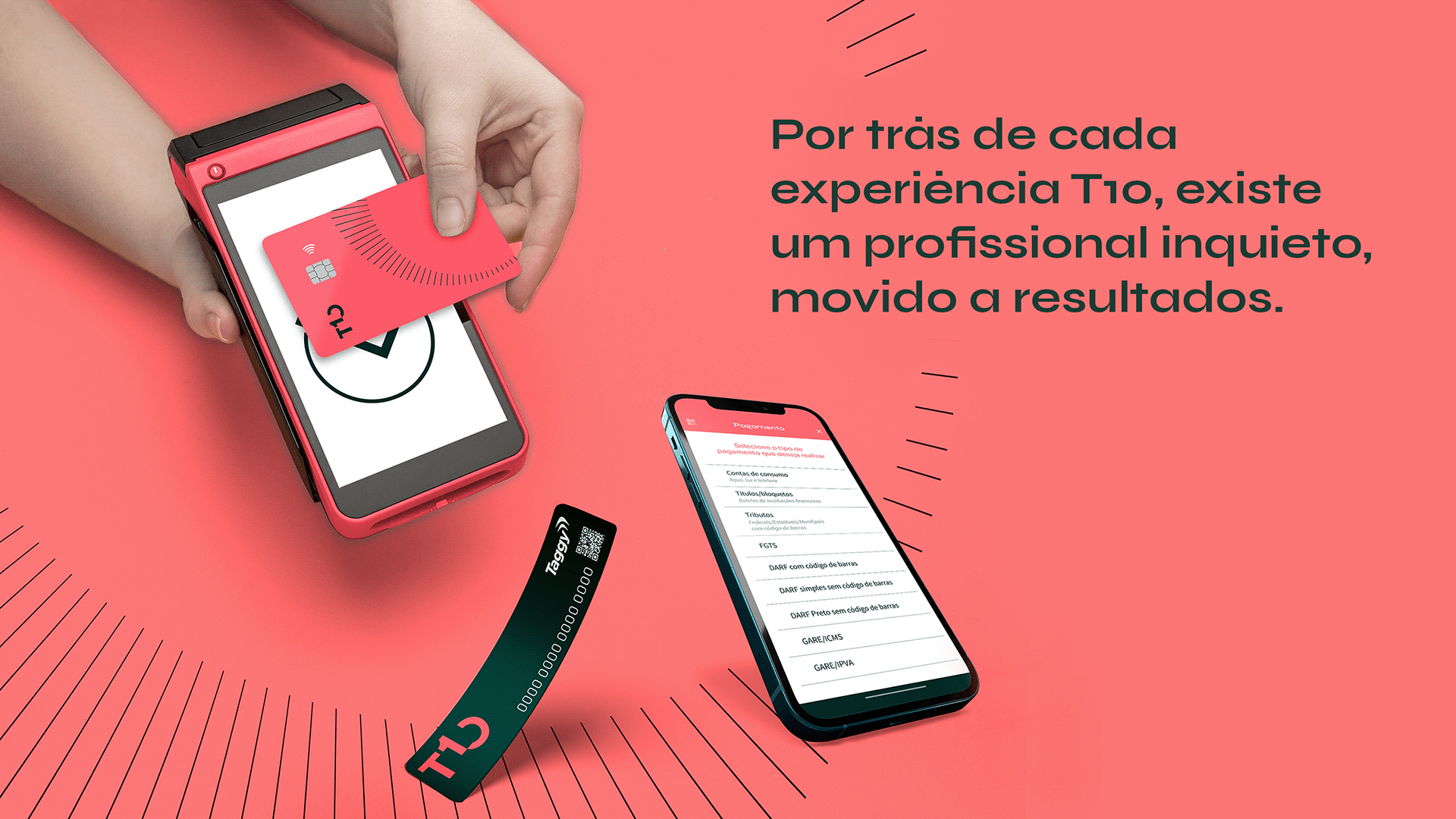
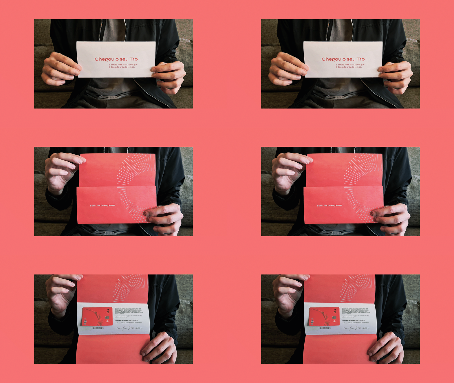
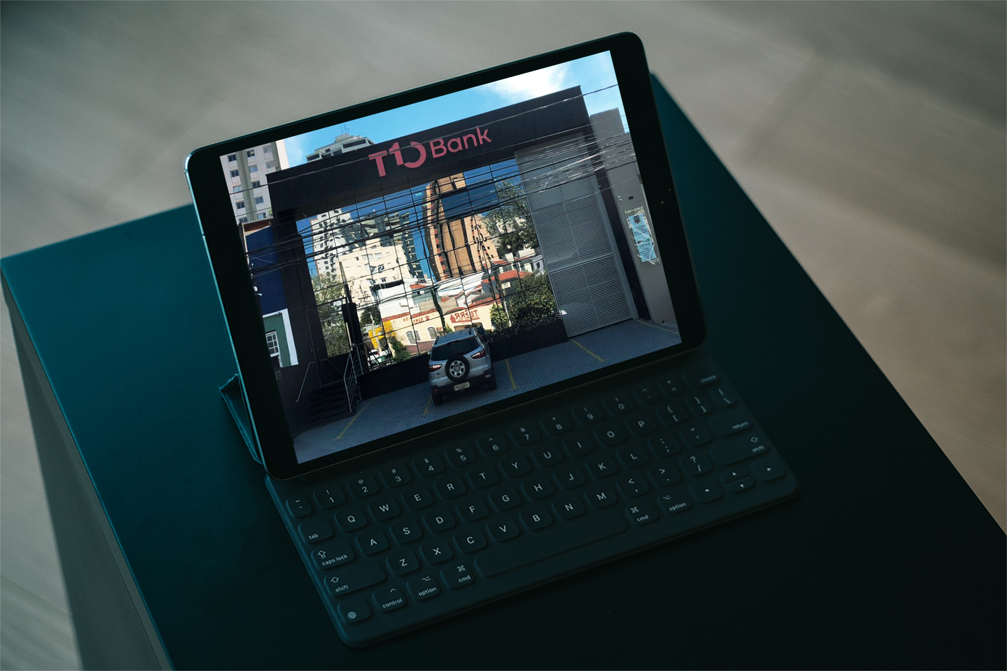
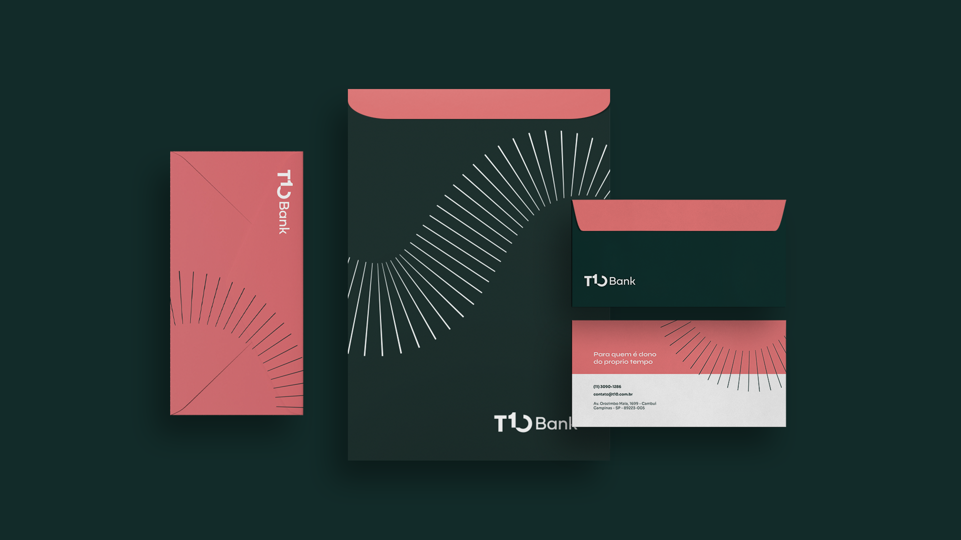
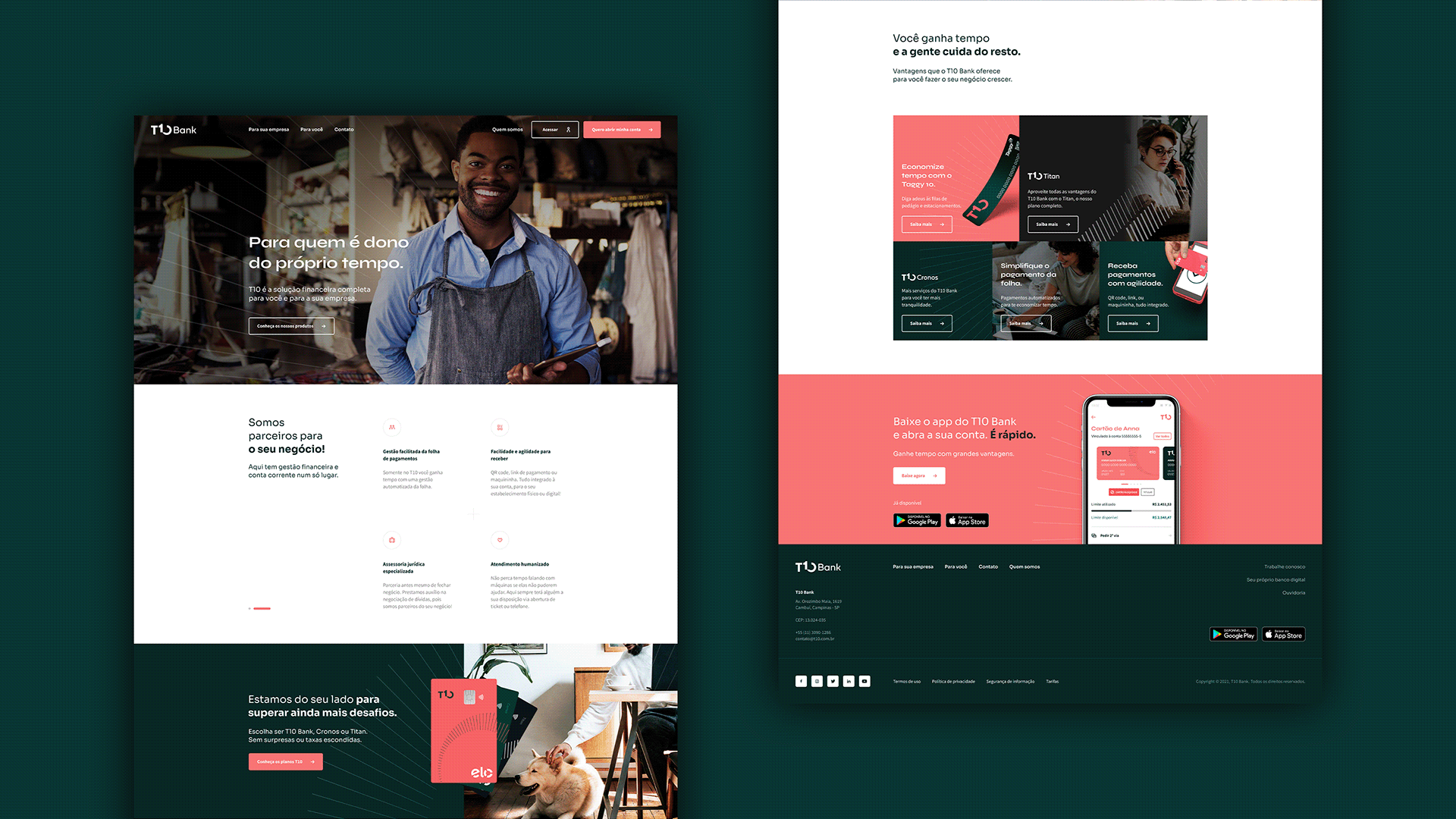
The entire verbal and visual universe of the T10 Bank brand was built from the concepts of leadership and time saving. Both the logo and the brand’s elements reflect the dynamism of the digital service and the robustness needed to convey a message of reliability. The choice of the striking color seeks to highlight T10 within the segment.



Brand Architecture
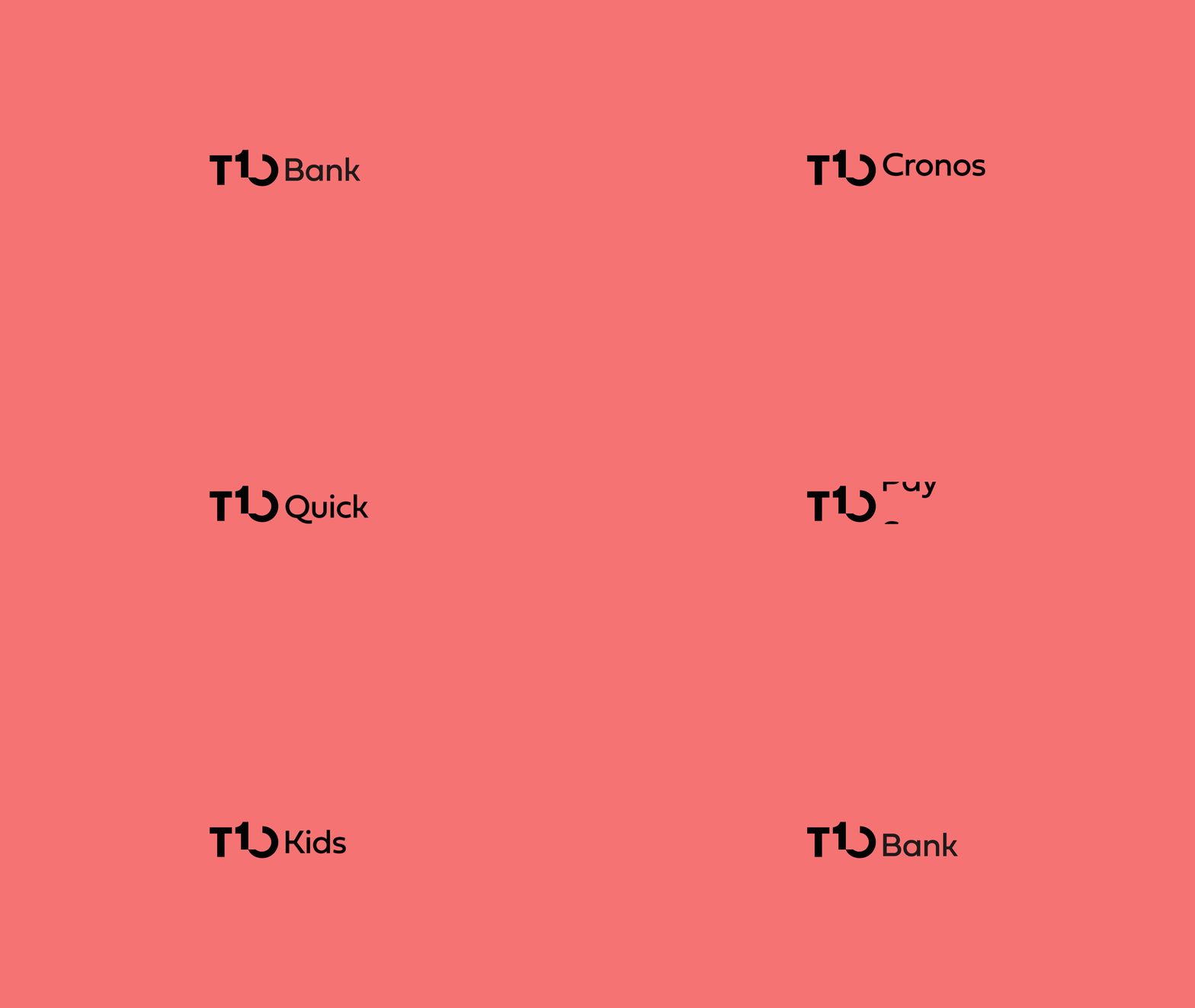
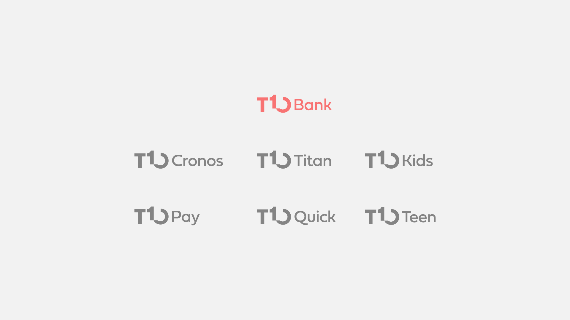
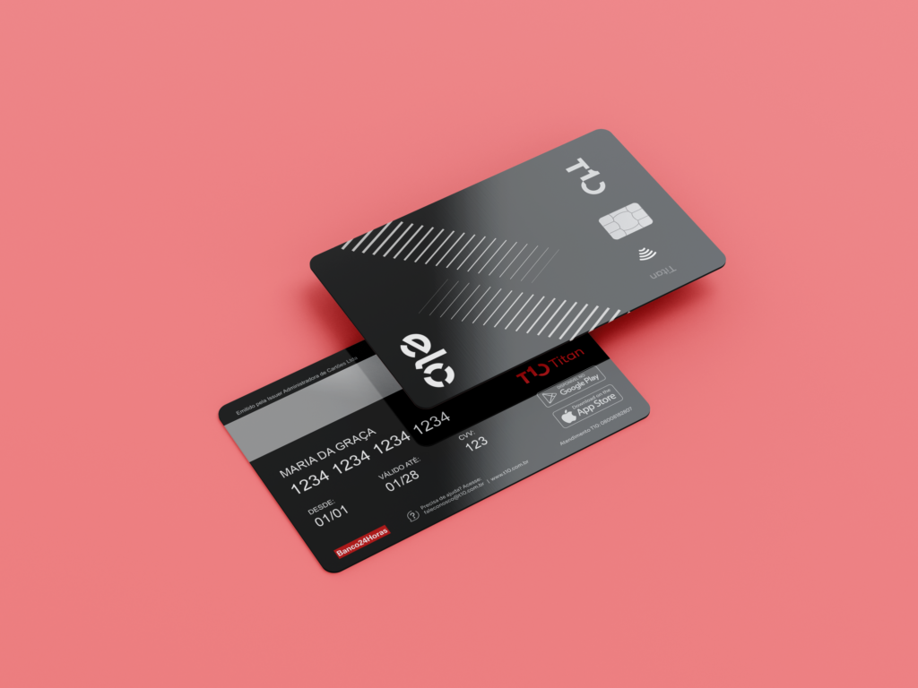
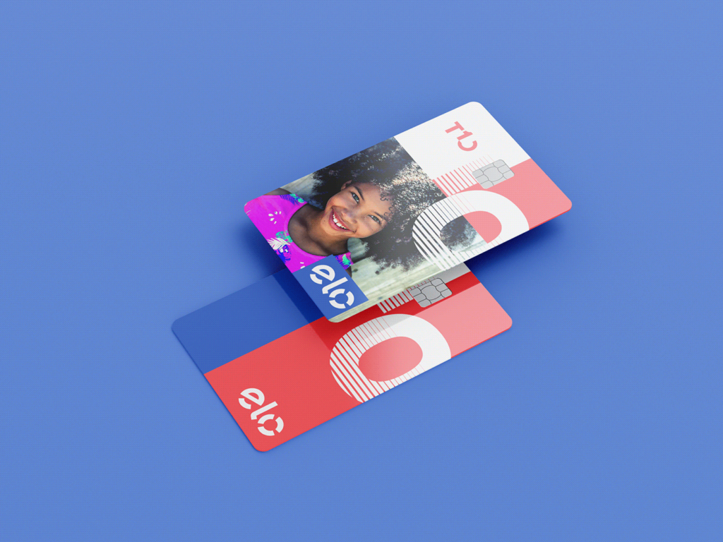
In addition to the main brand and colors, each credit card plan has its own colors and visual identity. The name of the plans reinforces the customer’s immersion within the universe of the brand: “T10 Bank, T10 Cronos and T10 Titan” , and their color palettes convey the exclusivity of the service within the app.




App and website
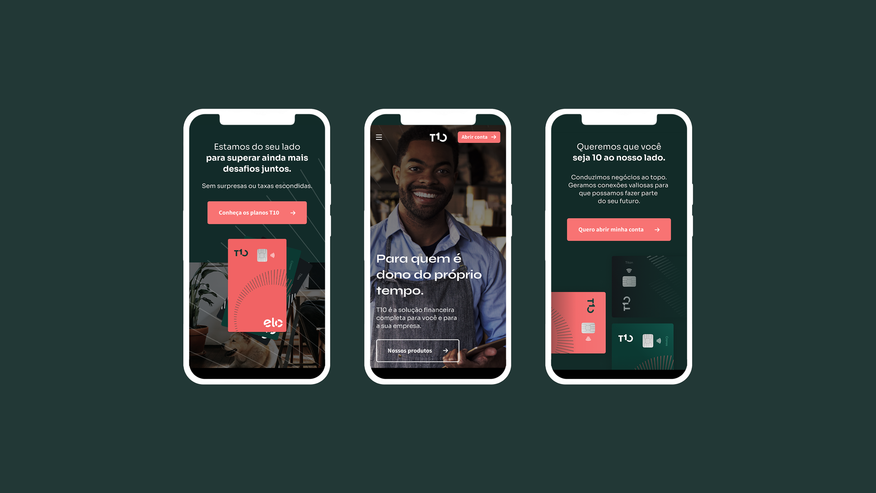
We were also responsible for the art direction of the entire UX project for the T10 website and app, in partnership with expert Ruhan Moreira. We ensured that every single detail of the interface spoke with the communication system we created.


Branding, visual identity and iconography: Motora
Strategic Direction: Luize Araújo
Strategy and writing: Luize Araújo, Juliana Argollo
Art Direction: Júlia Lago, Luize Araújo
Designers: Júlia Lago, Luíze Araújo and Juliana Argollo.
UI, app and app iconography: Ruhan Moreira