Rebranding Cracker Barrel
The Cracker Barrel rebranding is an emblematic case that illustrates a growing phenomenon in the design and branding industry: the problematic pursuit of minimalist brands.
Cracker Barrel is a traditional American restaurant chain with more than 50 years of history. Recently, the company unveiled a rebranding project, involving an investment of over 700 million dollars, which ended with bitter results. The public’s dissatisfaction was so significant that the company backtracked and replaced the new brand identity, reinstating elements that had been left behind.
Aiming to modernize and appeal to a broader audience, the redesign vision involved creating a “minimalist brand.” As a result, the new logo presented to the market was “cleaner” but without a long-standing brand symbol: the iconic “Uncle Herschel.”
At Motora, it’s not uncommon for us to receive similar requests from potential clients: to create something clean, modern, minimalist. This request reflects a trend from the fashion and design universe that associates minimalism with luxury, sophistication, and elegance. And this is precisely where the problem may lie.
1. Technical quality is not minimalism
Amid logos created by non-specialized professionals (or even artificial intelligence), it’s common for technical quality to be mistaken for minimalism.
A brand with too many elements, or one created many years ago, may not be properly prepared for digital applications. In these cases, it’s essential to consider scalability, grid systems, spacing, and even adapted versions for different channels and needs.

Minimalist design, while crucial in bringing clarity, functionality, and elegance to interfaces and brands, is not a prerequisite for elegance, sophistication, or modernity. Moreover, a brand can perform well in both digital and physical environments without necessarily being minimalist. In many cases, the best solution is redesigning classic and representative elements without losing the brand’s history and original identity.

2. Trends don’t position brands
Brand positioning involves communicating a unique message. Only those who dare to be authentic truly achieve this. It is impossible to reach that status by copying visual paths of major players, or worse, replicating a trendy style.
The risk lies in creating a visual universe disconnected from the brand’s essence and history, or adopting a concept that lacks personality.
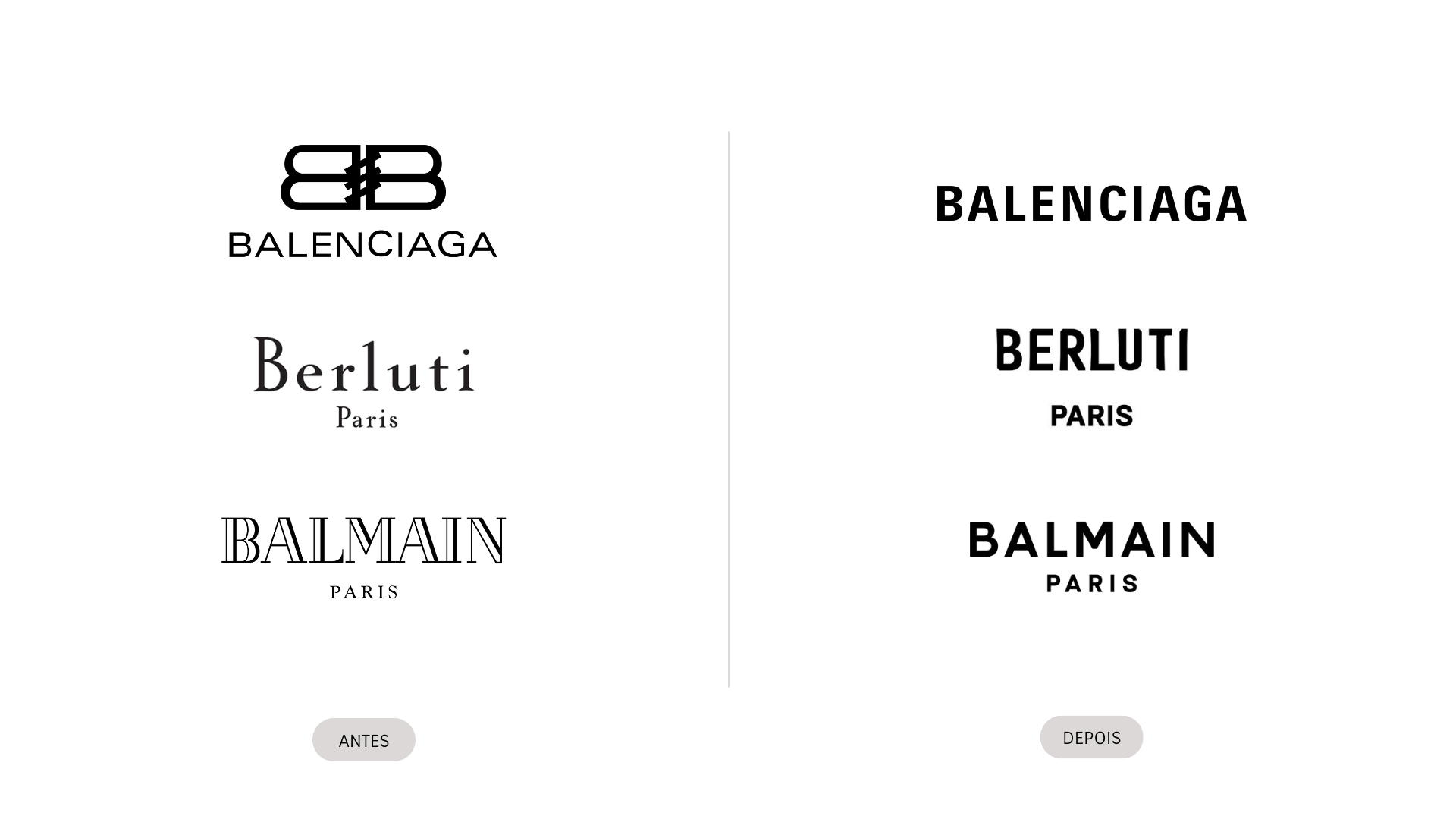
One of the main criticisms is the sense of excessive standardization that minimalism creates when applied as an absolute rule. Many brands, products, and environments end up looking too similar, losing identity, expression, and emotional connection with the audience, making differentiation difficult in saturated markets.

3. The audience is all that matters
Visuals should always be the final step in a business vision and strategy. Success inevitably depends on the target audience. Therefore, any change must always consider who the company aims to reach and engage with. What matters most is the audience’s connection to the brand and their behavioral trends.
Motora created the Global Alliance logo with greater complexity and a stronger connection to its audience: Indigenous peoples.
By overly prioritizing the reduction of visual elements, minimalism often leads to a lack of detail or absence of relevant information. The design may lose aesthetic diversity, becoming excessively cold, impersonal, and paradoxically less functional—especially in contexts where visual richness and clear communication are essential.

4. Presenting the change is key
If, after considering all of the above, the company decides to move forward with a brand change and adopt minimalism, one last factor can determine whether the process will be a success or a complete failure: how the change is presented to the market.
More than changing, communicating the change is key.
It is acceptable to shift audiences; it is acceptable to remove elements that no longer align with the company’s vision; it is acceptable to eliminate outdated brand elements that hinder new applications.
But it is not acceptable to announce such changes abruptly, disregarding the brand’s history and its long-standing relationship with the market.
That’s why it is necessary to involve the audience, build connection, tell a story, and open a dialogue.
5. Cracker Barrel
In Cracker Barrel’s case, a brand deeply tied to tradition, nostalgia, and a specific cultural experience, the sudden adoption of a simplified logo — without the iconic “Uncle Herschel” — triggered immediate backlash. This episode demonstrated that, during the rebranding, the company likely failed in several areas:
Overemphasized a design trend misaligned with its business context
Failed to account for symbolic meaning and the emotional capital of the old brand
Did not communicate the change adequately, leading to confusion and outrage
A brand is not just a set of shapes or fonts, but a complex system that communicates values, stories, and expectations. For traditional brands, especially those relying on iconic elements for identification and meaning, minimalist design must be applied with caution and deep respect for the audience’s emotional memory.
Cracker Barrel’s retraction was a necessary act of crisis management but left a clear warning for the industry: rebrandings can cause more harm than good. Sustainable and strategic branding requires thorough research, testing, and validation with key audiences and above all, respect for data and methodology.
Moreover, authentic minimalist movements originally sought to emphasize the essential. Today, however, minimalism often suffers from distortion. Excessive, mass-produced simplification risks replacing careful, intentional design with a mechanical pursuit of “less is more”, ignoring context, culture, and the sensory/emotional function of objects and spaces.
Minimalism is not universally effective: certain sectors (fashion, entertainment, e-commerce) require visual impact, subjective richness, and memory-building potential, elements that minimalism can stifle.
Conclusion for Managers
The challenge for branding professionals is to resist pressure to make decisions purely based on personal opinions or visual trends of the moment, and instead defend projects that are genuinely aligned with the brand’s essence: history, purpose, and audience.
See the full case studies included in this article:
Conteúdo e Imagens por: Monique Lemos e Júlia Chaves


